From research done previously, I can say that users really want to get hands on with type in digital specimens. They need to feel if the typeface they are evaluating will map to their needs. They want to try that particular set of letters, or create the logotype they're working on. Mostly, they want to take a screenshot and drop it in Photoshop, Sketch or Figma.
Type testers come in many different forms but the purpose is pretty similar: allow users – through a bunch of sliders, check-boxes, and select boxes – to manipulate an area of editable (but pre-populated) text. Here are some examples I've recently seen.

Space Grotesq from Florian Karston

Some foundries or designers take their testing tools a step further and allow minor layout, alignment and colour changes.

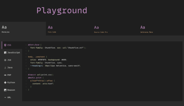
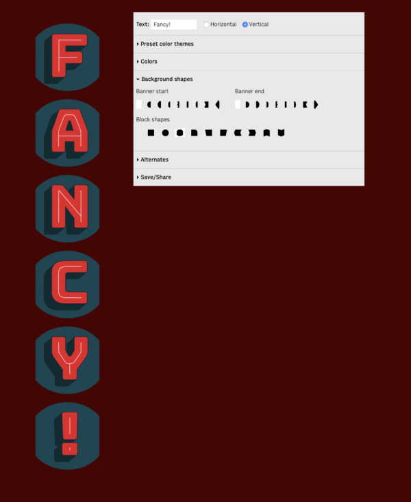
From previous research, I know people want this to some degree. Not everyone wants complex tooling. Don't forget: the purpose of a type tester is for evaluation, not to replicate a design environment. Most people that I've seen use these very quickly move on to looking at specifics of licensing or a glyph table.
Looking at all these type testers, I'm somewhat amazed that I've only managed to find a couple of available tools for people to plug into their own specimens – Flont from Chris Lewis, and Fontsample.js from Underscore. It's mind-boggling that something that does not differ greatly from foundry to foundry, from specimen to specimen, is not open sourced. Especially for designers or foundries where commissioning or developing these web-based components is way down a list of priorities or just plainly out of scope.
What about the future of type testers?
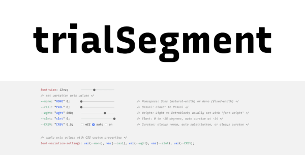
In the past couple of years, we've seen more variable fonts use this design pattern to educate users as to the benefits and flexibility that variable fonts offer.

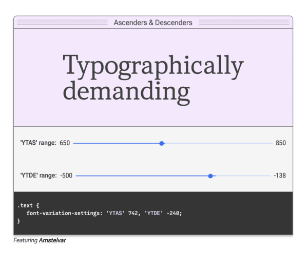
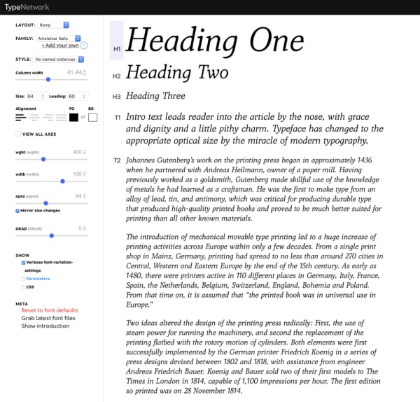
I can't help but feel this is a big jump for users. The interfaces are more complex. They are trying to educate as well as provide tools for evaluation because moving to variable fonts is a shift in mental model. From one where the weights we're all used to seeing – Regular, Italic, Bold – are the only available options in a particular typeface, to one where they are just points in a design space. This is complex.
Typefaces may have several variables that we're used to seeing – weight, slant, width – but there might be others such as the space inside and around characters, or one which might alter the overall feel and character of a typeface – like Recursive, for example.
This is all great, but what does this mean for the future of type testers and digital specimens? Due to this shift in mental model, how much time will have to be spent educating the user on what variables are on offer and how they can be changed? Type testers will no longer be simple tools to quickly evaluate a typeface but will instead have to become part education tool, part design tool. With this diversity comes deviation in understood, and well-used, interface conventions. I mentioned earlier that type testers pretty much all look the same. There is a reason for this convergence and we need to be mindful of any divergence in what has already been established as a design pattern. We must be careful and at all times consider our user's needs.
Are font users looking at typeface specimens to be educated in this shift in technology and what it empowers? Or are their needs not really going to change that much? Are they still going to just want a font for the project they are working on and to make that decision pretty quickly? My bet is on the latter.