Hello! Thanks for being here. I'm Mark and Type Specimens is a project I'm very excited to get underway.
What can you expect from this landing in your inbox once a week? I hope a dash of inspiration, a little design critique, and if that passes you by, then at least a few pointers to interesting typefaces you may not have seen before. Please note: I am not affiliated to any foundries or designers for the specimens I will discuss.
Of course, if this just isn't your thing, you can unsubscribe in one click.
So let's get started...
As multi-function publications, type specimens really interest me. They are equal part tool and marketing device. A hammer that tries to sell you nails.
Every week, I'd like to dig into some detail on a specimen that has caught my eye, either physical or digital – both media offer different benefits and challenges. This week is a typeface specimen I saw a little while ago: MonaLisa.
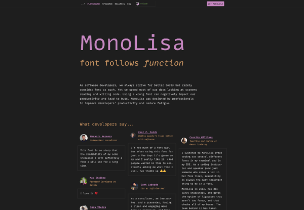
MonaLisa is a monospace typeface designed to be looked at all day, every day. It's a typeface specifically designed for coding environments with many features – both design and technical – to help* 'increase productivity and reduce fatigue'*. I'm all for that. In the designer's words:
"As software developers, we always strive for better tools but rarely consider font as such. Yet we spend most of our days looking at screens reading and writing code. Using a wrong font can negatively impact our productivity and lead to bugs. MonoLisa was designed by professionals to improve developers’ productivity and reduce fatigue."
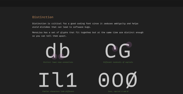
What struck me with this specimen was that it leads with context. The design looks like a coding environment. It has a theme switcher which allows the user to swap the colours to this rebased on popular IDE themes such as Dracula or Solarized. The content is led by features. The designers take us through the considerations of designing a monospace typeface, but then highlight those features that will reduce fatigue and help legibility such as character distinction and reading flow.

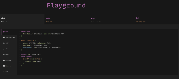
The design patterns of the specimen break with convention. Critically, though, they align with the context. The 'Playground' is a super-useful interactive element. Here, you can cross compare MonaLisa with Fira Code, Source Code Pro, and Jetbrains Mono. You can do this in the context of different programming languages – from JSX to Python – and, coupled with the theme switcher, means this little tester replicates the coding environment very well.

As delightful and useful this specimen is, what really gets me excited is the designer's publication of their release notes. These notes give an indication of the frequency of improvement and iteration, but also the focus of the designers. Remember, fonts have bugs, too – they are software! To see a record of these bug fixes, as well as additional features being released, is wonderfully transparent.
MonoLisa is designed by FaceType. The specimen was produced by Component Driven
As I mentioned earlier, Type Specimens is also a research and design project as well as a publication. Over the coming months, I'm going to be conducting some ongoing research into what makes a successful specimen, and how can they be used by type designers and users as part of their evaluation process.
I'll be taking these findings into prototyping and testing new design patterns – for print and digital – with a view to releasing a frequently updated library of patterns for the community to use. Many small foundries and type designers do not have the resources to produce type specimens that neatly walk that line between inspiration and function. They can take a tremendous amount of time, money, and resources.
Having done similar work in the past, I know this is a line of enquiry full of interesting challenges. Whilst brands and organisations may be able to easily articulate the decision they have made when it comes to type, getting under the skin of a largely subconscious process in a designer's head can be a problem! You see, many designers and font users find it hard to articulate this type of process. They rely on softer, less rational design skills. On feel. On gut. That stuff is hard to talk about.
I'm excited about this project. I've been wanting to do it for ages. A special mention should go to Google Fonts for supporting it, and, I hope, many of you over the coming months by continuing to help me dig into that burning question: what makes a good type specimen?
Until next week,
Mark