Hello again! I'm Mark, and this is the Type Specimen Digest, a weekly typography newsletter.
This week, I take a bit of a trip down memory lane with Emigré, I talk about how you could help me out with the research I'm about to undertake, and I have a few type specimens for you to have a peek at.
Emigré
I think most graphic designers of a certain age owe Emigré a favour or two. Personally, they were a driving force during university and my early career. Studying typography in Portsmouth University was an exercise in balancing opposing forces. On one hand, I was learning the traditional typographic craft of typesetting books, using typefaces to communicate, experimenting with layout and form but within the confines of tight constraints and strict deadlines. On the other was an explosion of expressive (some called it 'grunge') typography of the early '90's: David Carson; The Designers Republic; and later, Attik. This was the punk of typography, and just like most young designers, it excited me. So I walked that line, carefully trying to sneak in the expressive typography in amongst measured, considered – and some would say, more traditional – work.
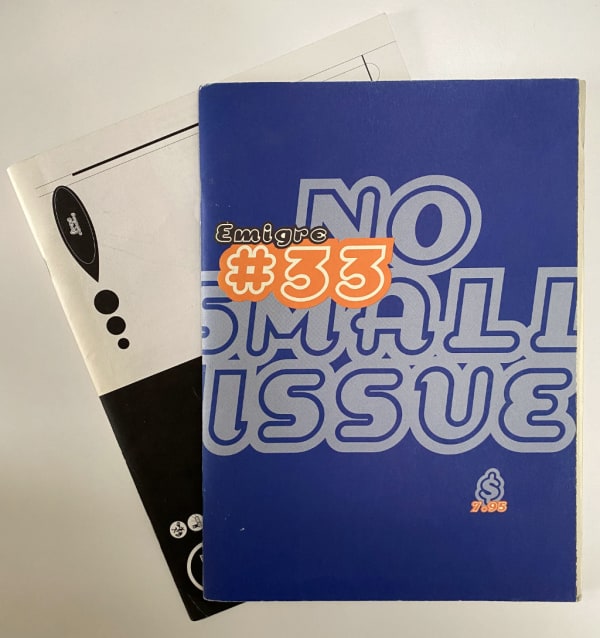
But when it came to the typefaces themselves, I continually picked up my Emigré issues as sources of inspiration. I remember the first issue I bought from Waterstones, a bookstore in Manchester in the UK, very clearly. Issue #33 – No Small Issue. 1995. Of course, I'd read many issues before, but in the UK, Emigré was expensive as it had to be shipped and, as a poor student, most of my university budget seemed to go on SprayMount at the time.
Pulling this issue down from my bookcase, I've just spent the last 30 minutes reading it almost cover to cover and I felt the same feeling of excitement. Or was it nostalgia? The latter issues of Emigré lack the early, painterly scrappiness of the issues in the late 80's and early 90's, but they still planted those seeds: 'typography and typefaces can break the rules'. Just what this designer wanted to hear at the time.
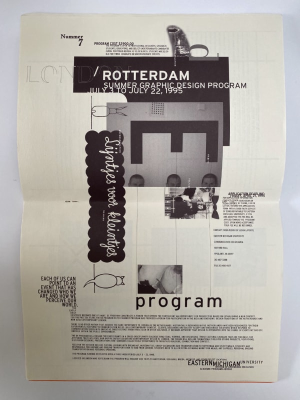
Whilst travelling down this Emigré nostalgia fest, and what prompted me to write about them this morning, was an Emigré fonts catalogue I forgot I had. From the listing of the magazines in the back, I think it's from around 1995.
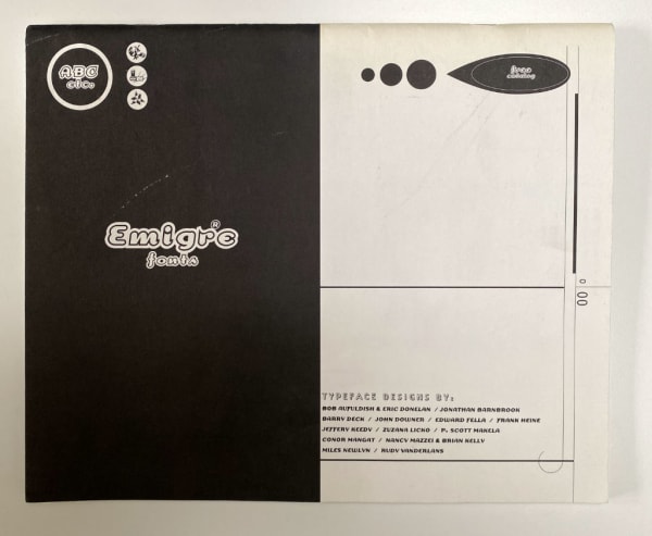
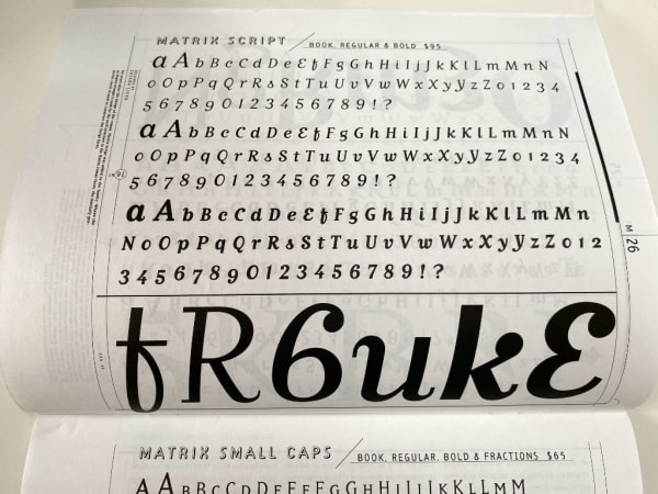
Classics such as Matrix, Dogma, and Outwest documented in full at varying sizes. The catalogue has a centre section of mint green paper, and on the back is a wonderful little advertisement for the new Emigré bulletin board.
Now Serving! Is Emigré's electronic bulletin board which enables users to preview and download fonts from a variety of independent type foundries in a matter of minutes.
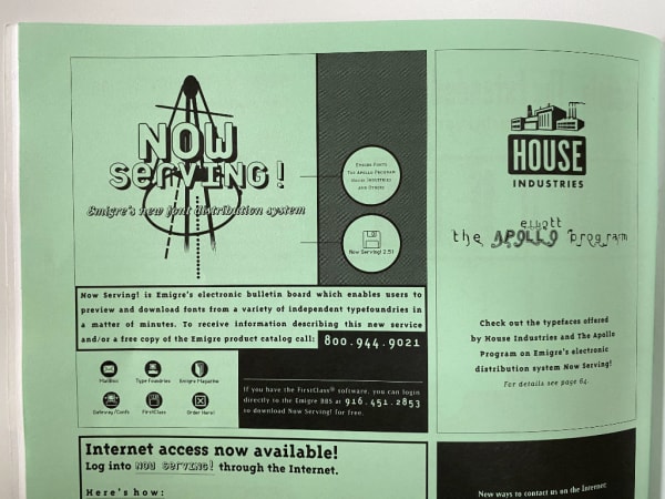
What was notable about Emigré's specimens was, because of the magazine, they probably didn't need them. My copy of this catalogue is in pristine condition despite its age. Emigré's specimens were the magazines. The advertisements for the typefaces were the many essays and articles published over the decades. As a designer, I could see exactly how these typefaces perform in a real world situation and didn't need some pangram to show me.
Last week, I was delighted to see an email from Emigré announcing a new illustration typeface: Chowdown by Tucker Nichols. Now, the digital specimen leaves a lot to be desired but do yourself a favour and download the PDF. The specimen is a lovely little recipe book.
Once again, Emigré focus on quality content as a vehicle for their fonts. It's not enough for them to just talk about how the designer was inspired to produce this typeface, or to give us a list of pangrams at various sizes. No. To really see how this thing works, you have to see it work. I just wish the digital specimen had this content.
Type specimens research
Part of this project is to conduct some research to answer the question: 'what makes a good specimen?'. Specimens have to do a lot: sell the typeface, demonstrate its potential usage and features. And, digitally, allow the designer to get hands on and have a play with it. But, other than sales figures, how do foundries and typeface designers know they are delivering to those needs?
The research will take the form of a few interviews. I'll show you some stuff. We'll have a chat. All very informal. If you can spare twenty minutes, please just reply to this email. I'll get it. Then I'll be in touch.
Specimens this week
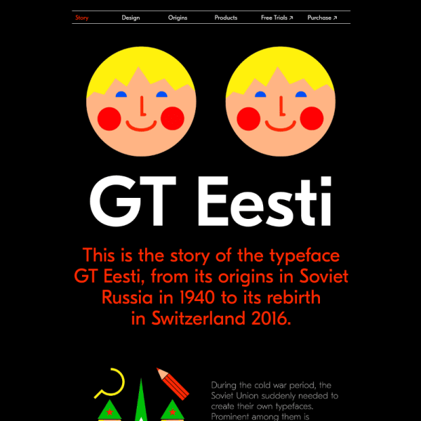
GT Eesti This specimen is delightful. From the bold, large letters presented alongside vibrant illustrations evoking the typeface's inspiration from 1940's Soviet Russia.
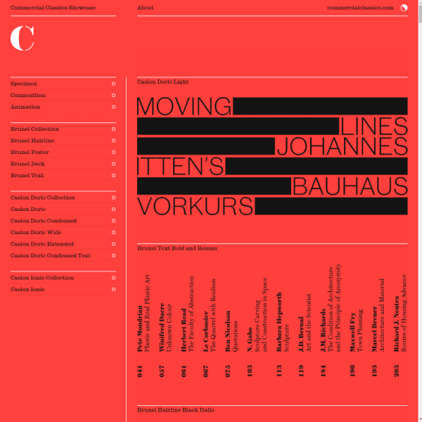
Three cornerstone typefaces Class graphic design meets modern web design, the Commercial Classics Showcase specimen is everything you'd expect from the team involved. Notable that Michael Bierut was Creative Director for the specimen. As always, beautiful typefaces from Paul Barnes and Christian Schwartz.
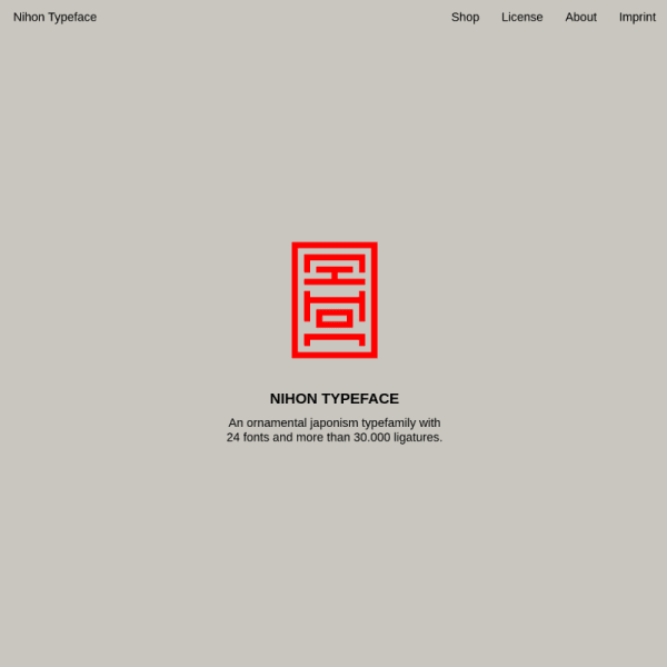
Nihon An ornamental Japanism typefamily. Inspired by traditional Japanese Inkan-Seals, Nihon takes abstracted latin letters and presents them as used by the seals. A complex goal, but the specimen walks through the results before digging into some features.
Digital type specimens that catch my eye are added to the type specimen feed on the website daily.
A few interesting typography links
The Typearture Variable Color Initials is a visual and technical feast showing how variable fonts could be used in illustrative and storytelling settings.
Text For Proofing Fonts by Jonathan Hoefler is a piece about saying goodbye to pangrams for testing fonts. These texts are notably available on Github as a PDF.
Type Together have an excellent piece on pairing fonts.
The KABA Type Media class of 2019 site has some wonderful work.