Hello again! I'm Mark, and this is the Type Specimen Digest, a weekly typography newsletter.
Last week, I took a little trip down memory lane with Emigré's specimens. This week, I take a look at type testers on the Type Specimens Journal, and I have quite a few specimens for you to have a look at.
Enjoy!
Mark
Hands on with type testers
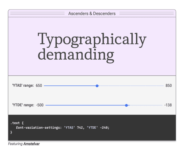
Type testers are available on pretty much all digital specimens now. In this journal post, I dig into the landscape a little but also try to look forward. With the increased usage of variable fonts, and an uptick in the availability of trial fonts that are freely available for designers, what role do type testers have in the future?
Specimens this week
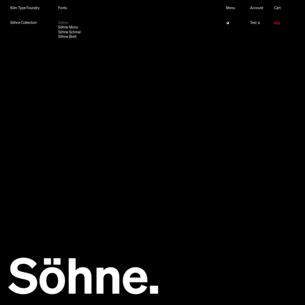
Exquisite specimen from Klim Type Foundry. On the surface, the specimen for Söhne is simply presented. Almost like a print specimen. It's not until you interact with the type that the controls appear for a feature-rich typetester. What is particularly interesting about this one is the ability to test multi-lingual definitions of 1984's Newspeak.
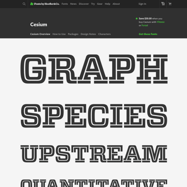
Hoefler&Co's specimens follow a similar templated approach, but they are considered and elegant. The full-featured type tester is front and centre inviting the user to get in and test the fonts themselves. Simple and effective.
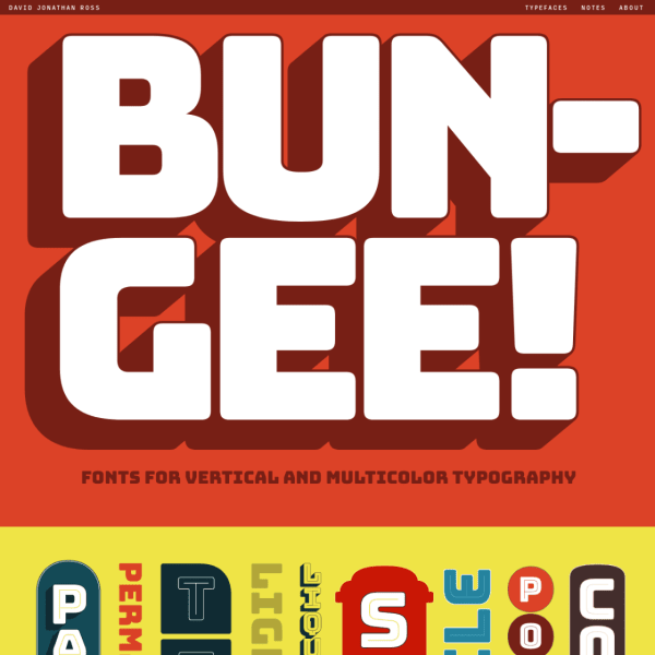
Bungee is for 'vertical and multicolour typography'. The type-tester is particularly interesting in this horizontally scrolling specimen. It allows the user, through various parameters, to emulate the designs shown in the specimen and share or download them.
LLineto's specimens follow a similar templated approach and closely mimicking a printed specimen. This is all about showing the different weights over titles and long form. What is particularly good is the very detailed technical information at the bottom of the page. Detailed waterfall design patterns with a full glyph table.
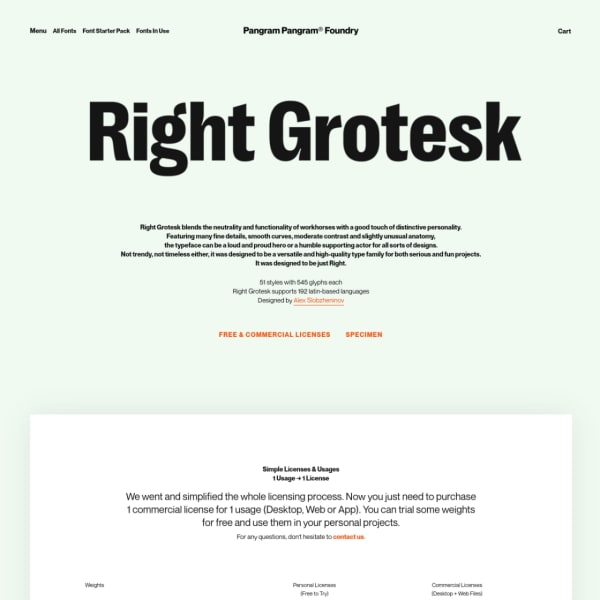
From PangramPangram, the Right Grotesque specimen, unusually, leads with pricing and downloads. Refreshing to see the continuing trends of free licences. The typeface tester is way down in the hierarchy followed by some images from the PDF specimen. I wish these were presented as web fonts.
Digital type specimens that catch my eye are added to the type specimen feed on the website daily.
Type specimens research
Part of this project is to conduct some research to answer the question: 'what makes a good specimen?'. Specimens have to do a lot: sell the typeface, demonstrate it's potential usage and features. And, digitally, allow the designer to get hands on and have a play with it. But, other than sales figures, how do foundries and typeface designers know they are delivering to those needs?
The research will take the form of a few interviews. I'll show you some stuff. We'll have a chat. All very informal. If you can spare twenty minutes, please just reply to this email. I'll get it.
A few interesting typography links
Azza's website caught my eye this week. It's not often you see the right balance of type design, graphic design, and native digital design.
This Google Sheet has a growing list of available variable fonts in addition to uses examples
The Font Review Journal is a real treasure trove of considered critique, great design, and typefaces you may not have heard of.