Hello again! I'm Mark, and this is the Type Specimen Digest, a weekly typography newsletter and this week we're in the middle of design research. And, boy, is it messy!
This project was always part design project, part publication. I wanted to continue the work I started five years ago in trying to understand how designers make decisions with specimens. Not why. There are plenty of reasons why people choose type. But the mechanisms, thought processes, and determining factors – as they relate to specimens as tools – is an interesting line of enquiry. Soon, I'll begin prototyping a set of templates and tools to help designers make specimens.
The walls of my studio, the desktop of my laptop, and the inside of my brain are covered with research insights from my discussions and desk research over the last month. It's a mess, frankly. I always feel a little strange at this part of the design research process as I try to deal with the mess I'm continuing to create. The more people I speak to, the more messy it gets. 'But, that's fine', I tell myself. 'This is the way it's supposed to be, and always is'. And, I'm right. I know I am.
Trends and threads of insight present themselves in different ways depending on a few things. Speak to any researcher and they will give you a bunch of processes and methods that work for them, but there are many ways to skin a cat. The method that works for me is immersion. I just have to live with the feedback. Often, physically. Hence the mess. But then, and only then, can I start to form connections between the little data points.
This is an enrichment process – immersing myself in the feedback – so I can draw on it, reinterpret it, use it as a springboard to other things. It isn't about ticking a box. It's about trying to understand the landscape. For me, design always starts there.
Until next week, Mark
GT Super
We started this newsletter with a breakdown of the MonaLisa specimen. This week, I want to walk you through a beautifully elegant specimen from Grilli Type, GT Super.
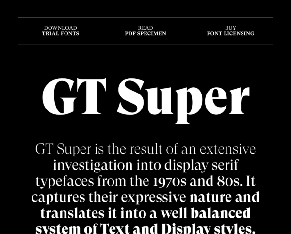
Designed by Noël Leu, after seeing a newspaper clipping, GT Super is reimagined melting pot of typefaces from the 1960's and 70's such as Perpetua, Trooper Roman, and Times Modern.
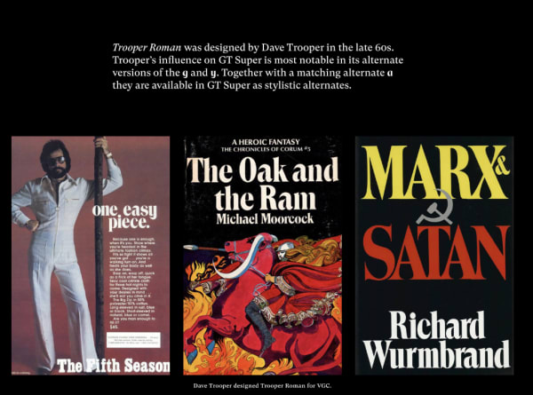
The specimen tells that story beautifully. Simply presented, but engaging, content walks the reader through the inspiration coupled with historical examples.
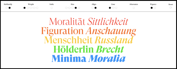
Each panel of text editable. Upon clicking, it reveals a type tester. This one is a little unconventional, though; editable values are tightly constrained. A series of radio buttons allows the user to quickly jump between presets allowing just enough control to get a sense of the typeface at various sizes, weights, and alignments.
The typeface design features are particularly well done. Look at that animation for the lower case 'a'!
The specimen closes with three, simple calls to action: download trial fonts, a PDF specimen, or just go and buy it!
Specimens this week
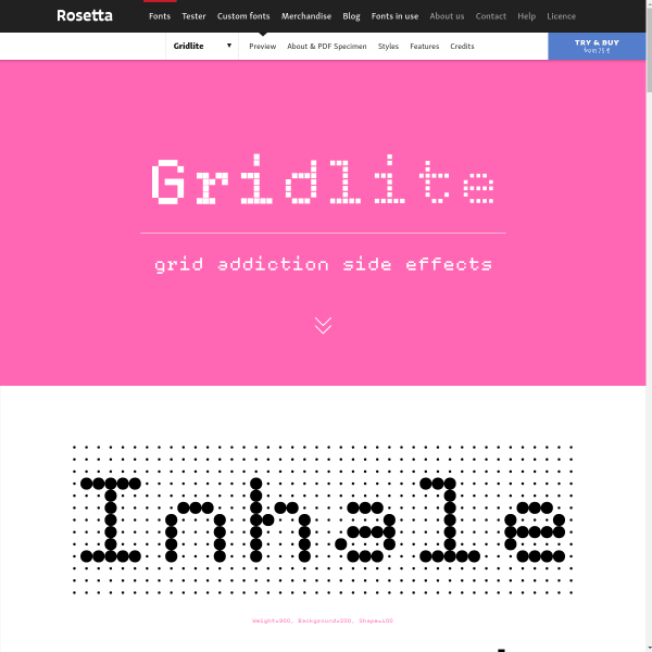
Gridlite New display typeface from Rosetta, Gridlite's specimen looks disarmingly simple. It's not until you use the type tester that the power and variation of Gridlite becomes apparent.
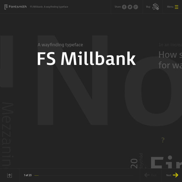
FS Millbank FS Millbank is a wayfinding typeface by Fontsmith. The specimen is more like a presentation than a traditional format. The user zooms in, out, and through the typeface's various applications, features and design details. Compelling viewing.
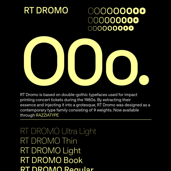
RT DROMO Based on double-gothic typefaces used for impact printing, RT Dromo is a characterful sans serif, especially the heavy weights. The specimen mixes panels of illustrative and educational content.

Korrodi A simple black and white specimen with stacked type testers with size controls from Feliciano Type.
A few interesting typography links
Leon Sans is a geometric sans serif made with code by Jongmin Kim. Amazingly flexible, you can use code to create custom animations, effects or shapes in an HTML Canvas element. Have a look at the examples, or the GitHub repo.
Jeremy Tankard's new typeface for Yale has a great case study walking you through historical reference, working drawings, and the development process.
Type Today has a great piece on quotation marks.