Hello again! I'm Mark, and this is the Type Specimen Digest, a weekly typography newsletter and we're descending ever deeper in research for the project at the moment. So deep, in fact, that the only reason this newsletter is going out on time is it's being written days before publication as it's my daughters ninth birthday this week. You know how nine year olds can be about birthdays. Birthday week, more like.
Alongside the research interviewing I'm doing for this project, I also know I need some broader data on why people use specimens, and how they use them. I'm a fan of a method called Top Tasks – I wrote a bit on the Journal about it this week – to give me a prioritised list of what people find the most important. But. Yes, there's a but, and a request...
I need your help. This will be the first of two requests: firstly to help me with some task gathering. The second will come in a couple of weeks time. Both tasks shouldn't take you more than ten minutes. Fifteen if you're nerdy about the subject.
So, firstly, I'd like you head on over to this Google Sheet and add the tasks that come to mind when you are evaluating type using a specimen. What is it you're looking for? What questions do you have? That's it. Easy! And, thank you!
Until next week, Mark

Something special arrived in the mail this week. This is the new binder and specimens from Rosetta.
Inside was a lovely note, written by David:
After designing and producing digital fonts for almost a decade, we felt an itch to make something tangible to show off our collection of typefaces – an object one could touch, smell, and hoard for posterity. Inspired by the classic binders produced by the Monotype Corporation in the 1950's, our designers Anna and Kamil created a limited edition of specimen binders. I thought you would not terribly mind having one of them for your studio library. Hopefully, it will bring you joy and a healthy dose of envy from your colleagues.


It is a beautiful piece of work. Nodding to the classic binders of the past, as David said, the quality of the artefact matches the quality of the typefaces. Apparently, there are still a few available for purchase from Rosetta's website.
Klarheit Grotesk
Sometimes you see a specimen and it gets under your skin. Usually, for me, it's the combination of typeface with the layout. That coupling of good typography, good content, usefulness, and that [insert chef's kiss], something.
Last week, I saw a specimen like that.

Klarheit Grotesk's specimen is the perfect layout for this typeface; stark, brutalist, utilitarian – not something when combined I usually get that excited about. As someone who grew up in the North West of England, I had my fair share of brutalism architecture and modernist-leaning 1990's graphic design revivals. No, what struck me about this specimen is the combination of all of those things but it has a lightness of touch. The content. The photographic and line illustrations. And, to top it all off, the buy button at the end made me smile.
Specimens this week

Nein There's a lot going on in the design of this specimen. Opening with probably the largest type seen anywhere, the visual assault continues through panelled animations demonstrating potential use. That started with enormous type, ends with an enormous buy button.

Blanchard Collection A specimen disarming in its simplicity. Just a paragraph of content simply set in the two available styles sit below a brief introduction. The digital specimen is bolstered by a comprehensive PDF, and a lengthy story of the origins, design, and development of the typeface.

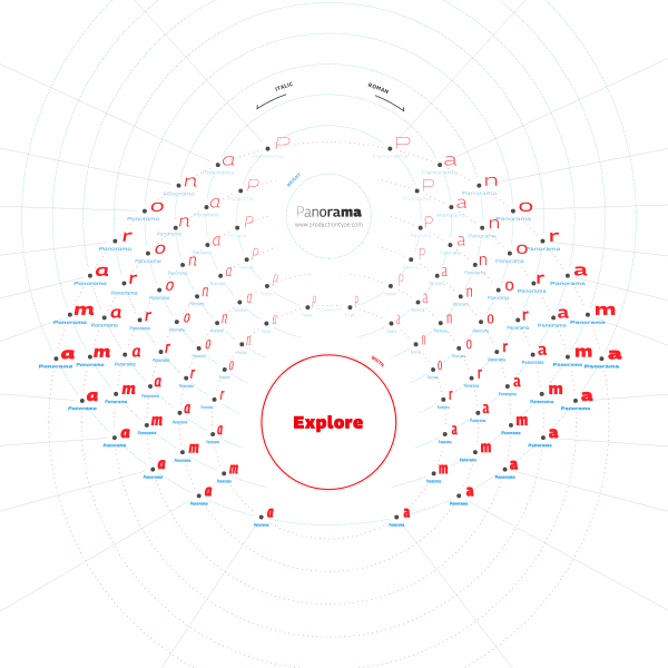
Panorama An exploratory interface allows the user to navigate the design space. An imaginative use of navigational devices and layout.
There are more specimens added this last week on the Type Specimen website. You can subscribe to the RSS feed for daily updates, or follow along on Twitter, if that takes your fancy.
A few interesting typography links
A brilliant piece from type.today on Cyrillic fonts on Google Fonts, starting with Humanist Sans.
Letter & Co is an online type design program that 'combines traditional letter drawing, and lettering techniques, with modern software, providing attendees with a solid theoretical basis and practical tools to create their own display font. The schedule includes workshops and critique sessions with international specialists and guest lectures, that will assist the attendees throughout the process.'
This is a fantastic lecture from ATypeI a while ago. Busting the Dyslexia Myth with Alessia Nicotra and Bruno Maag. I learnt a lot.
I've been thinking about content for specimens, and layouts, and how we – as designers who use type – need access to content for the things we produce to test our type. Lorem Ipsum just doesn't cut it. So, there are a few options available to us.
Lists.design used to be a website of, well, lists. It seems the website no longer exists which is a shame, but the Github repo is still there. Fork it while you still can.
Filibuster used to be a brilliant, fun, non-sensical website full of generated nonsense. The python script has since been updated and is available on Github too.