Hello again! I'm Mark, and this is the Specimen Digest, a weekly typography newsletter and I'm still interviewing, still analysing, and uncovering answers to the question: 'what does a good specimen look like?'. So what have I learnt so far?
Amongst many type designers, when we talked about print design, people smiled. When we talked about digital, people frowned. For many, print is a medium of expression, of creativity, of comfort. The polar opposite is true for digital. It's a place of shifting sands, constraints, and necessity. And cost. When this way of thinking is applied to the design and marketing of a new typeface, we get a split – a duality – of content. In print, we see fruitful collaboration with graphic designers, and the creation of beautiful, tactile objects. On the web, mostly, we see templates and catalogues as vehicles for images or PDFs. The creativity is happening elsewhere. The web is a publishing medium, not a creative medium.
The answer I got from most people when I asked the question 'what does a good specimen look like?' was 'what do you mean by "specimen"'? At first, this was a little bamboozling. 'You know, a specimen!'. Turns out it could be a beautiful printed launch booklet, or a 32-page technical PDF, or a micro-site, or a page in a catalogue, or a website templated page. It could one, two, or all of these things.
The biggest takeaway for me over the past few weeks has been that specimens are representations and presentations of the typeface with its best clothes on. They can be taken as individual pieces of work, or as packages in a marketing mix. They can be small and automated, or huge and bespoke. I'm coming to learn they are as varied and diverse as the type industry itself.
Top tasks!
My thanks to everyone who has submitted tasks for my survey so far. As a reminder, alongside the research interviewing I'm doing for this project, I also know I need some broader data on why people use specimens, and how they use them. I'm fan of a method called Top Tasks – I wrote a bit on the Journal about it last week
The first job is to gather tasks, which we started last week, and I need one more week. If you have the time, I'd be really grateful if you could head on over to this Google Sheet and add the tasks that come to mind when you are evaluating type using a specimen. What is it you're looking for? What questions do you have? That's it. Easy! And, thank you – the survey is coming next week!
Until next week, Mark
Specimens this week

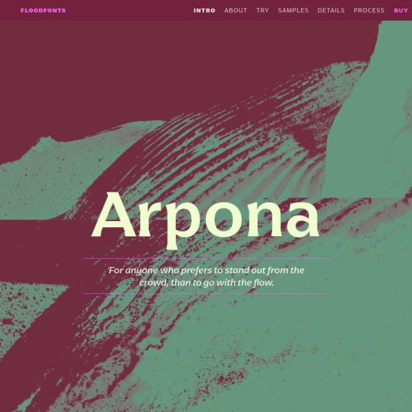
Arpona This specimen leads with animated illustrations and the features and inspiration for the typeface. The multicolumn and paragraph settings work particularly well, especially as they are crisp web fonts. The jewel of this specimen, though, is the accompanying design process content, complete with early sketches.

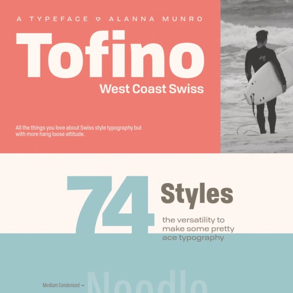
Tofino A comprehensive specimen for Tofino, a sans serif with a large range of weights and styles available. The specimen is notable for its huge range of examples of potential usage, which even goes as far as including a UI kit for Sketch and Illustrator.

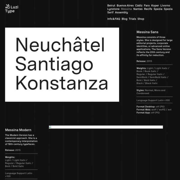
Messina An unusual and refreshing layout for this black and white specimen for Messina. The type family is comprised of Sans, Modern, and Serif. The outstanding part of this specimen is the fonts in use section with captioned images showing Messina in context.

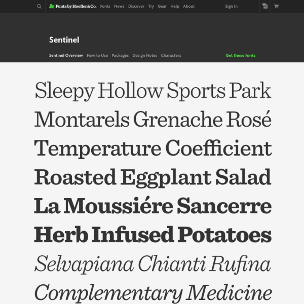
Sentinel Sentinel gets an update to Pro status. New fractions, ornaments, small caps and more. As always with Hoefler&Co's specimens, there is a clarity and purpose. Sections for design notes and characters support the highly practical overview page.
There are more specimens added this last week on the Type Specimen website. You can subscribe to the RSS feed for daily updates, or follow along on Twitter, if that takes your fancy.
A few interesting typography links
Redefining typography in CSS with Capsize. Web browsers determine things like line-height from adding space above and below a font's em-square. This little CSS library allows you to resize based on cap height and measure from the baseline. Pretty nifty.
Samsa is a very useful variable font inspector for peeking under the hood.
Having grown up in the 80's amongst arcade games and the Sinclair ZX Spectrum, I'm a sucker of pixel fonts. This couple caught me eye recently.
Sono is a soft monospace variable font.