Hello again! I'm Mark, and this is the Specimen Digest, a weekly typography newsletter and this week we take a deep dive into variable fonts and why is it that I'm not the only one who finds them confusing. I have a few great looking specimens for you. But first, I need your help!
The primary goal of this project is to understand how designers use type specimens, and, as an industry, how we can produce them to be more useful and delightful. A couple of weeks ago, I wrote about how I planned on using a survey method to do this. Now we have a list of 50 or so tasks – and thank you to those who have spared the time so far – it's time for the survey.
If you'd like to contribute, it should take no longer than 5 or 10 minutes. The survey is anonymous and I'll delete all the data once I close it in two weeks time.
Thanks!
From Weights to Space
Over the many hours of interviewing I've done during the last couple of months, one thing has repeatedly bubbled to the surface: variable fonts.
Variable fonts divide opinion amongst type designers and foundries. Users of fonts are still not sure of the benefits, or just don't know what they are; 'a font is a font is a font' I heard more than a few times. The benefits of variable fonts are clear: huge flexibility potential, smaller file size, fewer server requests. Just have a browse through this primer. So why is there a reluctance, a gap in understanding, and how do type specimens fit in all of this?
I tried to dig into this when I spoke to people – and continue to do so. And I think I'm getting somewhere. Variable fonts represent a mental model shift for users of fonts. From a list of weights and styles, to a design space with axis. I really don't want to understate what a shift this is: from a flat list, to a space. It's no wonder people are confused.
For type designers, they are already comfortable with this mental model and have been for decades. Probably centuries. But, for the rest of us, this is new. And, it's a mental model that is reinforced by the tools we use: our operating systems show lists of files, our design software shows us a list of fonts. Foundries still talk about weights, even when they are selling a variable font. The maddening thing is, that's also correct!
To explain all of this, and to hand hold us through it, type designers and foundries are using their type specimens of variable fonts to explain the benefits and features.
This week saw the release of GT Flexa from Grilli Type designed by Dominik Huber with Marc Kappeler. It is a perfect example of getting the balance right between education, features, design, and function.
I wanted to pick out a few standouts for me.
The hover states of buttons and links animate across a range of axis. Although unsubtle, it's a tiny thing that builds across the experience.
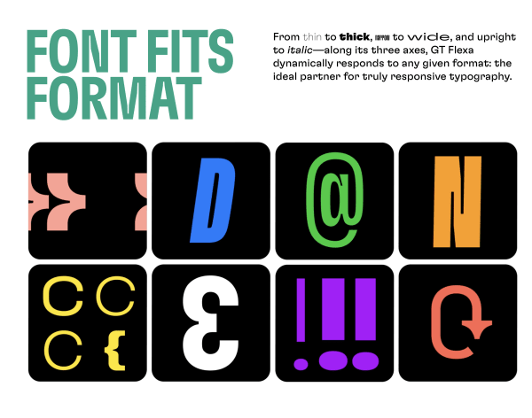
Through the specimen, the typography is just so varied. They've really pushed the variances, and by using just simple, bright colour, a refreshing design aesthetic is built.
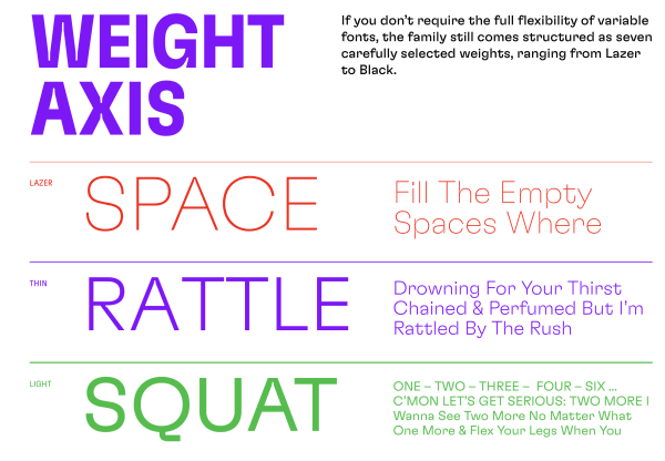
A feeling of 'show don't tell' is evident throughout. The stacked animations spring to life when a user hovers over them.
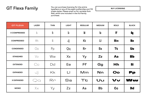
And, finally, the table of weights and styles. This further demonstrates this shift towards a design space from just a list of available weights.
Until our design tools all settle on a user interface convention that allows us to choose, manipulate, and set variable fonts, it's going to be down to specimens to continue the education process. I just hope that future specimens do the job as well as GT Flexa.
GT Flexa was designed by Dominik Huber with Marc Kappeler 2015–2020. Published by Grilli Type in 2020. The specimen was designed by Grilli Type with Informal Inquiry, and developed by Informal Inquiry and Sensor Station. Animations by Josh Schaub.
Specimens this week
Dotties A delightfully illustrated specimen full of lovely detail. The stacked ice cream pots are particularly clever.
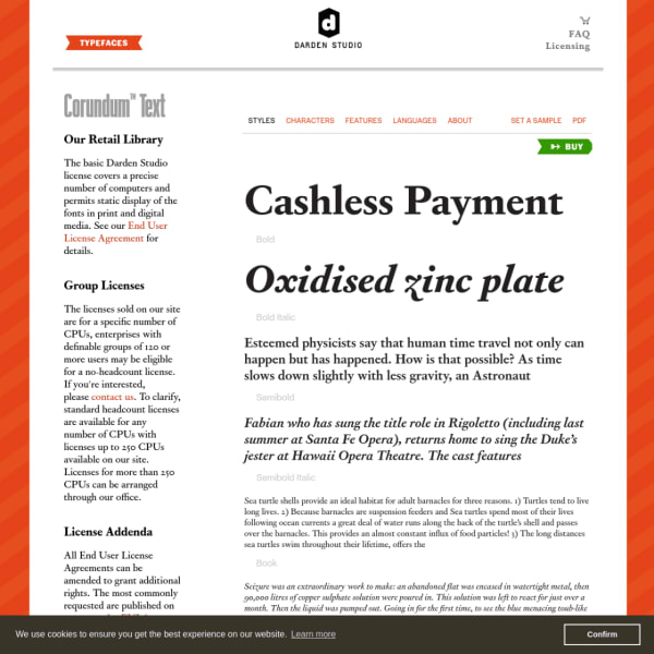
Corundum Text A workhorse of a specimen for a workhorse typeface. Darden Studio's specimen's, although templated, are very well designed. The type testers only appear when a use wants to investigate a particular weight or style.
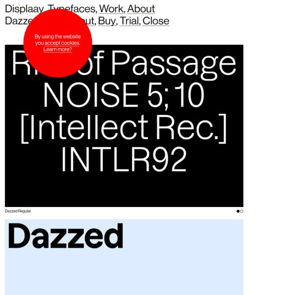
Dazzed An unusual specimen of panelled animations. The strenth of the large type set against a single colour, give this lengthy specimen a simplicity inviting the user to scroll and scroll.
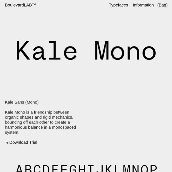
Kale Mono A stark, brutalist specimen. Large type, grey and black, sightly set explanatory text sets the tone for Kale Mono.
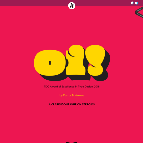
Oi! Brilliant name for a 'clarendonesque on steroids'. The Specimen for 'Oi!' is littered with comedic touches and the design fully supports the loud brash intention of the typeface.
There are more specimens added this last week on the Type Specimen website. You can subscribe to the RSS feed for daily updates, or follow along on Twitter, if that takes your fancy.
A few interesting typography links
Another typeface revival in the UK for a national institution. Sir Peter Hendy announces that Network Rail will be bringing back the Margaret Calvert-designed Rail Alphabet
A new font label, Fontwerk, was launched this week. Starting with an already solid library, this is a small independent foundry to keep a close eye on.
This is a good read from Greg Hitchcock, Principal Software Engineer at Microsoft: Thirty Years of Monotype’s Times New Roman and Arial on Windows
The Custer family by David Berlow – designed for small, on-screen text – gets an extension by Richard Lipton to take it into other environments. For web designers, take note, this new expansion of optical sizes, weights, and widths are available in a new variable font.
