Hello again! I'm Mark, and this is the Specimen Digest, a weekly typography newsletter and this week I am slowly drowning in post-it notes as I continue to work through insights from my research a few weeks ago. I've been distracting myself with the daily research into digital specimens, and, as I'm discovering, the occupational hazard with this project is I want to buy more fonts. Like, all the time!
In addition to a select few excellent specimens this week, I have but one other request before I stop bugging about you about it altogether: my Top Task survey for type specimens.
Thank you to everyone who has filled it out so far. But, if you haven't yet, and you have 3.5 minutes to spare (according to Survey Monkey, this is how long it's taking on average), then please do. It's anonymous, I'll be deleting the data after I close it, and the information will not be used in any commercial way.
Thanks!
Chasing Market Position
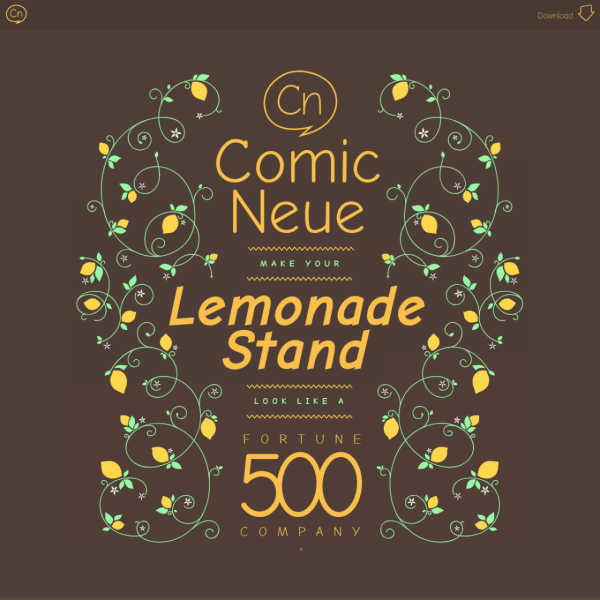
I came across Comic Neue by Craig Rozynski this last week. I had forgotten it existed, but now I remember the Kickstarter project. Setting aside your feelings about Comic Sans, and even this reimagining (I, incidentally, have good feelings about Comic Sans), what struck me was the graphic design of specimen. Specifically, the use of earthy colour palettes and the quite beautiful line art illustration.
A while ago, I was quite critical about the lack of good illustration across the web. We had textures, photographs, but no really great illustration. It existed, of course, but was often used in niche online publications, or reused from big corporate publishers who'd already had it commissioned for print. Then, I think it was around 2012 or something, Dropbox introduced a certain style of illustration as part of their identity. Suddenly, just like Stripe nowadays, every tech company was copying the illustrations as a way to say to their customers: 'hey, we're modern, relevant, forward-thinking'. For the past eight years this has trickled everywhere. Now, we're in the position of the most visually challenging sectors of industry possible – like B2B IT hardware – using the same aesthetic. Any cursory search on Getty will find thousands of these stock illustrations.
Why am I harping on about this, might you ask?
Just like other sectors of the design industry, 'digital product design', as it's become known, is incredibly insular. It's a new industry full of relatively young designers bouncing from one tech company to the other in a bubble of stock options and astronomical rent in San Francisco. It is not an industry that actively pursues external design influence, but trades on aesthetics to gain market position. And this is exactly why working closely again with the type and graphic design industry is so refreshing and nourishing. The maturity of these industries, and the practitioners in them, means there is depth and reach which is just not yet present in digital product design.
The illustration for Comic Neue, for me, is a simple reminder that there is more inspiration out there than staring at the same screen, reading the same blogs, and looking at the same competitors. Really great design work comes from a melting pot of lived experience and continual improvement. A cross-pollination that, I'm pleased to say, seems alive and well in the graphic design and type industry today.
Digital product designers, take note.
Specimens this week
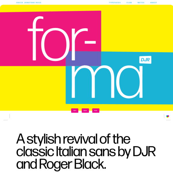
Forma The great thing about David Jonathan Ross's specimens is the writing. Full of humour and personality, Forma is no different. A refreshing design – bright, primary colours – are the backdrop for an excellent editorial specimen.
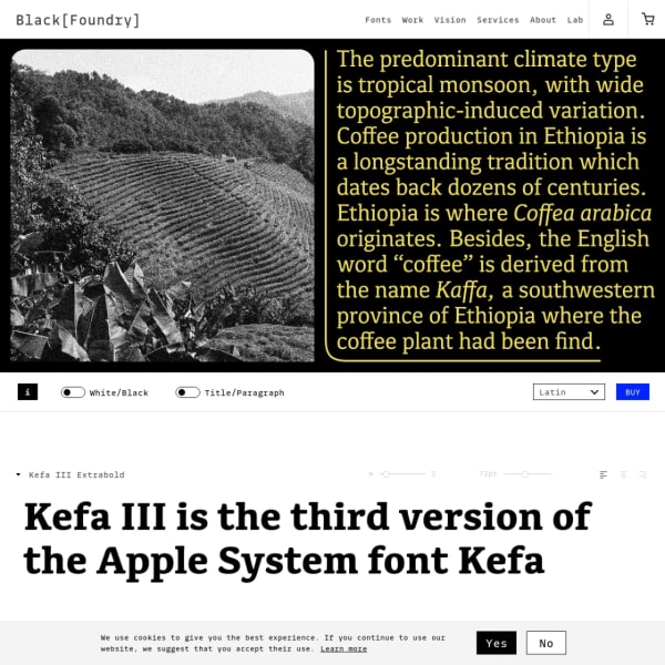
Kefa III Marketed as a 'UI Slab Serif', Kefa's specimen has some compelling images in a carousel. The stacked type testers have simple controls to allow the user to interact with the typeface.
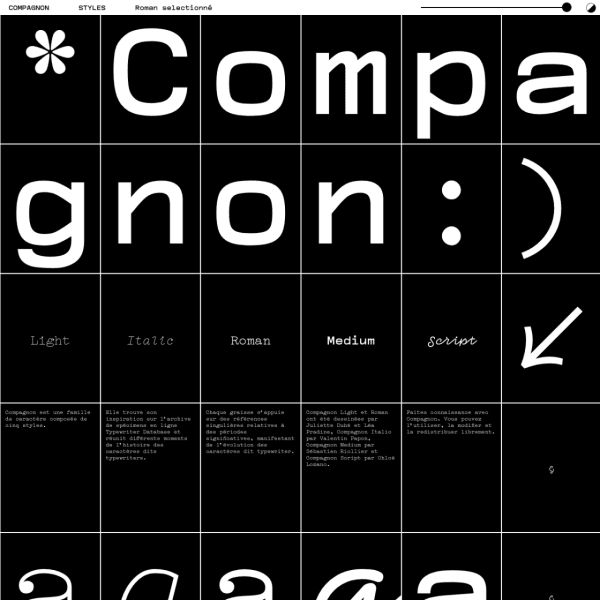
Compagnon An unusal specimen presented in a user-configurable grid. Every element is presented in one of the rectangles, and you can choose how many rectanges per row you want to see. Want big type? Bump up rectangles with the slider. The fragmented reading experience really works.
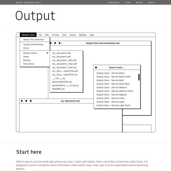
Output The companion to Output, Input is a simple, understated sans serif typeface presented in a simple specimen. The refreshing line illustrations are all that's needed to demonstrate the usage.
IBM Plex Sans KR Specimen for IBM Plex Korean. Super simple, but elegantly displays the typeface at the various weights.
There are more specimens added this last week on the Type Specimen website. You can subscribe to the RSS feed for daily updates, or follow along on Twitter, if that takes your fancy.
A few interesting typography links
A good reminder from Typotheque a while ago about what Opentype Features are available through CSS.
Mark Simonson releases a big update to Mostra Nuova.
Font Playground appeared in my feeds again this week. A good reminder that this excellent bit of browser software is available for us to preview fonts.
Perfect Edition is a lean, fast web e-book template. It's really good.
Font in Logo is a – you guessed it – a database and search engine for fonts in logos.
