Hello again! I'm Mark, and this is the Specimen Digest, a weekly typography newsletter. This week I mourn the loss of type catalogues, the usual round-up of some great looking digital specimens, and a sprinkling of interesting typography links.
This is also the last time I will be asking to complete the top task survey before I close it out. It will take 3.5 minutes. It's anonymous, I'll be deleting the data after I close it, and the information will not be used in any commercial way.
Thanks!
Whatever happened to catalogues?
For some reason, this week, I was reminded of my first internship (or 'work experience' as we called it in the UK) in a local advertising and marketing firm in Manchester in, I think, it was 1995 or thereabouts. It was a hot summer – for Manchester, anyway – and I recall sitting in rows of desks in the studio. Alongside these desks were a few rooms – a cutting room, full of Spray Mount booths, scalpels, foam core board, and reams of paper. Next to it was the server room, housing a powerful Macintosh Quadra, a DAT tape backup, and shelves and shelves of type specimens bound in folders. I think they were the old Bitstream and Linotype libraries.
Every now and then, as part of my lowly internship duties, I was asked to go into the server room and restore an old project from a tape. As this was 1995 – and a time when upon pressing f10 you could instantly crash QuarkXPress necessitating a process called 'rebuilding your desktop' that could take 30 minutes – restoring from tape took an age. But I couldn't leave it alone unless there was a problem with the restore, so I had to just sit there browsing the specimens!
I've come to believe this is an often neglected, but important, process in how designers do what they do. The act of collecting, reading, documenting, recalling and reinterpretation is the lifeblood of the creative process. Drawing from fragments of memories, flashes of inspiration, making connections. Without those shelves full of catalogues, without the enforced time to sit there and browse through them whilst I was waiting for something else, I couldn't now draw on that time well spent. Collecting. Sitting. Reading.
So, today, I'm mourning the loss of catalogues. The loss of those physical objects that I can store away for a rainy day that never comes. But all the while, fragments of them feed my creativity.
Specimens this week

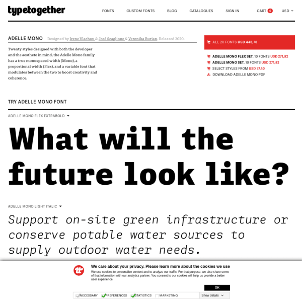
TypeTogethers specimens take a templated approach, but include this large section on the backstory of the typeface. Typically, they pair this with an even lengthier blog post providing a package of material to support the typeface release. A perfect example of when a specimen isn't just a specimen.
Turbine is a neo grotesk with distinctive curves and open apertures. This is quite some specimen. Starting with a quick introduction and type tester, it moves on to a long list of branded samples in the same two-colour palette. The Process section is a particularly good read.

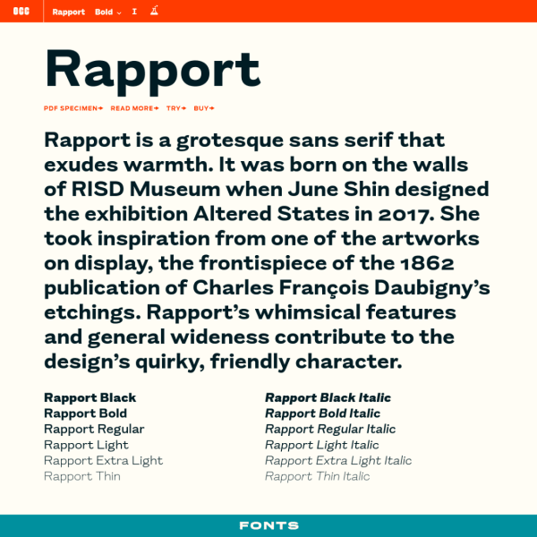
This is a deceptively simple specimen that, on further investigation, reveals different features in interesting ways. The type tester's controls are a little unusual. Clicking the 'read more' about the font opens a treasure trove of an article outlining the typeface's origins, inspiration, and design.

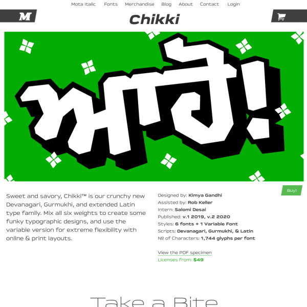
What a fun specimen! Bright, bold typographic illustrations pepper the content explaining the typeface's features. Really refreshing design.

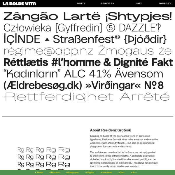
A specimen that reads like a product page, including often used conventions such as the alternating image and paragraph combination. Where this specimen breaks with convention is the navigation stuck to the bottom of the page.
There are more specimens added this last week on the Type Specimen website. You can subscribe to the RSS feed for daily updates, or follow along on Twitter, if that takes your fancy.
A few interesting typography links
The making of Adelle Mono and Adelle Flex.
Standards.site looks like a promising platform from those who produce the excellent Standards manual revivals. Sign up for early access.
To coincide with the release of the excellent Recursive Sans and Mono on Google Fonts, type designer Stephen Nixon writes a great primer on CSS Tricks on Getting the Most Out of Variable Fonts on Google Fonts.
