Hello again! I'm Mark, and this is the Specimen Digest, a weekly typography newsletter.
It's been a busy week in typography land with the ambitious rolling online coverage of this year's Typographics conference 'TypeLab'. Some excellent demos, workshops, presentations and discussions. Be sure to register for the online conference – free and open to the public – which is scheduled for July 24th to 26th.
In amongst my workshop watching, it's been another week of in-depth research and interviewing for the specimens project. I've spoken to many amazing people over this last three weeks. As I said in my journal post last week, there are definite trends so far, with a growing chasm between the design, production, and consumption of print and digital specimens. Seems the type industry really loves print! More to dig into next week!
Until then, Mark
What is happening to our digital archives?
History is important in typography and type design. Type revivals and reinterpretations are only made possible by the artefacts that remain from their initial use. Ephemeral in nature, most type specimens that remain from centuries past are parts of collections. Collectables are cared for, catalogued, preserved. Working documents – specimens pored over, first by compositors or printers, but then by academics and students – degrade with age. These are tools. Working specimens. That's ok in real life – in the physical world. But what about the digital world? What about digital specimens?
In this blog post, I talk about a clear trend I've seen in the last few weeks. There is a digital and print divide in many ways – design, investment, time, enjoyment – but perhaps a more critical one for future generations of type designers and designers alike is that of archiving and preservation. Based on some recent experience of mine unrelated to this project, I am painfully aware that this is an issue the world over. Digital preservation of our specimens is something we should take seriously.
Specimens this week
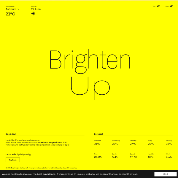
Live Weather Forecasts by Black Foundry This is an interesting little application of a font selling the benefits of variable fonts, but packaged up into something useful.
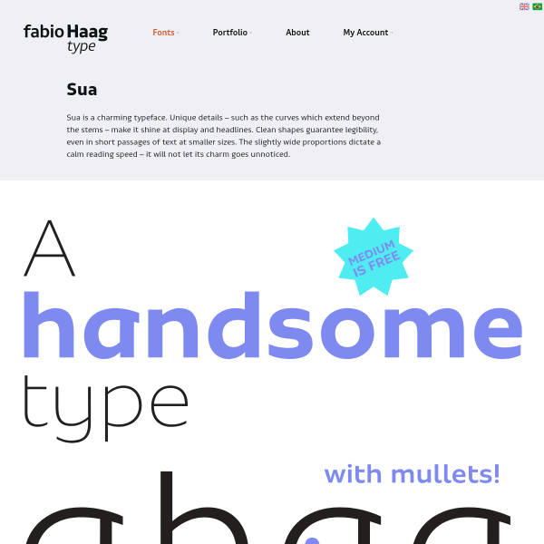
Sua A lovely looking typeface with a simple and clear specimen. Images of the type set in various contexts open the specimen – presumably from a printed companion – before moving into some type testing and finally the ability to download trial fonts.
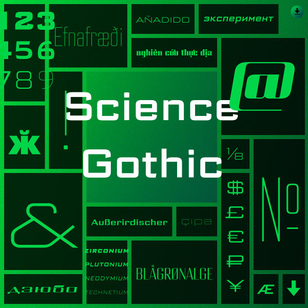
Science Gothic A variable font with a lot of variation! Science Gothic is a reimagining of Bank Gothic in a HUGE new design space. The specimen is interesting from a graphic design and web design perspective. A blend of noised backgrounds with two tone gradients fill each horizontal container.
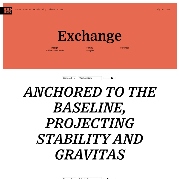
Exchange There is something nuts and bolts about this specimen that appeals. Lean on snazzy features, or enticing content, the Exchange specimen leads with simple typetesters, small explanatory text, and options to read more in-depth content or download a print specimen.
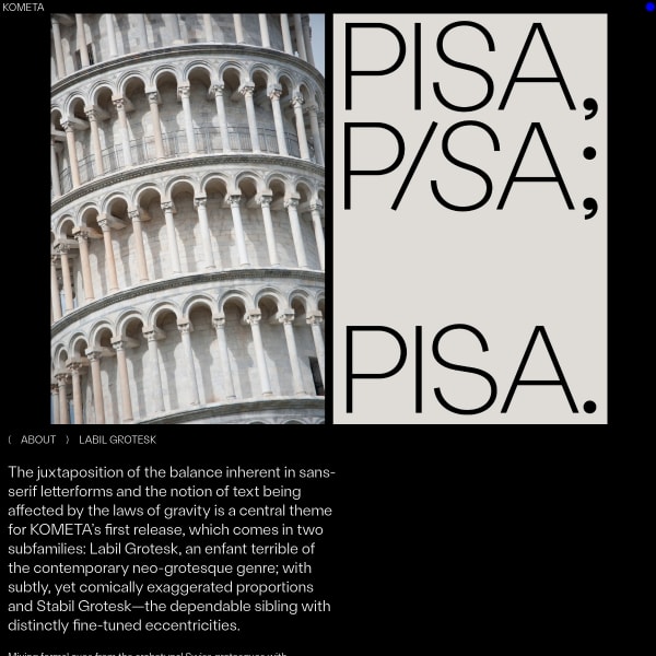
Labil Grotesk An unconventional specimen for an unconventional typeface. It's quite rare to see experimentation in this space, so when it does happen it's refreshing. A carousel of images with introductory content open the specimen leading onto stacked typesetters for the various weights. The design patterns themselves are conventional, but the presentation less so.
Digital type specimens that catch my eye are added to the type specimen feed on the website daily.
Type specimens research
Still plenty of room in my diary in the coming weeks for you to be involved in this project – if, of course, you have the time and inclination!
The research will take the form of a few interviews. I'll show you some stuff. We'll have a chat. All very informal. If you can spare twenty minutes, please just reply to this email. I'll get it.
A few interesting typography links
Silly hover effects and the future of web typography demonstrates how we might use variable fonts in the future. Now, some of these examples are quite extreme, but try to look past the that and you'll see that this could be incredibly useful.
Help! Is this عربي? is an incredibly useful one-pager highlighting common errors for non-arabic speakers finding themselves having to work with it.
TypeTogether continue their run of excellent articles with this piece on Type quality: how to spot fonts worth your money. Lengthy, in-depth, and worth a good 20 minutes of reading. Grab yourself a coffee and settle down.