A curated list of digital specimens
of the highest quality. Updated daily.
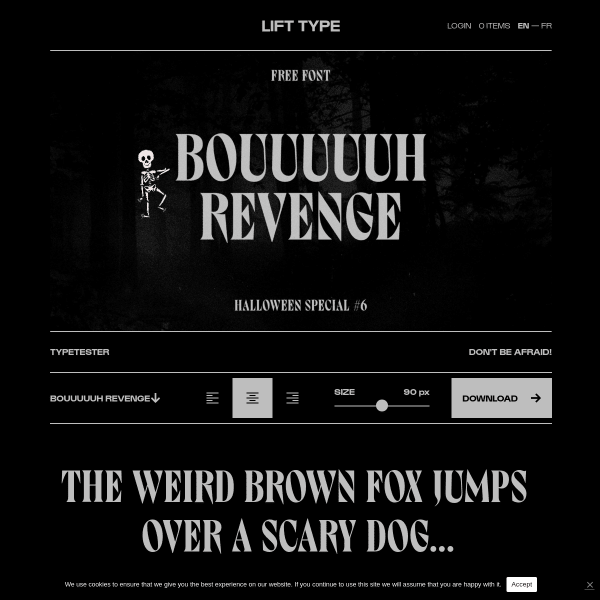
Bouuuuuh
A halloween special for the specimen of Bouuuuuh – complete with skeleton animation. Despite the fun and quirky design, this is a pretty good specimen functionality wise with type testers and clear calls to action.
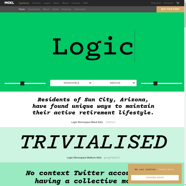
Logic Monospace
A bold, graphic appearance for Logic Monospace is matched by the monotone colour palette and graphic treatment of the typesetter controls. The graduated panels of sample text work particularly well at smoothing to the visual journey for the eye between high contrast areas.

Krasz
A comprehensive specimen for Krasz – a typeface for bad readability. The specimen fatures loads of vertically stacked reversed out type in black panels. Large, bold, and distinctive.
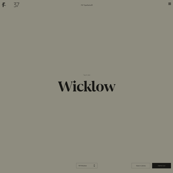
Wicklow
An interesting approach to displaying a library. A simulated design environment with a dropdown of all the typefaces in the selection. On interacting with the typeface, a set of tools is presented to the user for some considerable customisation in the browser. Pretty nifty.
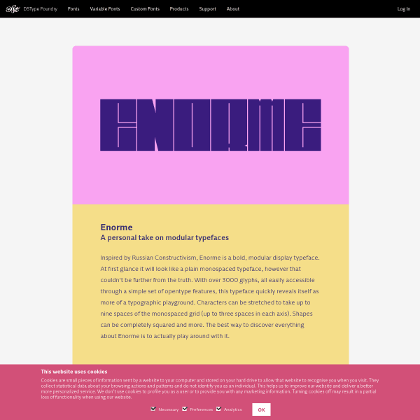
Enorme
These interstitial pages for DSType Foundry's specimens are interesting as they act as type specimens but firmly standing on the marketing side of things. They could be easily repurposed for other digital channels such as email or social.

Inline
A bright but templated specimen from Letters from Sweden for their latest variable release 'Inline'. The use of punctuating the design with little dancing animated calls to action – 'Neu!' – help lift the design.
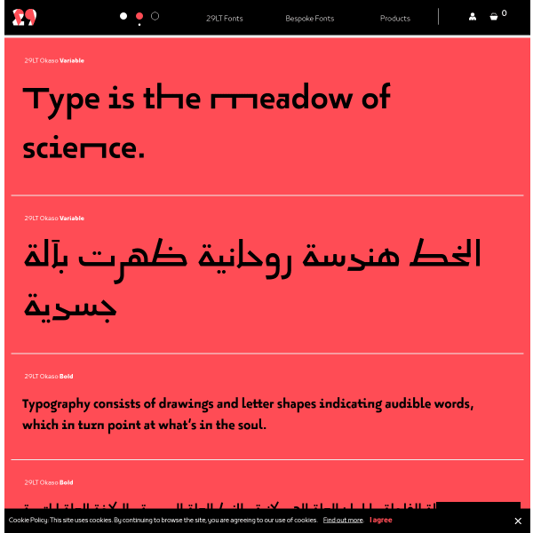
Okaso
This is a cool variable font with a stretch axis. Seen quite often in Arabic, this has a quirky result when applied to Latin. But Okaso pulls it off. The specimen is a stack of type testers in simple colour palettes. But it really shows off the type's best features.
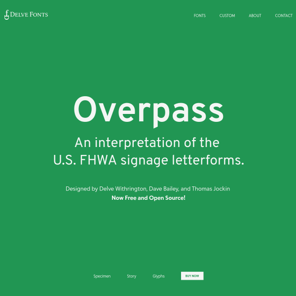
Overpass: Take 2
The Delve Fonts specimen for Overpass is different to the other specimen posted here last week. A simple affair highlighting the fonts features in large single words.
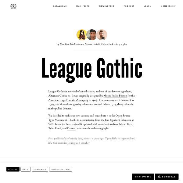
League Gothic
This specimen for League Gothic starts off looking like a Medium article. But then you realise that the title is a type tester (although just editable text with no controls). Scrolling down reveals a detailed – but notably not uniformly spaced – glyph set before getting to the detailed licensing information.
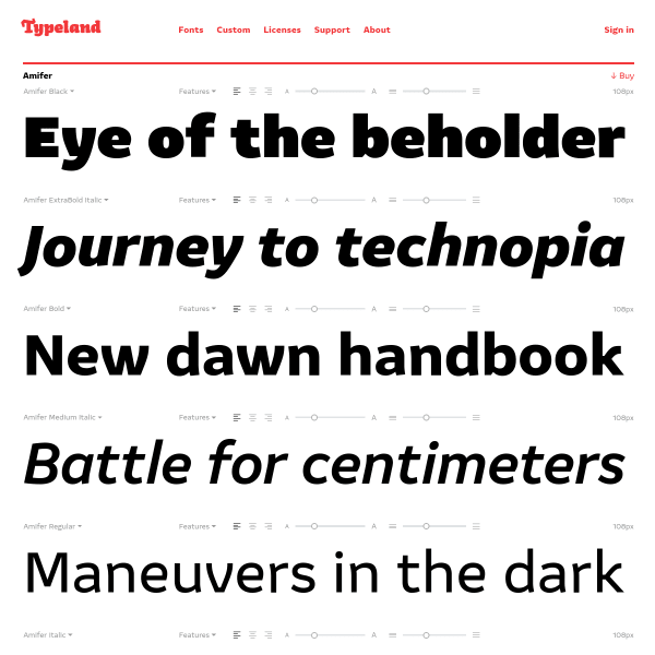
Amifer
These specimens from Typeland follow the increasingly common design pattern of just showing stacked typetesters with varying default weights and length of sample copy. Simple design but very effective.
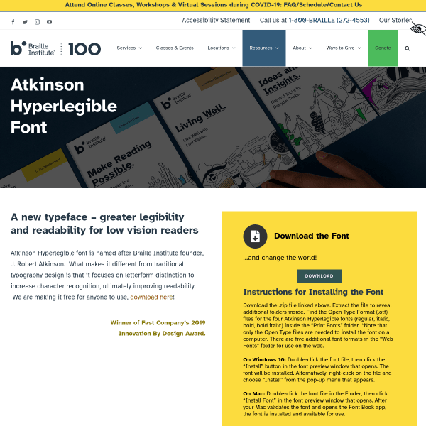
Atkinson Hyperlegible Font from the Braille Institute
A font specimen page that reads exactly like a software landing page. In fact, really, the only piece of content of benefit for typographic evaluation is the illustrations of distinctive letterforms and exaggerated forms.
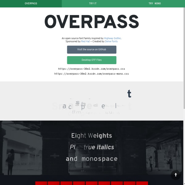
Overpass
An unusual specimen / microsite. Overpass, sponsored by Red Hat, is inspired by Highway Gothic. The specimen is microsite where all of the useful information is in sections called 'try it'. The 'monospace' section sticks out alone in the information architecture. Still, this aside, it's a nice typeface.
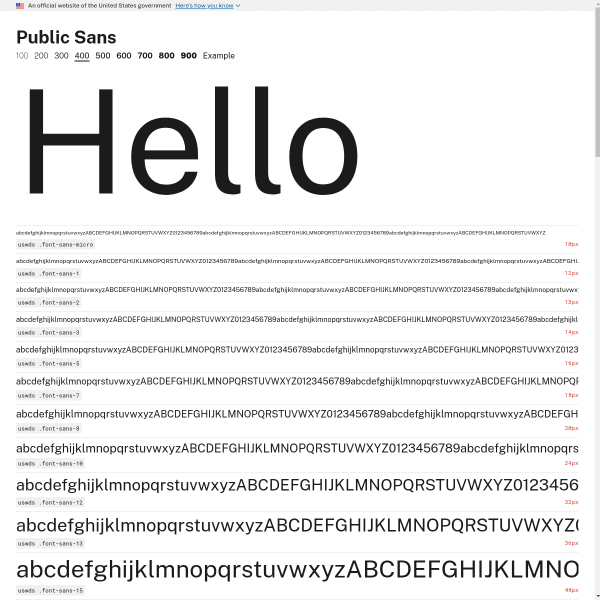
Public Sans 400
We've probably featured Public Sans on here before, but this is the actual specimen page – a level down from the micro site home page. Mirroring a print design, it displays a waterfall of different font sizes. An interesting comparative component where Public Sans is shown next to Verdana, Georgia, and System.
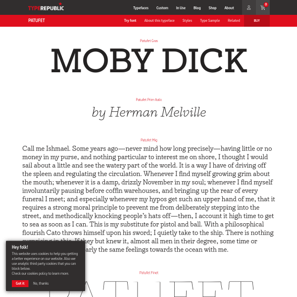
Patufet font
This is a great specimen from Type Republic. Traditionally designed, but with each paragraph or single sentence changing into a type tester when the user clicks on it. It's a detailed, considered digital specimen.
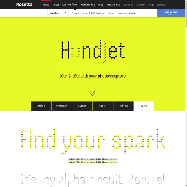
Handjet
An amazing experimental variable font, the specimen for Handset tries to articulate the huge range of options available to the user. The discretionary ligatures are such a delight.
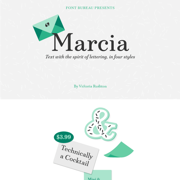
Marcia
The notable point about this specimen is the conversational tone it takes in explaining the features of the font – particularly the Very Discretionary Ligatures. Nicely presented illustrations give a 50's vibe.
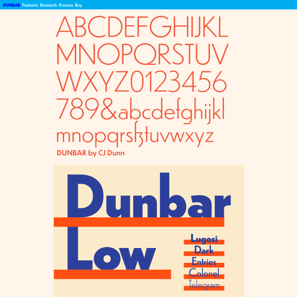
Dunbar
An impressively detailed, long-form specimen for Dunbar. Starting with stacked typographic illustrations, it moves onto typesetters for each individual weight. The detailed overview of Opentype features is a welcome addition, as are the in-depth design notes.
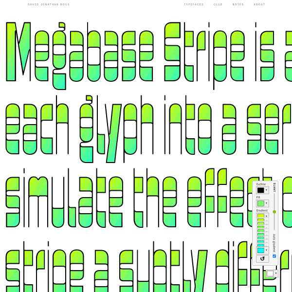
Megabase Stripe
A brilliant single page specimen for an experimental version of Megabase that allows the user to create colour gradients. It includes simple UI controls for changing the slant axis, as well as each of the colour steps in the gradient.
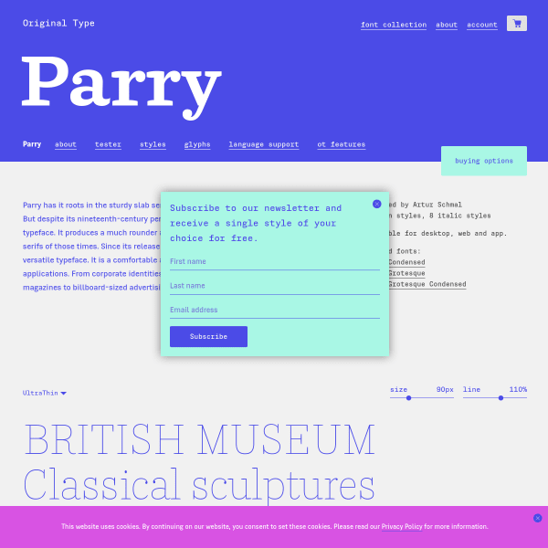
Parry
Simple, functional, and shows off the typeface in the best possible way, this specimen for Parry – similar to all specimens on the Original Type website – has a detailed view of all opentype features, glyph set, and stacked type testers.
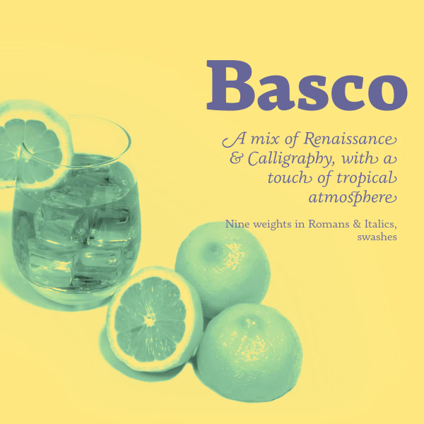
Basco
This specimen for Basco neatly combines a very tight-specific print aesthetic – duotone colour palette, and mixing supportive photography – with a more web-native feel with scrolling animations.
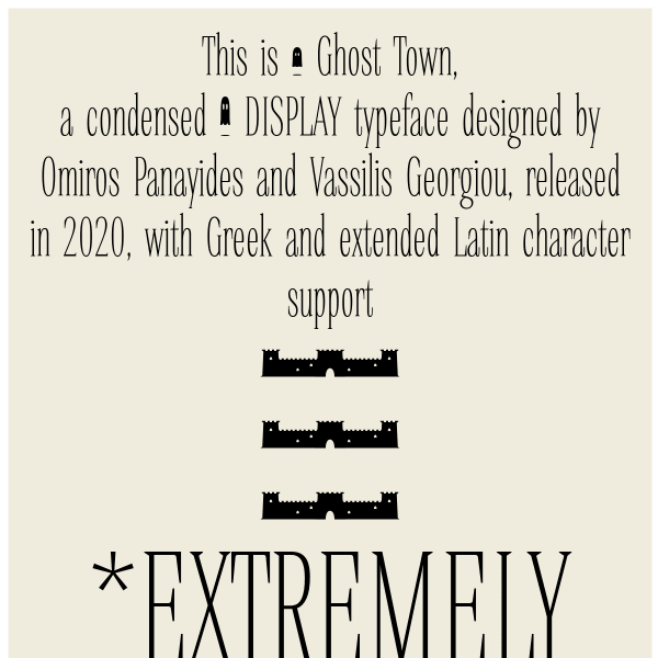
Ghost Town
The notable point about this specimen for Ghost Town from Ooukpress is the long form editorial as a way of introducing the typeface, describing the features of the typeface, but all set in varying weights and styles. It reads like a product page. Notable for Greek support, it's also freely available.
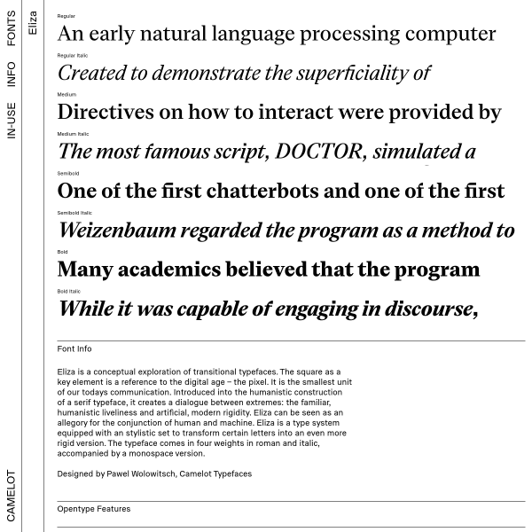
Eliza
This specimen for Eliza is notable for the graphic explanation of opentype features and support in addition to the detailed and categorised glyph set. The purchasing flow is interesting opening up drawers of content from the site's horizontal navigation.
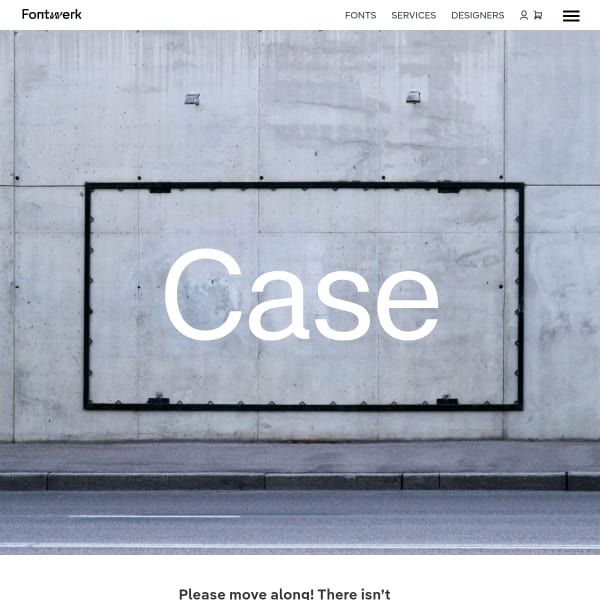
Case
A new typeface from Fontwerk. Case is a modern Neo-Grotesque made for the new Twenties. The specimen's subtle use of photography of found objects or urban textures works nicely with the content. The information architecture of Fontwork's specimens work really well in guiding the user down to more detailed information.
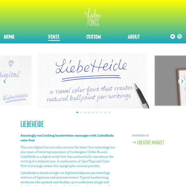
LiebeHeide
A lovely hand-written font with some clever additions detailed in the specimen. This typeface has emoji conversions, double underlines, and also some delightful scribbling-outs. The specimen itself is a stacked set of type testers sitting below a carousel and some brief editorial.