A curated list of digital specimens
of the highest quality. Updated daily.
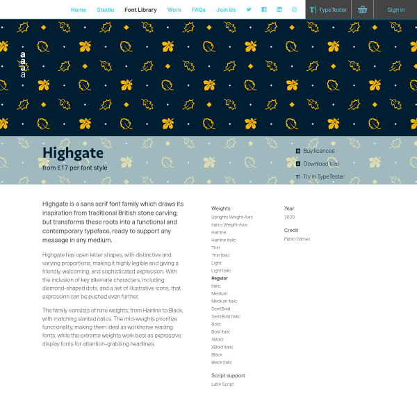
Highgate
Dalton Maag's Highgate typeface specimen has the right balance of aesthetics, history and context, and font features. The animation displaying the variable font animation is particularly good, highlighting the different glyph shapes when traversing the weight axis. The changes to the little leaf glyph are particularly revealing as to the considerations of the type designer.
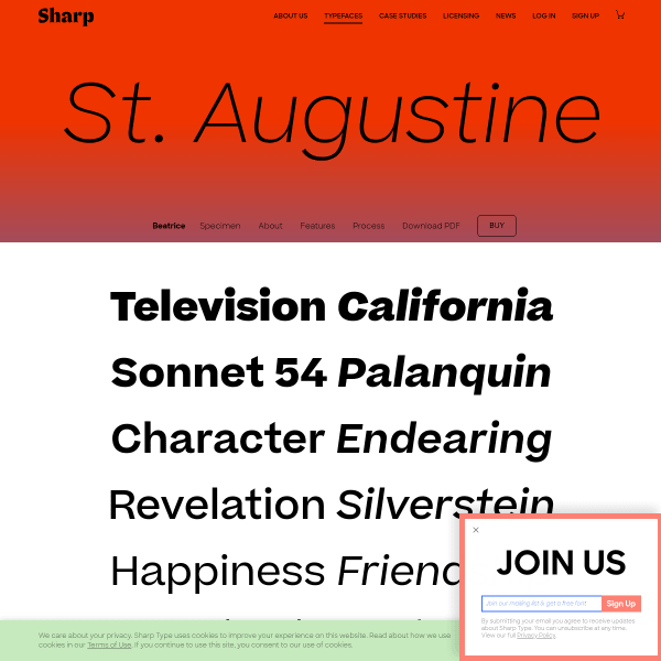
Beatrice
This is a great specimen focussing on the technical details and features of Beatrice. Following a template for all of Sharptype's specimens, Beatrice is presented amongst plenty of information about the process and examples of usage.
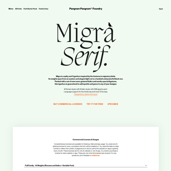
Migra
The standout of this specimen are the stacked images of example usage. The illustrations documenting the ligatures and typesetting are particularly outstanding.
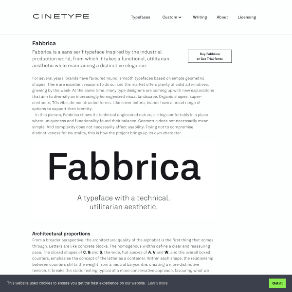
Fabbrica
This is fantastic. A specimen that is, in fact, just an article documenting the conception and influence for Fabbrica's creation.
Tongari
Leading with a typetester, the specimen for Tongari quickly moves into panle after panel of usage examples. The design sketches are a welcome addition to any specimen. These show the level of craft the designer puts into every single letterform.
Goldman Sans
Interesting slideshow for Goldman Sans. Sort of a specimen, sort of marketing to an internal audience, the website does a good job at explaining accessbility features to a lay audience. The section on number was especially good.
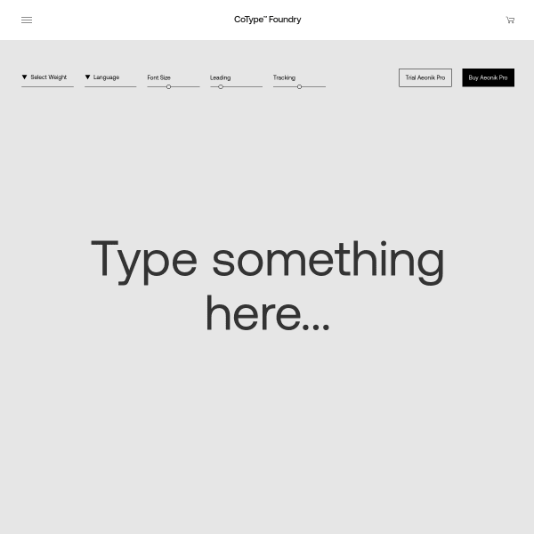
Aeonik Pro
A straight-forward typetester leads the specimen for Aeonik Pro, before an equally straight-forward list of weights, glyphs, and features. Nothing out of the ordinary here. The carousel of images of usage is where the interesting design lies on this specimen. Some beautiful pieces of work that I wish had been transposed into digital form.
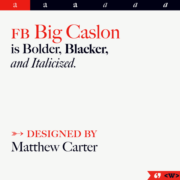
FB Big Caslon
Another slick, informative and exploratory specimen from The Font Bureau. Vertically stacked sample text invites the user to explore the large text before a simple categorised glyph list.
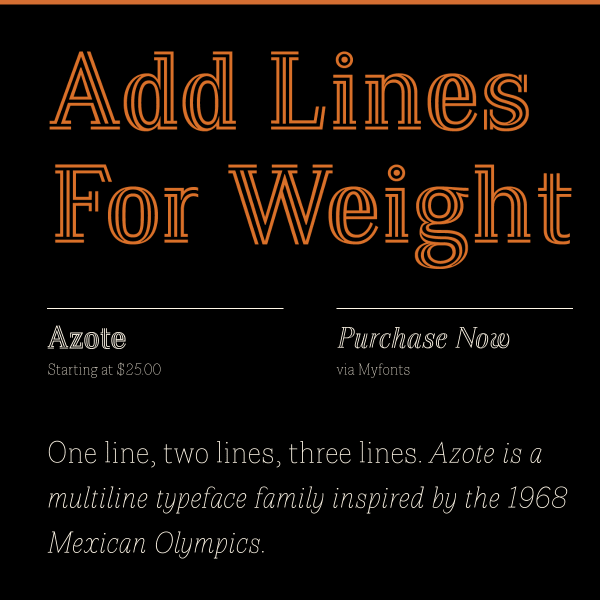
Azote
This is a traditional, but effective, digital specimen. Large sample text in different weights visually show the benefits and features of the font.
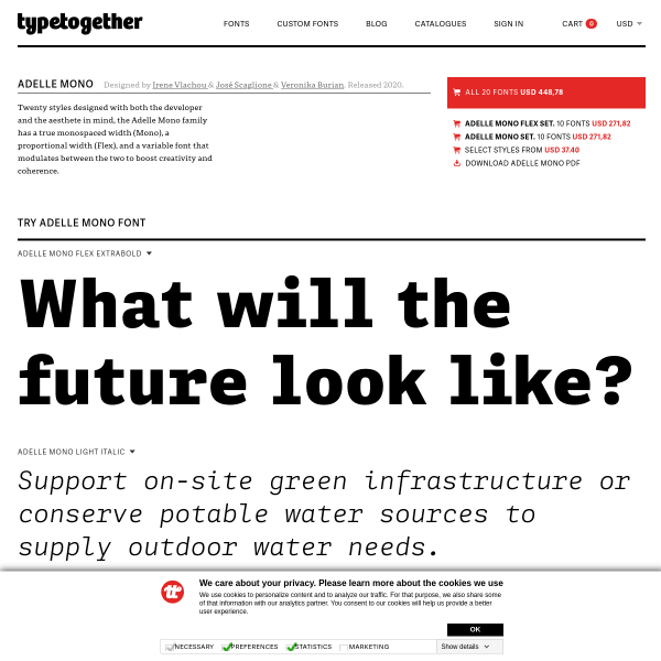
Adelle Mono Flex
TypeTogethers specimens take a templated approach, but include this large section on the backstory of the typeface. Typically, they pair this with an even lengthier blog post providing a package of material to support the typeface release. A perfect example of when a specimen isn't just a specimen.
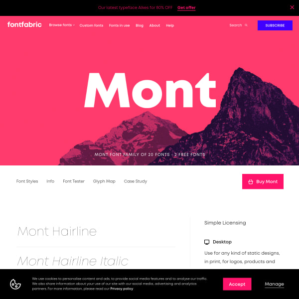
Mont
So many specimens follow a sinlge page approach with vertically defined sections. Mont takes the other approach of incorporating sub-pages and navigation. The type tester is particularly elegant.
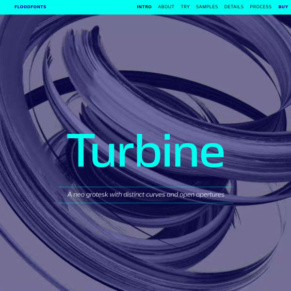
Turbine
Turbine is a neo grotesk with distinctive curves and open apertures. This is quite some specimen. Starting with a quick introduction and type tester, it moves on to a long list of branded samples in the same two-colour palette. The Process section is a particularly good read.