A curated list of digital specimens
of the highest quality. Updated daily.
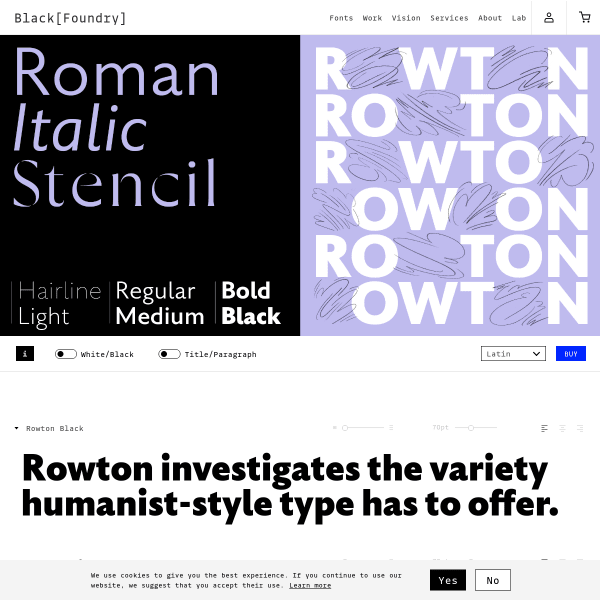
Rowton
This specimen for Rowton has the usual components: type testers, carousel of designed images etc. But, rather unglamorously, it's the buying options that sets this apart. A really simple walk through licence type, scripts, and individual weights and promotional packages. Super clear and easy.
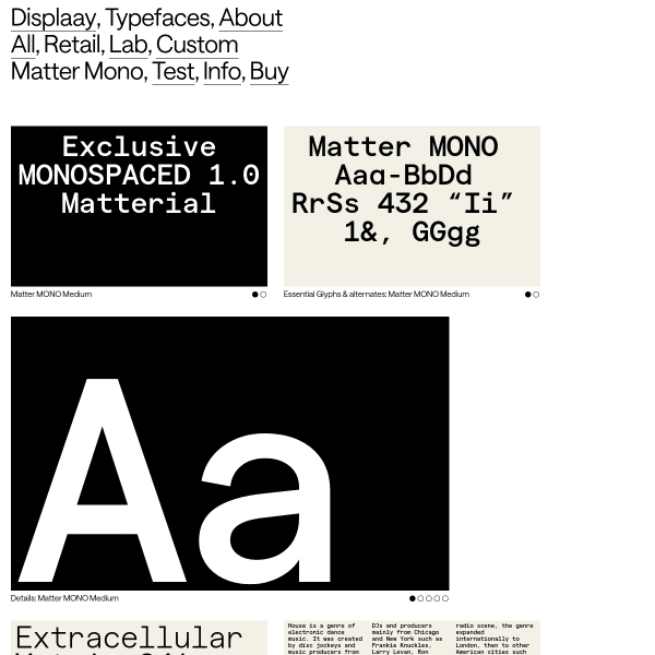
Matter Mono
New addition to Displaay's Matter typeface. Like its parent typeface, Matter Mono is just different enough to warrant attention. The specimen has a good type tester proceeded by some designed images.
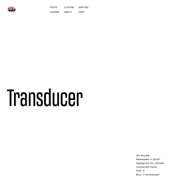
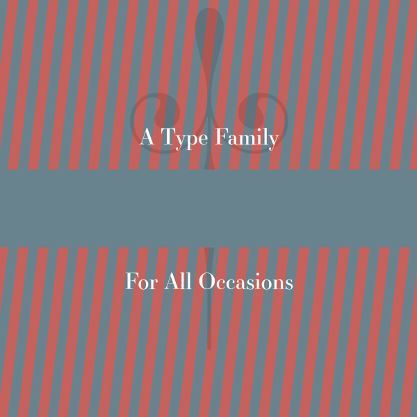
Transducer Font Family
There is just something about slightly extended or condensed typefaces that take me right back to memories of Space Lego, ABBA, and the early '80's Where everything was brown and orange. Not this specimen, though. Stark, stylish black type testers display large type harking back to those more stylish days.
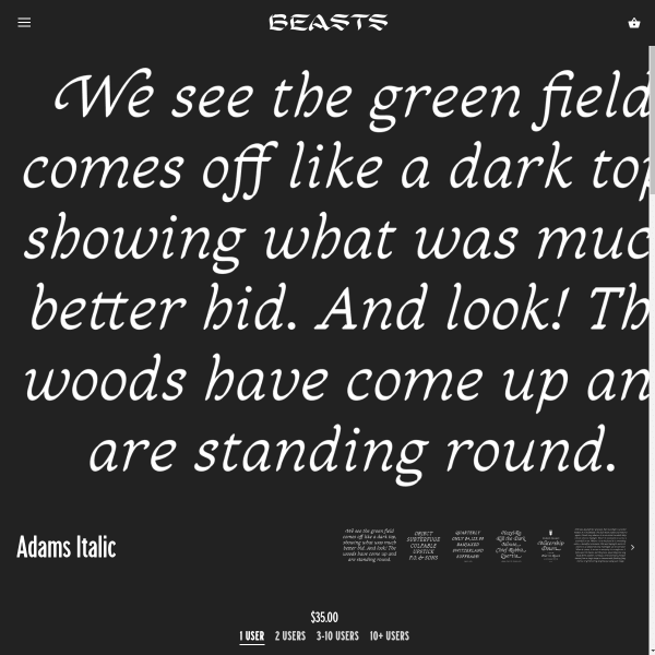
Adams Italic
Just look at those swash italics! Beautiful font, and quite a simple specimen – from a functional and aesthetic point of view. But what stands out on this is the copywriting. The wonderful little story sits alongside the font in the quirkiest of ways. There are other short stories o the site as well for you to enjoy.
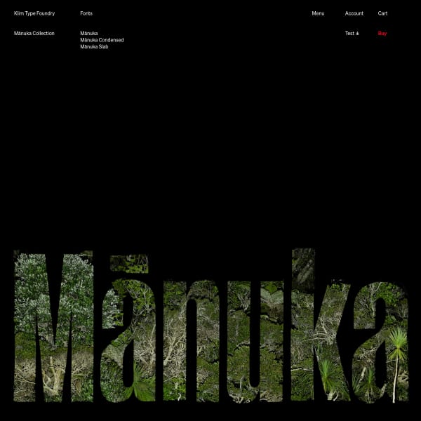
Mānuka Collection
A big release from Klim, and, as you'd expect, the specimen is pretty special. Following similar information architecture to the other specimens in the collection, Mānuka's distinctive branding sits atop the specimen and across all of the marketing. That's what I like about Klim's releases: the thought and careful execution given to branding every release.
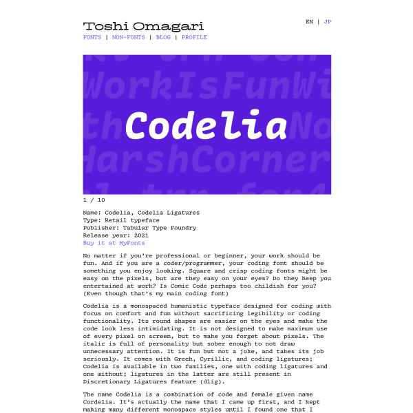
Codelia
Not a specimen as such, but I know Toshi and the care and attention he puts into the design of his typefaces. Codelia is no exception. Beautifully designed for a difficult work environment, it's sensitive to the needs of programmers who sit all day looking at code.
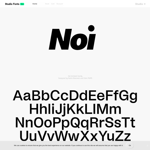
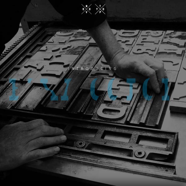
Noi Grotesk Family
Perhaps the longest scrolling foundry homepage I've seen. Atop is the specimen for Now Grotesk with some brilliantly designed components outlining the font features and design details.
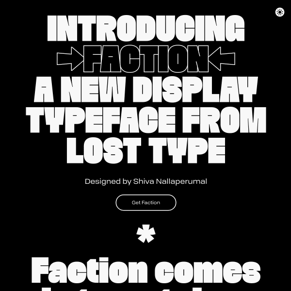
Faction
I'm a big fan of combining the design story of the typeface in a specimen. Of course, this has to be done sensitively, and at the right point in the user's evaluation of the typeface. The specimen for Faction does that particularly well, seamlessly moving from detailed specification type content, over to the story of how the typeface came to be.
Essonnes
Now this is cool. Instead of just showing a bunch of letters, type testers, and features like all specimens do, why not take three short stories and typeset them to show off the real-world capabilities of the web font. Perfect.
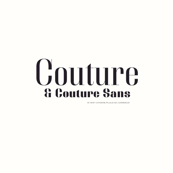
Couture and Couture Sans
This is really, really interesting from Positype. The unusual, but simple, interaction design of mirrored scrolling lend itself perfectly to this high contrast fashionista type design. Just enough content to whet the appetite presented in a cool way. Take my money.
Bixa Color
Some interesting things can be done with colour fonts. Bixa was originally designed as wood type for letterpress, and is now transformed into a multicolor font for web. The specimen suffers slightly in the same way specimens for variable fonts do: they have to explain the benefits and features ahead of the actual design. That said, this is an interesting specimen.
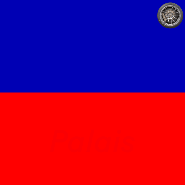
Baton Turbo
If you ignore the strange spinning wheel in the top corner, this is a well put together specimen. Striking colourways underpin some solid, usable components. The feature illustrations are particularly good.