A curated list of digital specimens
of the highest quality. Updated daily.
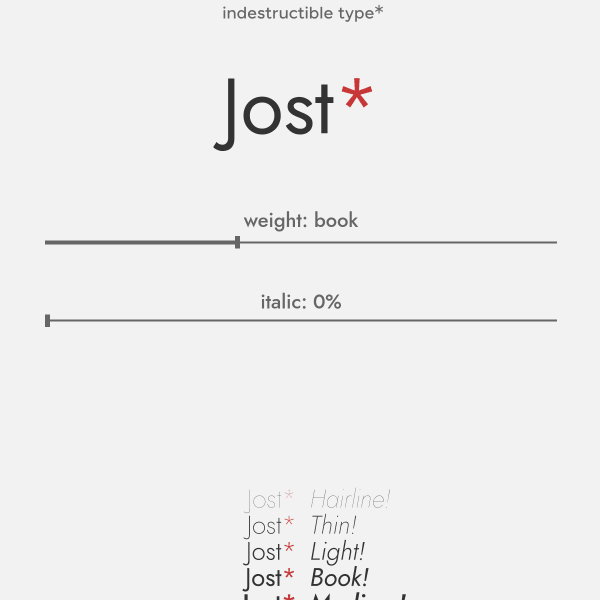
Jost*
Jost is a tribute to Futura named after Heinrich Jost. With variable axes for weight and italics, the specimen opens with just that single type tester and a revolving carousel of example images. Nicely done.

Collletttivo
I do like a challenging interface. An interface that challenges conventions. This specimen from Production Type for Tuner does just that. An animated menu makes way for panels of content on the origin, design, and a specimen of features.

Tuner
I do like a challenging interface. An interface that challenges conventions. This specimen from Production Type for Tuner does just that. An animated menu makes way for panels of content on the origin, design, and a specimen of features.
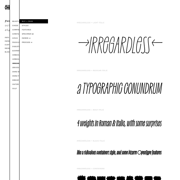
Irregardless ☠️
Oh no's specimens have been featured here before, but I had to include irregardless for its wonderful design. Checkout the 'containers' weight for some fun backgrounds to overlay text onto.
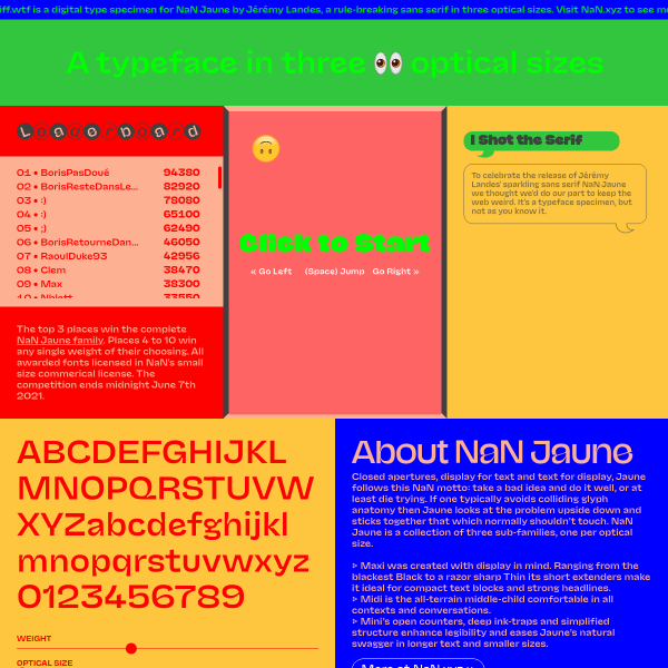
NaN Jaune — See the fonts 👀 Play the game 🎮
Where to start? 'Closed apertures, display for text and text for display, Jaune follows this NaN motto: take a bad idea and do it well, or at least die trying.' Behind the fun exterior, – I mean, a game!? With a leaderboard!' this specimen for Juane has some really great features. The optical size slider is perhaps the most useful here.
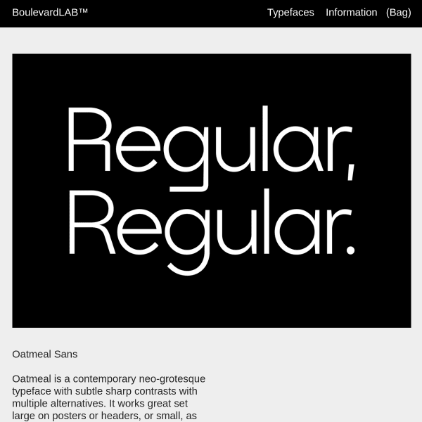
Oatmeal Sans
Yes, stacked sag graphics but a striking and bold specimen for Oatmeal Sans. Another neo-grotesque, but it has some striking alternates. The specimen only hints at those features, so whilst the graphic design is appealing, it's lacking those evaluative components for a user to explore it.
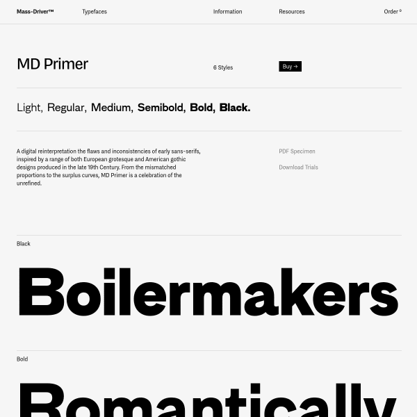
MD Primer
MD Primer is a digital reinterpretation the flaws and inconsistencies of early sans-serifs. Big, bold, stacked type testers are the order of the day. You may notice that the type tester words are all of a full screen width. A simple, subtle but sophisticated addition to the specimen.
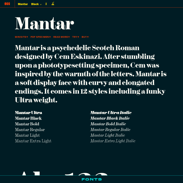
Mantar
A simple one-pager for Mantar. The accompanying mini site is an immersive story-based experience. Be sure to read the design notes for some detail on the design brief and exploratory illustrations.
NON Section
I'm a big fan of experimental typefaces. 'NON is a series of limited edition type systems that utilise the basic latin and numerical character sets to create abstract forms, rhythms and fields from otherwise ordinary text.'. In some ways, however, it would be nice if the specimen expanded on this brief.
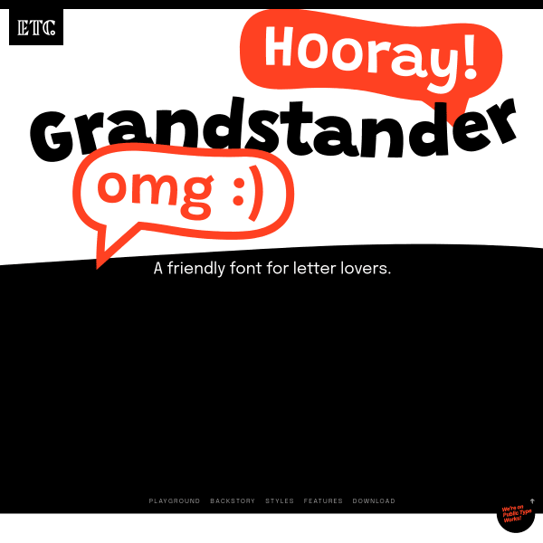
Grandstander
A friendly font for letter lovers. A really great, functional specimen for Grandstander from ETC. Added benefit? It's available on Google Fonts for you to use now.
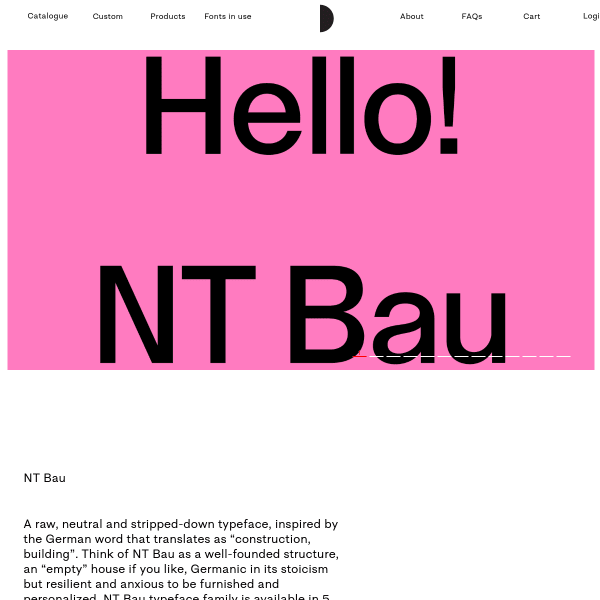
Bau
This specimen from Nodo Type Foundry is notable for it's long-form text type tester. It provides options for the user not seen in many specimens: multiple columns, multi-language, and different default character sets.
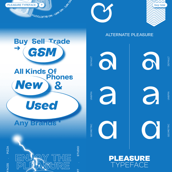
Pleasure
I'm not going to say too much about this one. Expect conventions to be broken, and preconceptions challenged.