A curated list of digital specimens
of the highest quality. Updated daily.
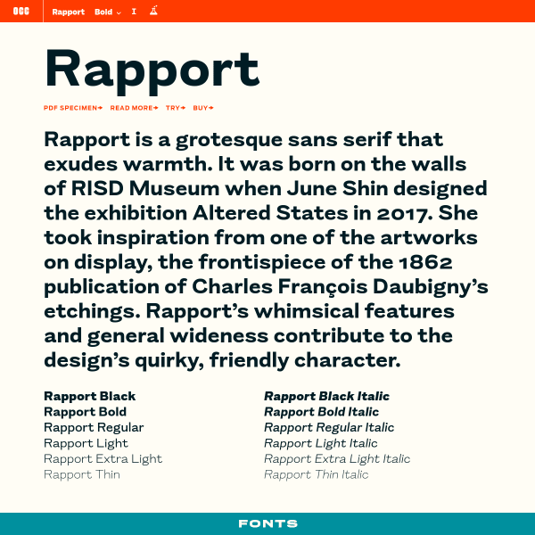
Rapport
This is a deceptively simple specimen that, on further investigation, reveals different features in interesting ways. The type tester's controls are a little unusual. Clicking the 'read more' about the font opens a treasure trove of an article outlining the typeface's origins, inspiration, and design
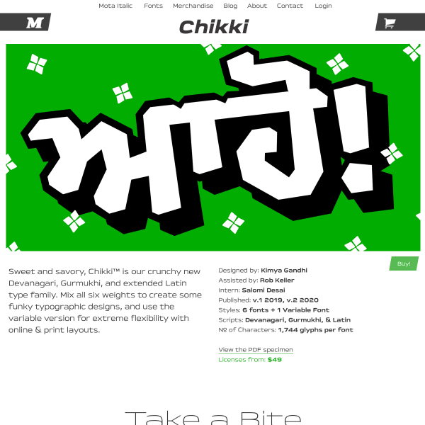
Chikki
What a fun specimen! Bright, bold typographic illustrations pepper the content explaining the typeface's features. Really refreshing design.
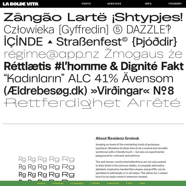
Residenz Grotesk
A specimen that reads like a product page, including often used conventions such as the alternating image and paragraph combination. Where this specimen breaks with convention is the navigation stuck to the bottom of the page.
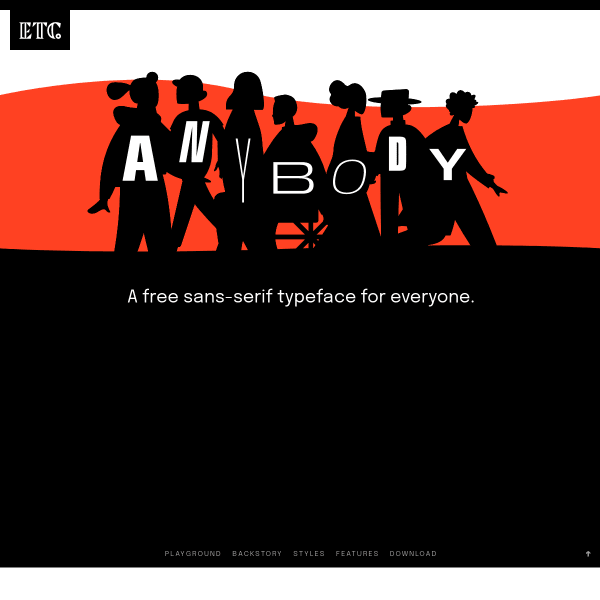
Anybody
A heavily stylised retro illustration opens the specimen before leading onto more conventional design patterns. It's a shame the aesthetic wasn't carried through to the features or back story of the typeface.
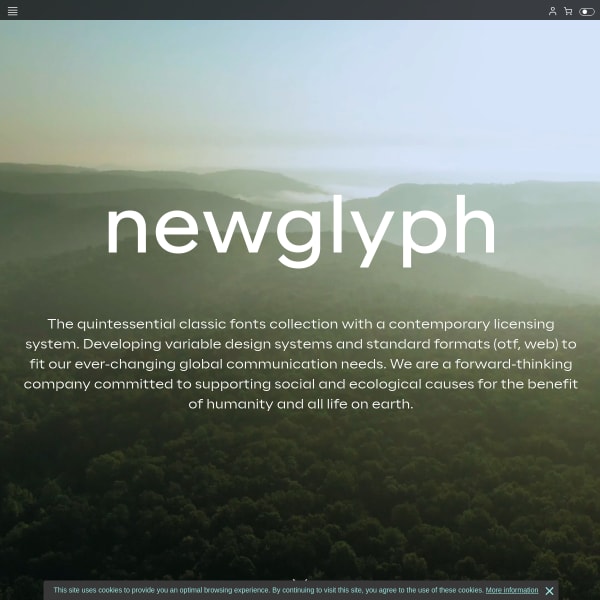
Newglyph
This is a really cool collection of specimens (as a catalogue, I suppose). Presented in a passive, scrollable format, the controls for manipulating the content ever-present at the bottom of the interface.
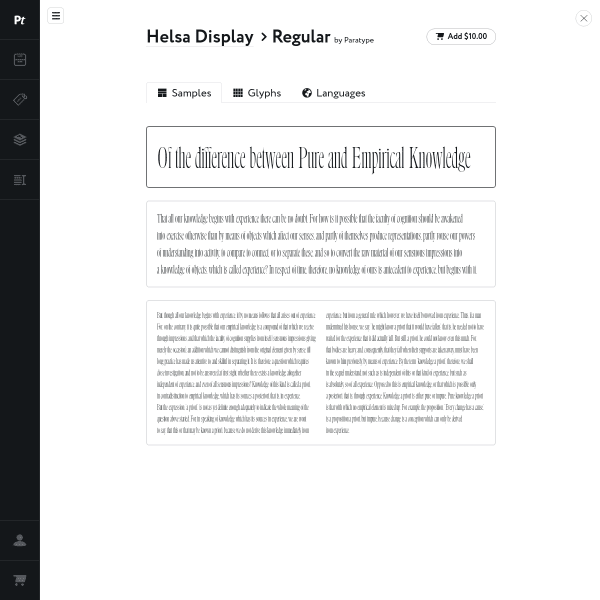
Helsa Display
Super simple specimen from Paratype which has glyphs and languages as different sections. There is a tool menu (which is a little obfuscated) and in here are the usual controls to manipulate the text.
Forgotten Shapes
This is a really interesting user interface and specimen format. It's a type specimen coupled with a lengthy article in a refreshing interface for swapping between the two.
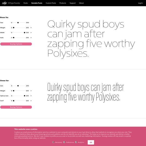
Breno Var et al
Tiny stacked type testers with variable font axis controllers. Simple but effective.
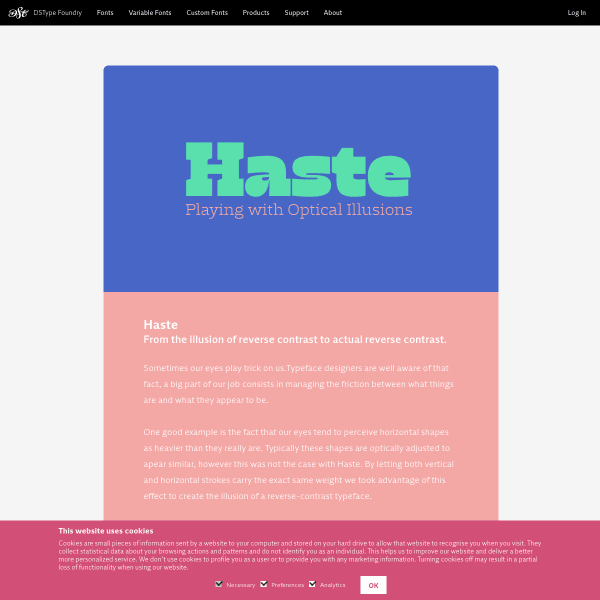
Haste
A simple digital equivalent of a flyer, I suppose. Stacked images of type samples for Haste. The larger weights particularly good.
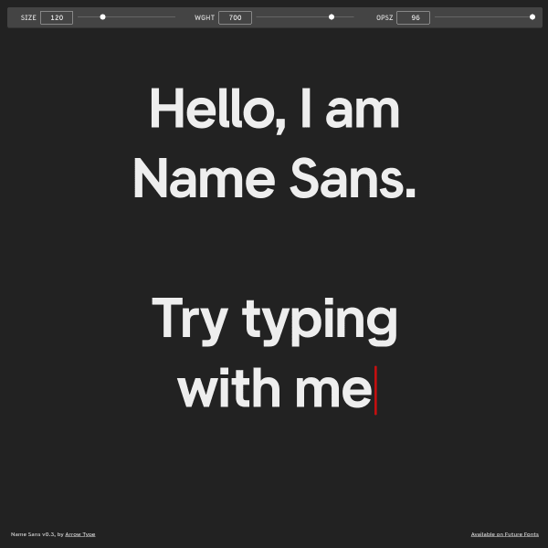
Name Sans
Refreshingly simple. A full page type tester with three variable font axis controllers. That's it!
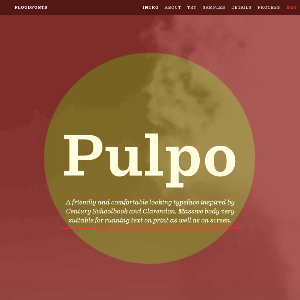
Pulpo
An in-depth specimen trying hard to display the many features and possible applications of the typeface.
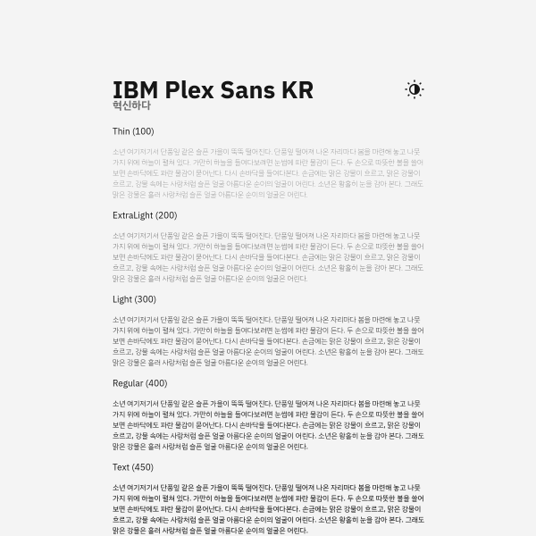
IBM Plex Sans KR
Specimen for IBM Plex Korean. Super simple, but elegantly displays the typeface at the various weights.
