A curated list of digital specimens
of the highest quality. Updated daily.
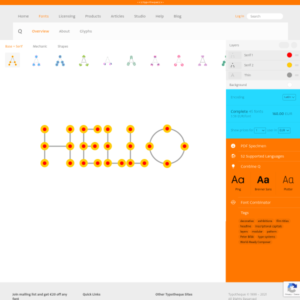
Q font family
Not sure where to start with this type tester for Q. Type tester is probably the wrong term anyway. 'Constructor' is probably more apt. The interface allows you to explore the various Lego-like build variables for the letterforms.
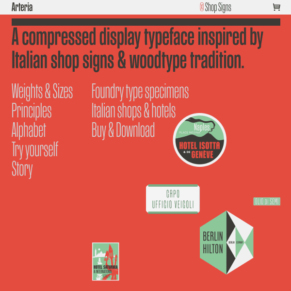
Arteria
This microsite for Arteria is full featured and sprinkled with witty, graphical moments. Subtle animations of interface elements add to the soecimen's appeal. But don't be fooled; this is a serious typeface for broad application.
League Gothic Italic
A bold, full screen type tester opens this specimen from Open Foundry before some equally large and bold illustrations.
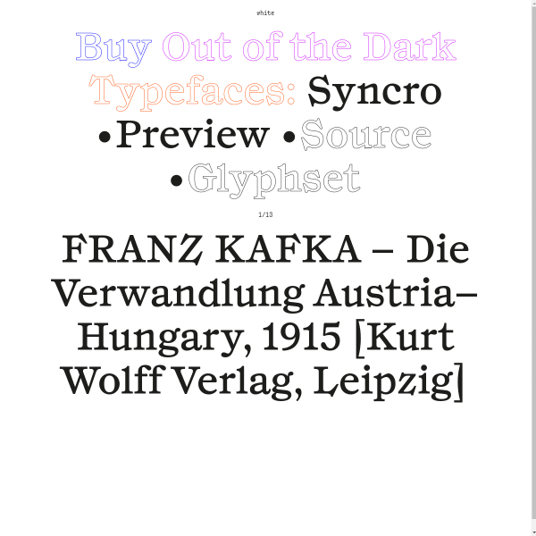
Syncro
Out of the Dark's specimens are really unusual. Pretty great, too. The specimen is notable for the very large type, and excellent design-in-use examples. The unusual interface element is the typesetter carousel, moving through different pangram, sentences and settings of the typeface.
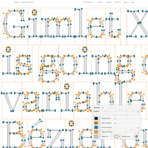
Gimlet X-Ray
An interesting specimen for Gimlet X-Ray. Huge type filling the screen from top to bottom with a few controls to customise the output from variable widths, to stroke colours, and the on-off curve points.
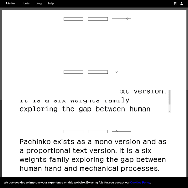
Pachinko
Panchinko is a lovely mono with a delightful italic. The specimen is a comprehensive, with some introductory type testers before moving into lengthy design notes, features and examples.
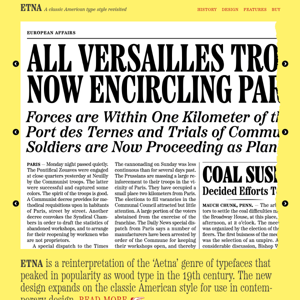
Etna
A new typeface from Mark Simonson, Etna is a reinterpretation of a genre of typefaces from the 19th century. The specimen is clever. Featuring three stacked carousels, the overall design is that of switching states of a newspaper layout.
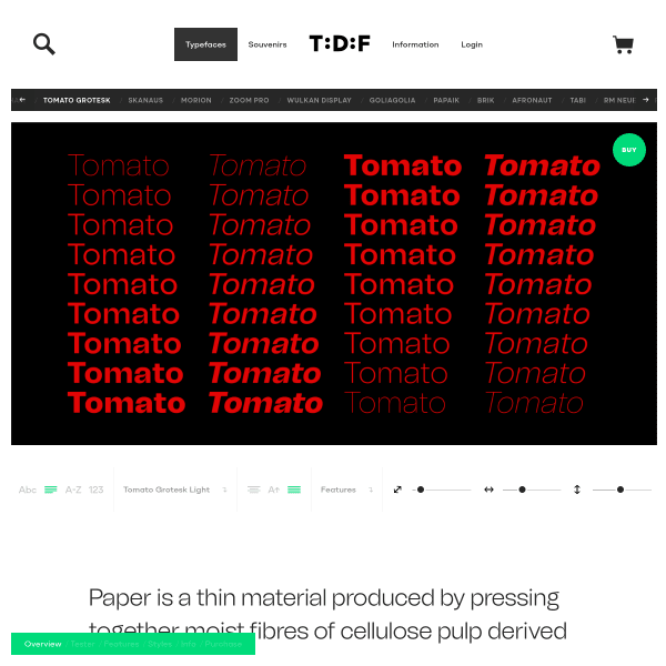
Tomato Grotesk
This specimen from The Designers Foundry for Tomato Grotesk has a really great type tester and opens with an example showing the whole design space.
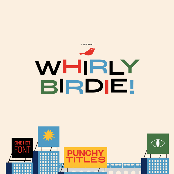
Whirly Birdie
This is a really fun specimen. Whirly Birdie is a display typeface inspired by 1950's American advertising.That aesthetic inspires some excellent illustration style with some feature rich interactive UI elements. The animated icons are particularly interesting.
