A curated list of digital specimens
of the highest quality. Updated daily.
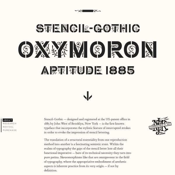
Stencil Gothic
A specimen that reads as a research project. The linear, scrolling story is punctuated by typographic illustrations and research photographs.
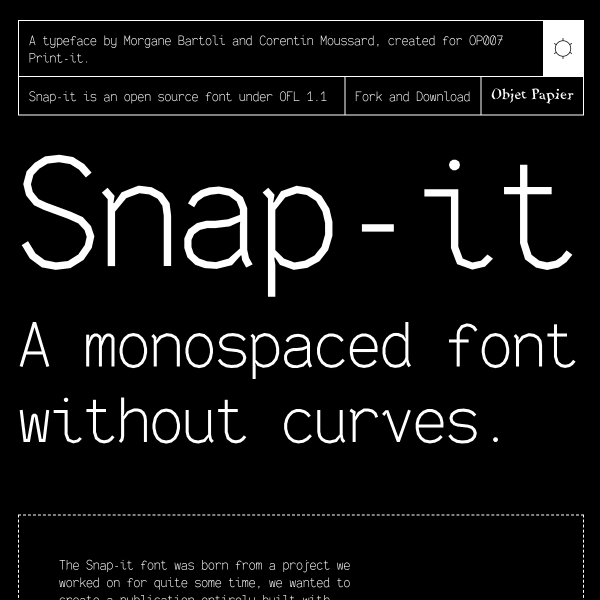
Snap-it
Snap it is a monospaced font without the curves. Because... why not? But underneath this quirky exterior is a typeface with considered and well-constructed form. The specimen in particular goes a long way in explaining the features.
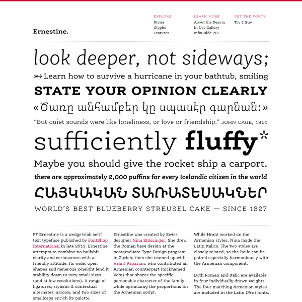
FF Ernestine
This specimen for FF Ernestine is a presented as a microsite in a traditional way. A homepage with hero image, introductory text, a page with all the glyphs. Whilst this could work very well for print, more is needed for digital. Maybe showing its age?
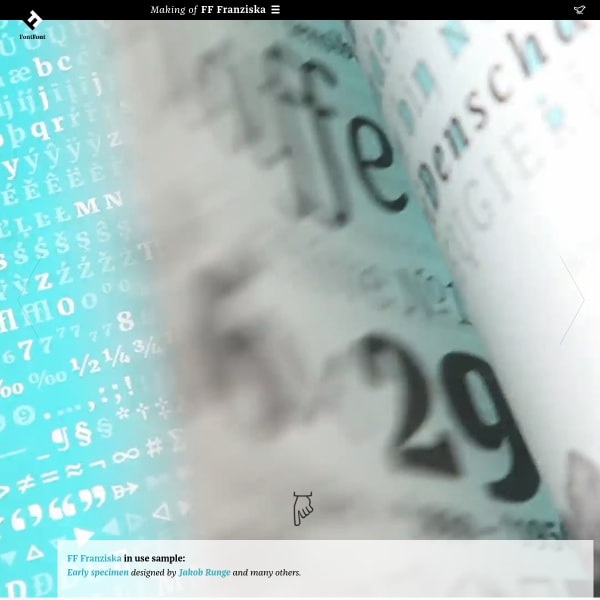
FF Franziska
A really unusual specimen. Presented as a long-form article documenting the design features, history, and inspiration for the creation of Franziska.
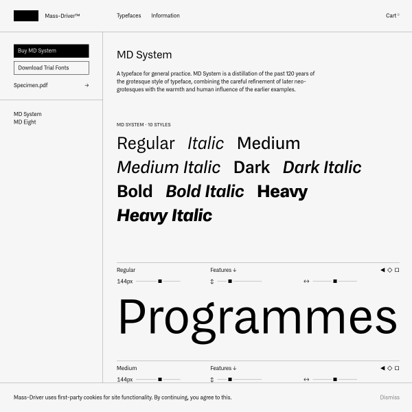
MD System
A simple but effective specimen for MD System from Mass Driver. Unusually, no type tester. Instead, a prominent download button for trial fonts and a PDF specimen.
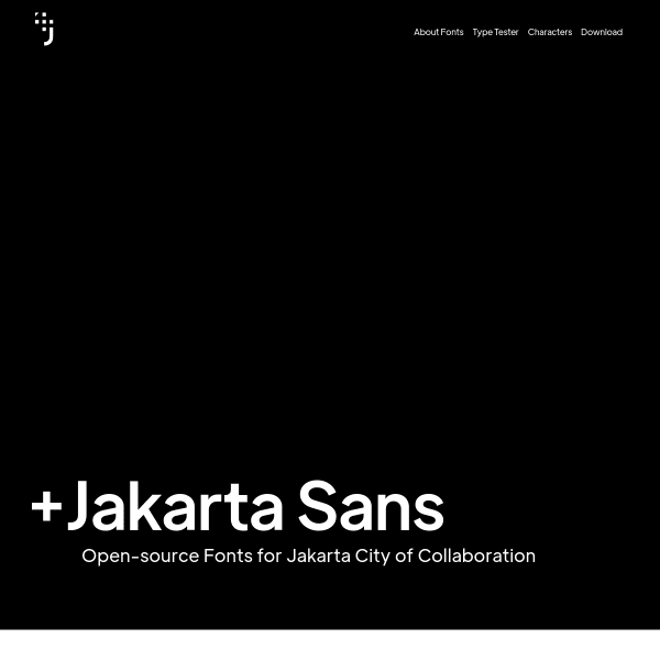
Jakarta Sans
A simple specimen for a workhorse of a typeface. Jakarta Sans, an Open-source font for Jakarta city has some really interesting alternates that, when combined, take Jakarta Sans in a really interesting direction.
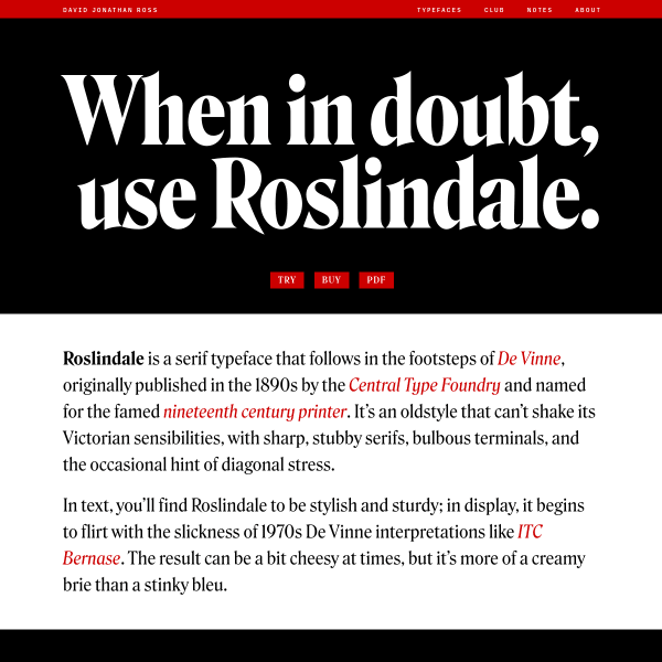
Roslindale
Another solid specimen from David Jonathan Ross. The Rosindale specimen opens with single words set in large bold weights before drilling down into more detail and origin content from David.
British Standard Type
This is an interesting website from British Standard Type that is part specimen, part client case study. Walking through each of the custom projects for their clients, the case study starts to then include comon design patterns from specimens.
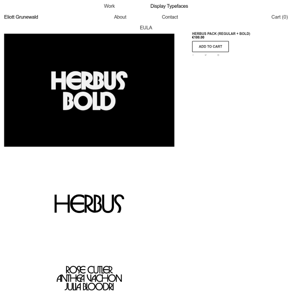
Herbus Pack
Despite this being a scrollable stack of images, instead of webfonts, there is clarity and purpose in the content. Bold, black and white illustrations of the typeface give an indication of usage.