A curated list of digital specimens
of the highest quality. Updated daily.
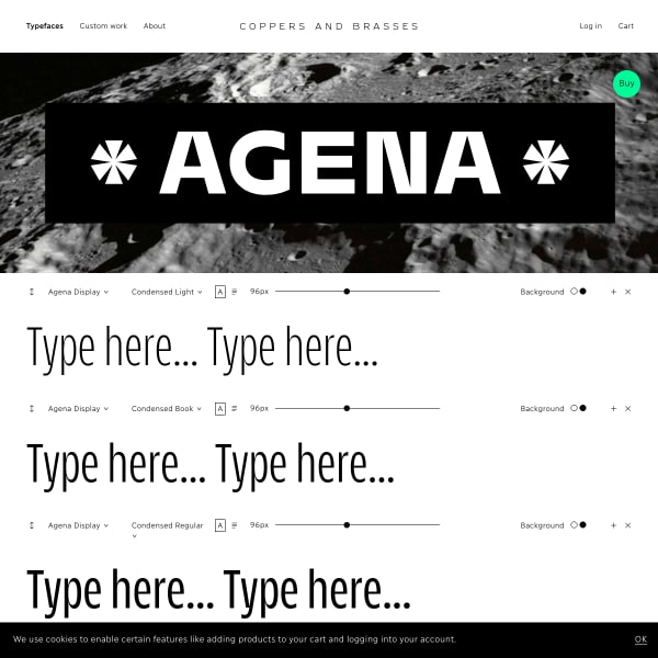
Agena Display
The hero image for this specimen for Agena Display by Copper and Brasses hints at what's to come after the stacks of type testers. Really effective branding and design showing off the features of the typeface.
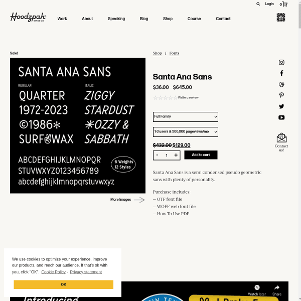
Santa Ana Sans
From a functional perspective, this specimen for Santa Ana Sans is a little unconventional and a bit lacking. But, from a marketing perspective, it's probably one of the best I've seen. Scroll down to see brightly designed tiles of features, examples, and proposed applications.
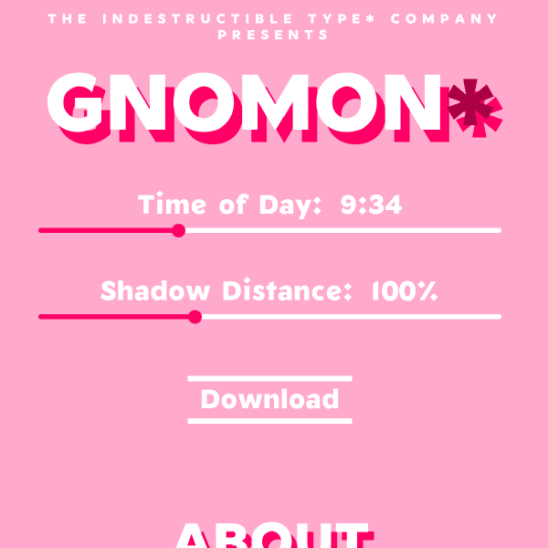
Gnomon*
An interesting specimen for free drop shadow variable font, Gnomon. The interesting aspect of this font is the unusual variable axis: 'time of day', and 'shadow distance'. This type of interface is brilliantly educational for the potential of variable fonts.
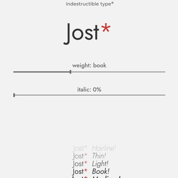
Jost*
Jost is a tribute to Futura named after Heinrich Jost. With variable axes for weight and italics, the specimen opens with just that single type tester and a revolving carousel of example images. Nicely done.

Collletttivo
I do like a challenging interface. An interface that challenges conventions. This specimen from Production Type for Tuner does just that. An animated menu makes way for panels of content on the origin, design, and a specimen of features.

Tuner
I do like a challenging interface. An interface that challenges conventions. This specimen from Production Type for Tuner does just that. An animated menu makes way for panels of content on the origin, design, and a specimen of features.
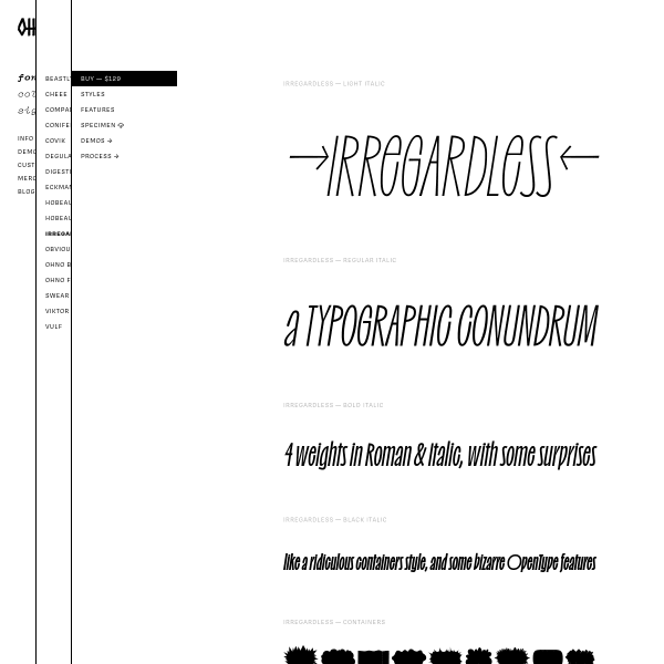
Irregardless ☠️
Oh no's specimens have been featured here before, but I had to include irregardless for its wonderful design. Checkout the 'containers' weight for some fun backgrounds to overlay text onto.
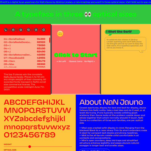
NaN Jaune — See the fonts 👀 Play the game 🎮
Where to start? 'Closed apertures, display for text and text for display, Jaune follows this NaN motto: take a bad idea and do it well, or at least die trying.' Behind the fun exterior, – I mean, a game!? With a leaderboard!' this specimen for Juane has some really great features. The optical size slider is perhaps the most useful here.
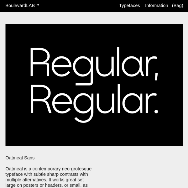
Oatmeal Sans
Yes, stacked sag graphics but a striking and bold specimen for Oatmeal Sans. Another neo-grotesque, but it has some striking alternates. The specimen only hints at those features, so whilst the graphic design is appealing, it's lacking those evaluative components for a user to explore it.