A curated list of digital specimens
of the highest quality. Updated daily.
Faune, Alice Savoie / Cnap
No doubt a beautiful typeface, but let's focus on the specimen. As is usual for many modern digital specimens, it leads with the story. Presenting the typeface in its various intended uses, it's not until the end that the specimen digs a little into the features of the fonts. It's not until you download the PDF specimen, can you dig into the font features and individual glyphs.
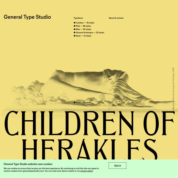
General Type Studio
As a homepage for a foundry, why not completely combine specimens of the catalogue in just one. big scrolling page? General Type Studio do just that and the result is wonderful.
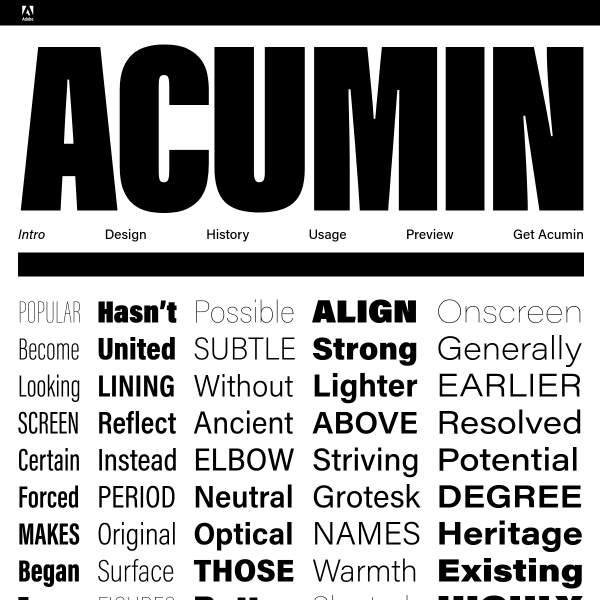
Acumin
What struck me about this specimen was the type tester. Most testers are quite lightweight; allowing the user to change weight and size, but that's pretty much it. Acumin's tester goes one step further in presenting a simple two column layout with a headline, a subhead, and some body copy. Allowing the designer to not only change the weights and sizes, but to do so in a limited (unbreakable) context.
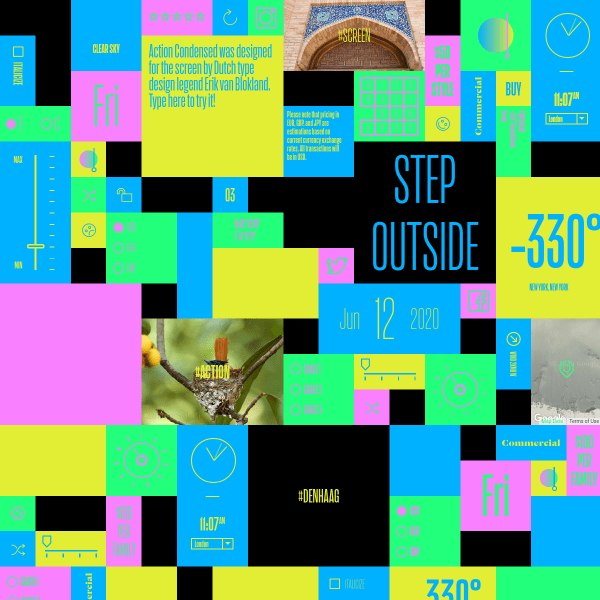
Action
A brilliant specimen. Full of little controls, icons and widgets to play with that alter the appearance and content.
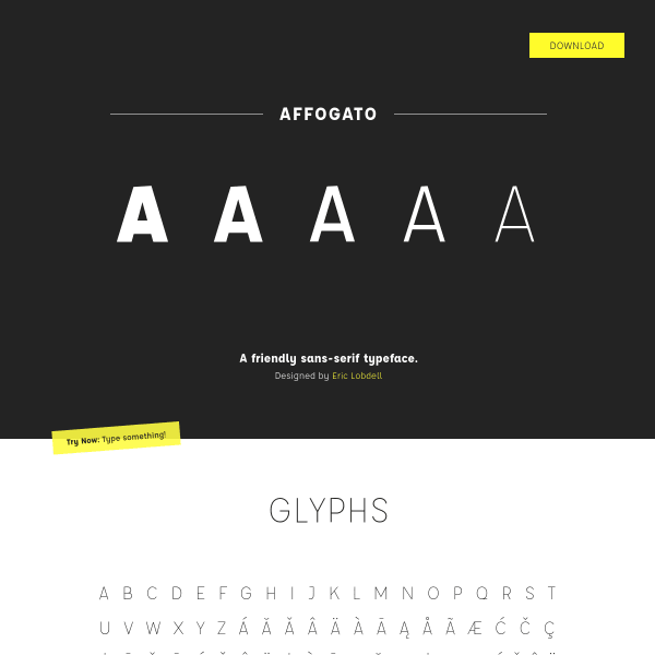
Affogato, A Friendly Sans-Serif Typeface
Unusually, Affogato leads with a glyph table. Normally this kind of detail is left to the end of a specimen – almost an after thought, unless presenting a comprehensive set of stylistic alternates, or particular support of unusual characters.
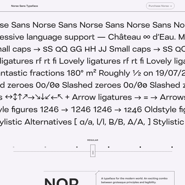
Norse Sans
The specimen leads with an unusual design pattern. A sort of feature carousel/animation in which the user can explore the features and switch weights if they wish. Unusually, this typeface specimen completely does away with any back story, marketing, or designers inspiration and just lays the typeface before the user: ' here are the features, here are my glyphs, buy me if you like me'.
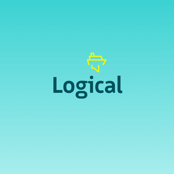
Logical
Beautiful, simple, legible sans serif from Bold Monday. It took me just minutes before I bought this typeface such is the power of this specimen. Leading with key stylistic features focussing on optimum legibility and humanistic feel, the large simple illustration help communicate what can often be type design specialist language. Another bonus of the typeface is the icons and the simply wonderful instructional animations. At the end of the specimen – in case you're not sold yet – we get to the nitty gritty features and glyph tables.
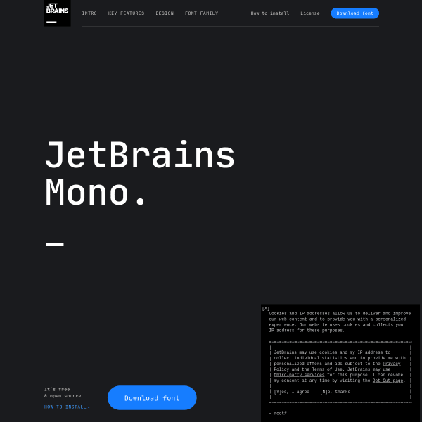
JetBrains Mono
Specimen as product website. There is just so much that can be learnt from how this website communicates the features of the typeface. From compelling layout, to informative animations, to a fantastic comparison table.
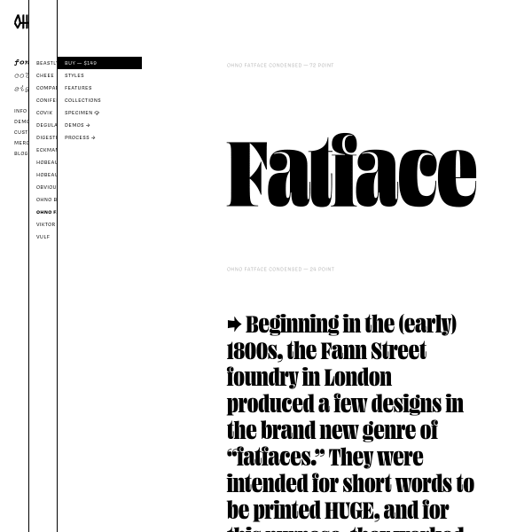
Ohno Fatface ☠️ OH no Type Company
The specimens for Ohno's website follow a similar simple design with stacked text containers at different sizes and weights. These areas are editable, but offer no type tester controls. The visual representations and animations of the features of the font work really well. Education, wayfinding, and a little bit of quirky fun, all wrapped into one.