A curated list of digital specimens
of the highest quality. Updated daily.
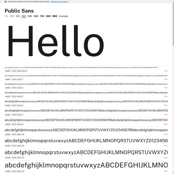
Public Sans 400
We've probably featured Public Sans on here before, but this is the actual specimen page – a level down from the micro site home page. Mirroring a print design, it displays a waterfall of different font sizes. An interesting comparative component where Public Sans is shown next to Verdana, Georgia, and System.
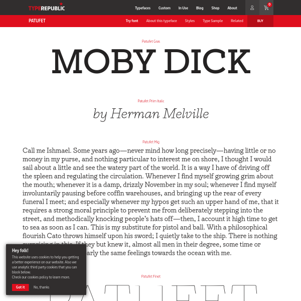
Patufet font
This is a great specimen from Type Republic. Traditionally designed, but with each paragraph or single sentence changing into a type tester when the user clicks on it. It's a detailed, considered digital specimen.
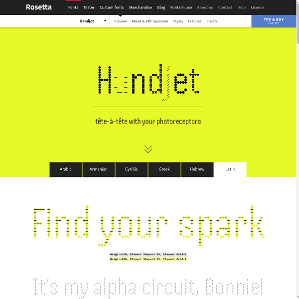
Handjet
An amazing experimental variable font, the specimen for Handset tries to articulate the huge range of options available to the user. The discretionary ligatures are such a delight.
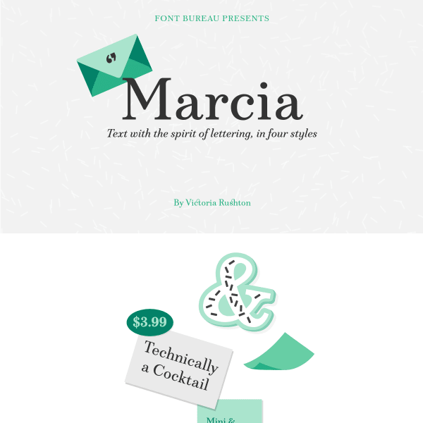
Marcia
The notable point about this specimen is the conversational tone it takes in explaining the features of the font – particularly the Very Discretionary Ligatures. Nicely presented illustrations give a 50's vibe.
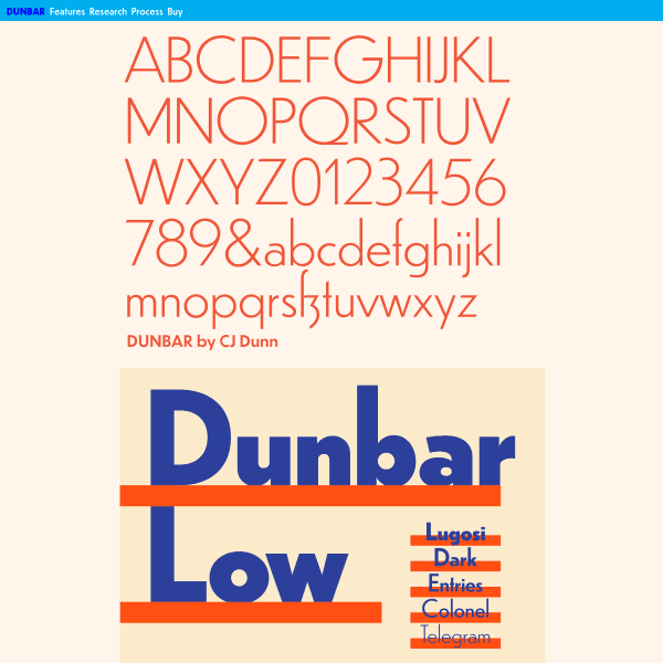
Dunbar
An impressively detailed, long-form specimen for Dunbar. Starting with stacked typographic illustrations, it moves onto typesetters for each individual weight. The detailed overview of Opentype features is a welcome addition, as are the in-depth design notes.
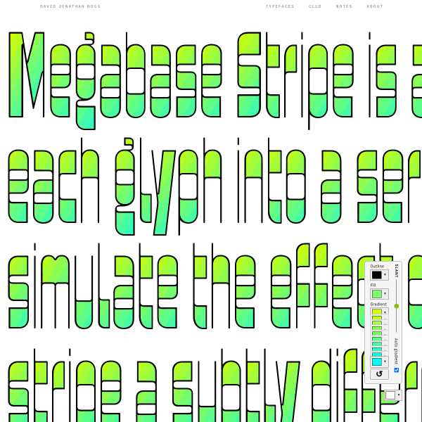
Megabase Stripe
A brilliant single page specimen for an experimental version of Megabase that allows the user to create colour gradients. It includes simple UI controls for changing the slant axis, as well as each of the colour steps in the gradient.
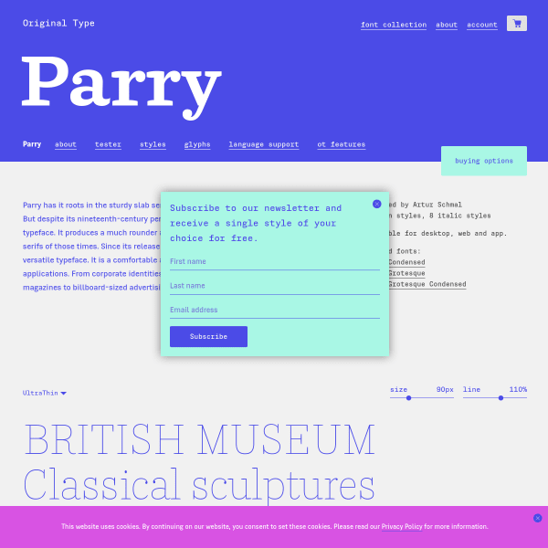
Parry
Simple, functional, and shows off the typeface in the best possible way, this specimen for Parry – similar to all specimens on the Original Type website – has a detailed view of all opentype features, glyph set, and stacked type testers.
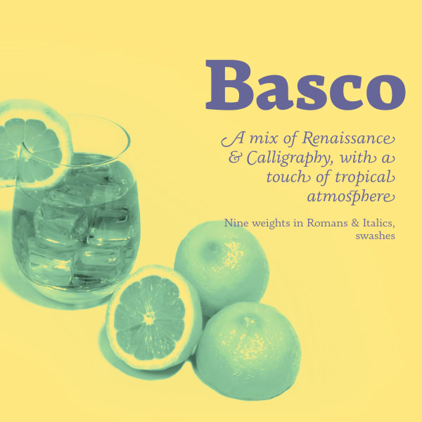
Basco
This specimen for Basco neatly combines a very tight-specific print aesthetic – duotone colour palette, and mixing supportive photography – with a more web-native feel with scrolling animations.
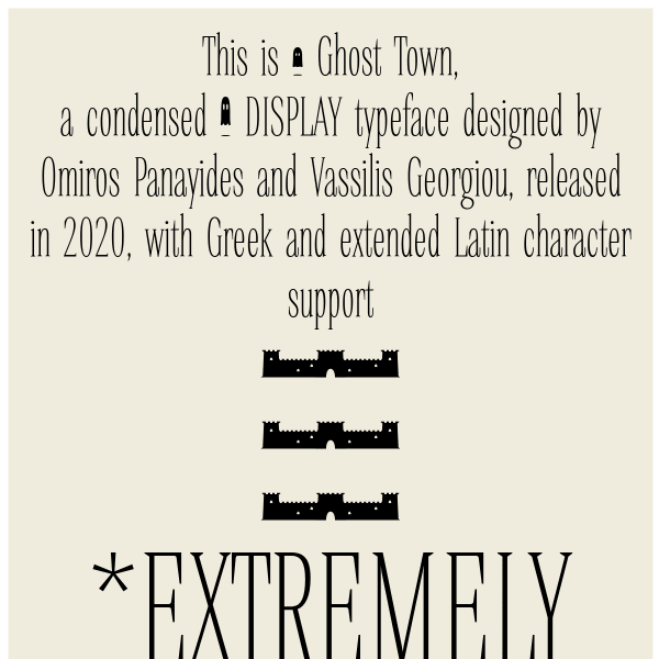
Ghost Town
The notable point about this specimen for Ghost Town from Ooukpress is the long form editorial as a way of introducing the typeface, describing the features of the typeface, but all set in varying weights and styles. It reads like a product page. Notable for Greek support, it's also freely available.
