A curated list of digital specimens
of the highest quality. Updated daily.
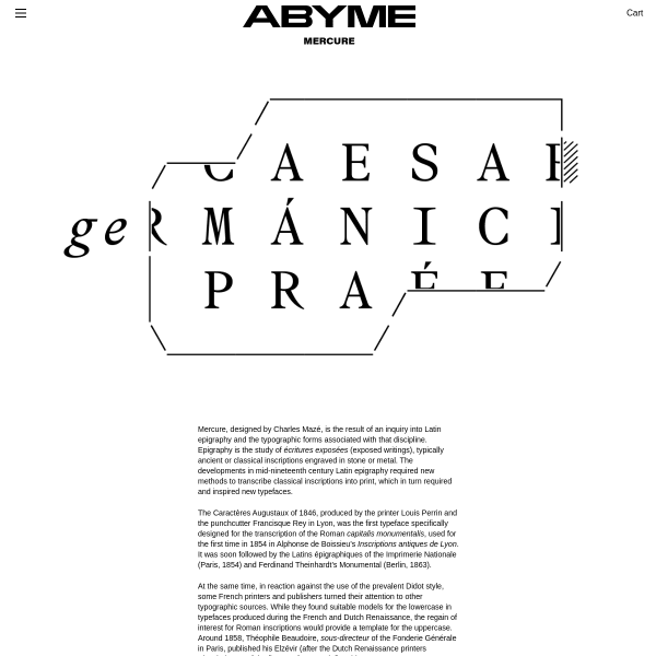
Mercure
Mercure, designed by Charles Mazé, is the result of an inquiry into Latin epigraphy and the typographic forms associated with that discipline. A touch of the experimental mixed with the conventional of digital type specimens. Yes please.
Lausanne
The graphic design of this specimen walks the line between two aesthetics - digital and print - but doesn't quite deliver on either. Which is a shame. With the introduction of a type tester, some clearer description of features and styles, it would be much improved.
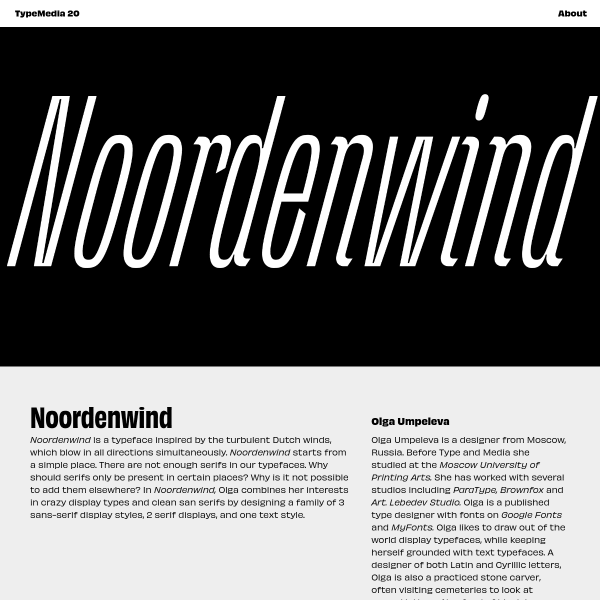
Noordenwind
Noordenwind is a typeface inspired by the turbulent Dutch winds. The really interesting part of this project is the different weights for each month, each with its own levell of stress and distortion matching the dutch weather.
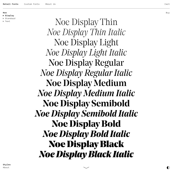
Noe Display
A couple of things to admire here but not the things you'd expect. The in-specimen navigation is subtle, supportive, and stays out of the way. The 'buy' buttons next to each type tester. The simple introduction of a centred waterfall.
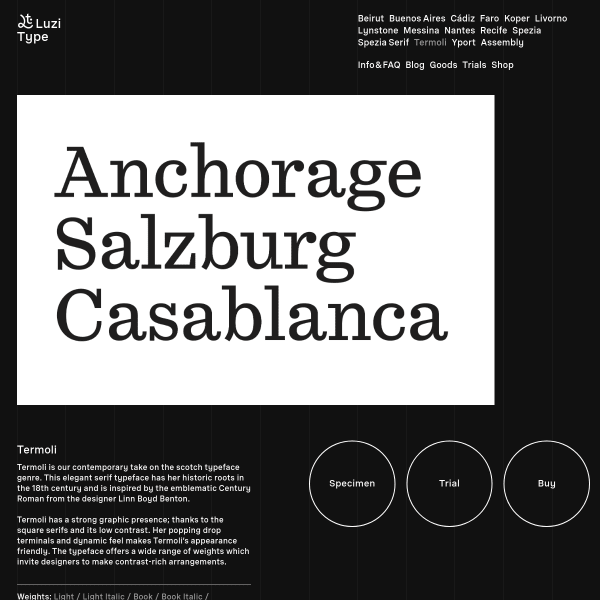
Termoli Font
Termoli is a contemporary take on the scotch typeface genre. The specimen is an interesting assortment of white on black content elements and type testers.
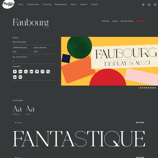
Faubourg
This specimen for Faubourg from Positype follows the increasing trend of 'everything is a type tester' but only having the controls available when the user is interacting with that content which makes things look nicely decluttered the rest of the time. Nice addition of the accompanying glyphs on the glyph preview.