A curated list of digital specimens
of the highest quality. Updated daily.
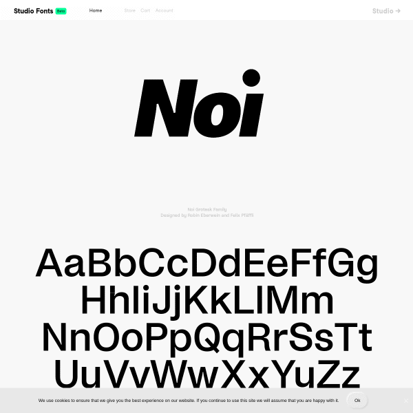
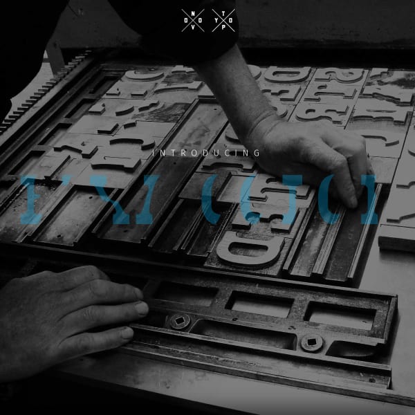
Noi Grotesk Family
Perhaps the longest scrolling foundry homepage I've seen. Atop is the specimen for Now Grotesk with some brilliantly designed components outlining the font features and design details.
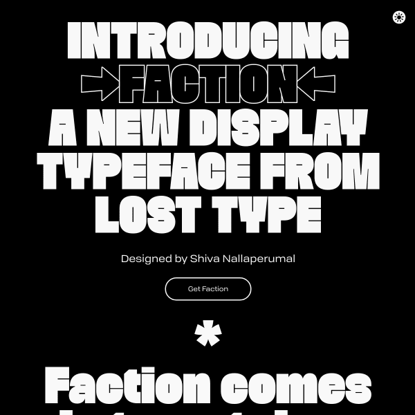
Faction
I'm a big fan of combining the design story of the typeface in a specimen. Of course, this has to be done sensitively, and at the right point in the user's evaluation of the typeface. The specimen for Faction does that particularly well, seamlessly moving from detailed specification type content, over to the story of how the typeface came to be.
Essonnes
Now this is cool. Instead of just showing a bunch of letters, type testers, and features like all specimens do, why not take three short stories and typeset them to show off the real-world capabilities of the web font. Perfect.
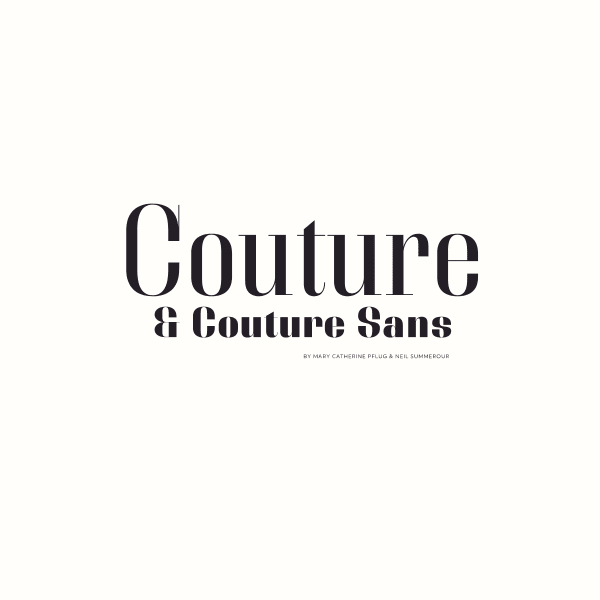
Couture and Couture Sans
This is really, really interesting from Positype. The unusual, but simple, interaction design of mirrored scrolling lend itself perfectly to this high contrast fashionista type design. Just enough content to whet the appetite presented in a cool way. Take my money.
Bixa Color
Some interesting things can be done with colour fonts. Bixa was originally designed as wood type for letterpress, and is now transformed into a multicolor font for web. The specimen suffers slightly in the same way specimens for variable fonts do: they have to explain the benefits and features ahead of the actual design. That said, this is an interesting specimen.
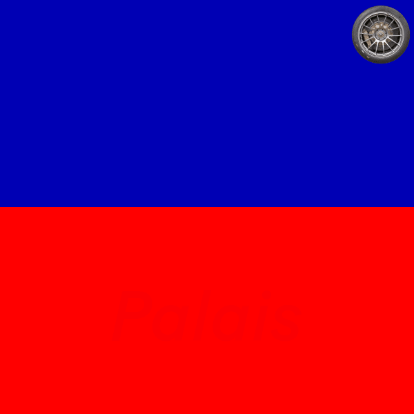
Baton Turbo
If you ignore the strange spinning wheel in the top corner, this is a well put together specimen. Striking colourways underpin some solid, usable components. The feature illustrations are particularly good.