A curated list of digital specimens
of the highest quality. Updated daily.
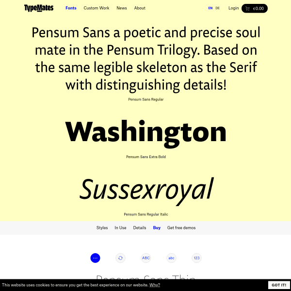
Pensum Sans
A fairly standard looking specimen, but it's enriched with content of its creation written by the designer.
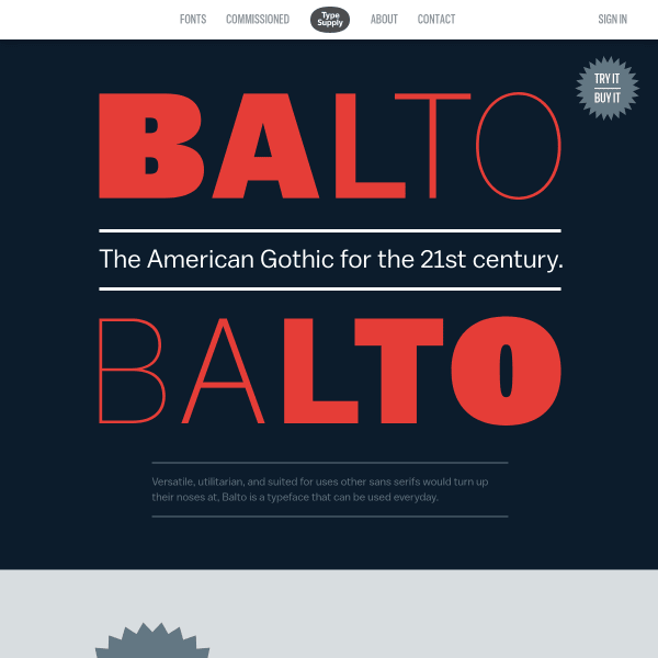
Balto
A visually interesting specimen that would be made so much better by being constructed with web fonts instead of rendered images. That aside, it does a good job of displaying the typeface's best features in an easily digestable format.
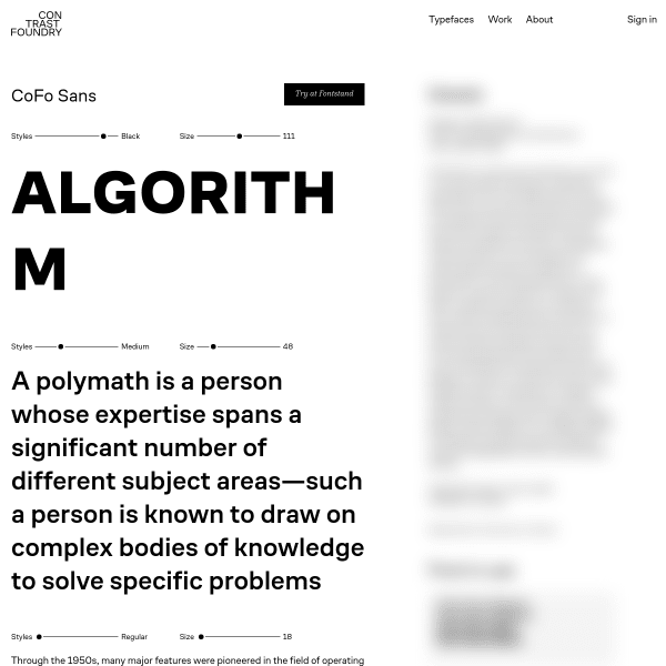
CoFo Sans
This is a smart looking specimen. Minimal in features, the design is horizontally split: typical specimen features on the left such as type testers, character set etc. But the right is blurred out. Until it is clicked, which reveals editorial about the typeface and designer, in addition to some fonts in use content.
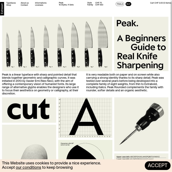
Peak
Another Extraset specimen with a vintage feel about it. Leading with illustrations to explain the font's features, the specimen moves on to a comprehensive and well-designed type tester. And there's that buy button again!
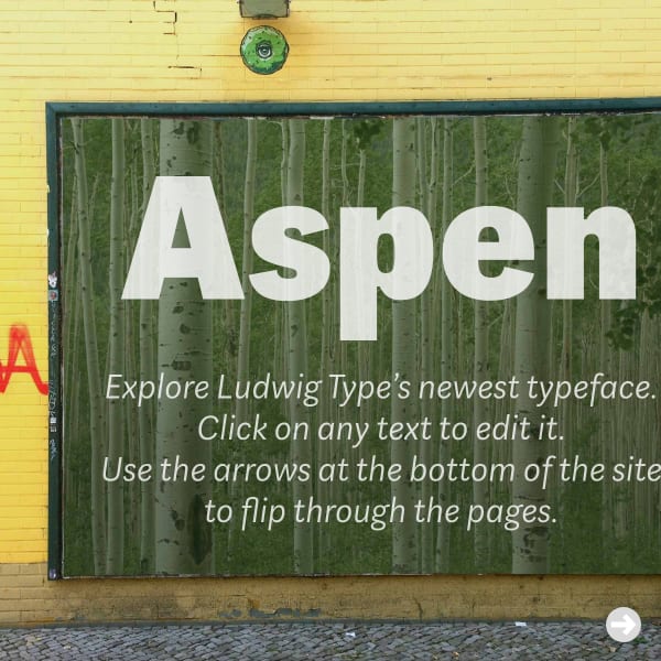
Aspen
This is a fun specimen. Luwig Type's Aspen typeface can be manipulated in mocked up contexts – from billboards and shop fronts, to books and magazines.
Playtype
Big. Type. but effective. The overlaid, layered, information panel is a useful and effective addition to the layout giving the appearence the user is scrolling an actual page of a specimen, rather than a web page. Subtle depth adding a subtle perception.