A curated list of digital specimens
of the highest quality. Updated daily.
Climate crisis font | Helsingin Sanomat
An interesting specimen for an interesting idea. A font that degrades in weights that represent the degredation of the Artict sea ice from 1979 and that projected in 2050. Specimen wise, it has some nice touches.
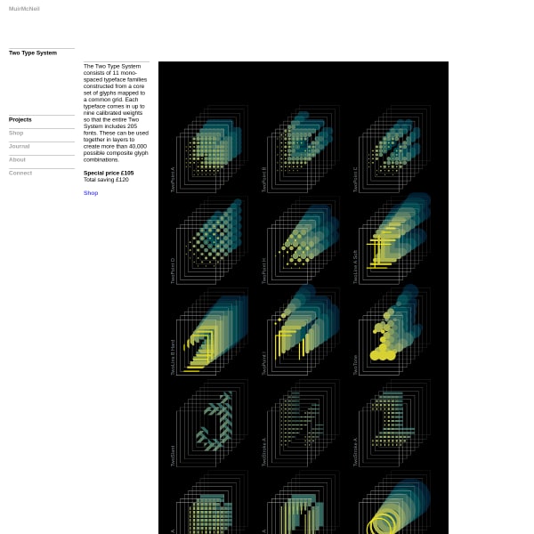
Two Type System
I miss typefaces like this. Reminds me of FUSE. The specimen for Two System doesn't quite demonstrate the possibilities, though. I'd really appreciate a type tester and some example usage.
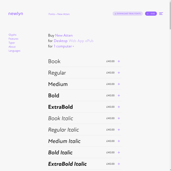
New Atten
Newlyn's templated specimens are really excellent from a usability perspective, offering all the features we know users need when evaluating a new font. But, of particular interest, is the multi-lingual content for the type tester.
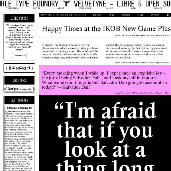
Happy Times at the IKOB New Game Plus Edition
I'm not sure where to look on this specimen for – and, yes, this is it's name – 'Happy Times at the IKOB New Game Plus Edition'. The scrolling, the pink, the competing hierarchy, the million type sizes. It shouldn't work. It really shouldn't. And yet...
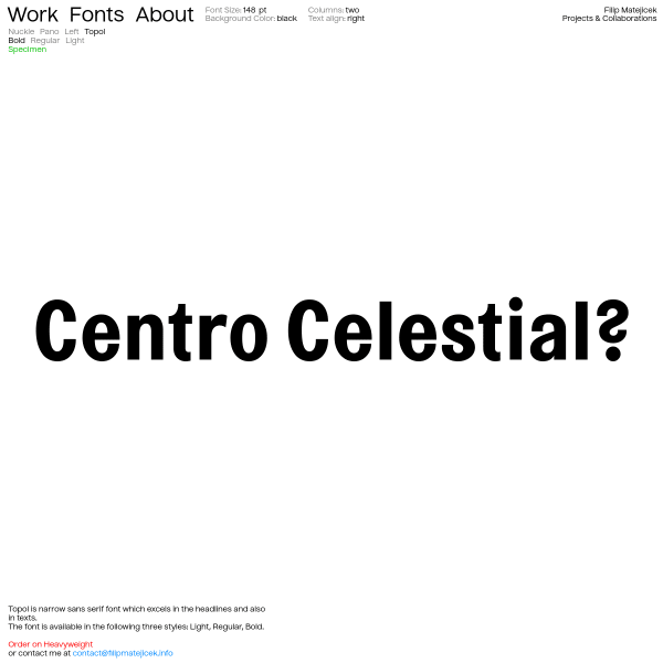
Filip Matějíček
There is something pleasingly simple about this specimen. Just a typetester with predefined pangrams at three different sizes navigable with toggles for three different weights. That's it. And, you could argue, that's all it needs to be.
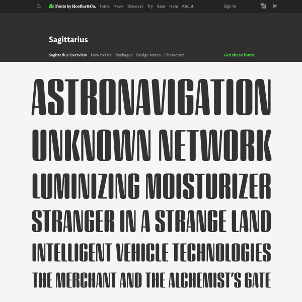
Sagittarius
This new typeface from Hoefler&Co is subtle. What really works is the copywriting coupled with the design. Simple, effective art direction whilst demonstrating the full range of design. Clever.