A curated list of digital specimens
of the highest quality. Updated daily.
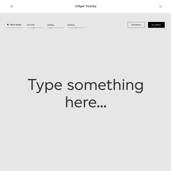
Altform
CoType's sepcimens are really good in their clarity and simplicity. The overlaying of content areas on scroll is a simple but effective little trick to clearly demonstrate different content areas, but also adds subtle animation and a feeling of depth.
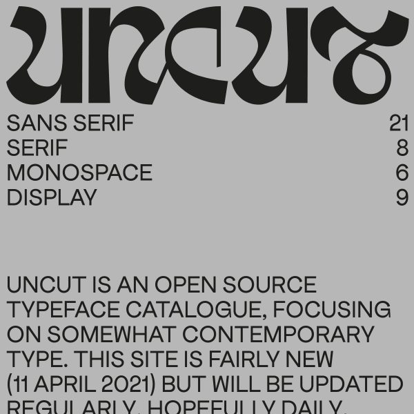
UNCUT
An unusual website. Or catalogue? Or specimen(s)? Maybe it's a foundry? I'm a little unsure, but what I do like is the bold, unconventional web design. Feels like a print publication for a contemporary gallery space. Refreshing!
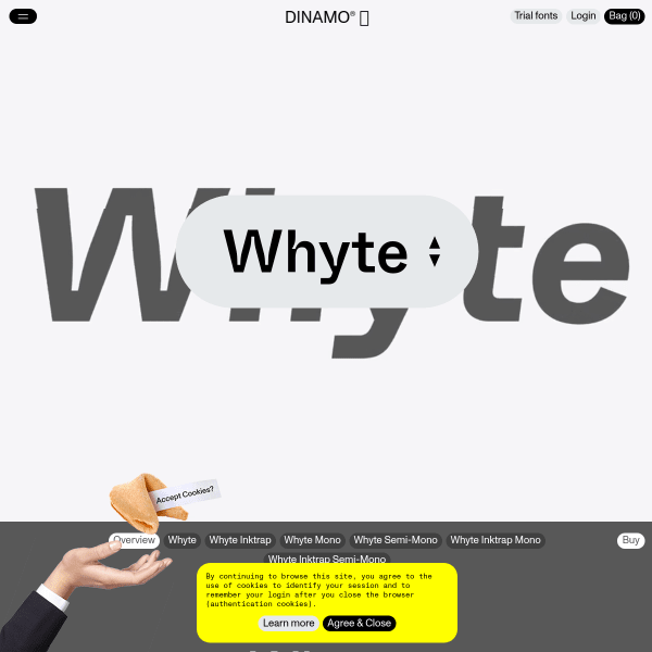
Whyte
I'm a massive fan of Dinamo's typefaces and specimens and this is no exception. Whyte is a brilliant typeface and specimen is bold and delightful, yet useful and usable. A delicate balance realised very well, here.
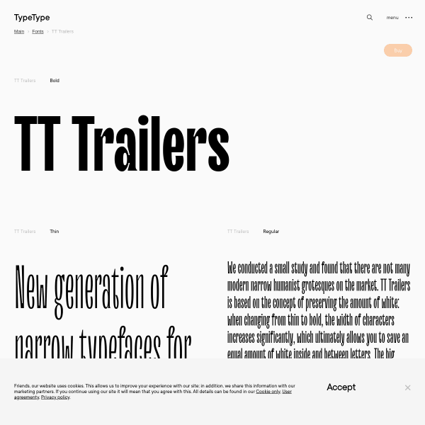
TT Trailers
The refreshing aspect of this efficient specimen for Trailers is the multi-lingual predefined sample text at different lengths. So often, language evaluation is limited to a list of supported languages. More specimens taking this approach would be welcome.
RT Alias
Green and black and nothing else. Simple design with effective designed panels. To explain the features of the font (different density of pixels) has been handled really well.
RT Rondelle
This is more 'essay as specimen' for Rondelle. Describing the motivation, design process, and results is refreshing in its depth providing the user with plenty of opportunity to review the features.
