A curated list of digital specimens
of the highest quality. Updated daily.
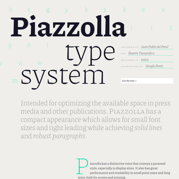
Piazzolla
So much detail in this specimen. From the long-form editorial, to the different interactive panels. One of these really stood out: the highlights panel. Here, we have on display a grid of selected glyphs for the user. Useful.
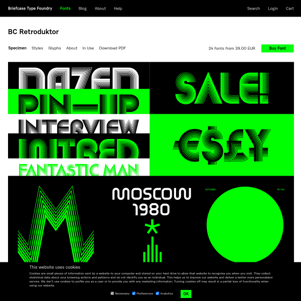
BC Retroduktor
The opening screen of this specimen is striking. A stacked selection of svg graphics show the typeface in various graphics. The rest of the specimen – behind sub navigation – allows the user to sample the typeface as well as a complete glyph table.
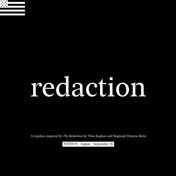
Redaction
A specimen that takes cursor-jacking to a whole new level! There is much to enjoy in this specimen and, for those who are old enough, you may be reminded of early 2000s web design where experimentation, play, and expression were still high on the medium's agenda.
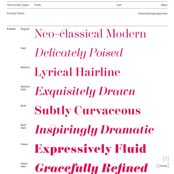
Foundry Tiento
A subtle, simple and usable specimen for Tiento. It delivers on the basics, but being such a simple design, there is an elegance there that matches the typeface beautifully.
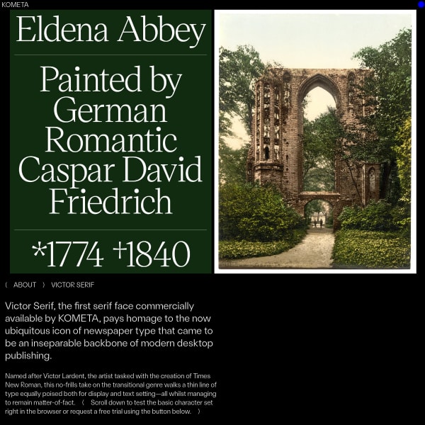
( KOMETA ) Victor Serif
Another interesting specimen from Kometa. Notable for it's use of vintage photography combined with starkly contrasting and large type, the specimen moves onto stacked settings that build on the idea of paying homage to the ubiquitous icon of newspaper type.
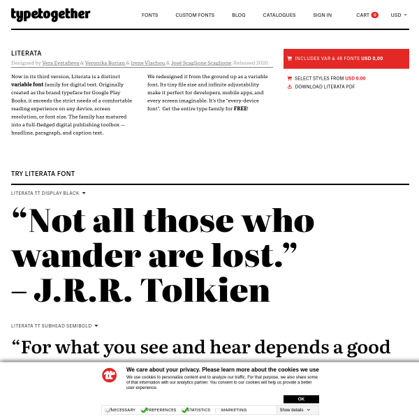
Literata
Typetogether's specimens are always so detailed, full of useful and detailed information. This specimen for Literata doesn't disappoint. The specimens as type testers work particularly well since they only reveal their controls when a user interacts with them keeping the overall appearance clean and uncluttered with UI controls.
