A curated list of digital specimens
of the highest quality. Updated daily.
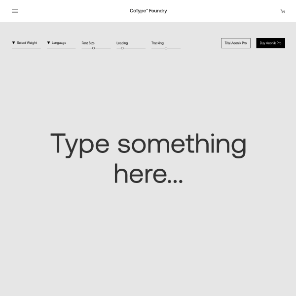
Aeonik Pro
A straight-forward typetester leads the specimen for Aeonik Pro, before an equally straight-forward list of weights, glyphs, and features. Nothing out of the ordinary here. The carousel of images of usage is where the interesting design lies on this specimen. Some beautiful pieces of work that I wish had been transposed into digital form.
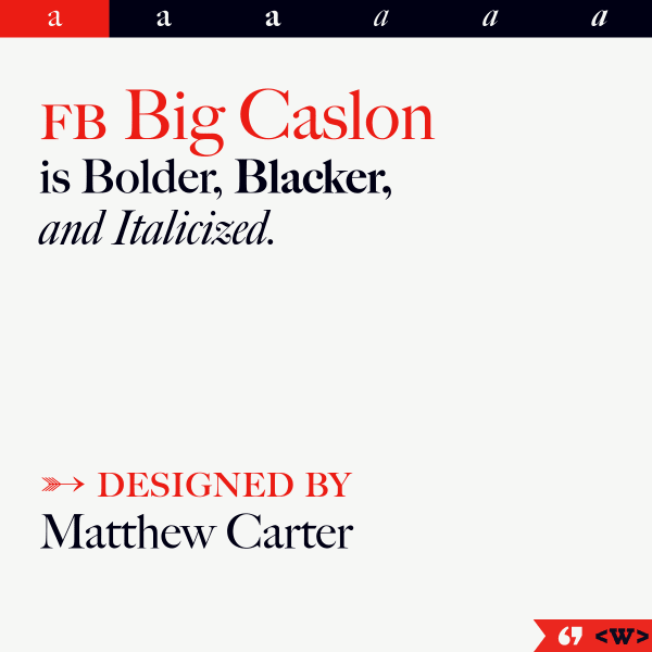
FB Big Caslon
Another slick, informative and exploratory specimen from The Font Bureau. Vertically stacked sample text invites the user to explore the large text before a simple categorised glyph list.
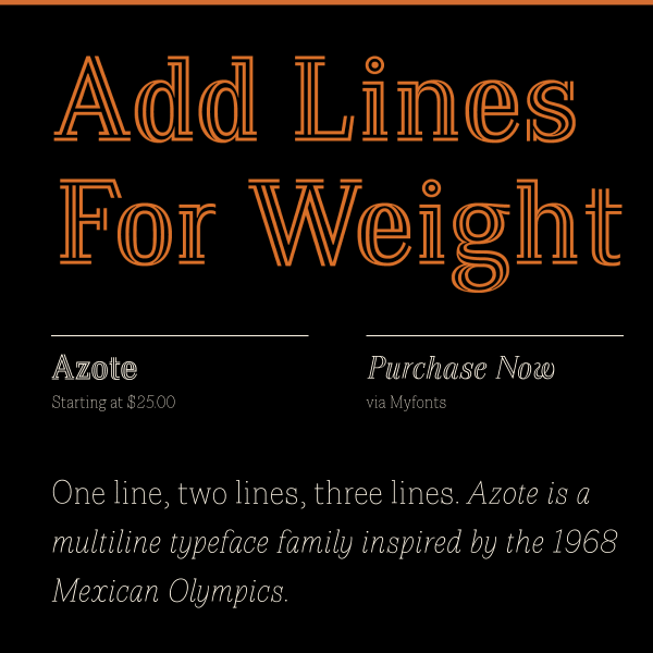
Azote
This is a traditional, but effective, digital specimen. Large sample text in different weights visually show the benefits and features of the font.
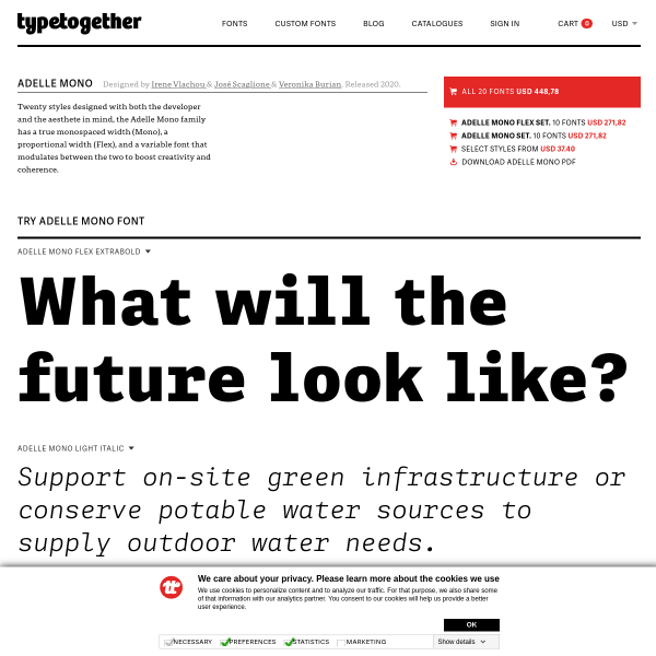
Adelle Mono Flex
TypeTogethers specimens take a templated approach, but include this large section on the backstory of the typeface. Typically, they pair this with an even lengthier blog post providing a package of material to support the typeface release. A perfect example of when a specimen isn't just a specimen.
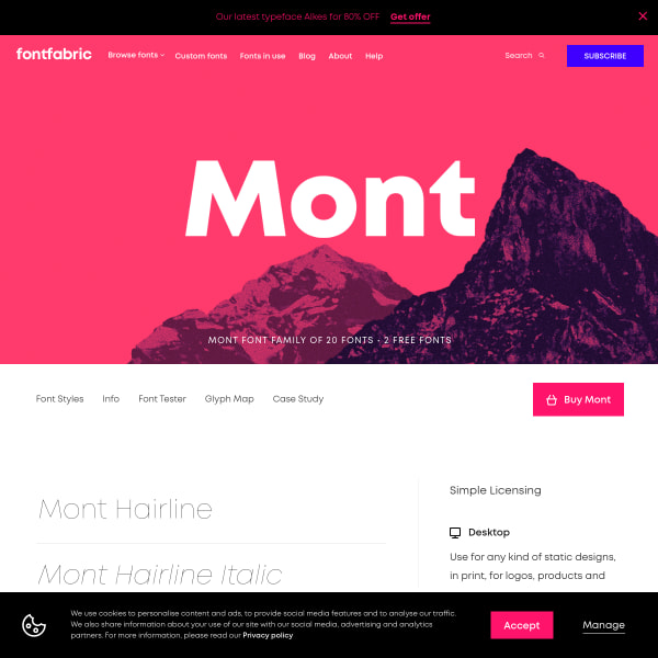
Mont
So many specimens follow a sinlge page approach with vertically defined sections. Mont takes the other approach of incorporating sub-pages and navigation. The type tester is particularly elegant.
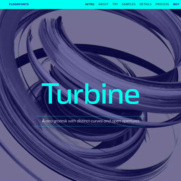
Turbine
Turbine is a neo grotesk with distinctive curves and open apertures. This is quite some specimen. Starting with a quick introduction and type tester, it moves on to a long list of branded samples in the same two-colour palette. The Process section is a particularly good read.
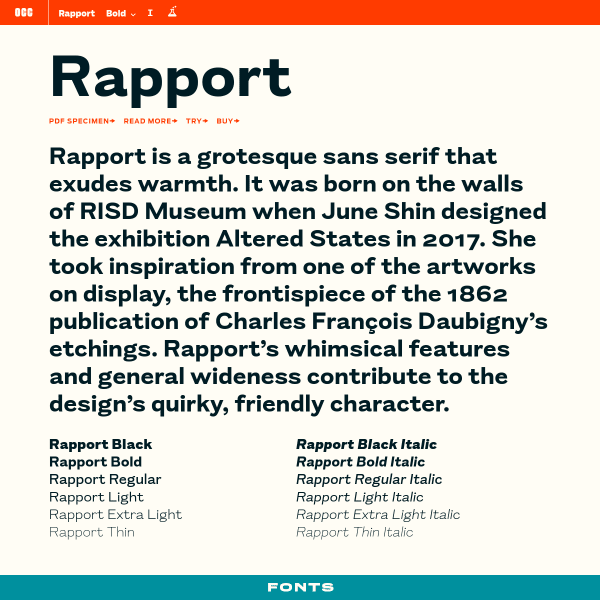
Rapport
This is a deceptively simple specimen that, on further investigation, reveals different features in interesting ways. The type tester's controls are a little unusual. Clicking the 'read more' about the font opens a treasure trove of an article outlining the typeface's origins, inspiration, and design
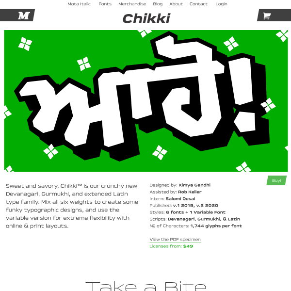
Chikki
What a fun specimen! Bright, bold typographic illustrations pepper the content explaining the typeface's features. Really refreshing design.
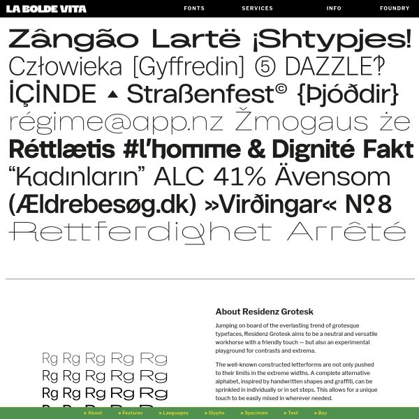
Residenz Grotesk
A specimen that reads like a product page, including often used conventions such as the alternating image and paragraph combination. Where this specimen breaks with convention is the navigation stuck to the bottom of the page.
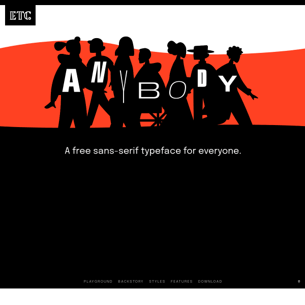
Anybody
A heavily stylised retro illustration opens the specimen before leading onto more conventional design patterns. It's a shame the aesthetic wasn't carried through to the features or back story of the typeface.
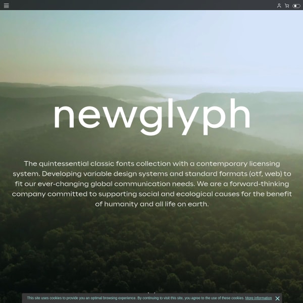
Newglyph
This is a really cool collection of specimens (as a catalogue, I suppose). Presented in a passive, scrollable format, the controls for manipulating the content ever-present at the bottom of the interface.
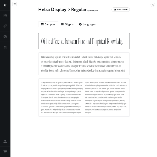
Helsa Display
Super simple specimen from Paratype which has glyphs and languages as different sections. There is a tool menu (which is a little obfuscated) and in here are the usual controls to manipulate the text.
Forgotten Shapes
This is a really interesting user interface and specimen format. It's a type specimen coupled with a lengthy article in a refreshing interface for swapping between the two.
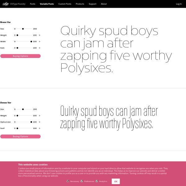
Breno Var et al
Tiny stacked type testers with variable font axis controllers. Simple but effective.
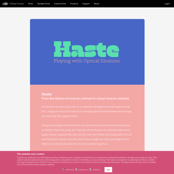
Haste
A simple digital equivalent of a flyer, I suppose. Stacked images of type samples for Haste. The larger weights particularly good.
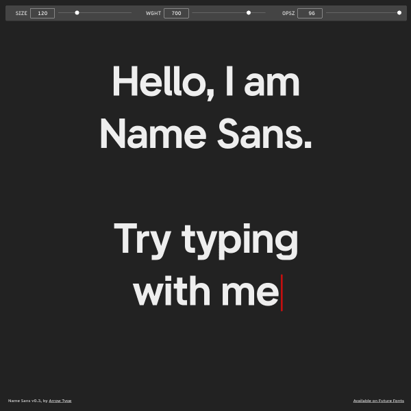
Name Sans
Refreshingly simple. A full page type tester with three variable font axis controllers. That's it!
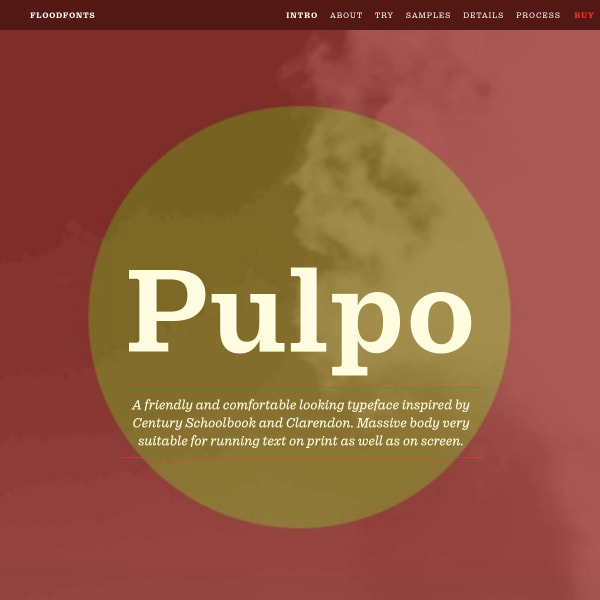
Pulpo
An in-depth specimen trying hard to display the many features and possible applications of the typeface.
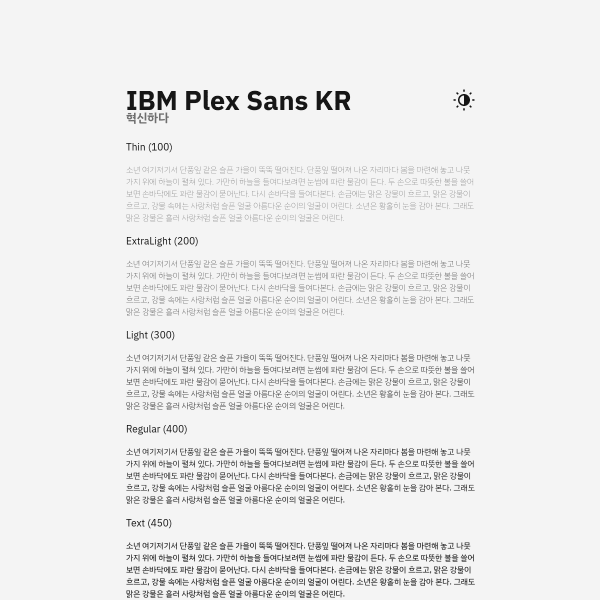
IBM Plex Sans KR
Specimen for IBM Plex Korean. Super simple, but elegantly displays the typeface at the various weights.