A curated list of digital specimens
of the highest quality. Updated daily.
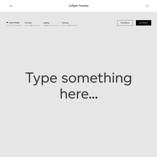
Altform
CoType's sepcimens are really good in their clarity and simplicity. The overlaying of content areas on scroll is a simple but effective little trick to clearly demonstrate different content areas, but also adds subtle animation and a feeling of depth.
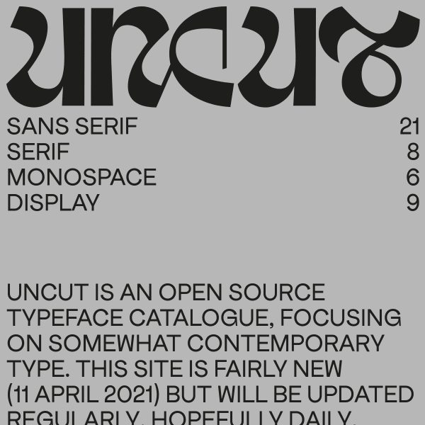
UNCUT
An unusual website. Or catalogue? Or specimen(s)? Maybe it's a foundry? I'm a little unsure, but what I do like is the bold, unconventional web design. Feels like a print publication for a contemporary gallery space. Refreshing!
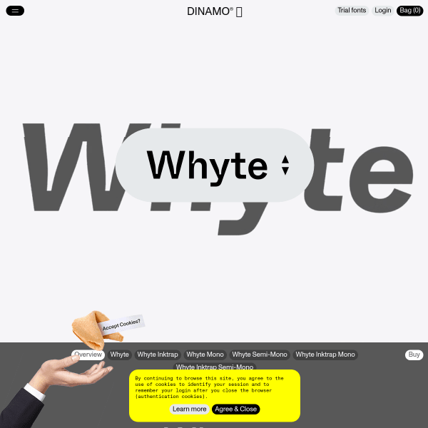
Whyte
I'm a massive fan of Dinamo's typefaces and specimens and this is no exception. Whyte is a brilliant typeface and specimen is bold and delightful, yet useful and usable. A delicate balance realised very well, here.
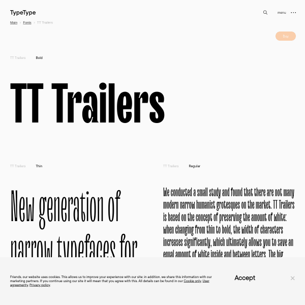
TT Trailers
The refreshing aspect of this efficient specimen for Trailers is the multi-lingual predefined sample text at different lengths. So often, language evaluation is limited to a list of supported languages. More specimens taking this approach would be welcome.

RT Alias
Green and black and nothing else. Simple design with effective designed panels. To explain the features of the font (different density of pixels) has been handled really well.
RT Rondelle
This is more 'essay as specimen' for Rondelle. Describing the motivation, design process, and results is refreshing in its depth providing the user with plenty of opportunity to review the features.
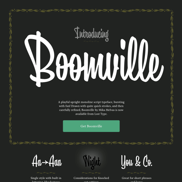
Boomville
Boomville describes itself as 'A playful upright monoline script typeface, bursting with fun!'. It's not wrong! Packed with nifty features, Boomville will certainly sit in a niche place in my font library.
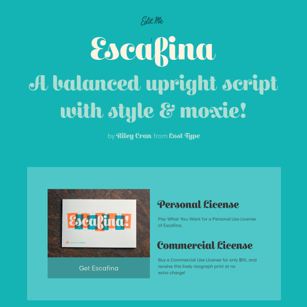
Escafina
This is a characterful specimen for Escafina. A simple, bright colour palette of the design pairs well with the playful curves of the typeface.
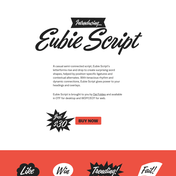
Eubie Script
These simple, single-page specimens - which just outline the features of the font - but rely on the design of the page to really sell the idea are really effective. I love the arrows surrounding the buy button.

Marvin Visions
Stranger things? Yes, sort of. But where this specimen for Marvin from Visions really shines is the use of the variable weights. There are some novel UI elements to help the user explore variable axis. I really like the square 'design space' slider. Nifty.
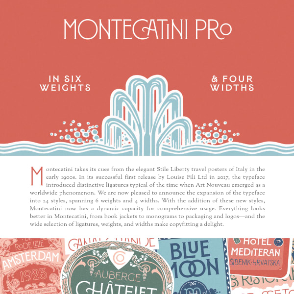
Montecatini Pro
Will you look at that CA ligature in the title! This specimen for Montecatini is very refreshing. Leading with design information and inspiration, the specimen goes on to provide type testers. The real stand-out, though, is the real selling point: the contextual and stylistic alternates.
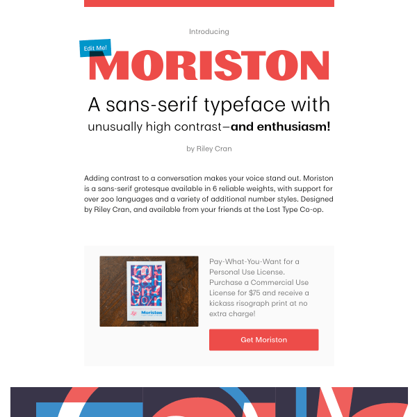
Moriston
Part article, part type specimen, and part – sort of – product landing page. The 'pay-what-you-want' personal licensing is a welcome addition, plus the various calls to action for signing up to the newsletter. These commercial additions – whilst welcome here – are sadly lacking from many specimens out there.
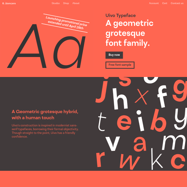
Uivo
Uivo is a geometric grotesque hybrid with a specimen full of personality. The delicate balance of marketing, usefulness, distinctive, and design is well constructed with a simple colour palette, stacked specimen components, and finishing with some really useful customer testimonials. I wish we'd see more of those.
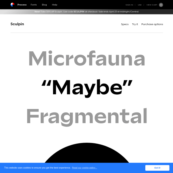
Sculpin
Process's type specimens are always so simple, engaging, and just useful enough to tempt any designer to part with their cash. Really good specimen with larger than life type.
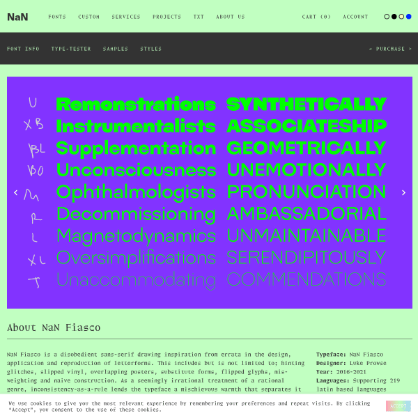
NaN Fiasco – NaN
NaN Fiasco is a disobedient sans-serif drawing inspiration from errata in the design, application and reproduction of letterforms. The specimen is a neatly stacked selection of type testers before concluding with one of the most engaging license selectors I've seen.
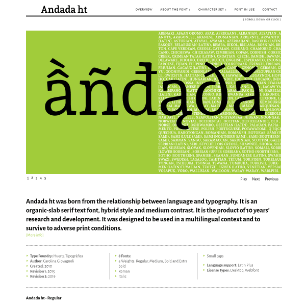
Andada
This specimen for Andana is just about as comprehensive as you can get. It's got it all: fonts in use, complete character set, open type features (together with educational content).
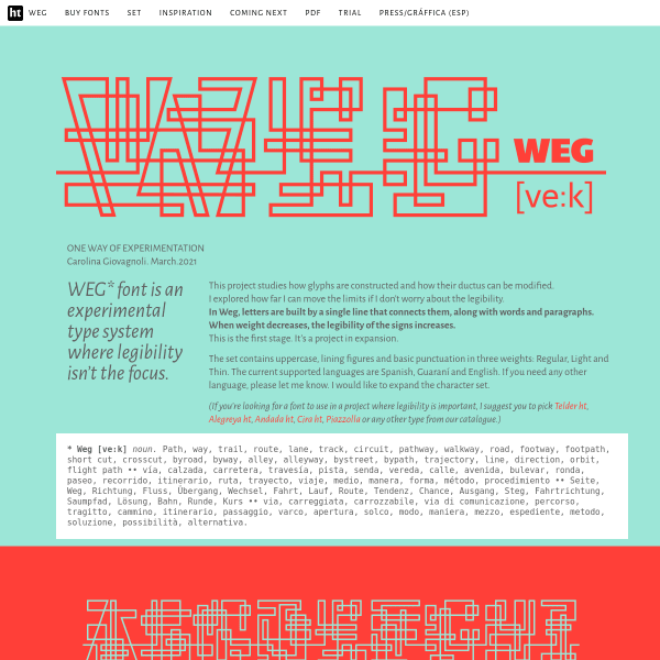
— WEG —
WEG font is an experimental type system where legibility isn't the focus. It's refreshing to see this type of experimentation is still alive and kicking in the type design industry. The specimen demonstrates potential usage which frames the experiment in the real world of application to products and services.
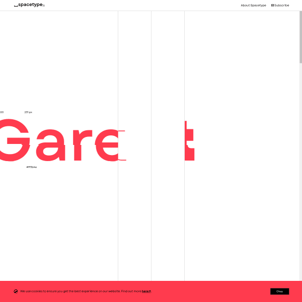
Garet
Some interesting components in the specimen for Garet. The opentype features selector is particularly useful when combined with the sample text. The inclusion of some experimental and playful components – such as the 'talk' component – is very welcome.