A curated list of digital specimens
of the highest quality. Updated daily.
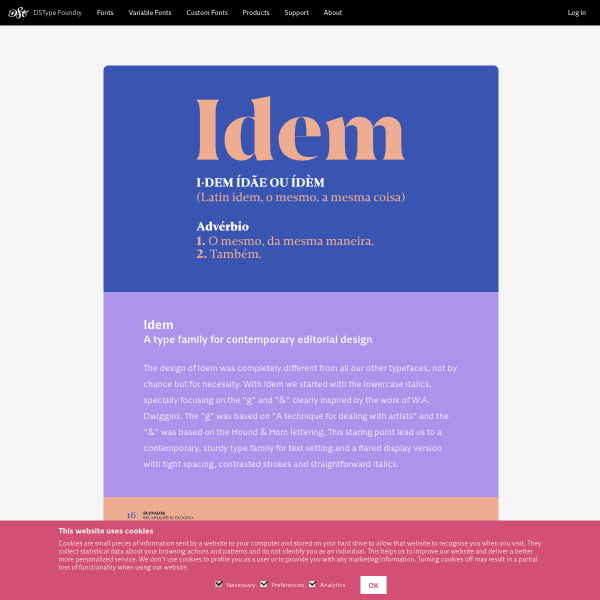
Idem & Idem Display
An interesting idea from DSType. Sort of an interstitial page before the standard catalogue specimens. This is a nice way to introduce the type in a bespoke way – that templated specimens will not allow – without the overhead of creating a mini site.
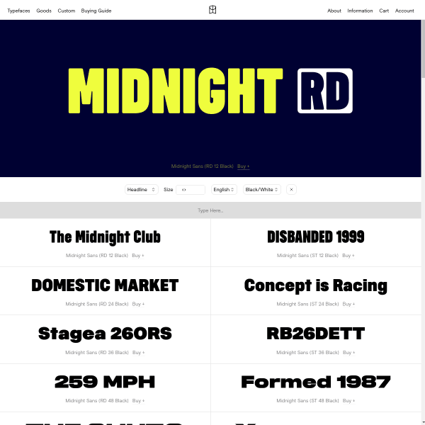
Midnight Sans
The standard catalogue specimen for Midnight Sans but punctuated by some visually interesting large panels of glyphs. Really good explanatory illustrations for opentype features.
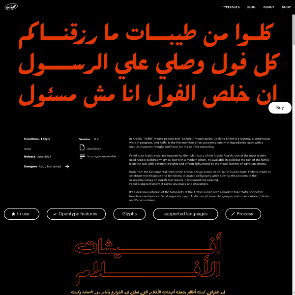
Felfel
It's refreshing to see an Arabic specimen so comprehensive. Felfel is made to celebrate the elegance and timeliness of Arabic calligraphy while solving the problem of the cascading nature of Ruq’ah that results in increased line spacing.
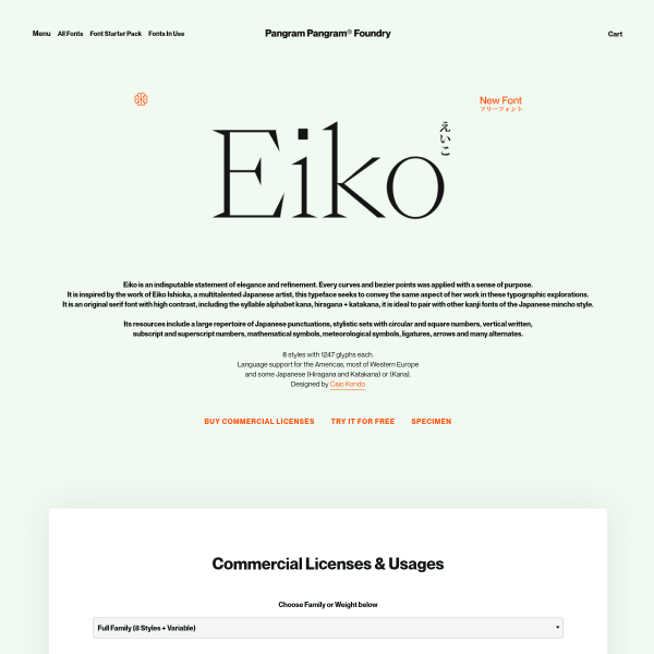
Eiko
A beautiful specimen for Eiko from Pangram Pangram. The sophisticated branding is what this specimen is all about. Multiple vertical panels of photography and refreshing graphic design followed by images of enormous glyphs and long-form specimens.
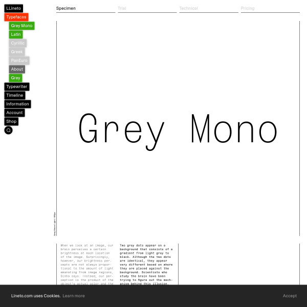
Grey Mono
Lineto's specimens are always interesting. This one for Grey Mono gets better the more you scroll with blocks of long form content in different weights and columns
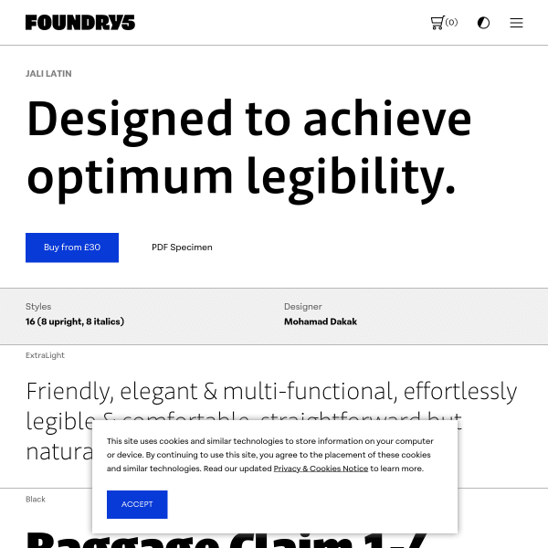
Jali Latin
What the specimen for Jali Latin lacks in character and individuality, it more than makes up in usefulness and usability. Almost everything is here to fully evaluate the typeface.

Lars
Full screen type tester. HUGE type. Unconventional UI with a few little surprises. MIssing a few details, though, to make some really informed decisions about if you want to buy it or not.
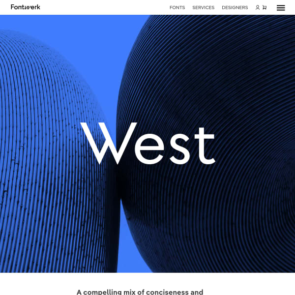
West
The specimen for Fontwerk's newest release, West, builds on their other specimens. Comprehensive, stylish, with just the right mix of functional and delightful.
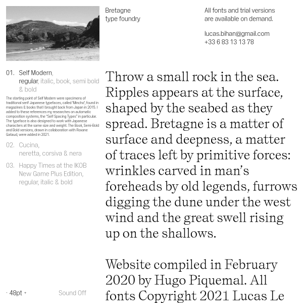
Bretagne
Want to peruse your type to the relaxing sounds of running water and acoustic guitar? A sparce specimen which is just unconventional enough to make it interesting. Good stuff.
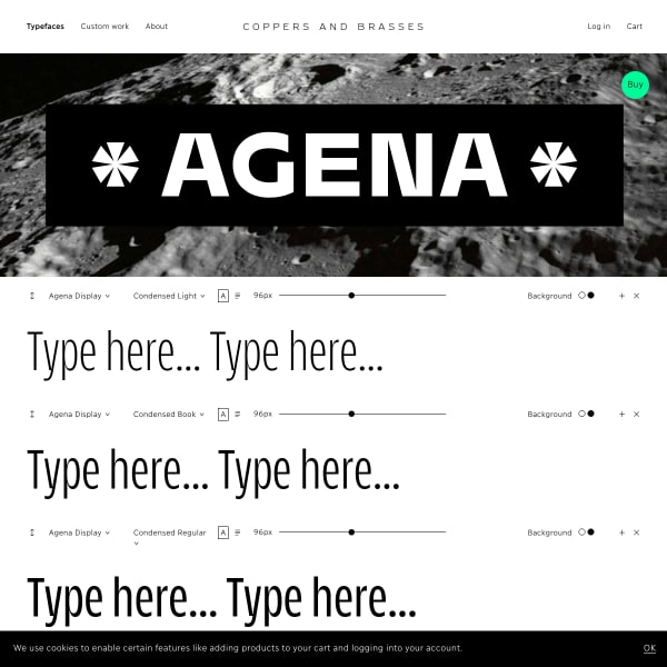
Agena Display
The hero image for this specimen for Agena Display by Copper and Brasses hints at what's to come after the stacks of type testers. Really effective branding and design showing off the features of the typeface.
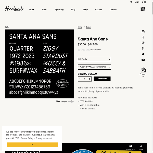
Santa Ana Sans
From a functional perspective, this specimen for Santa Ana Sans is a little unconventional and a bit lacking. But, from a marketing perspective, it's probably one of the best I've seen. Scroll down to see brightly designed tiles of features, examples, and proposed applications.
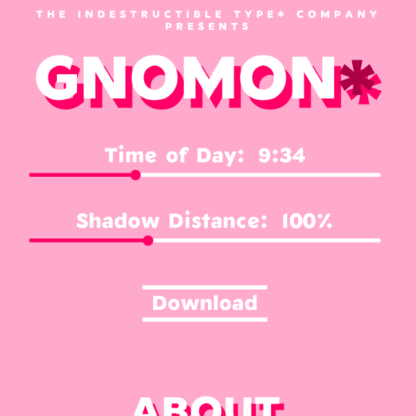
Gnomon*
An interesting specimen for free drop shadow variable font, Gnomon. The interesting aspect of this font is the unusual variable axis: 'time of day', and 'shadow distance'. This type of interface is brilliantly educational for the potential of variable fonts.
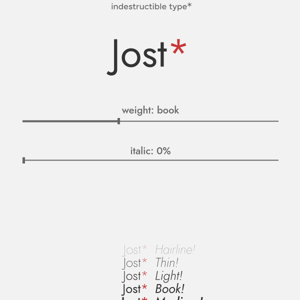
Jost*
Jost is a tribute to Futura named after Heinrich Jost. With variable axes for weight and italics, the specimen opens with just that single type tester and a revolving carousel of example images. Nicely done.

Collletttivo
I do like a challenging interface. An interface that challenges conventions. This specimen from Production Type for Tuner does just that. An animated menu makes way for panels of content on the origin, design, and a specimen of features.

Tuner
I do like a challenging interface. An interface that challenges conventions. This specimen from Production Type for Tuner does just that. An animated menu makes way for panels of content on the origin, design, and a specimen of features.
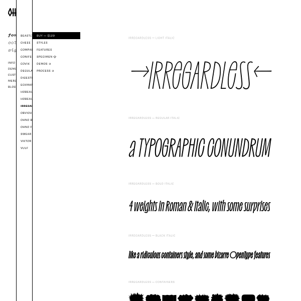
Irregardless ☠️
Oh no's specimens have been featured here before, but I had to include irregardless for its wonderful design. Checkout the 'containers' weight for some fun backgrounds to overlay text onto.
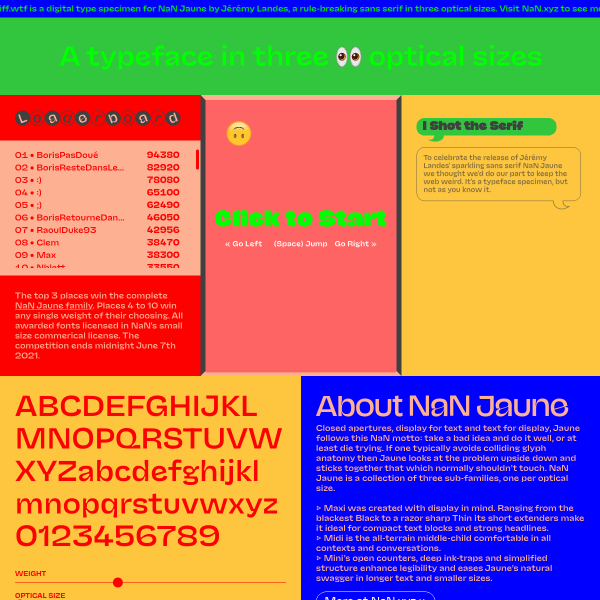
NaN Jaune — See the fonts 👀 Play the game 🎮
Where to start? 'Closed apertures, display for text and text for display, Jaune follows this NaN motto: take a bad idea and do it well, or at least die trying.' Behind the fun exterior, – I mean, a game!? With a leaderboard!' this specimen for Juane has some really great features. The optical size slider is perhaps the most useful here.
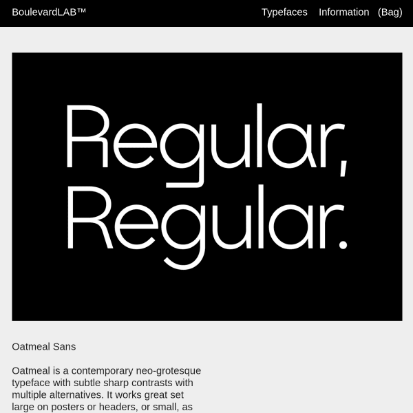
Oatmeal Sans
Yes, stacked sag graphics but a striking and bold specimen for Oatmeal Sans. Another neo-grotesque, but it has some striking alternates. The specimen only hints at those features, so whilst the graphic design is appealing, it's lacking those evaluative components for a user to explore it.