A curated list of digital specimens
of the highest quality. Updated daily.
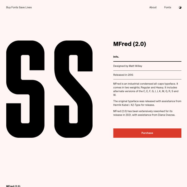
MFred
A solid looking specimen for a solid looking typeface from Buy Fonts Save Lives. Simple, designed panels in two colours precede some stacked type testers. All the basics, very well done.

News Serif
NewsSerif was built for editorial and all typographic challenges – analogue or digital. A really useful specimen. Opening with a type tester, but then screen after screen of large example designs showing News Serif in context.
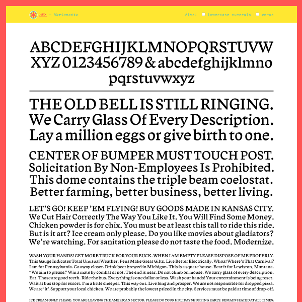
Marionette
These single sheet specimens from Nick Sherman's foundry, Hex, are very effecitve. Multiple stacked panels of justified paragraphs are reminiscent of old single sheet printer's specimens.
Clarette
Striking, but a bit perplexing, use of photography in the specimen. But the design certainly paints a picture of inspiration and possible intended usage. However, I find myself wanting to see more web fonts rather than lots of stacked svgs.
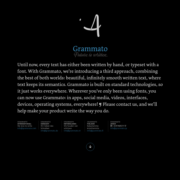
Grammato — Future is written
Not really a specimen. Not really a product page. More like a technology, or a service? Regardless, this page for Grammato is an interesting approach to displaying an interesting and complex problem being solved through type.
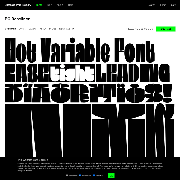
BC Baseliner
Ok, the specimen for this may be just one big svg but the design delivers on its purpose: to make you sit up and think 'hmmm, that's a cool typeface'. Sometimes that's all it needs.
Fit
FIT is a hyper-stylized series of caps designed with one thing in mind: filling up space with maximum impact. As a variable font with extremes of weights, from the super condensed, to the very, very wide, the specimen for FIT displays this perfectly. Stacked panels of text with anchor controls to stretch them. Brilliant.
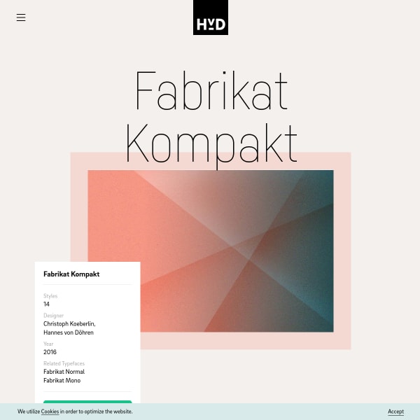
Fabrikat Kompakt
A functional specimen from HvD Fonts for Fabrikat Kompakt but notable because of the opening branding/illustration. Clean, simple, graphical lines present the typeface in simple juxtaposition. Another nice touch is the long-form feature explanation with toggles to see the difference.
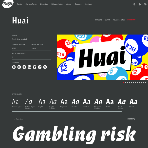
Huai
This templated specimen from Positype is notable for the glyph table. In particular, I felt the preview of the glyphs – which are shown on click – display that choice in the context of other glyphs either side and simple cap height, x-height and baseline metrics.
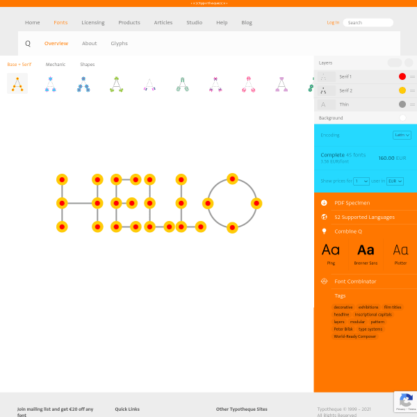
Q font family
Not sure where to start with this type tester for Q. Type tester is probably the wrong term anyway. 'Constructor' is probably more apt. The interface allows you to explore the various Lego-like build variables for the letterforms.
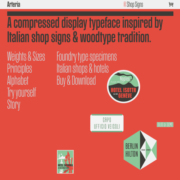
Arteria
This microsite for Arteria is full featured and sprinkled with witty, graphical moments. Subtle animations of interface elements add to the soecimen's appeal. But don't be fooled; this is a serious typeface for broad application.
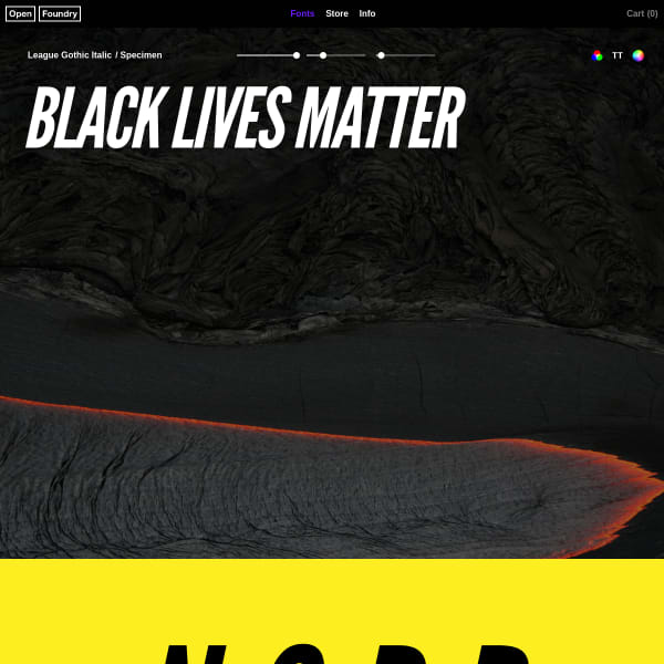
League Gothic Italic
A bold, full screen type tester opens this specimen from Open Foundry before some equally large and bold illustrations.
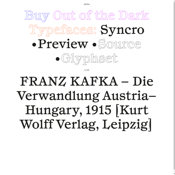
Syncro
Out of the Dark's specimens are really unusual. Pretty great, too. The specimen is notable for the very large type, and excellent design-in-use examples. The unusual interface element is the typesetter carousel, moving through different pangram, sentences and settings of the typeface.
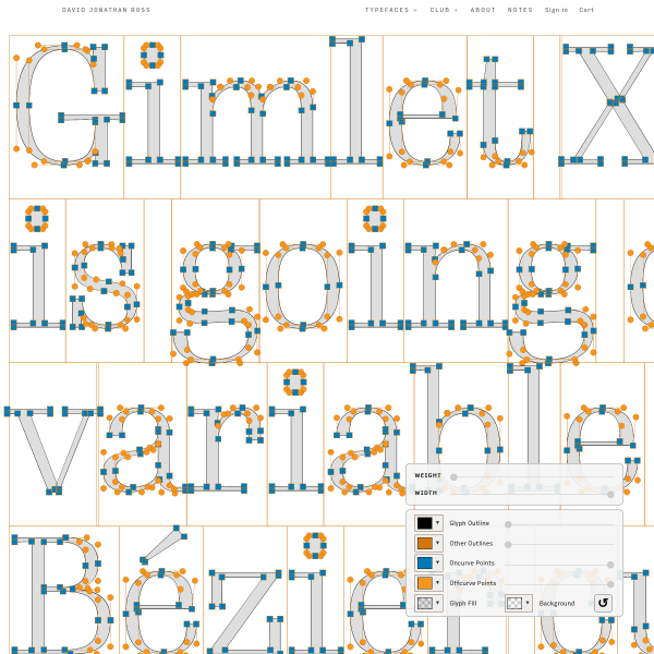
Gimlet X-Ray
An interesting specimen for Gimlet X-Ray. Huge type filling the screen from top to bottom with a few controls to customise the output from variable widths, to stroke colours, and the on-off curve points.
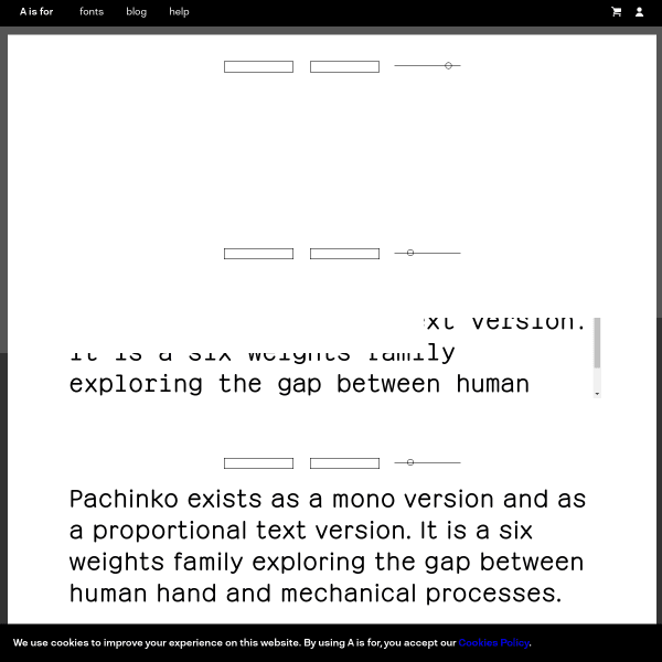
Pachinko
Panchinko is a lovely mono with a delightful italic. The specimen is a comprehensive, with some introductory type testers before moving into lengthy design notes, features and examples.
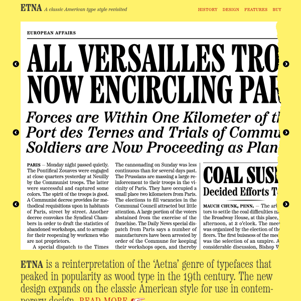
Etna
A new typeface from Mark Simonson, Etna is a reinterpretation of a genre of typefaces from the 19th century. The specimen is clever. Featuring three stacked carousels, the overall design is that of switching states of a newspaper layout.
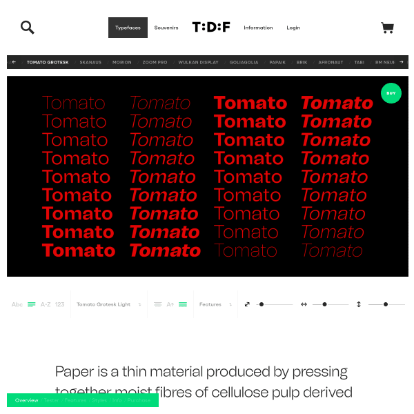
Tomato Grotesk
This specimen from The Designers Foundry for Tomato Grotesk has a really great type tester and opens with an example showing the whole design space.
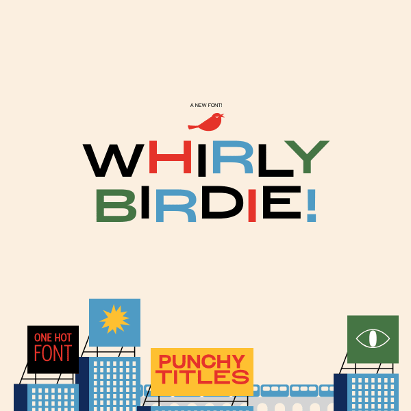
Whirly Birdie
This is a really fun specimen. Whirly Birdie is a display typeface inspired by 1950's American advertising.That aesthetic inspires some excellent illustration style with some feature rich interactive UI elements. The animated icons are particularly interesting.