A curated list of digital specimens
of the highest quality. Updated daily.
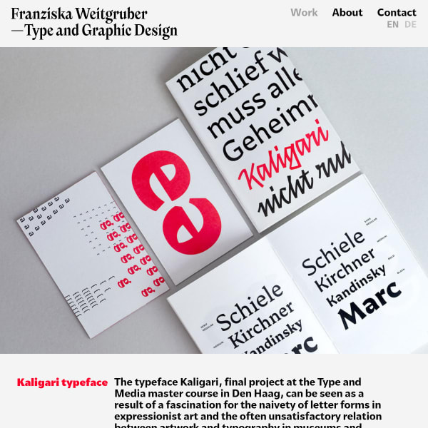
Kaligari
This specimen page for Kaligari belongs to the 'scrollable svgs' type of specimen. That said, these look great. High contrast, interesting shapes, and enough detail to properly evaluate the typeface without a type tester.
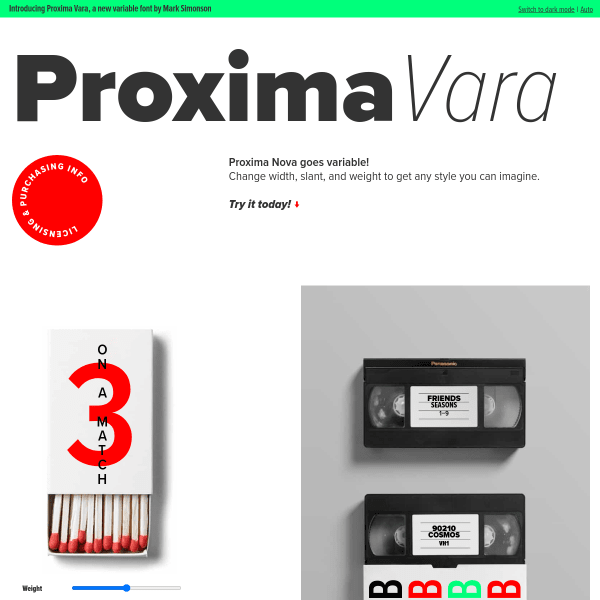
Proxima Vara
Proxima Nova goes variable! This specimen, or more like a micro site, has some interesting examples as type testers: mocked up physical artefacts with the type overlaying them and controls to change the variable axes. Seen many times in more corporate guidelines, this is a cool addition to a specimen site.
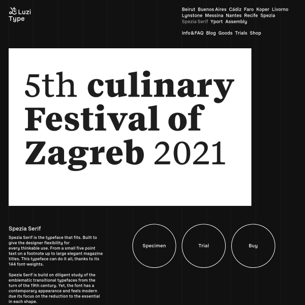
Spezia Serif Font
A useful specimen from Luzi Type for Spezia Serif. Of particular note is the little variable font tester. This is great. A simple user interface offering axis sliders and italic toggles.

Utile Narrow
A solid, functional library specimen from Kontour. Stacked type testers with variable length sample text give way to accordions of features and design story.
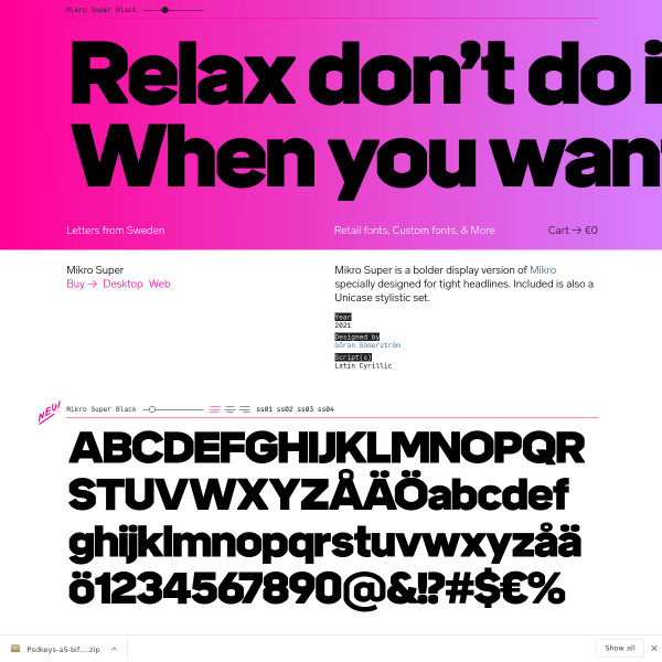
Mikro Super
A specimen exclusively made up from stacked type testers for each weight and style. The vibrant colours work well against the large, heavy glyphs.
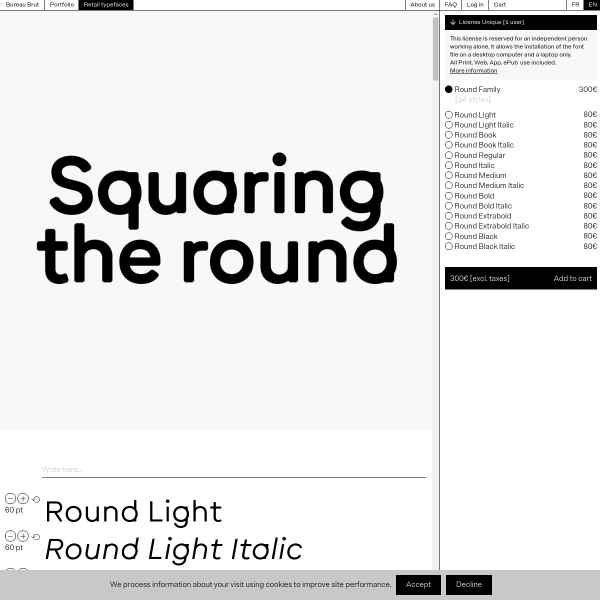
Round
Refreshing specimen for a refreshing typeface. A stark black and white layout, large glyphs, with a conventional shopping cart. What's not to like?
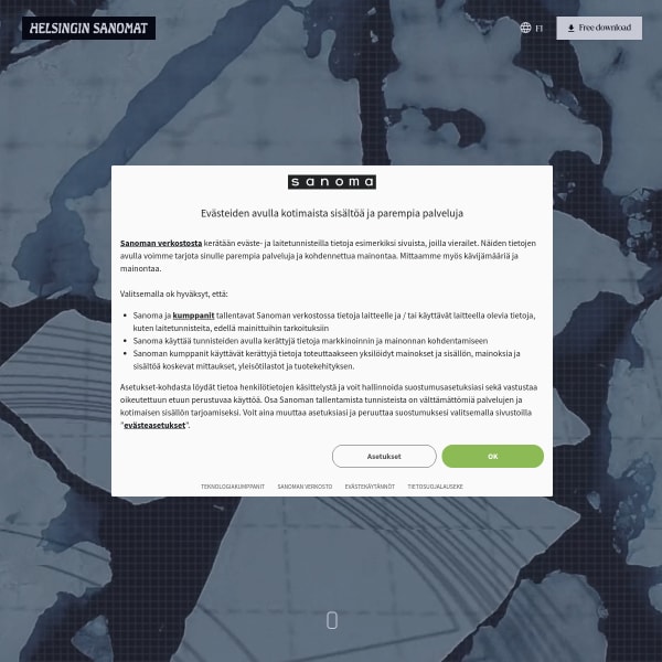
Climate crisis font | Helsingin Sanomat
An interesting specimen for an interesting idea. A font that degrades in weights that represent the degredation of the Artict sea ice from 1979 and that projected in 2050. Specimen wise, it has some nice touches.
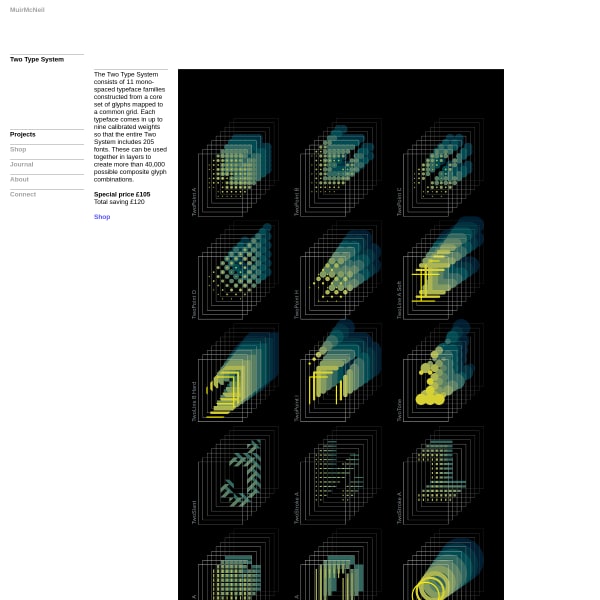
Two Type System
I miss typefaces like this. Reminds me of FUSE. The specimen for Two System doesn't quite demonstrate the possibilities, though. I'd really appreciate a type tester and some example usage.
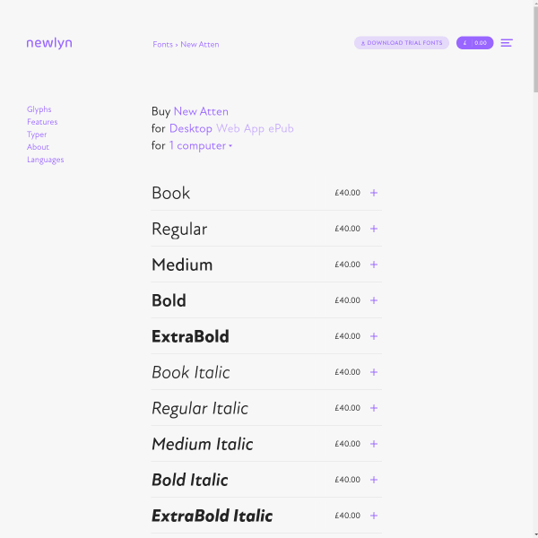
New Atten
Newlyn's templated specimens are really excellent from a usability perspective, offering all the features we know users need when evaluating a new font. But, of particular interest, is the multi-lingual content for the type tester.
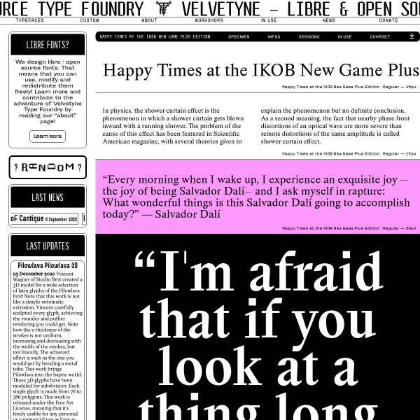
Happy Times at the IKOB New Game Plus Edition
I'm not sure where to look on this specimen for – and, yes, this is it's name – 'Happy Times at the IKOB New Game Plus Edition'. The scrolling, the pink, the competing hierarchy, the million type sizes. It shouldn't work. It really shouldn't. And yet...
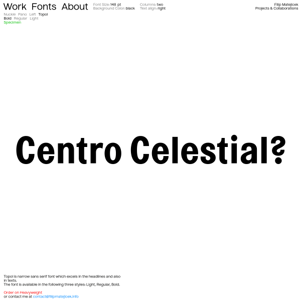
Filip Matějíček
There is something pleasingly simple about this specimen. Just a typetester with predefined pangrams at three different sizes navigable with toggles for three different weights. That's it. And, you could argue, that's all it needs to be.
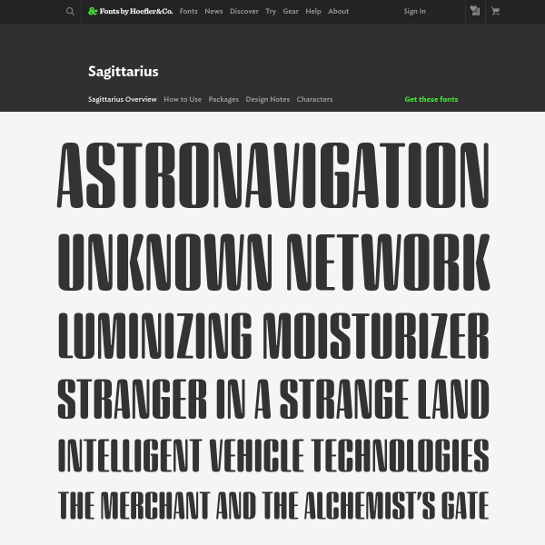
Sagittarius
This new typeface from Hoefler&Co is subtle. What really works is the copywriting coupled with the design. Simple, effective art direction whilst demonstrating the full range of design. Clever.
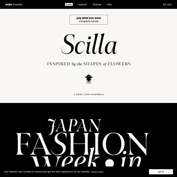
Scilla
There are many tihngs that users want that are not in this specimen: a list of glyphs, a type tester, features, language support. But, there are many specimens that don't deliver on what this one for Scilla does: beautifully typeset typographic illustrations demonstrating the beauty of the letterforms.
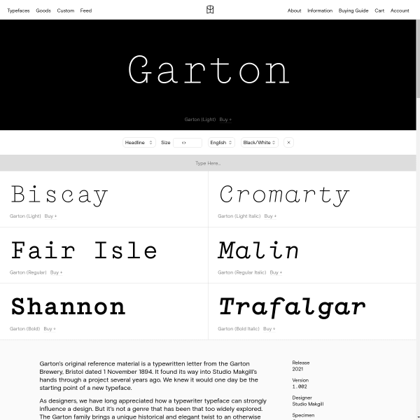
Garton
Derived from an old letter from Garton Brewery, Bristol, Garton is a typerwriter-inspired monospace from Colophon. The specimen has a couple of notable features: the animated typewriter style example, and the great copywriting.
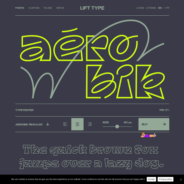
Aerobik
A fairly standard looking specimen for a quirky typeface. The sense of humour is evident throughout, though, and works really well. I can't quite understand the replacement cursor illustration – but I like it!
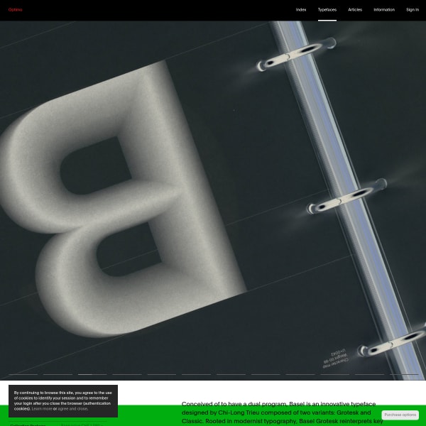
Basel
Optimo's specimens work really well and present their typefaces in a functional, yet pleasing, way. What works particularly well is the stack of preset typetesters, each with slightly different content.
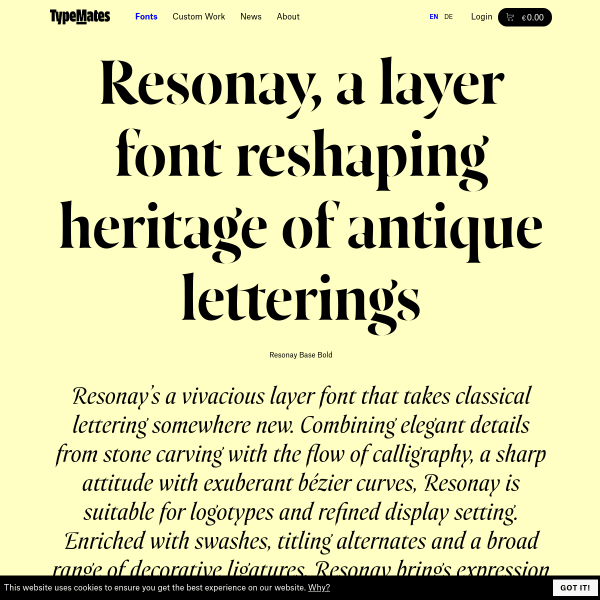
Resonay
A really detailed one-page specimen for Resonay from Typemates. I may have outlined this specimen design before, but it works really well. Particularly as you move further down the page to how the opentype features and licensing information is displayed.

Build
Another brilliant specimen from Extraset building on their previous designs featured here. The new typeface, build, has various states of design, so this specimen is about walking the user through those states whilst transporting them with a Bauhaus style of content and photography. Really effective specimen, both functionally and aesthetically.,