A curated list of digital specimens
of the highest quality. Updated daily.
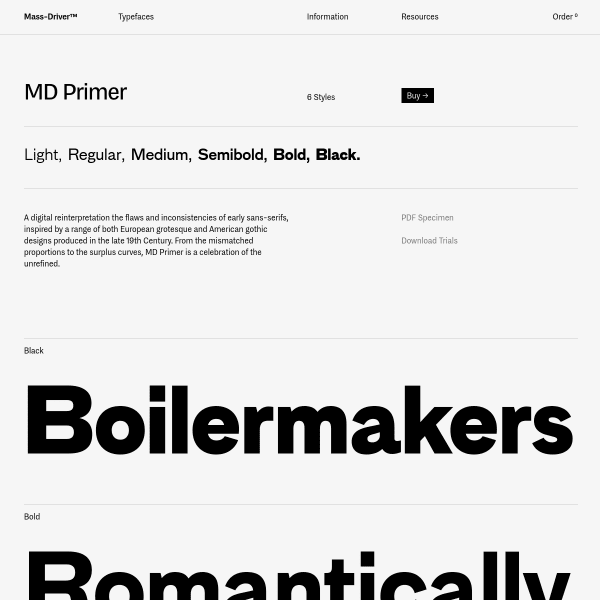
MD Primer
MD Primer is a digital reinterpretation the flaws and inconsistencies of early sans-serifs. Big, bold, stacked type testers are the order of the day. You may notice that the type tester words are all of a full screen width. A simple, subtle but sophisticated addition to the specimen.
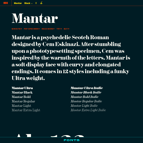
Mantar
A simple one-pager for Mantar. The accompanying mini site is an immersive story-based experience. Be sure to read the design notes for some detail on the design brief and exploratory illustrations.
NON Section
I'm a big fan of experimental typefaces. 'NON is a series of limited edition type systems that utilise the basic latin and numerical character sets to create abstract forms, rhythms and fields from otherwise ordinary text.'. In some ways, however, it would be nice if the specimen expanded on this brief.
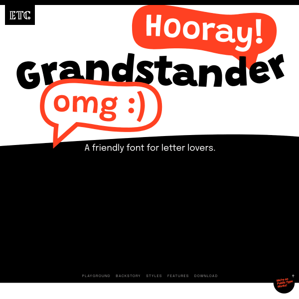
Grandstander
A friendly font for letter lovers. A really great, functional specimen for Grandstander from ETC. Added benefit? It's available on Google Fonts for you to use now.
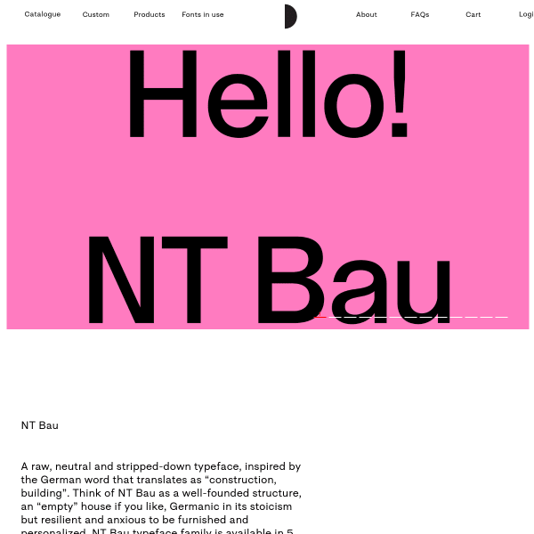
Bau
This specimen from Nodo Type Foundry is notable for it's long-form text type tester. It provides options for the user not seen in many specimens: multiple columns, multi-language, and different default character sets.
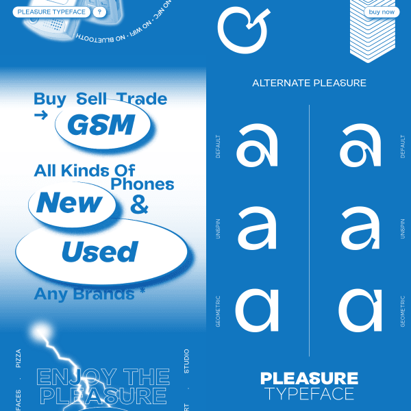
Pleasure
I'm not going to say too much about this one. Expect conventions to be broken, and preconceptions challenged.
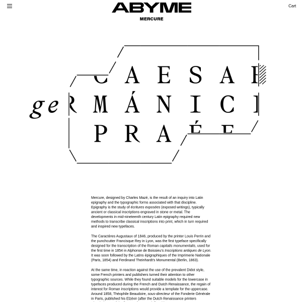
Mercure
Mercure, designed by Charles Mazé, is the result of an inquiry into Latin epigraphy and the typographic forms associated with that discipline. A touch of the experimental mixed with the conventional of digital type specimens. Yes please.
Lausanne
The graphic design of this specimen walks the line between two aesthetics - digital and print - but doesn't quite deliver on either. Which is a shame. With the introduction of a type tester, some clearer description of features and styles, it would be much improved.
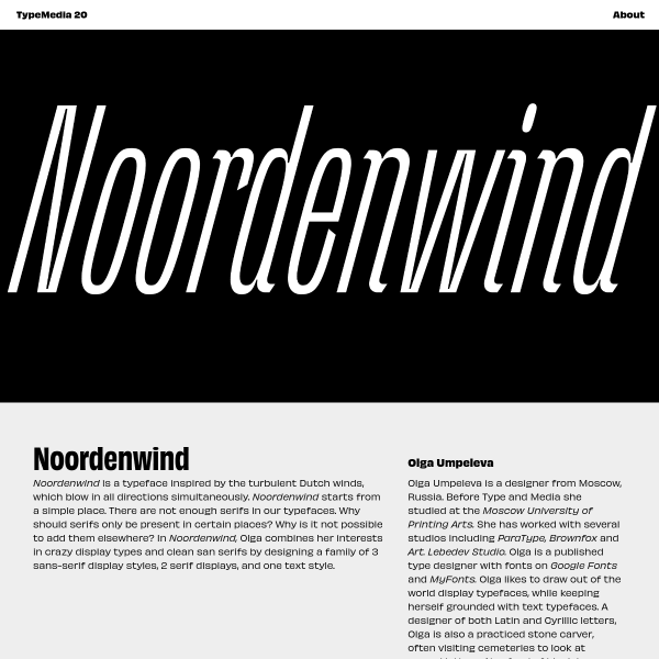
Noordenwind
Noordenwind is a typeface inspired by the turbulent Dutch winds. The really interesting part of this project is the different weights for each month, each with its own levell of stress and distortion matching the dutch weather.
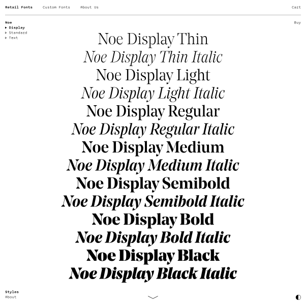
Noe Display
A couple of things to admire here but not the things you'd expect. The in-specimen navigation is subtle, supportive, and stays out of the way. The 'buy' buttons next to each type tester. The simple introduction of a centred waterfall.
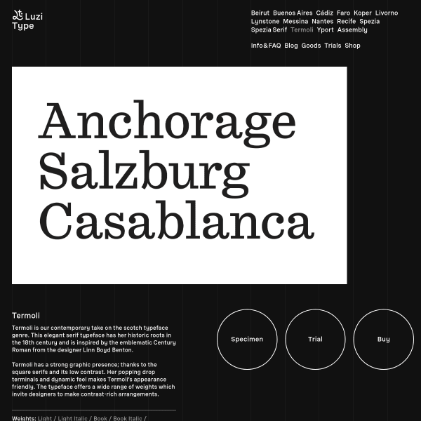
Termoli Font
Termoli is a contemporary take on the scotch typeface genre. The specimen is an interesting assortment of white on black content elements and type testers.
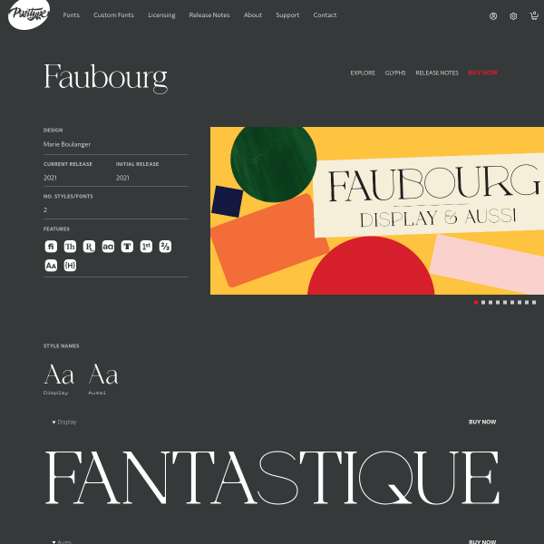
Faubourg
This specimen for Faubourg from Positype follows the increasing trend of 'everything is a type tester' but only having the controls available when the user is interacting with that content which makes things look nicely decluttered the rest of the time. Nice addition of the accompanying glyphs on the glyph preview.

GT Maru
Well, Grilli Type do it again. A wonderful, thoughtful micro site for the new font GT Maru. Crammed full of engaging illustrations and animations whilst not distracting from key selling points and features of the new font. It's just so good.
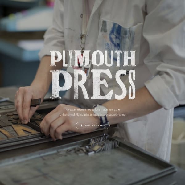
PlymouthPress
More like a product page than a type specimen, but it's an interesting project. I really like the randomisation feature. I just wish there was an outlined webfont version!
Graf
A really effective, lightweight, and simple specimen for Graf. The tiles of different colour settings work really well as a mosaic.
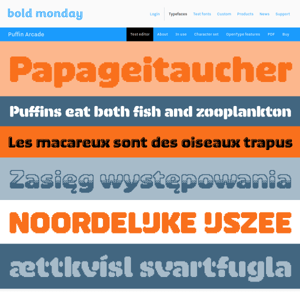
Puffin Arcade
Want some throwback arcade chrome pixel fonts? Puffin Arcade is brilliant. Reminds me of Bubble Bobble from about 1988 on the Amiga. It's aching for a bespoke mini site or specimen rather than being presented as part of the wider Bold Monday catalogue.
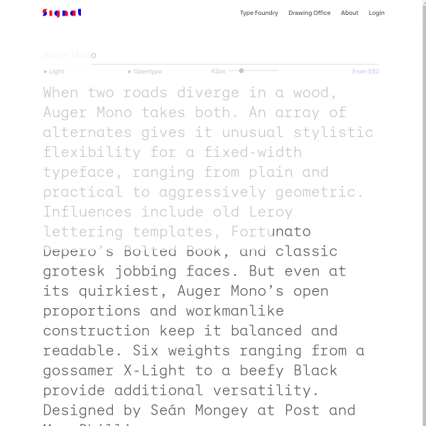
Auger Mono
There is something about this specimen that reminds me of the printed specimens from Emigre in the mid 90's. Maybe it's the colour combinations, or the simple panels of large glyphs.

Fiction
As a specimen to evaluate weights at different sizes, different settings, many don't come as good as this one. In-depth and detailed, however it still lacks some contextual designs to really demonstrate the font in action.