A curated list of digital specimens
of the highest quality. Updated daily.
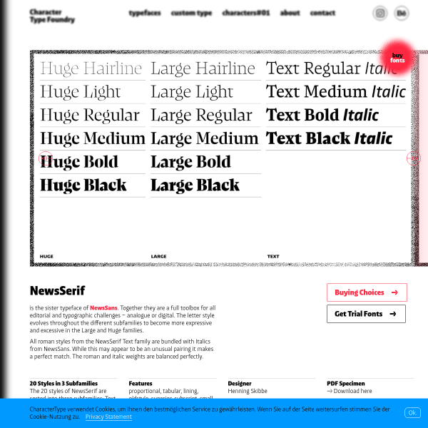
NewsSerif
The companion to NewsSans, NewsSerif's specimen is a simple presentation of type testers opening with a carousel of example designs. An often neglected, but in this case well done, is the buying options. Buying fonts can be confusing but this simple design makes things easy.
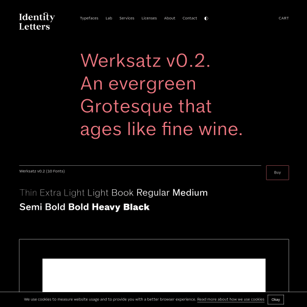
Werksatz v0.2
Sometimes a simple headline, a carousel showing some examples of usage, and a bunch of minimal type testers is just enough for a specimen. This example from Identity Letters for Werksatz shows what can be done with just a few simple elements.
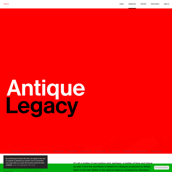
Antique Legacy
A simple and efficient specimen for Antique Legacy from Optimo. Notable are the stacked type testers with different lengths of copy, but also the ability to change the sample text to a number of defaults.
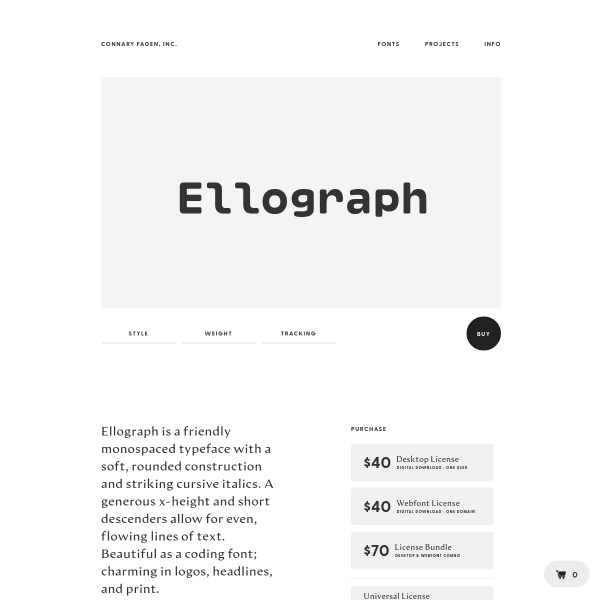
Ellograph
An efficient specimen for Ellograph from Connary Fagen. Opening with an unusual type tester followed by some fabulous example usage designs. Shown full screen, these really do show off the font's features well. The glyph table below is a little small in comparison, however, and could use a large scale preview.
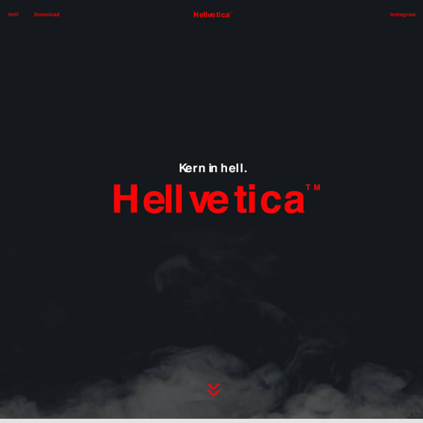
Hellvetica
Want to troll a designer? Just mess with the kerning. Although, maybe not as overtly as this wonderfully useless typeface. Playful, tongue-in-cheek, and why the hell not? Brilliant.
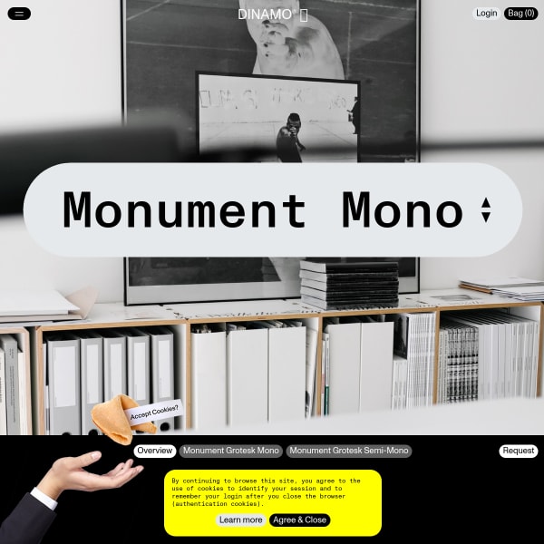
Monument Mono
Dínamos specimens continue to surprise and delight and this one for Monument Mono is no exception. Playful, oversized user interface elements coupled with some introductory photography. Don't be fooled, though, this is a seriously usable specimen with stacked type testers and lots of detailed information.
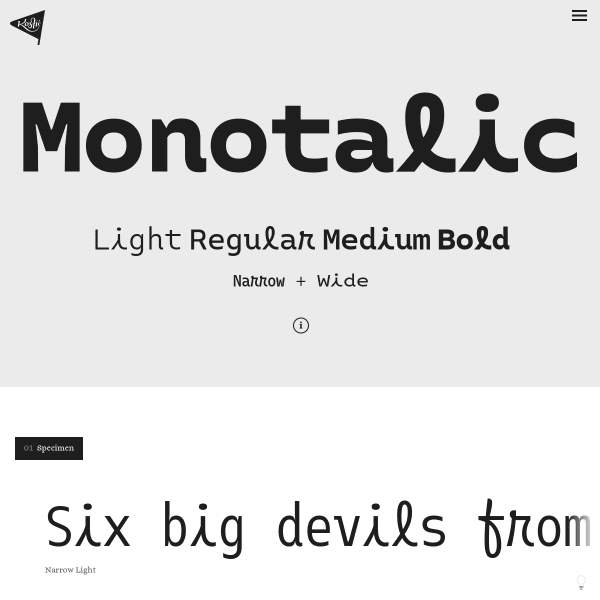
Monotalic
A quirky typeface with a conventional specimen layout. That said, I was drawn to the scale of the type on show here. Just huge glyphs in the waterfall show off the design to its full potential.
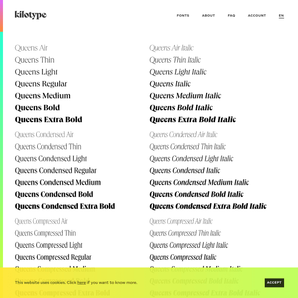
Queens
Stacked type testers are the order of the day for this specimen for Queens. Shown full width, with minimal controls, the type testers give way to a few features at the bottom of the specimen page. All that aside, the notable design feature of this specimen is the UI for adding different weights to the cart. Clever.
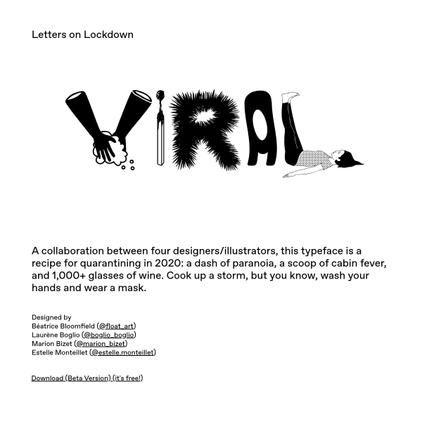
VIRAL
Excellent copywriting for this fabulous display font. 'A collaboration between four designers/illustrators, this typeface is a recipe for quarantining in 2020: a dash of paranoia, a scoop of cabin fever, and 1,000+ glasses of wine.' The result has an Ed Fella flavour to it.
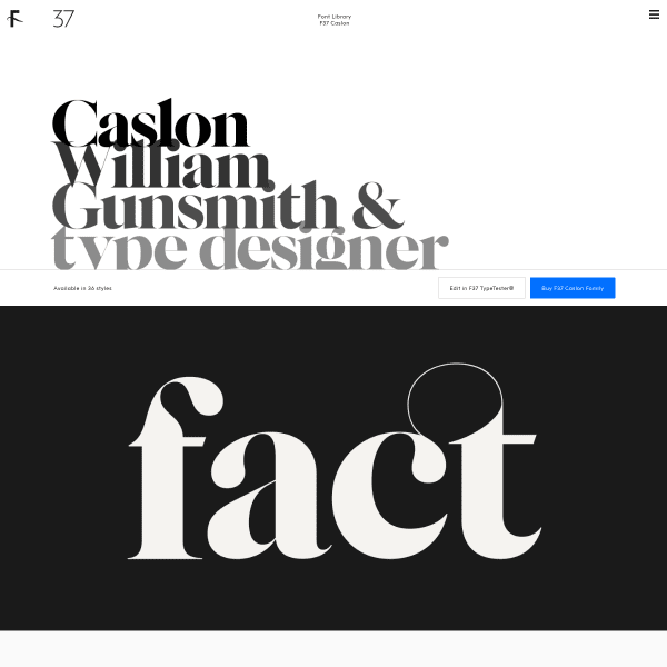
F37 Caslon
This specimen for F37 Caslon from foundry f37 strikes the right balance between form and function. Opening with extremely large type designed to show of the design features of the glyphs, the specimen is one of only a handful available that demonstrate the type working in comparative paragraph settings.
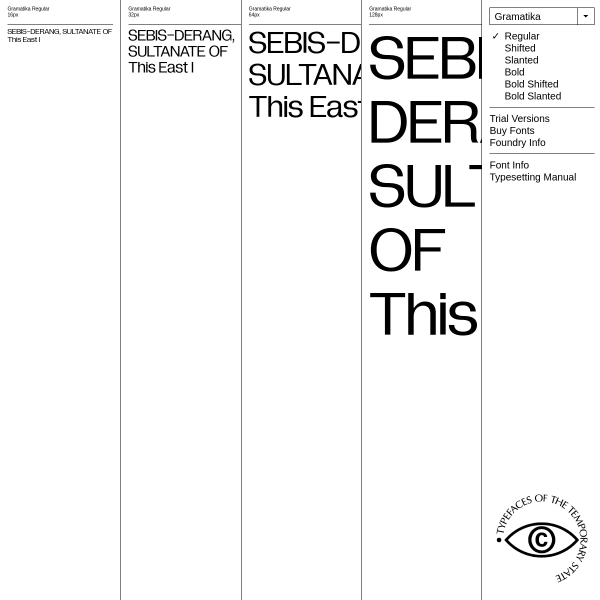
Gramatika
A novel design for the specimen for Gramatika, a custom typeface project for V-A-C Foundation. A notable, fantastic addition is the typesetting guide. Unfortunately, it's a PDF. it would be great to turn that content into a valuable microsite, I'm sure.
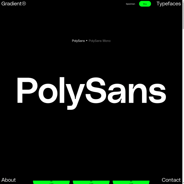
PolySans
Big. Simple. Straight to the point. The defining characteristic of this specimen is scale. It fills the available screen space from one corner to the other.
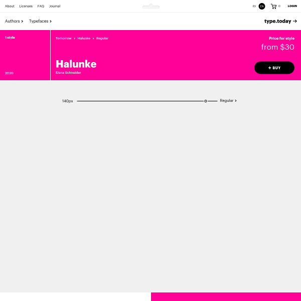
Halunke Regular
Type Today's Tomorrow (!) specimens are great. Thoughtfully designed, leading with a type tester with a couple of controls, and just enough 'type in use' graphics to support the design rationale for the typeface. This specimen for Halunke Regular works well in this format.
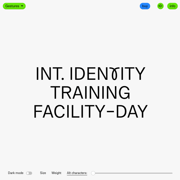
Gestures
A single typetester punctuated with animations, audio (which was a surprise), and exciting – and unextected – punctuations leading to a a specimen you experience rather than use.
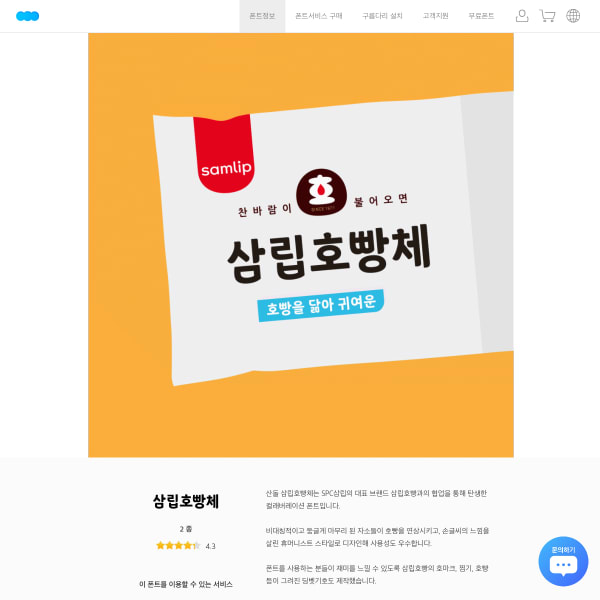
산돌구름
What struck me about this simple specimen – even though I can't read it – were the informative illustrations, and introductory animation style.
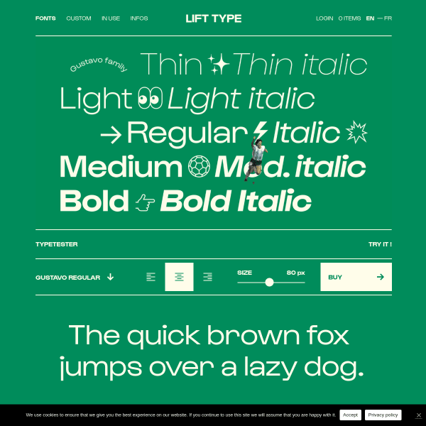
Lift Type
A good looking specimen featured stacked SVG graphic panels with an intermingled type tester. On the face of it, serious stuff, until you notice the running Maradona figure...
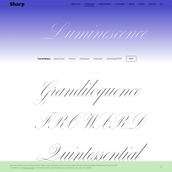
Carta Nueva
The really interesting part of this specimen is at the end of the page. Long-form descriptions of the font features and design details underpin a really useful format.
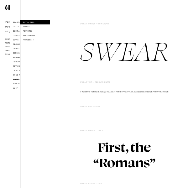
Swear
I really like this specimen format from OH no Type Company. As we increasingly see in digital specimens, there are vertically stacked type testers each set in default weights with varying content lengths. A subtle combination of old and new.