A curated list of digital specimens
of the highest quality. Updated daily.
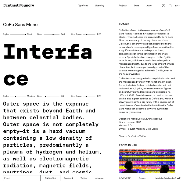
Cofo Sans Mono
Contrast Foundry's specimens walk that fine line between useful and unconventional really well. The focussing on each side of the specimen is particularly interesting.
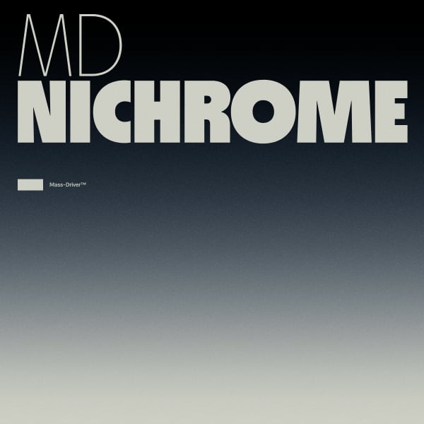
MD Nichrome
The microsite for Nichrome is so well done. From the branding and accompanying video, to the stacked example phrases. The opentype feature layout is also a useful addition to clearly see the built-in features such as alternates and case-sensitive forms.
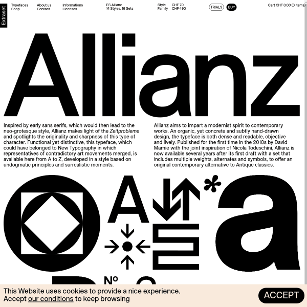
ES Allianz
This is a clever layout from Extraset for their latest release, Allianz. Using borderless tiled animations and static graphics interesting combinations of glyphs and features the specimen builds into a tapestry. This simple but effective technique adds an added dimention to evaluating the typeface.

Bau Mono
The designs for the carousel that opens the specimen for Bau Mono are refreshing, but hidden away. The specimen would be really improved by having them as stacked panels. The typetesters are good, providing multi-lingual defaults and options for different columns.

Rustica
Efficient and elegance is the name of the game with this specimen from TipoType. Simple, stacked typetesters, one or two 'in context' images. And then compiling all of the features, glyphs, and language support into a useful tabbed component at the bottom of ther specimen.
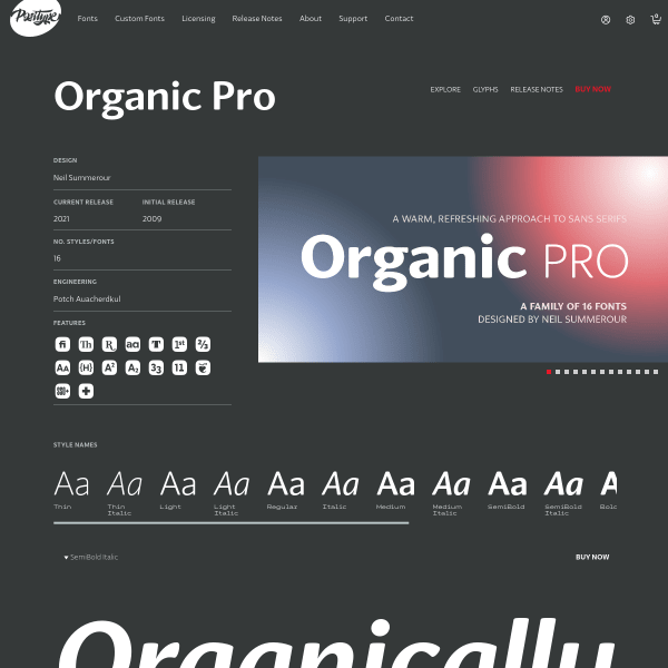
Organic Pro
A fairly standard specimen from Positype, but it's the glyph table that is of interest. Each preview of a glyph is shown with two other characters either side and is overlaid with lines for cap height, x-height and baseline. This is very useful to see glyphs in context with others.
Avantt
This specimen for Avantt reeks of modernist design values combined with a wilful disregard for digital type specimen conventions. And it's brilliant as a result. Refreshing content. Interesting branding.
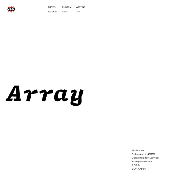
Array
Array is a characterful mono typeface. A response to the design brief of 'can a typeface work for coding and regular text?'. Array is a combination of the two. The specimen neatly demonstrates the font and its capabilities, but is lacking showing it in an actual coding environment.
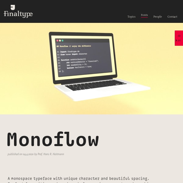
Monoflow
Monoflow is a coding font. The website goes into great detail as to what that means from a design perspective, carefully explaining the impact on readability in a coding environment.
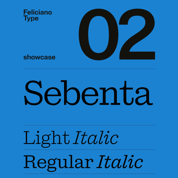
Sebenta
Great looking monochrome colour palette for this striking specimen for Sebenta. Big, full width type displayed in stacked layouts of components with text long and short, large and small.
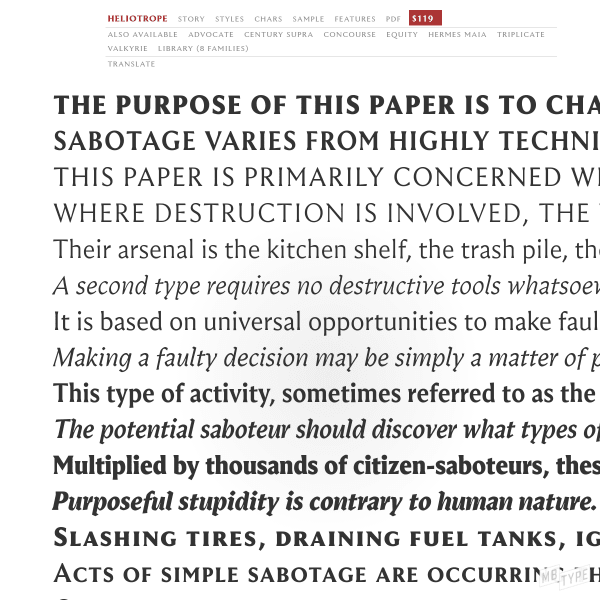
Heliotrope
A catalogue specimen, but a sensitive reimagining of a printed specimen to digial form. More traditional in its approach, the specimen leaves no stone unturned; it is comprehensive. A full glyph preview, download the printed PDF, and an accompanying long-form article on the history of the design.
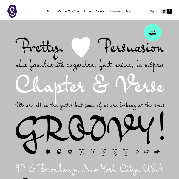
Goskar
Handwriting fonts can be difficult to produce good specimens for. Especially those which have inbuilt features such as auto-ligatures and interesting alternates to mimic the inconsistency and quirks of human-made lettering. This specimen for Goskar does a good job at highlighting those features on a backdrop of a useful specimen.