A curated list of digital specimens
of the highest quality. Updated daily.
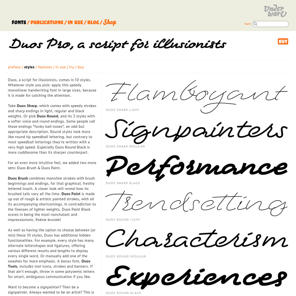
Duo Pro
A script with three different styles, the specimen for Duo Pro aims to show these off in simple two tone illustrations as much as possible. Organised as a micro site, rather than the conventional single page, the specimen nicely demonstrates the features of the font.
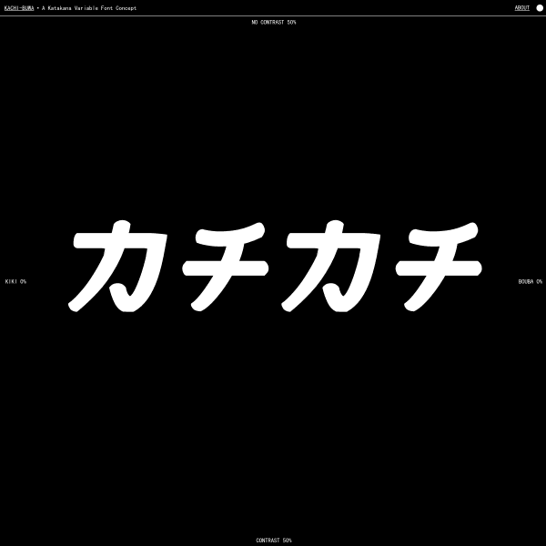
Kachi Buwa
This is an interesting specimen. A single type tester demonstrating a variable Japanese font on two axis: contrast, and between 'kiki' and 'bouba'. All visualised through some appropriate mouse-jacking.
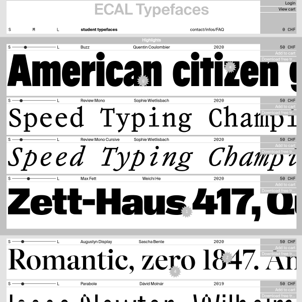
ECAL Typefaces
A single page of stacked type testers with tiny controls. The standout feature of these are the tiny rosettes positioned over typeface features. For example, an 'a' rosette toggles between an alternate lower case a. Nifty.
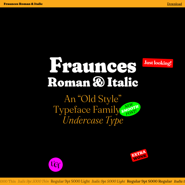
Fraunces
The opening screen for this specimen for Fraunes is loads of fun (I'll leave it to you to experiment and find out for yourself!). Many stacked components outlining and demonstrating features sit either side of a long form article outlingin the design. One stand out component is the comparison between optical sizing and without. Very smart.
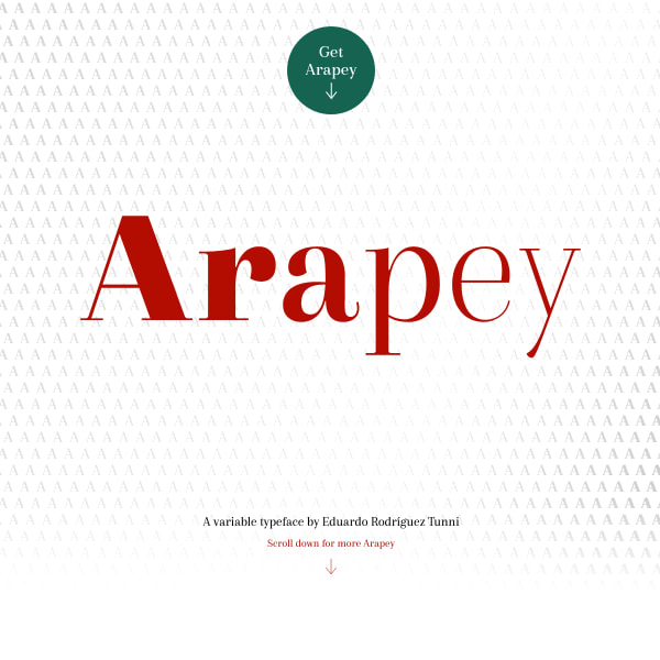
Arapey
A feature-rich specimen for Arapey comprised of numerous horizontally stacked interactive elements all wrapped around a simple, two tone design.
FORGE
An unusual specimen that dispenses with many conventions in favour of expression and experimentation. Illustrative and creative, it includes a really simple type tester and glyph list, but it's the framing illustrations that challenge the viewer.
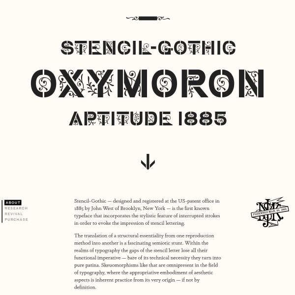
Stencil Gothic
A specimen that reads as a research project. The linear, scrolling story is punctuated by typographic illustrations and research photographs.
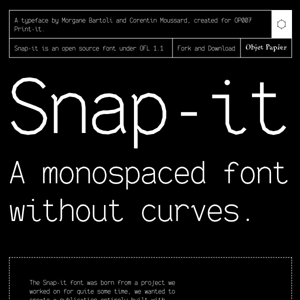
Snap-it
Snap it is a monospaced font without the curves. Because... why not? But underneath this quirky exterior is a typeface with considered and well-constructed form. The specimen in particular goes a long way in explaining the features.
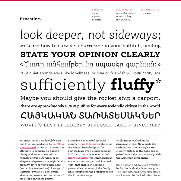
FF Ernestine
This specimen for FF Ernestine is a presented as a microsite in a traditional way. A homepage with hero image, introductory text, a page with all the glyphs. Whilst this could work very well for print, more is needed for digital. Maybe showing its age?
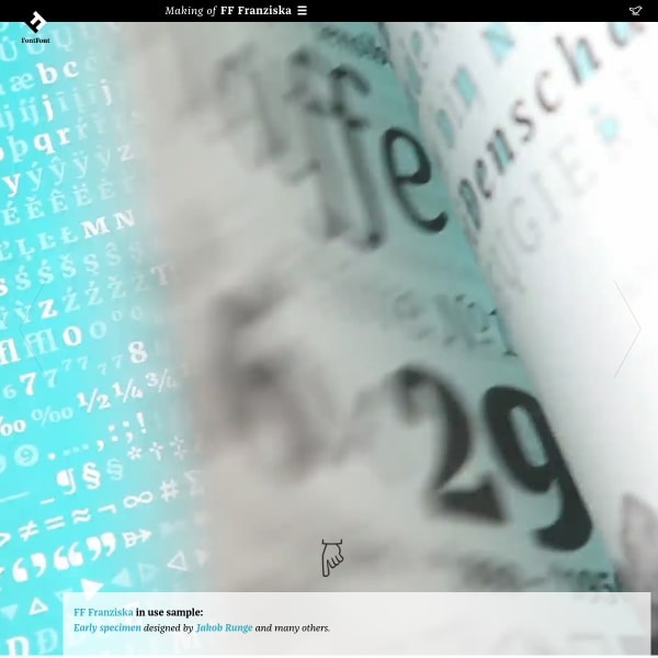
FF Franziska
A really unusual specimen. Presented as a long-form article documenting the design features, history, and inspiration for the creation of Franziska.
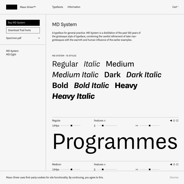
MD System
A simple but effective specimen for MD System from Mass Driver. Unusually, no type tester. Instead, a prominent download button for trial fonts and a PDF specimen.
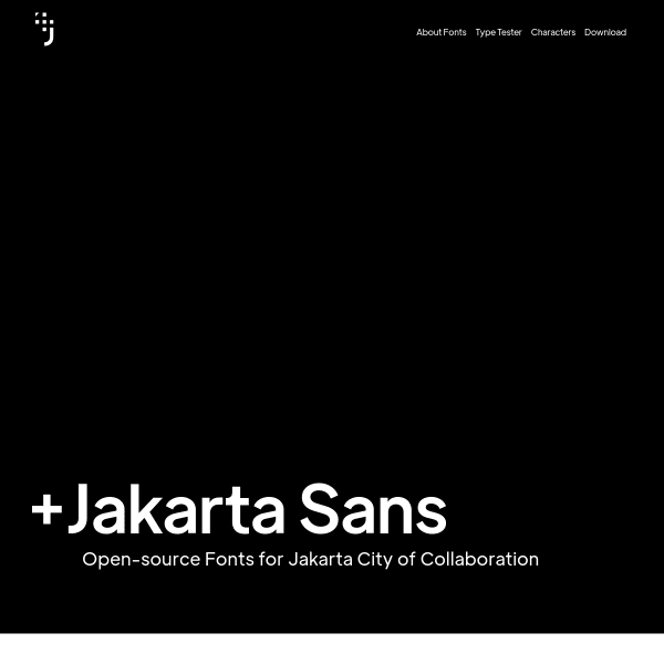
Jakarta Sans
A simple specimen for a workhorse of a typeface. Jakarta Sans, an Open-source font for Jakarta city has some really interesting alternates that, when combined, take Jakarta Sans in a really interesting direction.