A curated list of digital specimens
of the highest quality. Updated daily.
Edit Serif Pro
Despite Edit Serif being a lovely looking typeface, this is another specimen that is, unfortunately, pictures of type rather than web fonts.
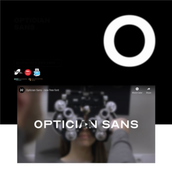
Optician Sans
A free font based on the eye charts throughout the world used for vision testing. An interesting idea that continues the design lineage of Dutch ophthalmologist Herman Snellen, in 1862, and Louise Sloan in 1959.
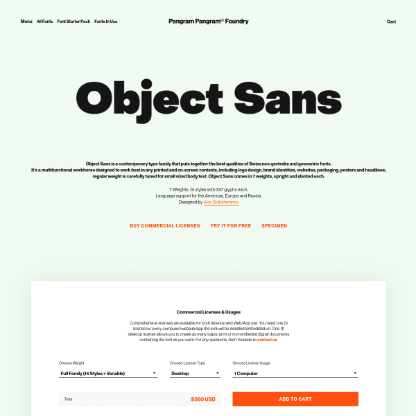
Object Sans
PangramPangram's specimens follow a similar templated approach but with bespoke, stacked typographic illustrations. Object Sans doesn't disappoint with striking illustrations displaying a range of weights in a simple two-colour palette.
Gravostyle
A catalogue style specimen but with interesting modular typetesters. The notable difference between these and most others is the option to choose different types of preset text: from headings, and alphabets, to paragraphs and more.
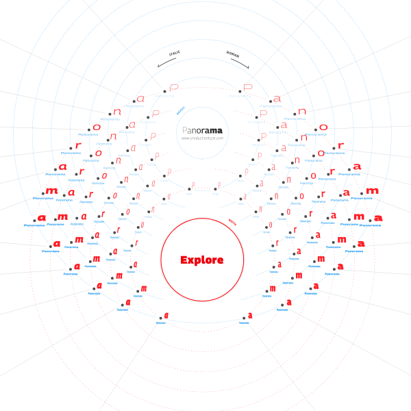
Panorama
An exploratory interface allows the user to navigate the design space. An imaginative use of navigational devices and layout.
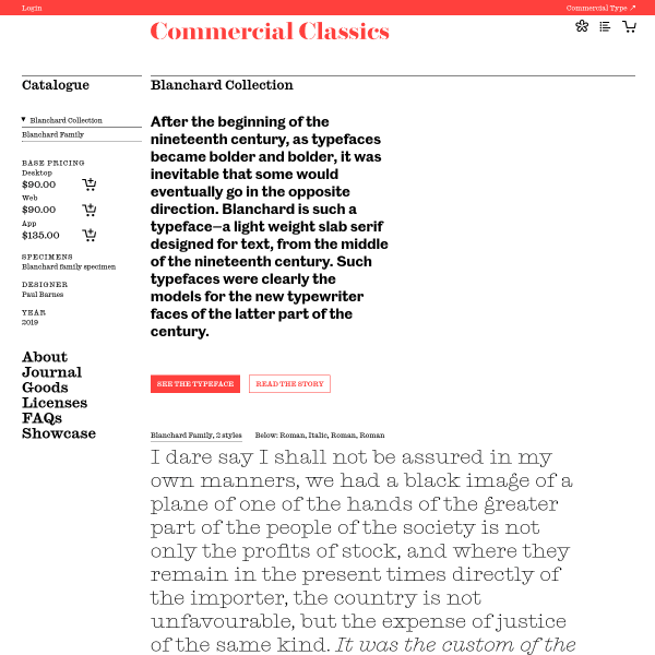
Blanchard Collection
A specimen disarming in its simplicity. Just a paragraph of content simply set in the two available styles sit below a brief introduction. The digital specimen is bolstered by a comprehensive PDF, and a lengthy story of the origins, design, and development of the typeface.
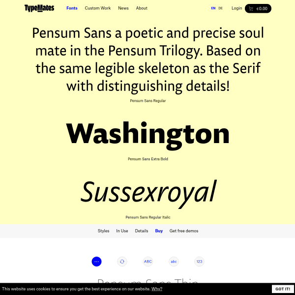
Pensum Sans
A fairly standard looking specimen, but it's enriched with content of its creation written by the designer.
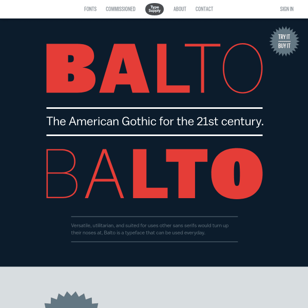
Balto
A visually interesting specimen that would be made so much better by being constructed with web fonts instead of rendered images. That aside, it does a good job of displaying the typeface's best features in an easily digestable format.
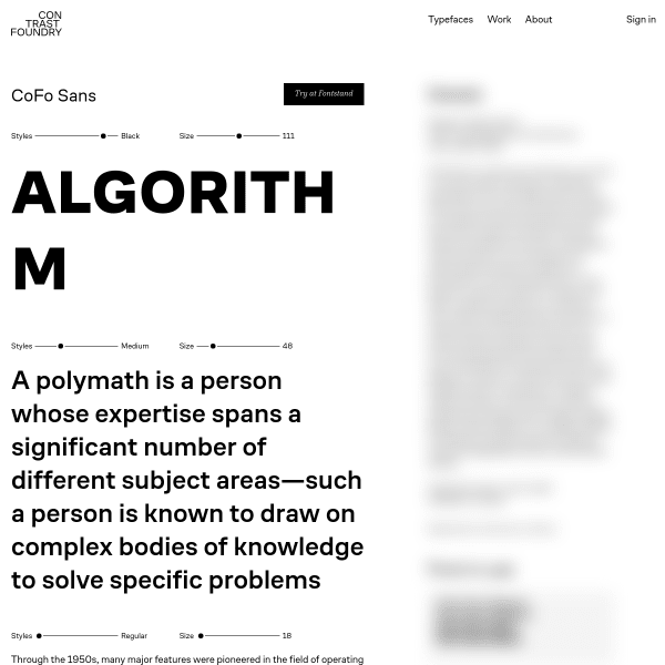
CoFo Sans
This is a smart looking specimen. Minimal in features, the design is horizontally split: typical specimen features on the left such as type testers, character set etc. But the right is blurred out. Until it is clicked, which reveals editorial about the typeface and designer, in addition to some fonts in use content.
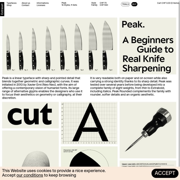
Peak
Another Extraset specimen with a vintage feel about it. Leading with illustrations to explain the font's features, the specimen moves on to a comprehensive and well-designed type tester. And there's that buy button again!
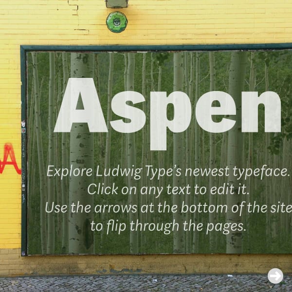
Aspen
This is a fun specimen. Luwig Type's Aspen typeface can be manipulated in mocked up contexts – from billboards and shop fronts, to books and magazines.
Playtype
Big. Type. but effective. The overlaid, layered, information panel is a useful and effective addition to the layout giving the appearence the user is scrolling an actual page of a specimen, rather than a web page. Subtle depth adding a subtle perception.