A curated list of digital specimens
of the highest quality. Updated daily.
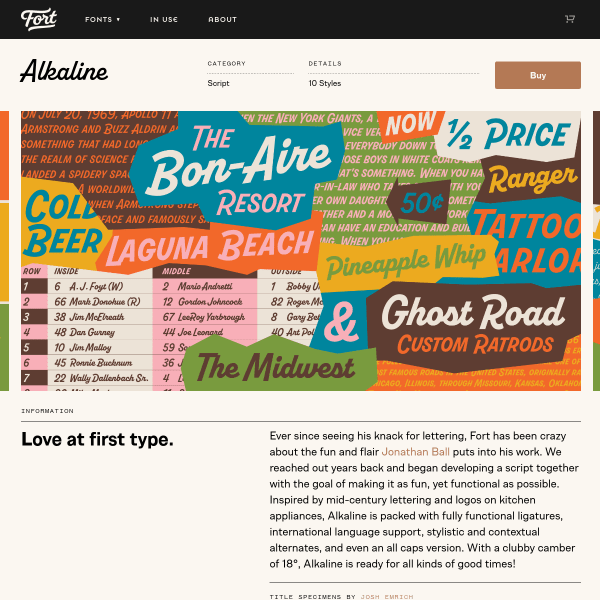
Alkaline
Simple and functional specimen for Alkaline, but it's those designs in the carousel that really sell it. Bright and carefully designed, It'd be great to see more of them in context with the font features.
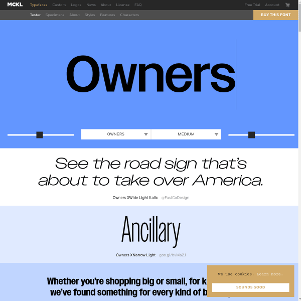
Owners
The type tester in Owners is really a hero image. Letting the type do the talking with some simple controls. This specimen really does take advantage of every available pixel with very long scrolling page with multiple type testers.
Deia
The striking element of this specimen for Deia is the mosaic of coloured panels featuring different weights and styles for different types and length of content. Nicely done.
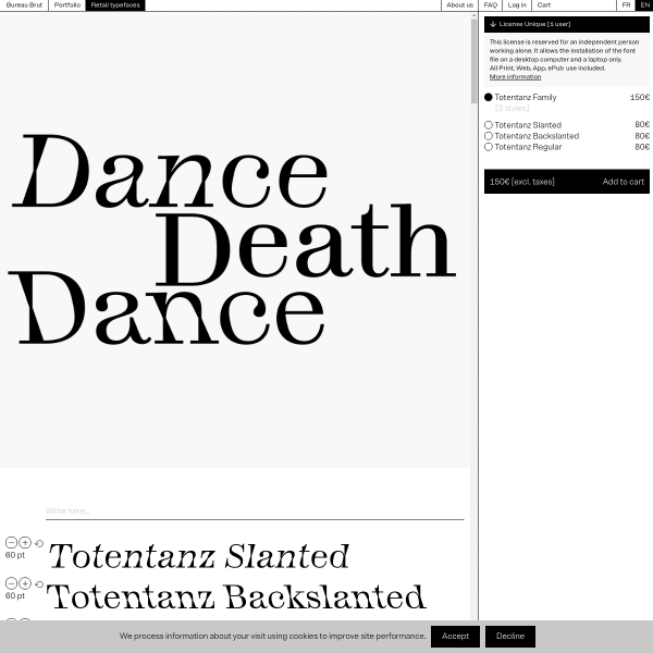
Totentanz
There is much to get excited about with this specimen. Interesting rethinking of conventional components such as the opening hero carousel. But it's the explanation of the features that really stand out.
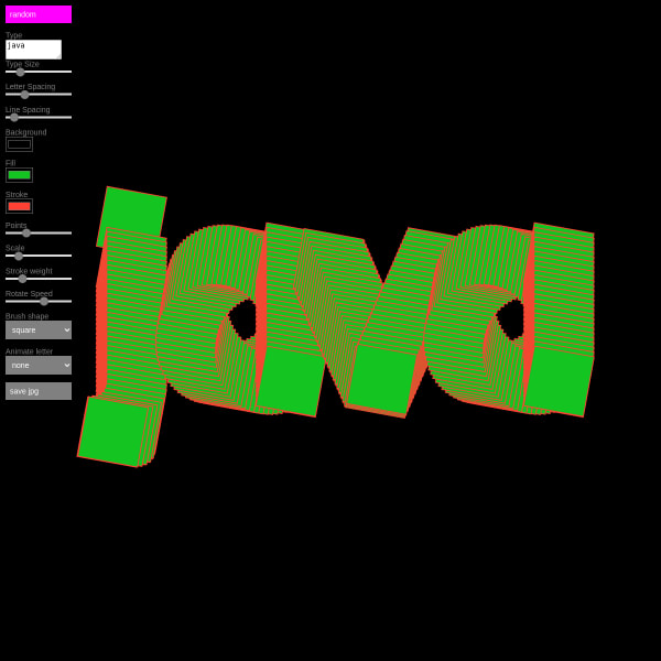
Java Sans
Java Sans is an experimental typeface and this playground specimen really demonstrates it. Change all kinds of metrics from points, stroke with, brush shape, and animation speed.
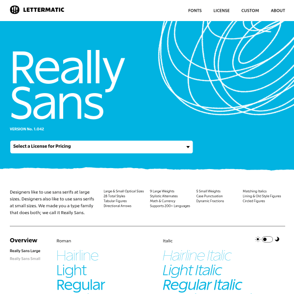
Really Sans
This specimen is all business and really well done. It's about giving the user all the tools they need to make a good decision and making it easy to buy. The switchable opentype feature components are particularly good.
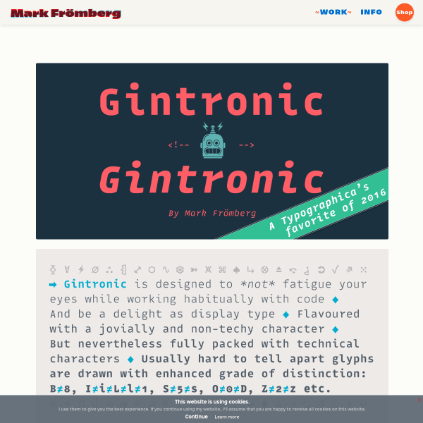
Gintronic
No other typeface has to work quite as hard as a monospace designed for coding environments if you ask me. Here, the specimen for Gintronic features panels of explanatory text explaining the features baked into the font to mitigate things like fatigue for the reader.
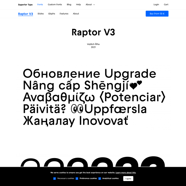
Raptor V3
Really neat specimen for a good looking typeface. Whilst missing a few key components for effective evaluation, such as a type tester, it makes up for it by the stacked example panels outlining the features of the font.
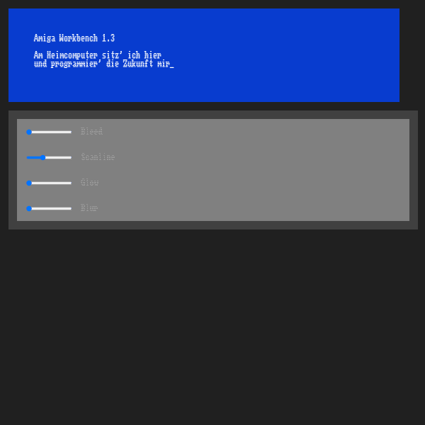
Amiga workbench font
This takes me back. My Amiga 500 was my first serious computer experience (following on from the BBC Micro and Spectrum ZX81). It's amazing how just a font can rekindle those feelings. The specimen here is simple and adds various simulating screen effects.
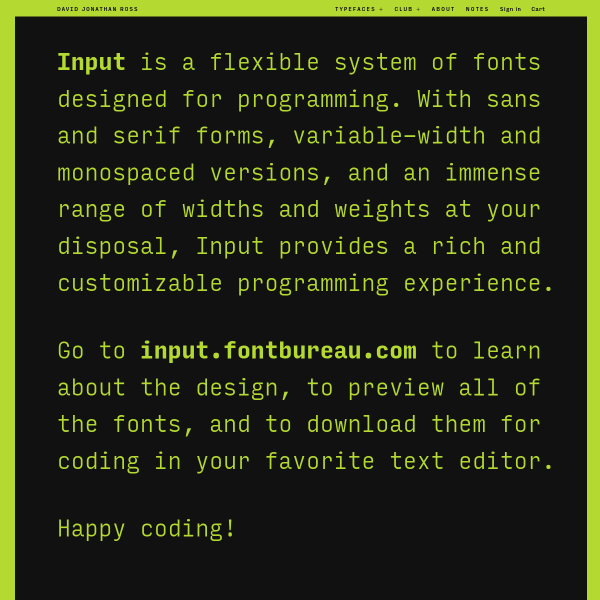
Input | DJR
Input is a 'flexible system of fonts designed for programming'. This specimen is a treat. Interesting design, useful content, supportive illustrations shown potential usage, and a really well designed license table.
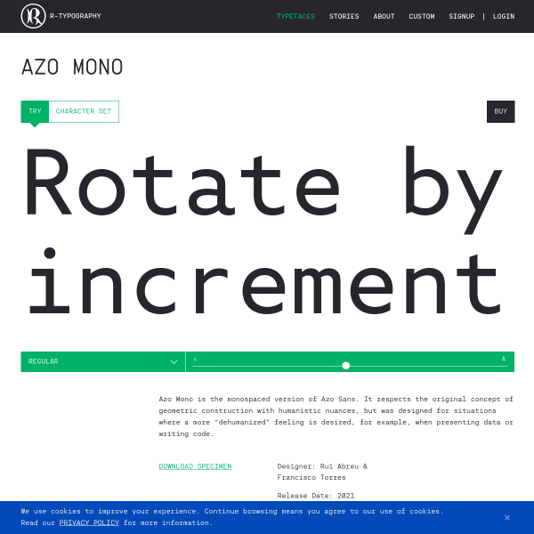
Azo Mono
Always a sucker for Mono typefaces. This specimen for Azo Mono has some interesting generative illustrations accompanying the type tester.
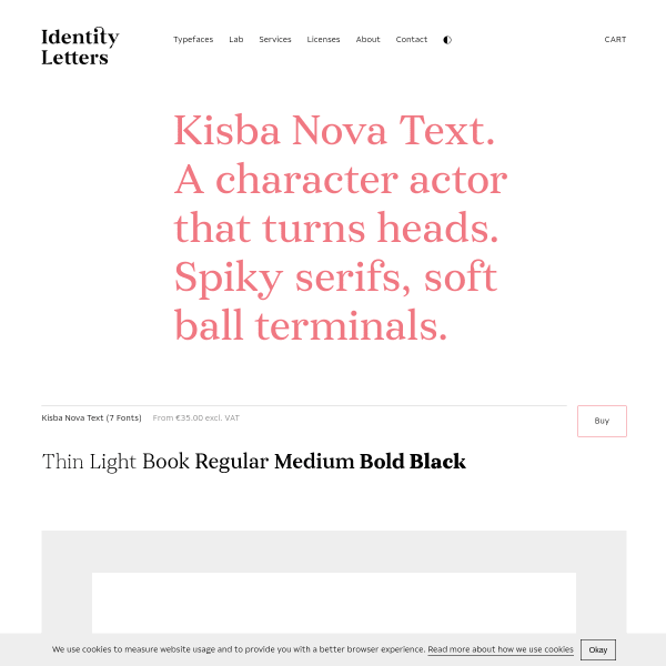
Kisba Nova Text
What a beautiful serif typeface. The specimen is simple and opens with a carousel of images, but it's the type testers where Kisba Nova Text comes alive – especially the longer form paragraphs.