A curated list of digital specimens
of the highest quality. Updated daily.
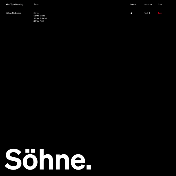
Söhne
Exquisite specimen from Klim Type Foundry. On the surface, the specimen for Söhne is simply presented. Almost like a print specimen. It's not until you interact with the type that the controls appear for a feature-rich typetester. What is particularly interesting about this one is the ability to test multi-lingual definitions of 1984's Newspeak.
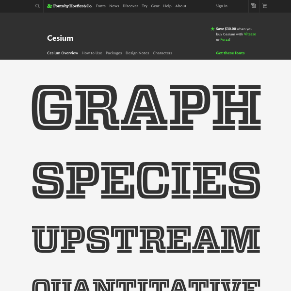
Cesium
Hoefler&Co's specimens follow a similar templated approach, but they are considered and elegant. The full-featured type tester is front and centre inviting the user to get in and test the fonts themselves. Simple and effective.
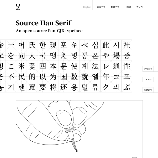
Source Han Serif
Adobe's open source CJK typeface initiative. A calming and sophisticated website punctuated with line drawing illustrations and subtle interactions.
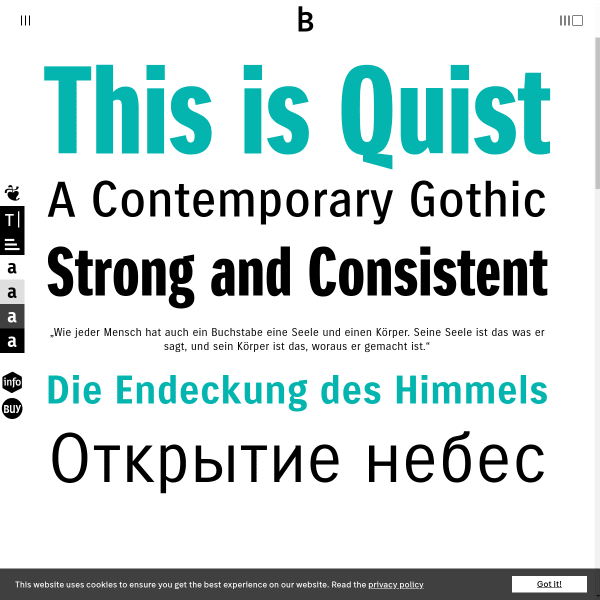
Quist
A functional, traditional-looking specimen from bBox Type. Leading with the various weights, sizes and simple two colour presentation, the specimen quickly moves on to describe features. The type tester is another section, but feature rich allowing the user to change paragraphs and do basic typesetting.
Bold Decisions
An unusual specimen, Bold Decision's Glossy specimen follows the same style as the other typefaces on sale: a simple quote is presented full screen. There's something to be said for powerful words set large and strong.
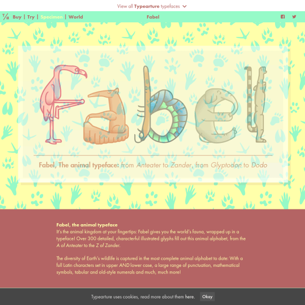
Fabel, the animal alphabet
A delightful specimen to match a delightful typeface. The ligatures and tabular vs old style numerals are particularly lovely.
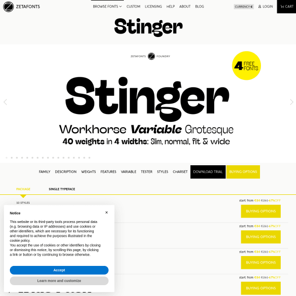
Stinger
This is a workhorse of a specimen. Functionally driven, it's about getting the prospective customer to the features quickly for them to make a decision and try out Stinger.
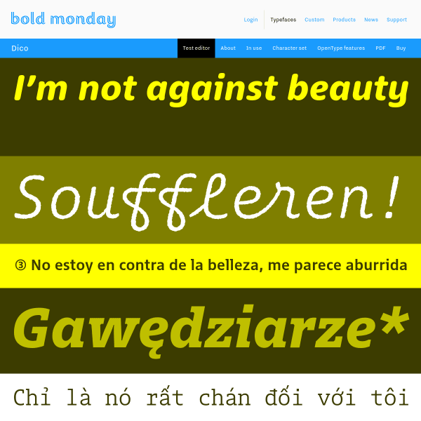
Bold Monday - independent font foundry of high quality type
Bold Monday's specimens always strike such a good balance between form and function. This new specimen for Dico opens with several stacked typetesters that go beyond just changing weights. You can also change colours, alignment, and letter spacing.
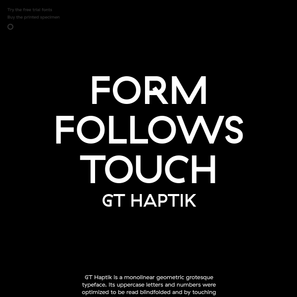
GT Haptik Font
Haptic is a monolinear geometric grotesque typeface with uppercase letters and numbers that have been optimised to be read blindfolded and by touching them. The specimen takes this experience a little way on as their are touches of discovery throughout, for example, the controls to view the different weights. A bold lack of colour and simple photography add to the stark design.
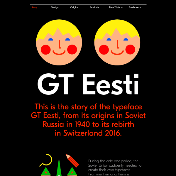
GT Eesti
This specimen is delightful. From the bold, large letters presented alongside vibrant illustrations evoking the typeface's inspiration from 1940's Soviet Russia.
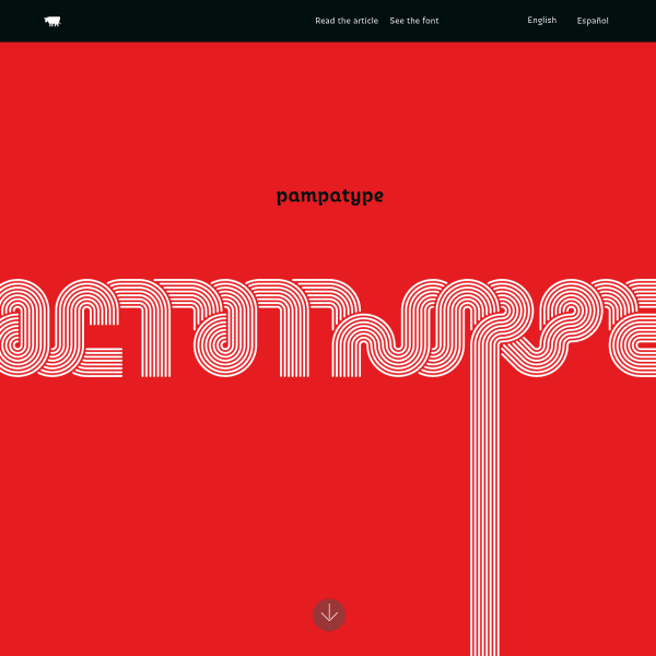
Octothorpe
This is a joy. A reimagining of a 1970's transfer lettering classic, Octothorpe's specimen takes us vertically through its features: from swashes, to contextual ligatures, to 'all sorts of figures'. No type testers here, but an invitation to try out the font elsewhere in a more templated tester as well as read an in-depth article.
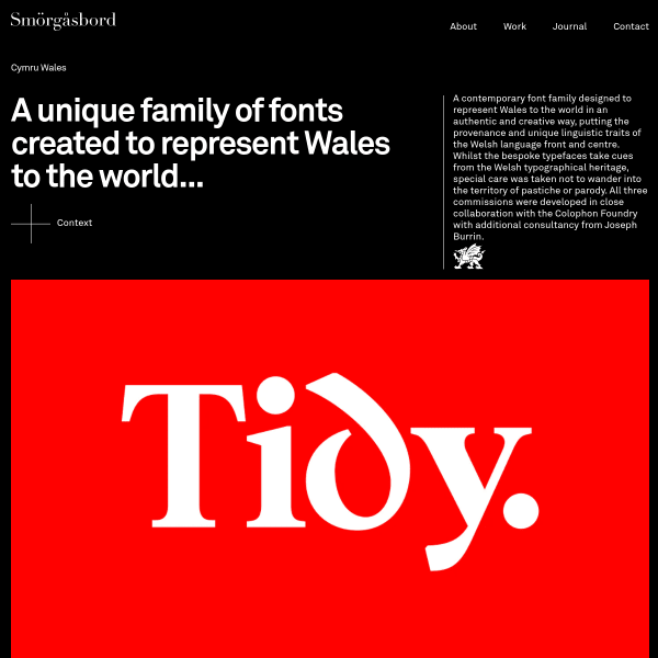
Cymru Wales
Part case study, part specimen. The Cymru Wales font has been designed in collaboration with the Colophon Foundry. Cymru Wales has a rather overt nod to Wales' cultural and typographic history but I think it just about pulls it off without the usual Celtic clichés.