A curated list of digital specimens
of the highest quality. Updated daily.
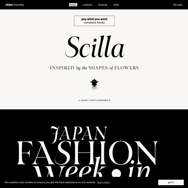
Scilla
There are many tihngs that users want that are not in this specimen: a list of glyphs, a type tester, features, language support. But, there are many specimens that don't deliver on what this one for Scilla does: beautifully typeset typographic illustrations demonstrating the beauty of the letterforms.
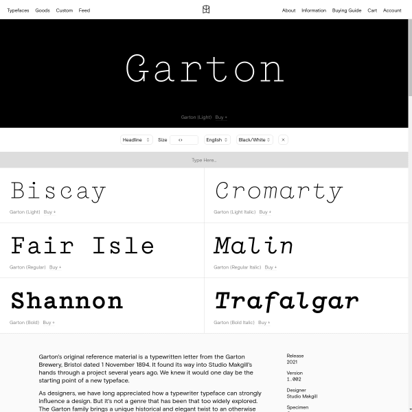
Garton
Derived from an old letter from Garton Brewery, Bristol, Garton is a typerwriter-inspired monospace from Colophon. The specimen has a couple of notable features: the animated typewriter style example, and the great copywriting.
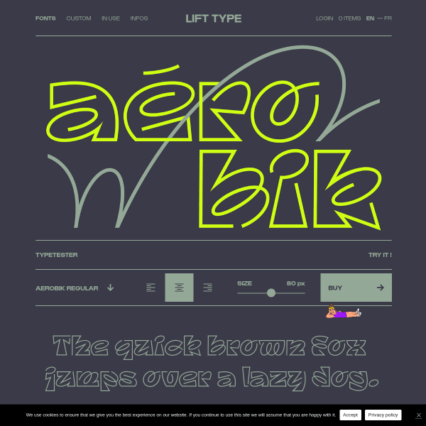
Aerobik
A fairly standard looking specimen for a quirky typeface. The sense of humour is evident throughout, though, and works really well. I can't quite understand the replacement cursor illustration – but I like it!
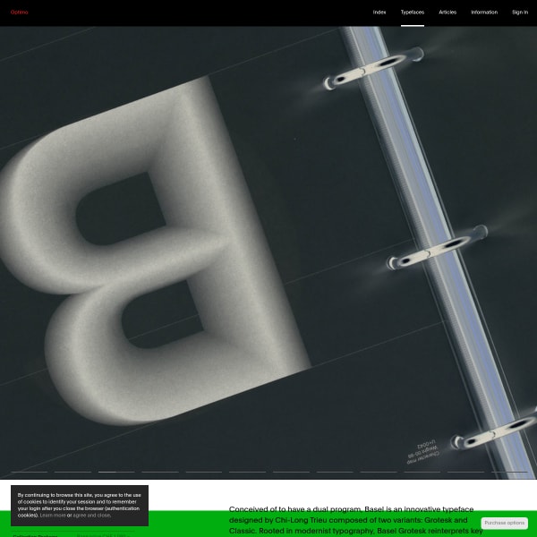
Basel
Optimo's specimens work really well and present their typefaces in a functional, yet pleasing, way. What works particularly well is the stack of preset typetesters, each with slightly different content.
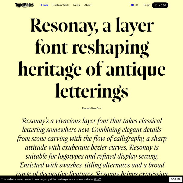
Resonay
A really detailed one-page specimen for Resonay from Typemates. I may have outlined this specimen design before, but it works really well. Particularly as you move further down the page to how the opentype features and licensing information is displayed.

Build
Another brilliant specimen from Extraset building on their previous designs featured here. The new typeface, build, has various states of design, so this specimen is about walking the user through those states whilst transporting them with a Bauhaus style of content and photography. Really effective specimen, both functionally and aesthetically.,
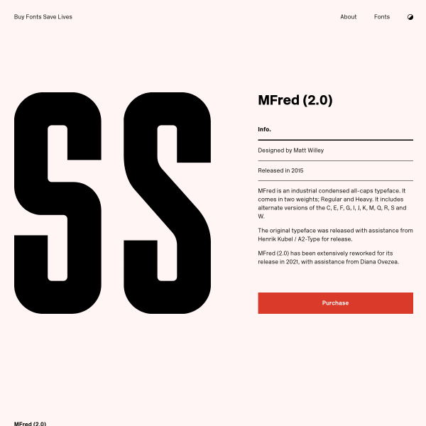
MFred
A solid looking specimen for a solid looking typeface from Buy Fonts Save Lives. Simple, designed panels in two colours precede some stacked type testers. All the basics, very well done.

News Serif
NewsSerif was built for editorial and all typographic challenges – analogue or digital. A really useful specimen. Opening with a type tester, but then screen after screen of large example designs showing News Serif in context.
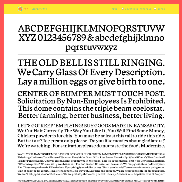
Marionette
These single sheet specimens from Nick Sherman's foundry, Hex, are very effecitve. Multiple stacked panels of justified paragraphs are reminiscent of old single sheet printer's specimens.
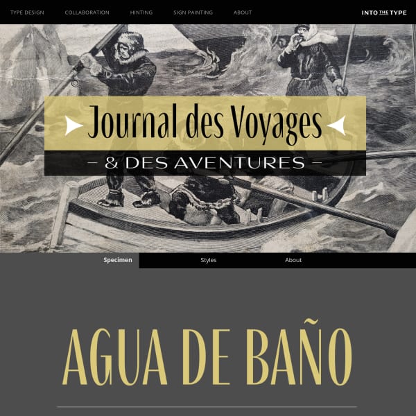
Clarette
Striking, but a bit perplexing, use of photography in the specimen. But the design certainly paints a picture of inspiration and possible intended usage. However, I find myself wanting to see more web fonts rather than lots of stacked svgs.
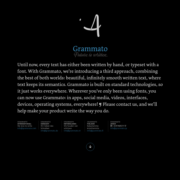
Grammato — Future is written
Not really a specimen. Not really a product page. More like a technology, or a service? Regardless, this page for Grammato is an interesting approach to displaying an interesting and complex problem being solved through type.
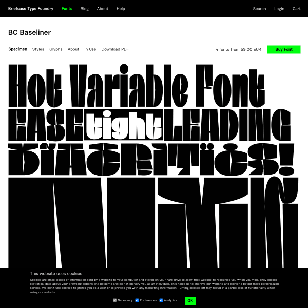
BC Baseliner
Ok, the specimen for this may be just one big svg but the design delivers on its purpose: to make you sit up and think 'hmmm, that's a cool typeface'. Sometimes that's all it needs.