A curated list of digital specimens
of the highest quality. Updated daily.
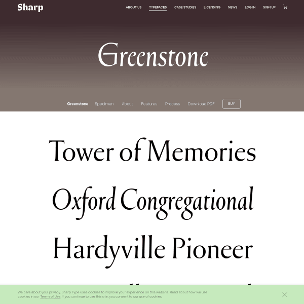
Greenstone
This specimen for Greenstone from Sharp gets better the further you scroll. Past some basic evaluation components and stacked type testers, the specimen goes into detail of the design process.
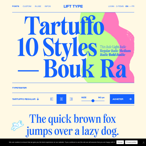
Tartuffo
A bright specimen for Tartuffo. "This new font, the Tartuffo, is as bad-looking and bitter as the hypocrites in literary works". Check out the ligatures!
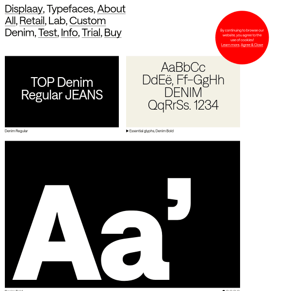
Denim
Displaay continue their templated specimens for their new release, Denim. A grid of carousels of example designs followed by a feature-filled type tester.
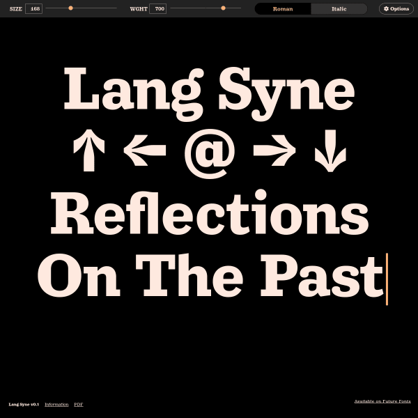
Lang Syne
An efficient single screen specimen for Lang Syne from Arrow Type. Putting the type tester front and centre and using the pre-defined text as content – not just placeholder content – is something we should see more of.
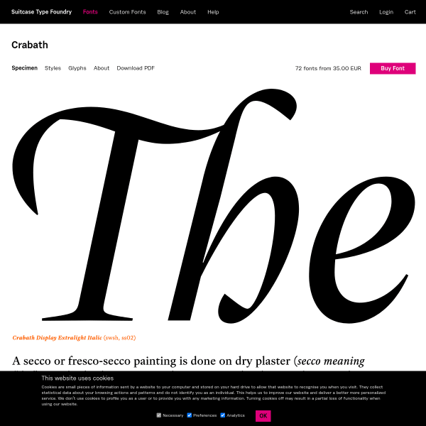
Crabath
A good looking specimen of stacked large glyphs. Despite them being static, and not type testers, there are enough of them to get a good sense of the typeface in different uses.
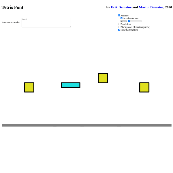
Tetris Font
This is weird, but fun, and extremely clever. An experimental specimen for a font where the letters are made from Tetris blocks. Not only that, but the specimen animates the building of them.
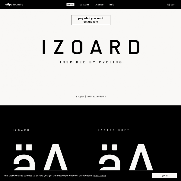
Izoard
The new release from atipo is a tribute to the famous Tour de France climb. The specimen for Izoard is a stack of designed graphics which demonstrate the versatility. It'd be nice to see some web fonts in a browser, though.
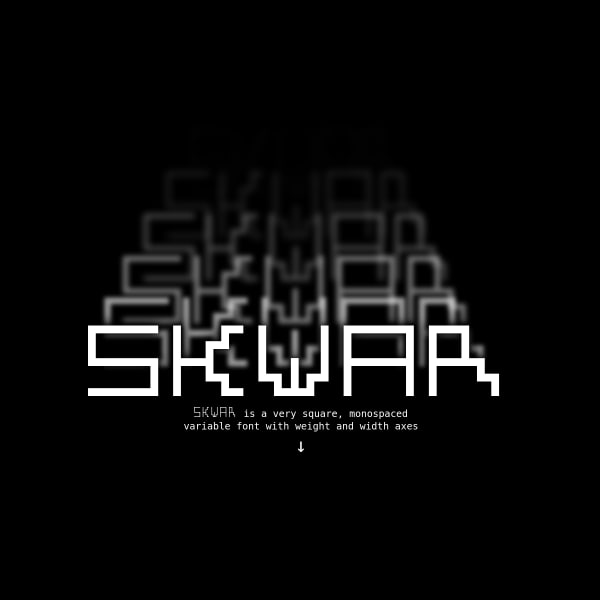
SKWAR
SKWAR is a very square, monospaced variable font with weight and width axes. The specimen has a very nice feature of mapping the width axis to music for a nifty equaliser.
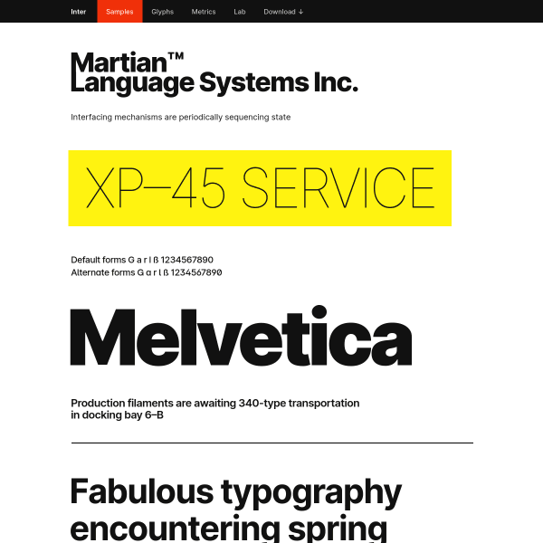
Inter Samples
Inter has been featured here before, but the samples page is something special. A LONG list of typeset examples showing potential usage. This mapping of features of the typeface to real-world examples is really useful in evaluation.
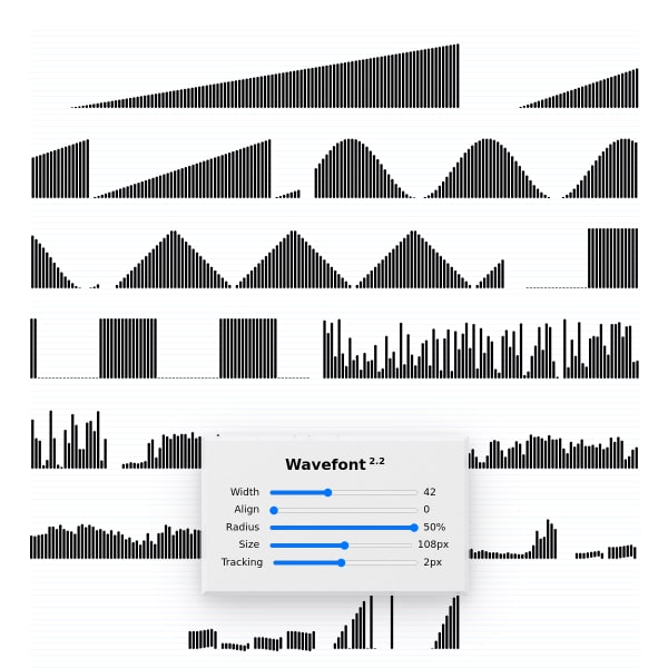
Wavefont
A variable font for waveforms? Why not! The specimen is super-simple with examples and sliders for the axes.
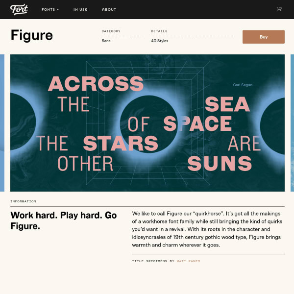
Figure
Fort describe Figure as a quirkhorse – all the makings of a workhorse whilst still bringing some quirks from a revival. The specimen hits all the right notes: designed examples, stacked type testers, and complete glyph table with previews.
Heheh Type
This is a bit of a outlier but I thought it would be interesting to bookmark the use of Instagram as a specimen. Of course, it lacks critical features, but as an effective way to showcase images of the type in a curated way, it's pretty good!