A curated list of digital specimens
of the highest quality. Updated daily.
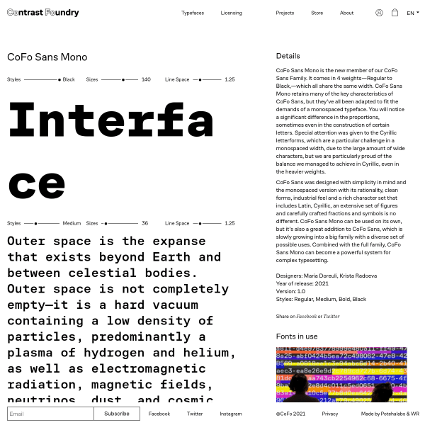
Cofo Sans Mono
Contrast Foundry's specimens walk that fine line between useful and unconventional really well. The focussing on each side of the specimen is particularly interesting.
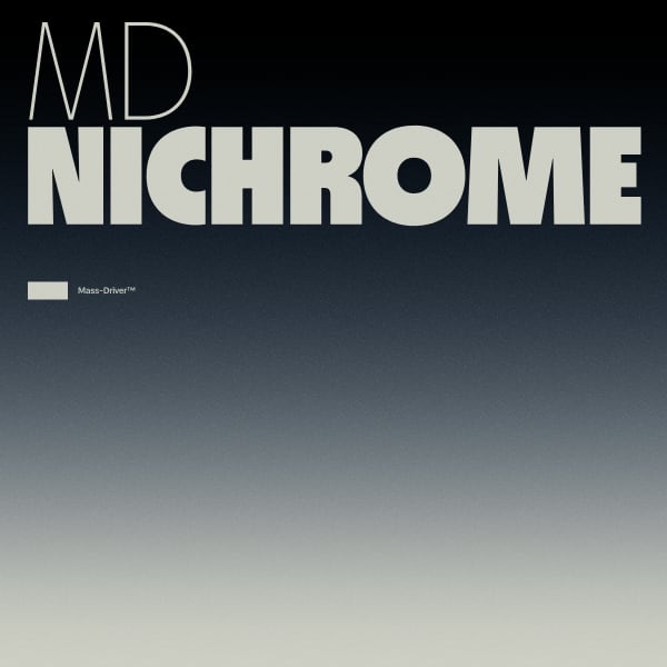
MD Nichrome
The microsite for Nichrome is so well done. From the branding and accompanying video, to the stacked example phrases. The opentype feature layout is also a useful addition to clearly see the built-in features such as alternates and case-sensitive forms.
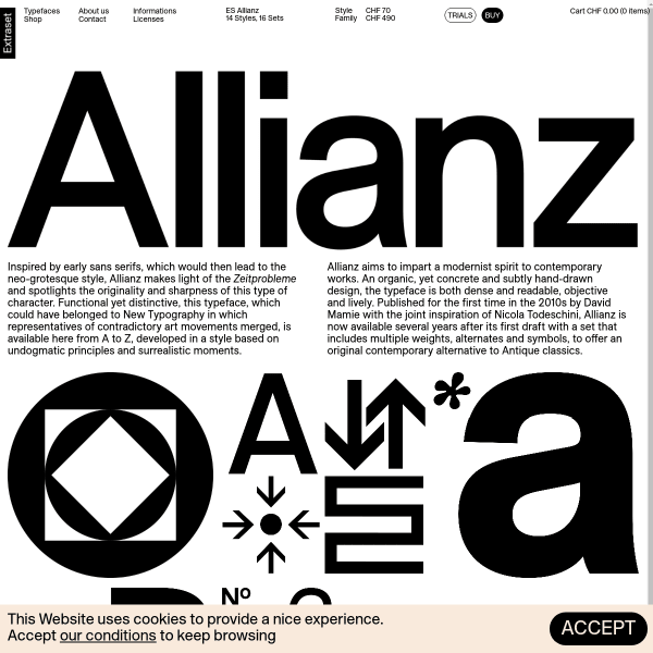
ES Allianz
This is a clever layout from Extraset for their latest release, Allianz. Using borderless tiled animations and static graphics interesting combinations of glyphs and features the specimen builds into a tapestry. This simple but effective technique adds an added dimention to evaluating the typeface.

Bau Mono
The designs for the carousel that opens the specimen for Bau Mono are refreshing, but hidden away. The specimen would be really improved by having them as stacked panels. The typetesters are good, providing multi-lingual defaults and options for different columns.

Rustica
Efficient and elegance is the name of the game with this specimen from TipoType. Simple, stacked typetesters, one or two 'in context' images. And then compiling all of the features, glyphs, and language support into a useful tabbed component at the bottom of ther specimen.
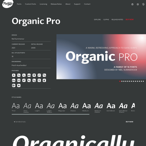
Organic Pro
A fairly standard specimen from Positype, but it's the glyph table that is of interest. Each preview of a glyph is shown with two other characters either side and is overlaid with lines for cap height, x-height and baseline. This is very useful to see glyphs in context with others.
Avantt
This specimen for Avantt reeks of modernist design values combined with a wilful disregard for digital type specimen conventions. And it's brilliant as a result. Refreshing content. Interesting branding.
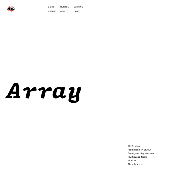
Array
Array is a characterful mono typeface. A response to the design brief of 'can a typeface work for coding and regular text?'. Array is a combination of the two. The specimen neatly demonstrates the font and its capabilities, but is lacking showing it in an actual coding environment.
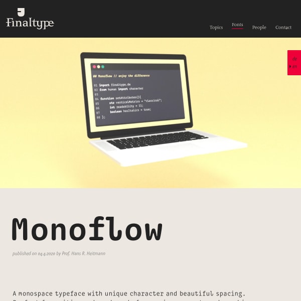
Monoflow
Monoflow is a coding font. The website goes into great detail as to what that means from a design perspective, carefully explaining the impact on readability in a coding environment.
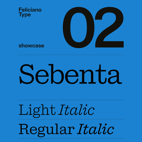
Sebenta
Great looking monochrome colour palette for this striking specimen for Sebenta. Big, full width type displayed in stacked layouts of components with text long and short, large and small.
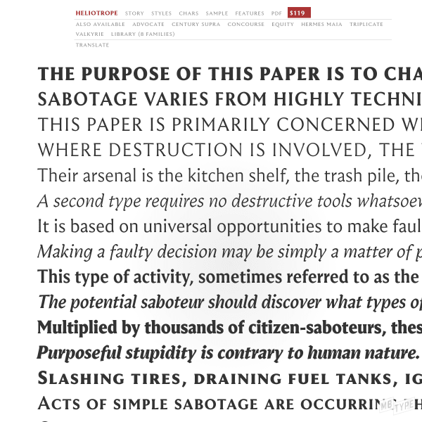
Heliotrope
A catalogue specimen, but a sensitive reimagining of a printed specimen to digial form. More traditional in its approach, the specimen leaves no stone unturned; it is comprehensive. A full glyph preview, download the printed PDF, and an accompanying long-form article on the history of the design.
Goskar
Handwriting fonts can be difficult to produce good specimens for. Especially those which have inbuilt features such as auto-ligatures and interesting alternates to mimic the inconsistency and quirks of human-made lettering. This specimen for Goskar does a good job at highlighting those features on a backdrop of a useful specimen.
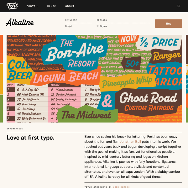
Alkaline
Simple and functional specimen for Alkaline, but it's those designs in the carousel that really sell it. Bright and carefully designed, It'd be great to see more of them in context with the font features.
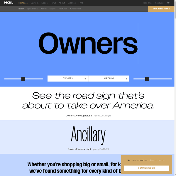
Owners
The type tester in Owners is really a hero image. Letting the type do the talking with some simple controls. This specimen really does take advantage of every available pixel with very long scrolling page with multiple type testers.
Deia
The striking element of this specimen for Deia is the mosaic of coloured panels featuring different weights and styles for different types and length of content. Nicely done.
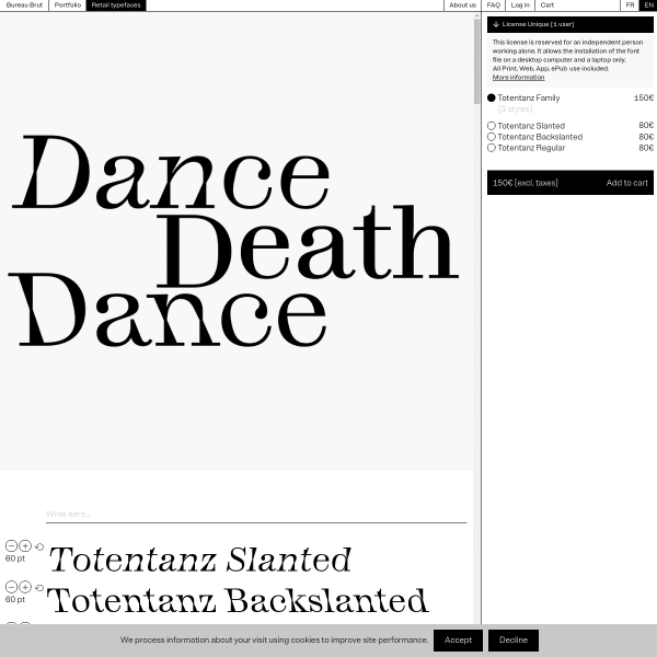
Totentanz
There is much to get excited about with this specimen. Interesting rethinking of conventional components such as the opening hero carousel. But it's the explanation of the features that really stand out.
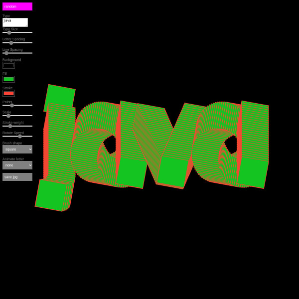
Java Sans
Java Sans is an experimental typeface and this playground specimen really demonstrates it. Change all kinds of metrics from points, stroke with, brush shape, and animation speed.
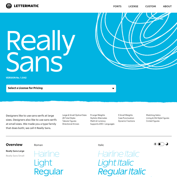
Really Sans
This specimen is all business and really well done. It's about giving the user all the tools they need to make a good decision and making it easy to buy. The switchable opentype feature components are particularly good.
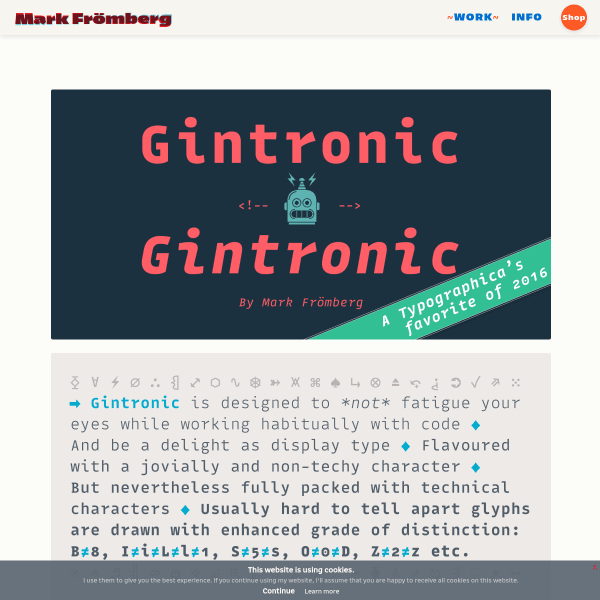
Gintronic
No other typeface has to work quite as hard as a monospace designed for coding environments if you ask me. Here, the specimen for Gintronic features panels of explanatory text explaining the features baked into the font to mitigate things like fatigue for the reader.
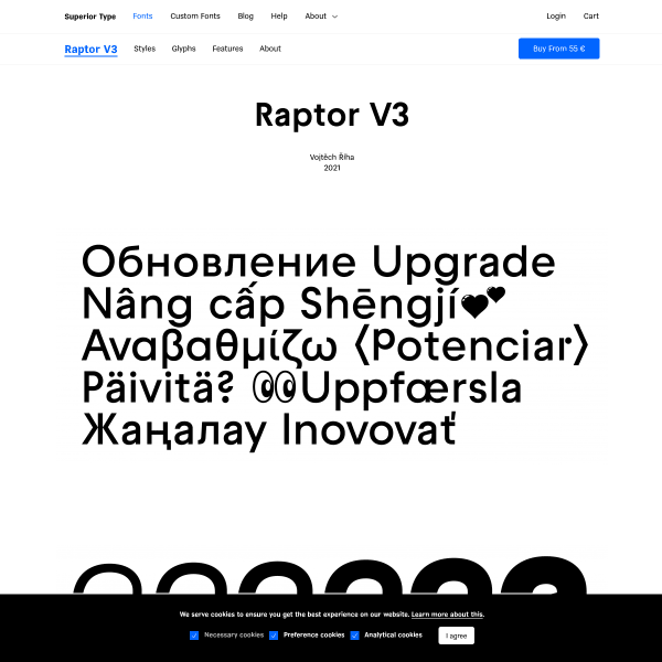
Raptor V3
Really neat specimen for a good looking typeface. Whilst missing a few key components for effective evaluation, such as a type tester, it makes up for it by the stacked example panels outlining the features of the font.
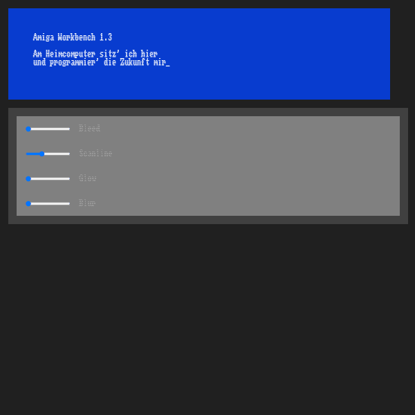
Amiga workbench font
This takes me back. My Amiga 500 was my first serious computer experience (following on from the BBC Micro and Spectrum ZX81). It's amazing how just a font can rekindle those feelings. The specimen here is simple and adds various simulating screen effects.
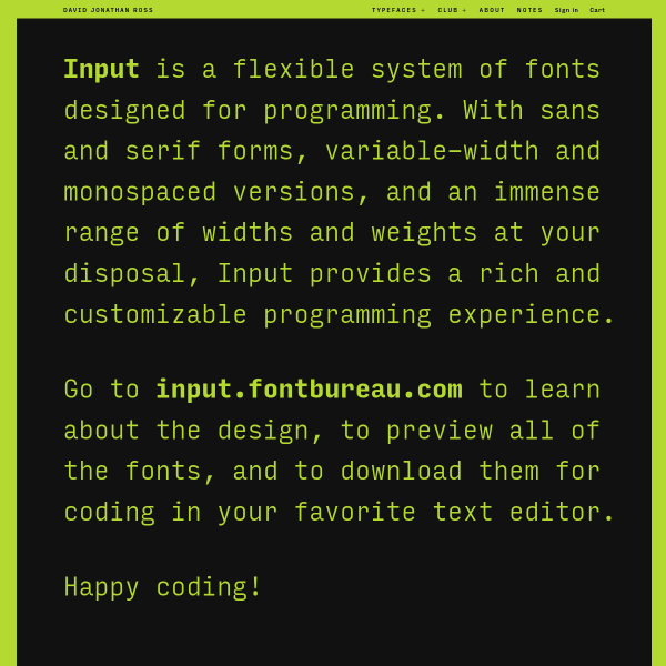
Input | DJR
Input is a 'flexible system of fonts designed for programming'. This specimen is a treat. Interesting design, useful content, supportive illustrations shown potential usage, and a really well designed license table.
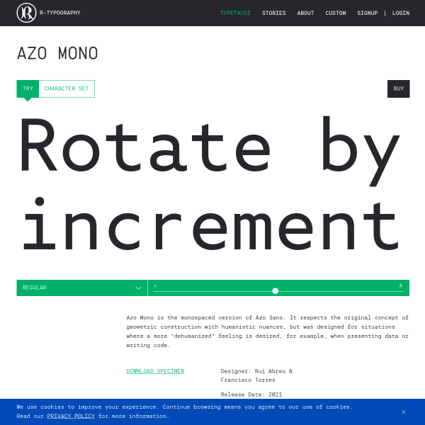
Azo Mono
Always a sucker for Mono typefaces. This specimen for Azo Mono has some interesting generative illustrations accompanying the type tester.
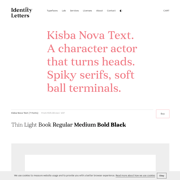
Kisba Nova Text
What a beautiful serif typeface. The specimen is simple and opens with a carousel of images, but it's the type testers where Kisba Nova Text comes alive – especially the longer form paragraphs.
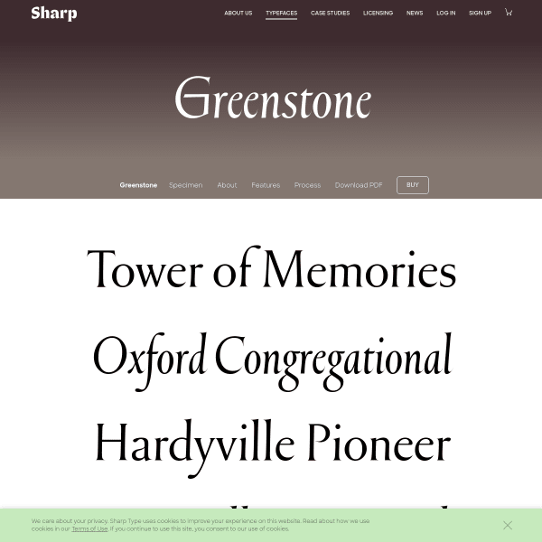
Greenstone
This specimen for Greenstone from Sharp gets better the further you scroll. Past some basic evaluation components and stacked type testers, the specimen goes into detail of the design process.
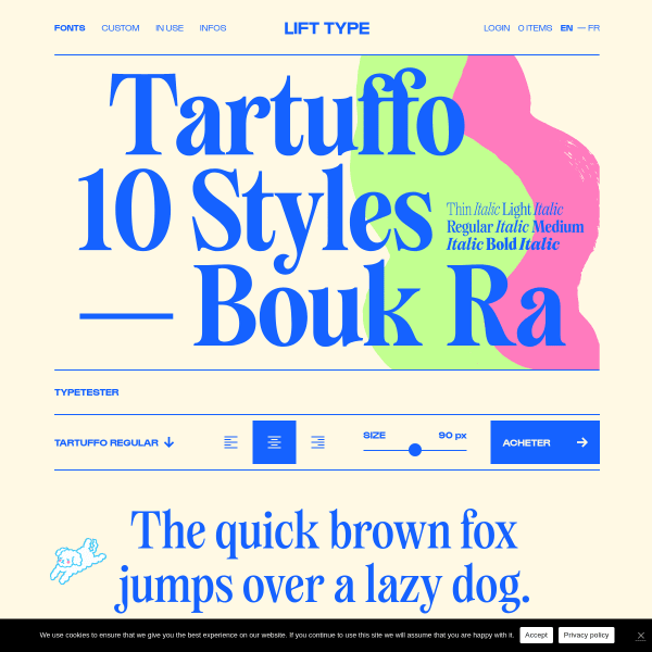
Tartuffo
A bright specimen for Tartuffo. "This new font, the Tartuffo, is as bad-looking and bitter as the hypocrites in literary works". Check out the ligatures!
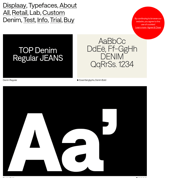
Denim
Displaay continue their templated specimens for their new release, Denim. A grid of carousels of example designs followed by a feature-filled type tester.
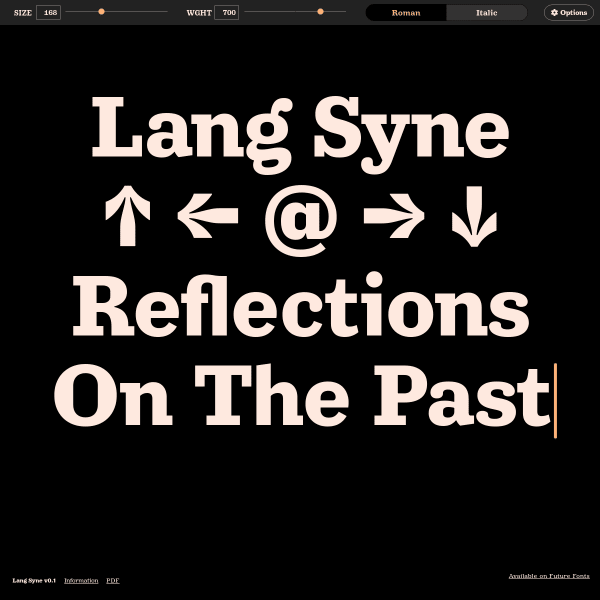
Lang Syne
An efficient single screen specimen for Lang Syne from Arrow Type. Putting the type tester front and centre and using the pre-defined text as content – not just placeholder content – is something we should see more of.
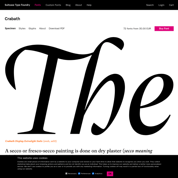
Crabath
A good looking specimen of stacked large glyphs. Despite them being static, and not type testers, there are enough of them to get a good sense of the typeface in different uses.
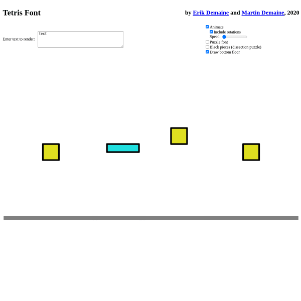
Tetris Font
This is weird, but fun, and extremely clever. An experimental specimen for a font where the letters are made from Tetris blocks. Not only that, but the specimen animates the building of them.
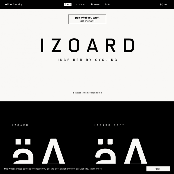
Izoard
The new release from atipo is a tribute to the famous Tour de France climb. The specimen for Izoard is a stack of designed graphics which demonstrate the versatility. It'd be nice to see some web fonts in a browser, though.
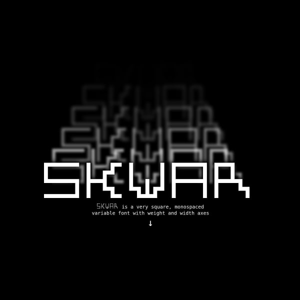
SKWAR
SKWAR is a very square, monospaced variable font with weight and width axes. The specimen has a very nice feature of mapping the width axis to music for a nifty equaliser.
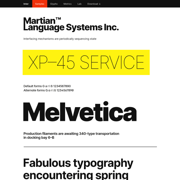
Inter Samples
Inter has been featured here before, but the samples page is something special. A LONG list of typeset examples showing potential usage. This mapping of features of the typeface to real-world examples is really useful in evaluation.
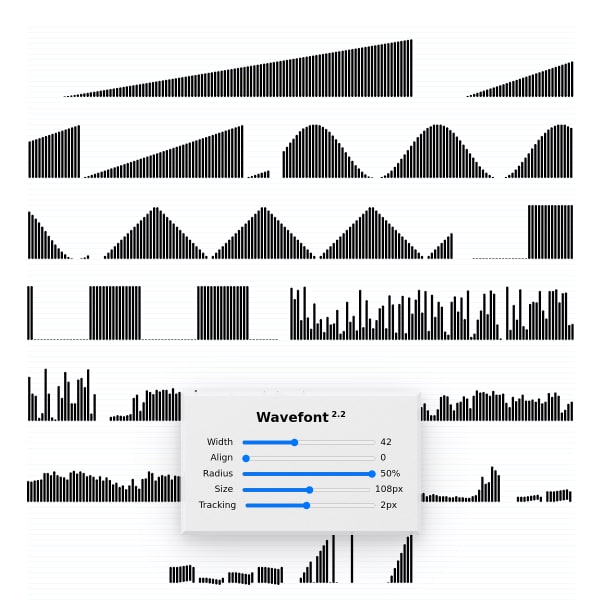
Wavefont
A variable font for waveforms? Why not! The specimen is super-simple with examples and sliders for the axes.
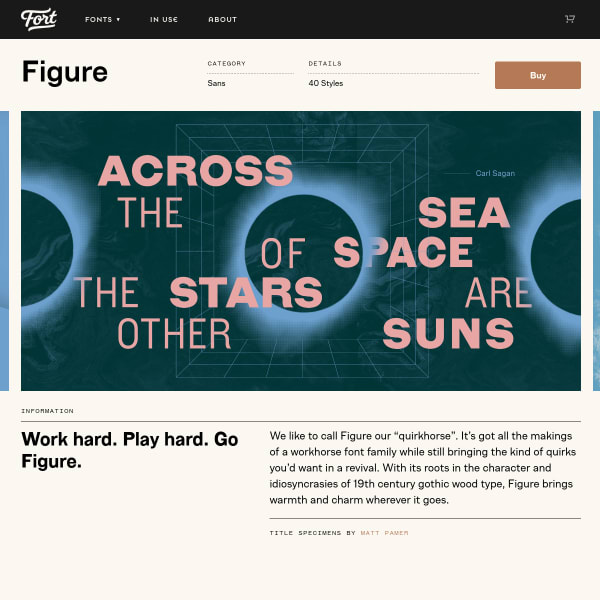
Figure
Fort describe Figure as a quirkhorse – all the makings of a workhorse whilst still bringing some quirks from a revival. The specimen hits all the right notes: designed examples, stacked type testers, and complete glyph table with previews.
Heheh Type
This is a bit of a outlier but I thought it would be interesting to bookmark the use of Instagram as a specimen. Of course, it lacks critical features, but as an effective way to showcase images of the type in a curated way, it's pretty good!