A curated list of digital specimens
of the highest quality. Updated daily.
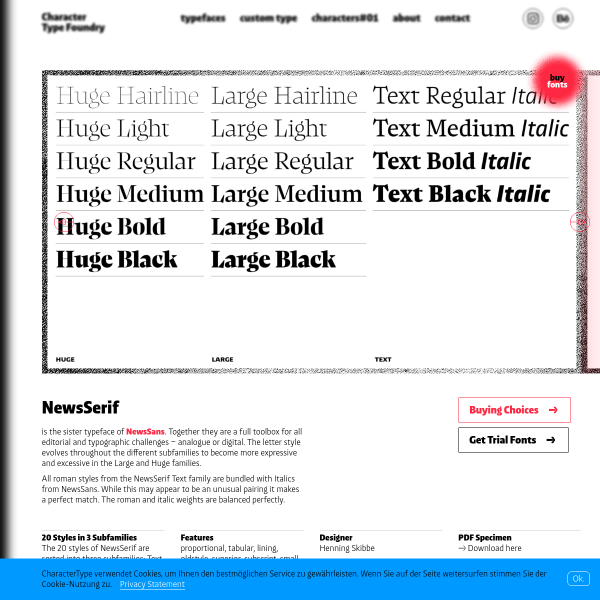
NewsSerif
The companion to NewsSans, NewsSerif's specimen is a simple presentation of type testers opening with a carousel of example designs. An often neglected, but in this case well done, is the buying options. Buying fonts can be confusing but this simple design makes things easy.
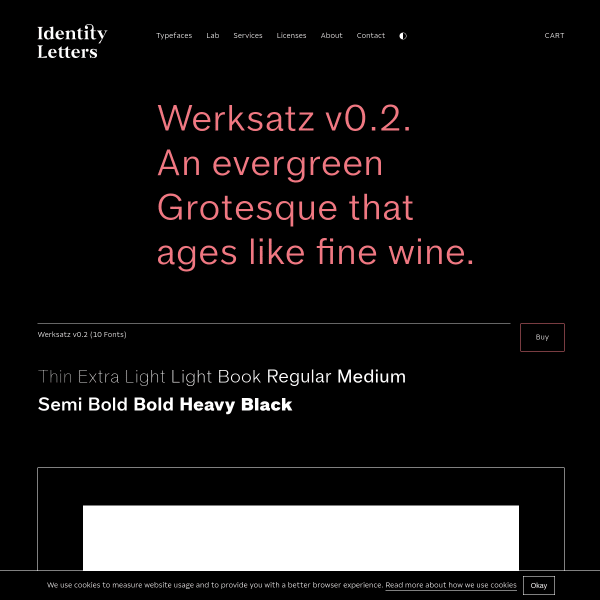
Werksatz v0.2
Sometimes a simple headline, a carousel showing some examples of usage, and a bunch of minimal type testers is just enough for a specimen. This example from Identity Letters for Werksatz shows what can be done with just a few simple elements.
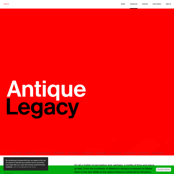
Antique Legacy
A simple and efficient specimen for Antique Legacy from Optimo. Notable are the stacked type testers with different lengths of copy, but also the ability to change the sample text to a number of defaults.
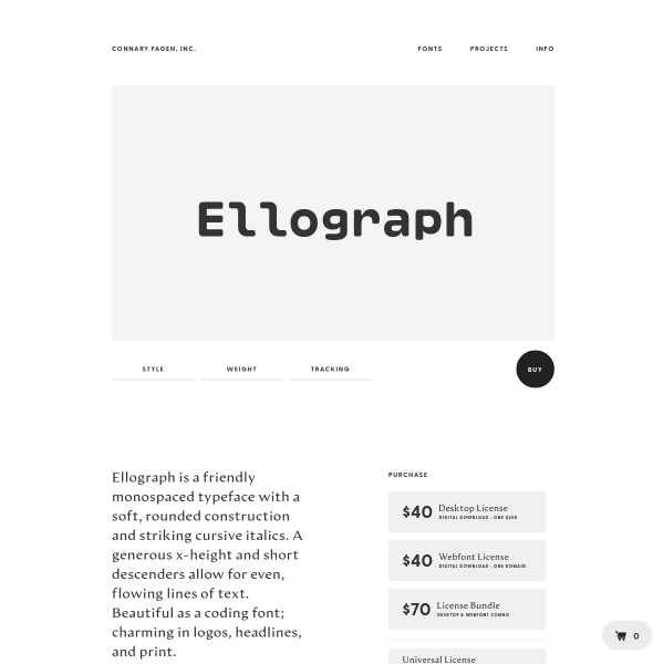
Ellograph
An efficient specimen for Ellograph from Connary Fagen. Opening with an unusual type tester followed by some fabulous example usage designs. Shown full screen, these really do show off the font's features well. The glyph table below is a little small in comparison, however, and could use a large scale preview.
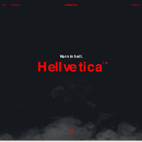
Hellvetica
Want to troll a designer? Just mess with the kerning. Although, maybe not as overtly as this wonderfully useless typeface. Playful, tongue-in-cheek, and why the hell not? Brilliant.
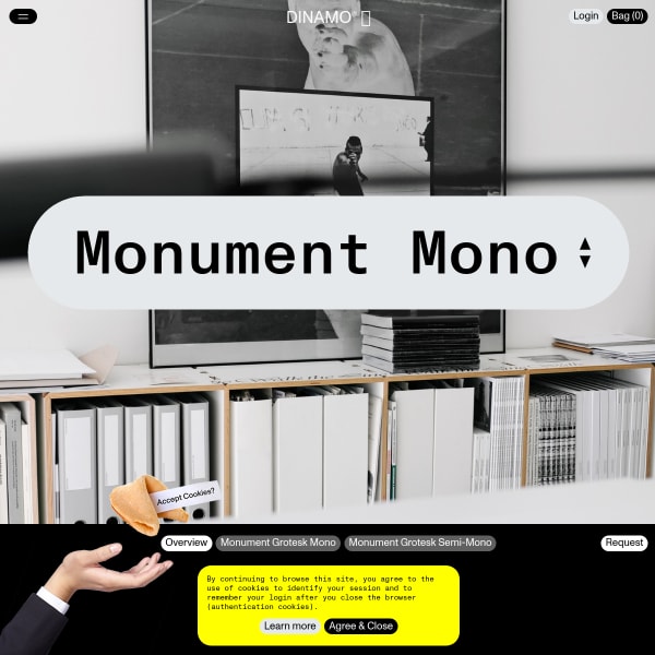
Monument Mono
Dínamos specimens continue to surprise and delight and this one for Monument Mono is no exception. Playful, oversized user interface elements coupled with some introductory photography. Don't be fooled, though, this is a seriously usable specimen with stacked type testers and lots of detailed information.
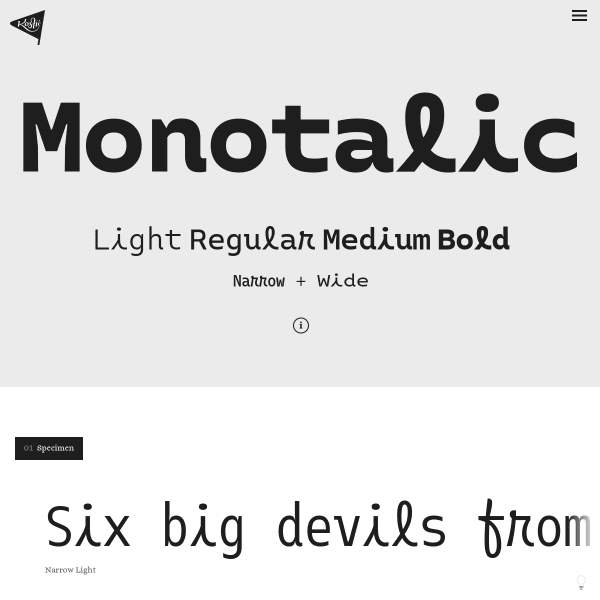
Monotalic
A quirky typeface with a conventional specimen layout. That said, I was drawn to the scale of the type on show here. Just huge glyphs in the waterfall show off the design to its full potential.
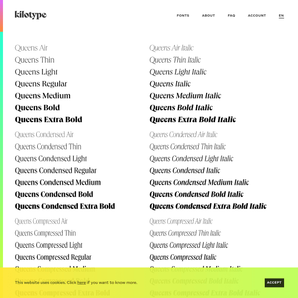
Queens
Stacked type testers are the order of the day for this specimen for Queens. Shown full width, with minimal controls, the type testers give way to a few features at the bottom of the specimen page. All that aside, the notable design feature of this specimen is the UI for adding different weights to the cart. Clever.
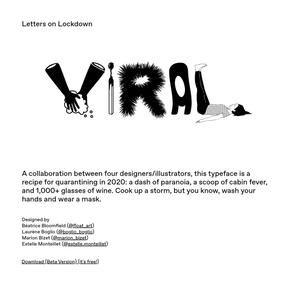
VIRAL
Excellent copywriting for this fabulous display font. 'A collaboration between four designers/illustrators, this typeface is a recipe for quarantining in 2020: a dash of paranoia, a scoop of cabin fever, and 1,000+ glasses of wine.' The result has an Ed Fella flavour to it.
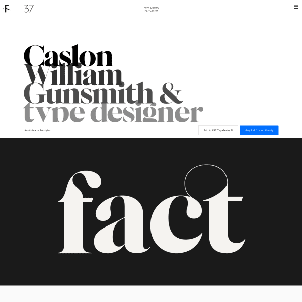
F37 Caslon
This specimen for F37 Caslon from foundry f37 strikes the right balance between form and function. Opening with extremely large type designed to show of the design features of the glyphs, the specimen is one of only a handful available that demonstrate the type working in comparative paragraph settings.
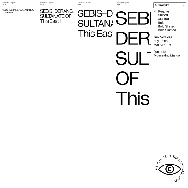
Gramatika
A novel design for the specimen for Gramatika, a custom typeface project for V-A-C Foundation. A notable, fantastic addition is the typesetting guide. Unfortunately, it's a PDF. it would be great to turn that content into a valuable microsite, I'm sure.
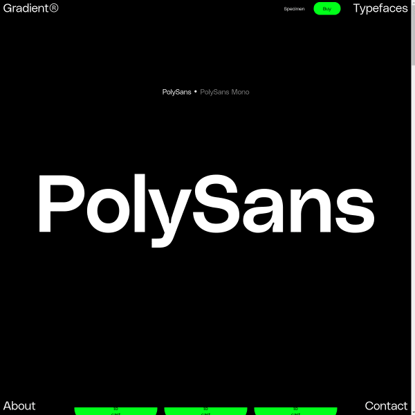
PolySans
Big. Simple. Straight to the point. The defining characteristic of this specimen is scale. It fills the available screen space from one corner to the other.
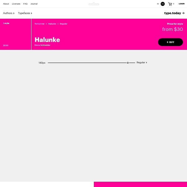
Halunke Regular
Type Today's Tomorrow (!) specimens are great. Thoughtfully designed, leading with a type tester with a couple of controls, and just enough 'type in use' graphics to support the design rationale for the typeface. This specimen for Halunke Regular works well in this format.
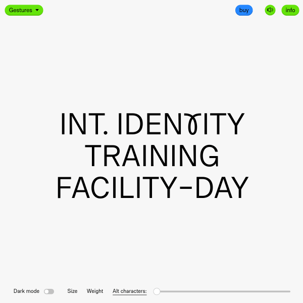
Gestures
A single typetester punctuated with animations, audio (which was a surprise), and exciting – and unextected – punctuations leading to a a specimen you experience rather than use.
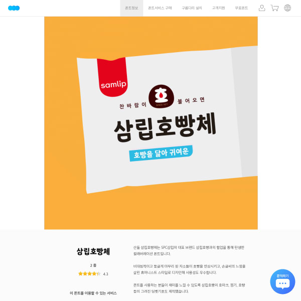
산돌구름
What struck me about this simple specimen – even though I can't read it – were the informative illustrations, and introductory animation style.
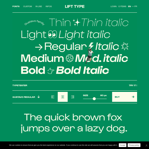
Lift Type
A good looking specimen featured stacked SVG graphic panels with an intermingled type tester. On the face of it, serious stuff, until you notice the running Maradona figure...
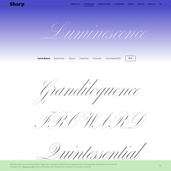
Carta Nueva
The really interesting part of this specimen is at the end of the page. Long-form descriptions of the font features and design details underpin a really useful format.
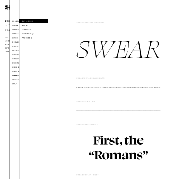
Swear
I really like this specimen format from OH no Type Company. As we increasingly see in digital specimens, there are vertically stacked type testers each set in default weights with varying content lengths. A subtle combination of old and new.
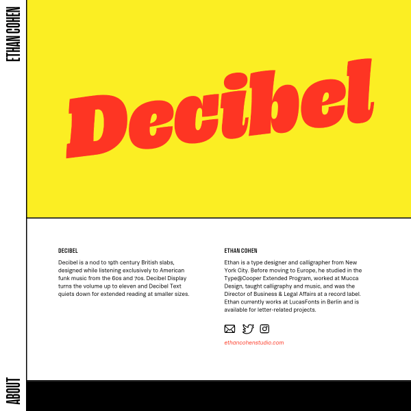
Decibel
Decibel is a nod to 19th century British slabs, designed while listening exclusively to American funk music from the 60s and 70s. The specimen displays the type in stacked panels of animated text. Great content, stricking design. As this was part of TypeMedia 2019, you can't actually buy it yet, though.
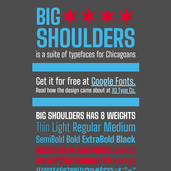
Big Shoulders
A bold and patriotic looking specimen for Big Shoulders, the typeface created by XO Type Co for the Chicago Design System. The nod to a traditional print specimen is handled well, although notable for omissions of digital specimens such as a type tester or list of glyphs.
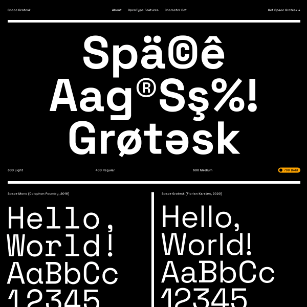
Space Grotesk
A striking and simple one-page specimen for Space Grotesk. Neatly displaying the variable weight axis with mouse-over animations, the specimen shows just opentype features and a comprehensive list of glyphs. No type tester, though, which is a shame.
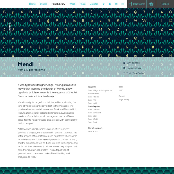
Mendl
The latest release from Dalton Maag does not disappoint. Mendl is a typeface representative of the the Art Deco movement and this feeling is evident across the artwork on the specimen.
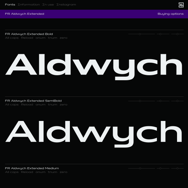
Aldwych Extended
Following the recent trend of multiple, stacked typesetters, the specimen for Aldwych Extended presents the typeface in stacked white on black background with elegant typesetter controls.
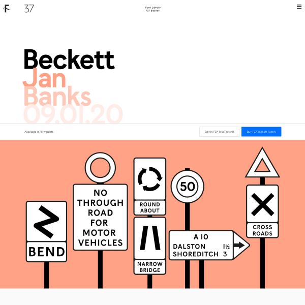
F37 Beckett
A great specimen with some lovely, subtle graphic design. Black and white illustrations set against a peachy monotone colour palette is punctuated by the usual useful functionality such as type testers and glyph tables.
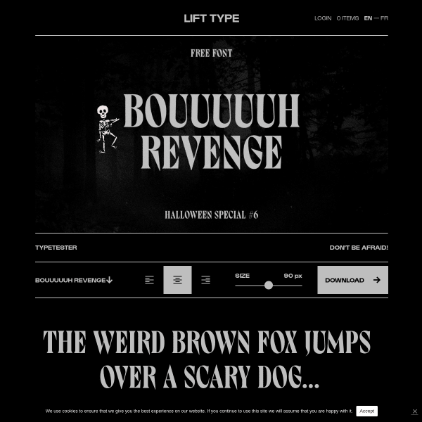
Bouuuuuh
A halloween special for the specimen of Bouuuuuh – complete with skeleton animation. Despite the fun and quirky design, this is a pretty good specimen functionality wise with type testers and clear calls to action.
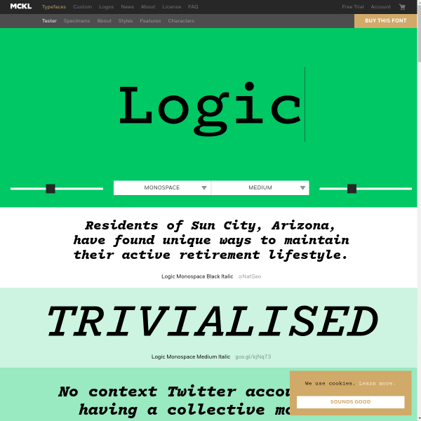
Logic Monospace
A bold, graphic appearance for Logic Monospace is matched by the monotone colour palette and graphic treatment of the typesetter controls. The graduated panels of sample text work particularly well at smoothing to the visual journey for the eye between high contrast areas.

Krasz
A comprehensive specimen for Krasz – a typeface for bad readability. The specimen fatures loads of vertically stacked reversed out type in black panels. Large, bold, and distinctive.
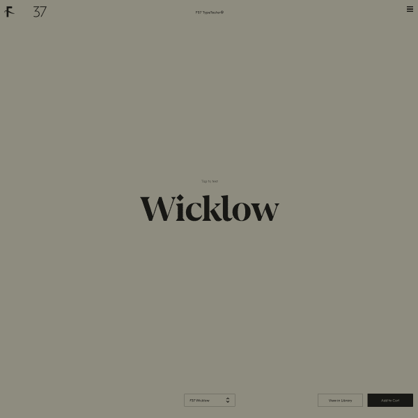
Wicklow
An interesting approach to displaying a library. A simulated design environment with a dropdown of all the typefaces in the selection. On interacting with the typeface, a set of tools is presented to the user for some considerable customisation in the browser. Pretty nifty.
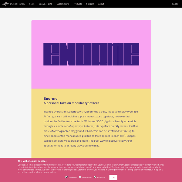
Enorme
These interstitial pages for DSType Foundry's specimens are interesting as they act as type specimens but firmly standing on the marketing side of things. They could be easily repurposed for other digital channels such as email or social.

Inline
A bright but templated specimen from Letters from Sweden for their latest variable release 'Inline'. The use of punctuating the design with little dancing animated calls to action – 'Neu!' – help lift the design.
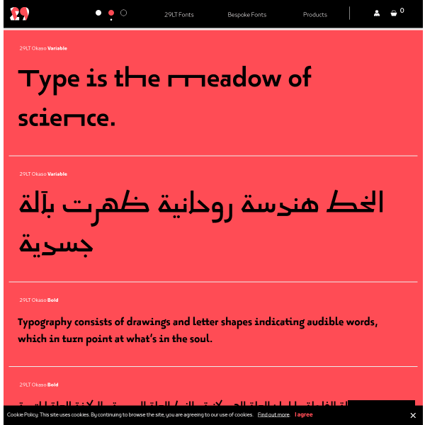
Okaso
This is a cool variable font with a stretch axis. Seen quite often in Arabic, this has a quirky result when applied to Latin. But Okaso pulls it off. The specimen is a stack of type testers in simple colour palettes. But it really shows off the type's best features.
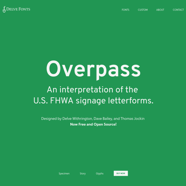
Overpass: Take 2
The Delve Fonts specimen for Overpass is different to the other specimen posted here last week. A simple affair highlighting the fonts features in large single words.
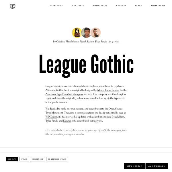
League Gothic
This specimen for League Gothic starts off looking like a Medium article. But then you realise that the title is a type tester (although just editable text with no controls). Scrolling down reveals a detailed – but notably not uniformly spaced – glyph set before getting to the detailed licensing information.
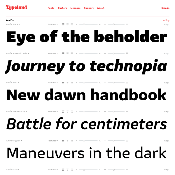
Amifer
These specimens from Typeland follow the increasingly common design pattern of just showing stacked typetesters with varying default weights and length of sample copy. Simple design but very effective.
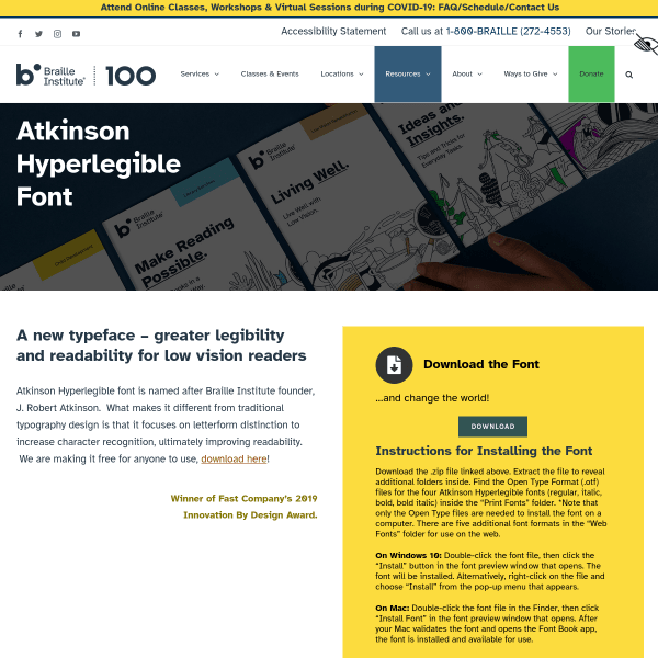
Atkinson Hyperlegible Font from the Braille Institute
A font specimen page that reads exactly like a software landing page. In fact, really, the only piece of content of benefit for typographic evaluation is the illustrations of distinctive letterforms and exaggerated forms.
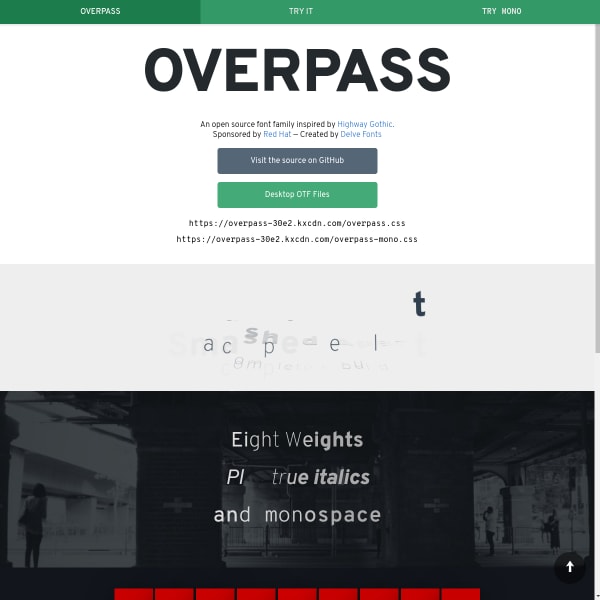
Overpass
An unusual specimen / microsite. Overpass, sponsored by Red Hat, is inspired by Highway Gothic. The specimen is microsite where all of the useful information is in sections called 'try it'. The 'monospace' section sticks out alone in the information architecture. Still, this aside, it's a nice typeface.