A curated list of digital specimens
of the highest quality. Updated daily.
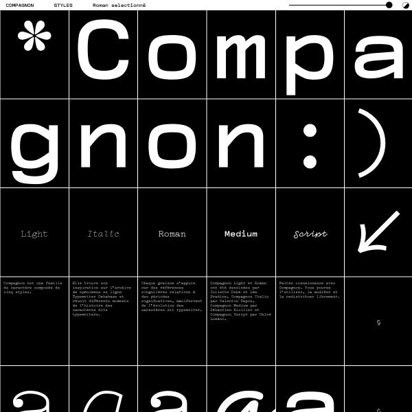
Compagnon
An unusal specimen presented in a user-configurable grid. Every element is presented in one of the rectangles, and you can choose how many rectanges per row you want to see. Want big type? Bump up rectangles with the slider. The fragmented reading experience really works.
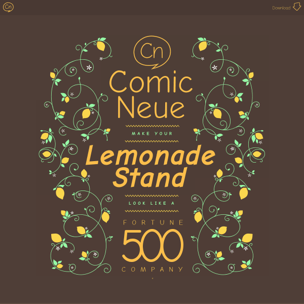
Comic Neue
This is a lovely specimen for a reimagining of Comic Sans. Going as far as suggesting this is for everyone – including the typographically savvy. The refreshing element of this specimen is the opening illustration and the earthy colour palette.
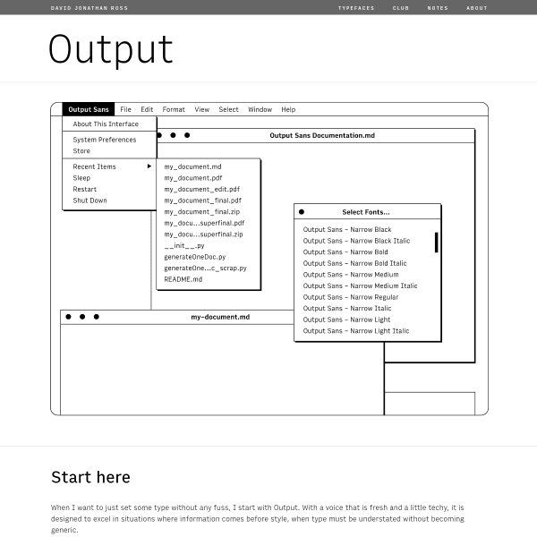
Output Font
The companion to Output, Input is a simple, understated sans serif typeface presented in a simple specimen. The refreshing line illustrations are all that's needed to demonstrate the usage.
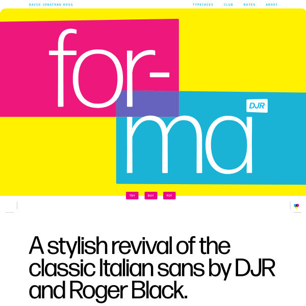
Forma DJR Font
The great thing about David Jonathan Ross's specimens is the writing. Full of humour and personality, Forma is no different. A refreshing design – bright, primary colours – are the backdrop for an excellent editorial specimen.
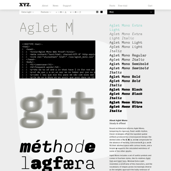
Aglet Mono
The Aglet Mono specimen page opens with a type tester and a complete display of all weights available to buy. The real selling point of this specimen, though, are the contextual samples – showing aglet performing in a code environment.
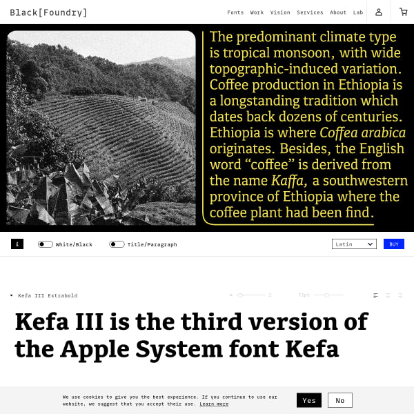
Kefa III
Marketed as a 'UI Slab Serif', Kefa's specimen has some compelling images in a carousel. The stacked type testers have simple controls to allow the user to interact with the typeface.
The Northern Block
An unconventional specimen – certainly from a web perspective. It leads with a fake article and is navigable by vertical tabs on the left of the screen. The right of the screen permenantly has an open drawer for licensing and purchasing workflow.
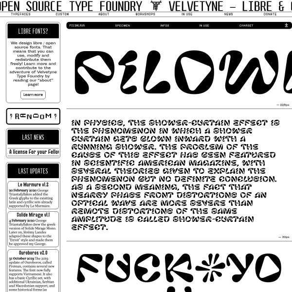
Pilowlava - VTF
A bit of an assault on the senses, the specimen for Pilowlava harks back to a more creative time on the web. A refreshing aesthetic.
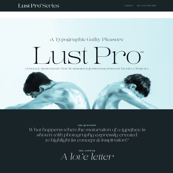
The Lust Pro Series
What happens when you art direct the design of a specimen with customised photography and fully illustrate its intended use? This. This is what happens. The Lust pro specimen shows high level editorial design, complete with its own content.
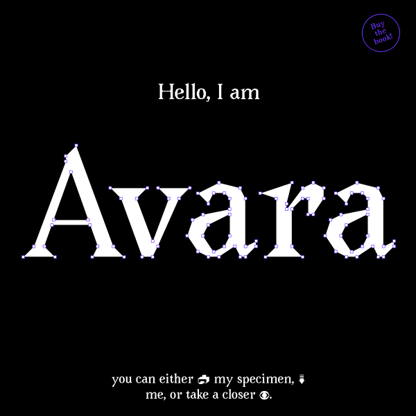
Avara
A typeface with no curves. The specimen is a single element – an editable name of the typeface, but not editable in the sense you might expect. Here, you can manipulate the points of the glyphs.
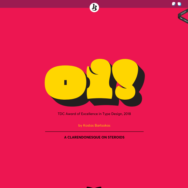
Oi!
Brilliant name for a 'clarendonesque on steroids'. The Specimen for 'Oi!' is littered with comedic touches and the design fully supports the loud brash intention of the typeface.
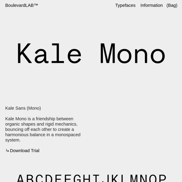
Kale Sans
A stark, brutalist specimen. Large type, grey and black, sightly set explanatory text sets the tone for Kale Mono.
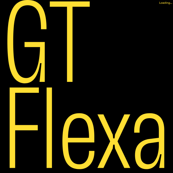
GT Flexa
Where to start with this specimen!? As with many specimens for extensive variable fonts, GT Flexa's content is heavily focussed on explaining the benefits and design attributes. It does this wonderfully through illustrations, animations, and beautifully designed content.
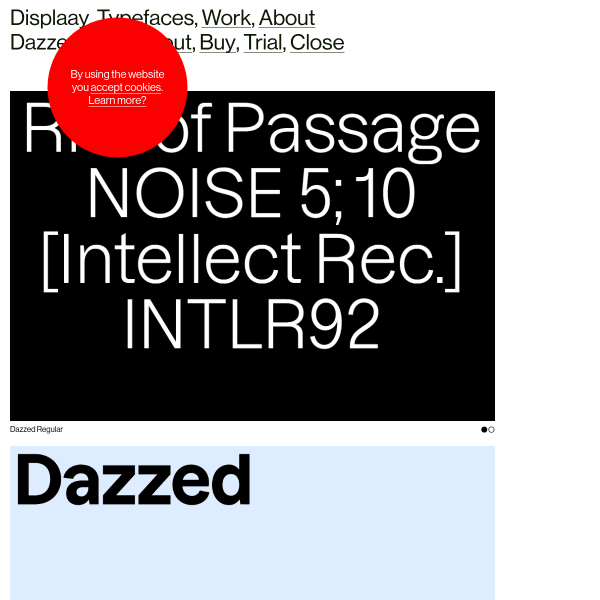
Dazzed
An unusual specimen of panelled animations. The strenth of the large type set against a single colour, give this lengthy specimen a simplicity inviting the user to scroll and scroll.
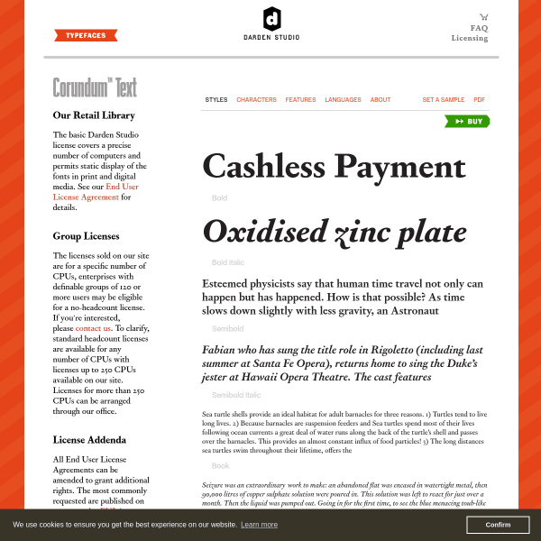
Corundum Text
A workhorse of a specimen for a workhorse typeface. Darden Studio's specimen's, although templated, are very well designed. The type testers only appear when a use wants to investigate a particular weight or style.
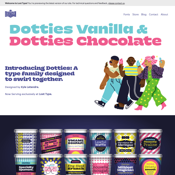
Dotties
A delightfully illustrated specimen full of lovely detail. The stacked ice cream pots are particularly clever.
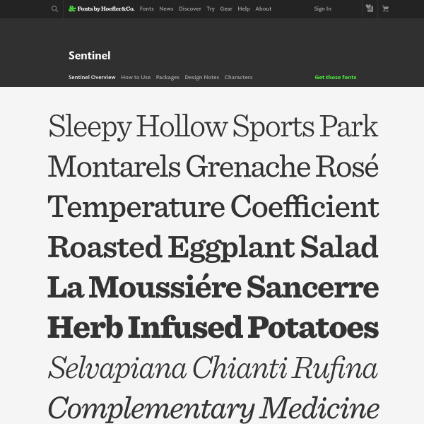
Sentinel
Sentiel gets an update to Pro status. New fractions, ornaments, small caps and more. As always with Hoefler&Co's specimens, there is a clarity and purpose. Sections for design notes and characters support the highly practical overview page.
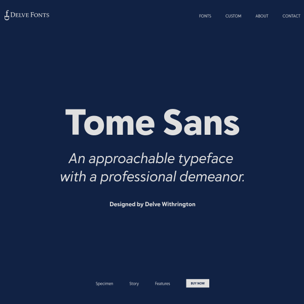
Tome Sans
An 'approachable typeface with a professional demeanor', Tome Sans from Delve Fonts has a functional but comprehensive one-page specimen.
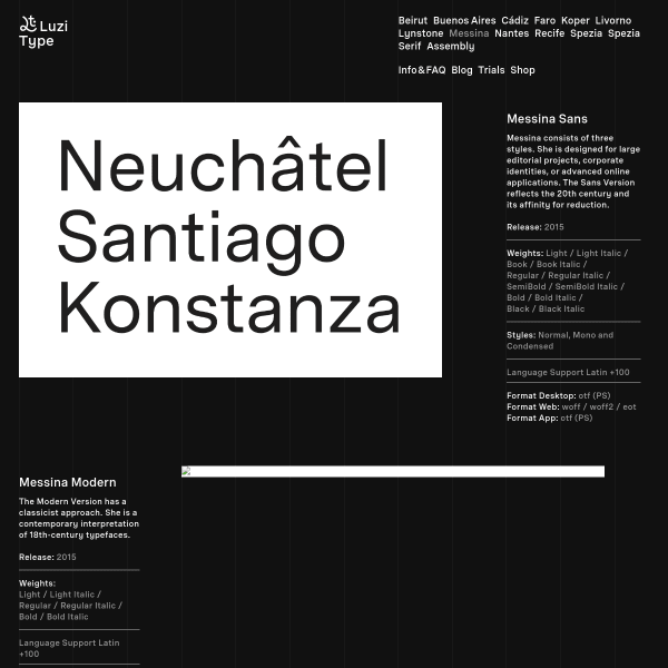
Messina
An unsual and refreshing layout for this black and white specimen for Messina. The type family is comprised of Sans, Modern, and Serif. The outstanding part of this specimen is the fonts in use section with captioned images showing Messina in context.
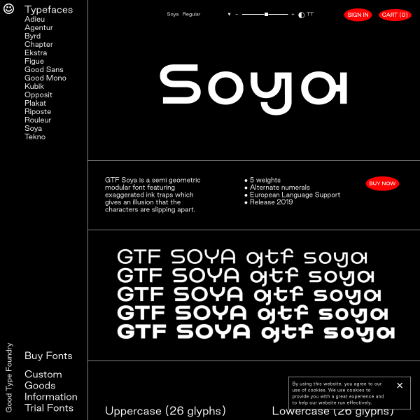
Soya
A type tester with a few controls, some sample text, the weights available and a glyph table. What more do you need in a specimen? No much more. Certainly no less.
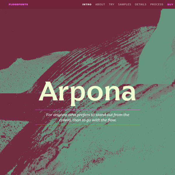
Arpona
This specimen leads with animated illustrations and the features and inspiration for the typeface. The multicolumn and paragraph settings work particularly well, especially as they are crisp web fonts. The jewel of this specimen, though, is the accompanying design process content, complete with early sketches.
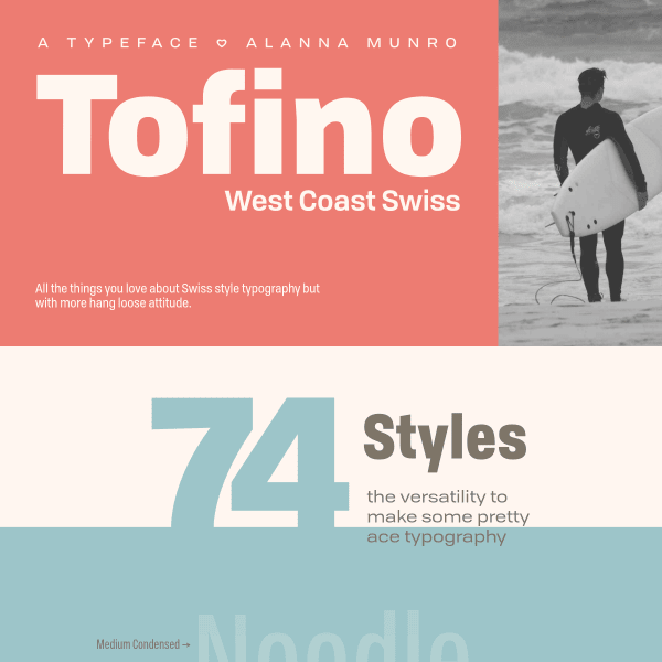
Tofino
A comprehensive specimen for Tofino, a sans serif with a large range of weights and styles available. The specimen is notable for its huge range of examples of potential usage, which even goes as far as including a UI kit for Sketch and Illustrator.
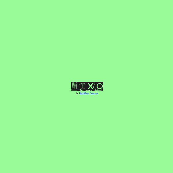
Mixo
A very simple specimen for the unusual display face, Mixo. A selection of sizes and a glyph table are all that's available.
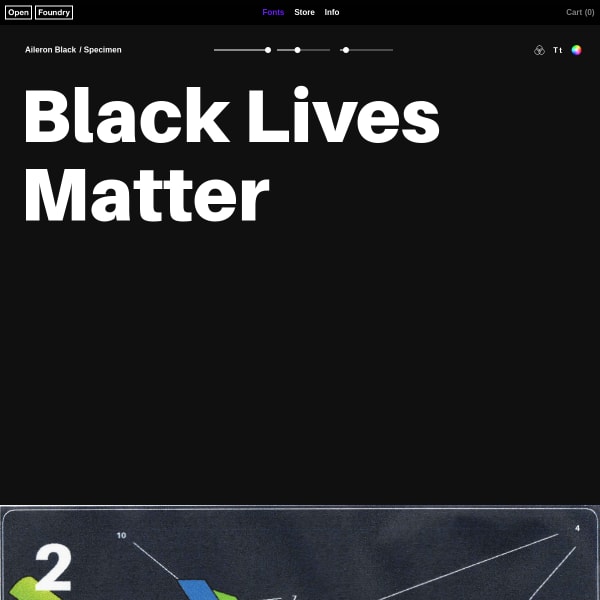
Aileron Black
A bare bones, but useful specimen. Type tester, big marketing focussed image, followed by a limited glyph table. The type tester is full featured with colour options and background images.
Edit Serif Pro
Despite Edit Serif being a lovely looking typeface, this is another specimen that is, unfortunately, pictures of type rather than web fonts.
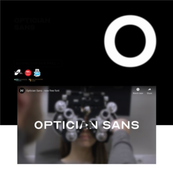
Optician Sans
A free font based on the eye charts throughout the world used for vision testing. An interesting idea that continues the design lineage of Dutch ophthalmologist Herman Snellen, in 1862, and Louise Sloan in 1959.
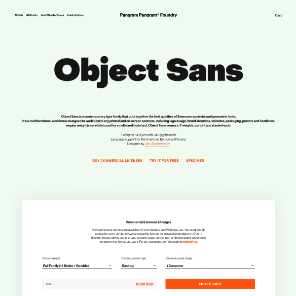
Object Sans
PangramPangram's specimens follow a similar templated approach but with bespoke, stacked typographic illustrations. Object Sans doesn't disappoint with striking illustrations displaying a range of weights in a simple two-colour palette.
Gravostyle
A catalogue style specimen but with interesting modular typetesters. The notable difference between these and most others is the option to choose different types of preset text: from headings, and alphabets, to paragraphs and more.
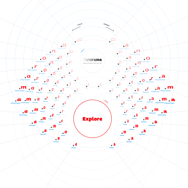
Panorama
An exploratory interface allows the user to navigate the design space. An imaginative use of navigational devices and layout.
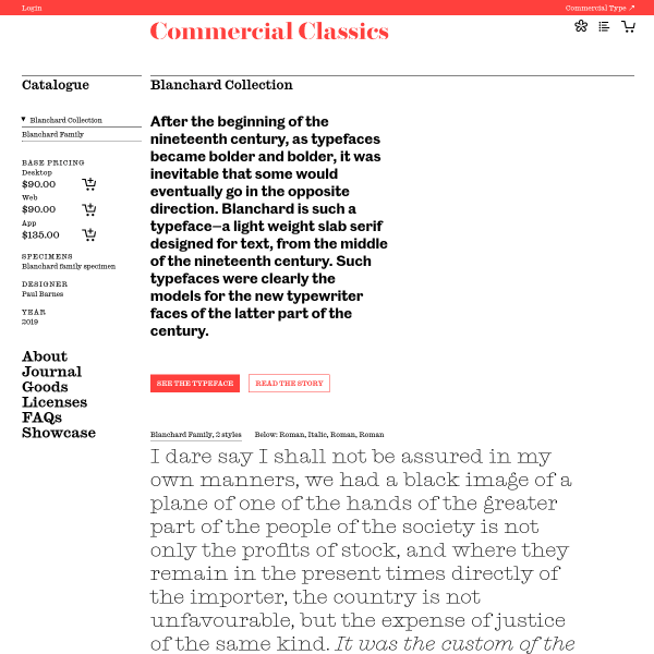
Blanchard Collection
A specimen disarming in its simplicity. Just a paragraph of content simply set in the two available styles sit below a brief introduction. The digital specimen is bolstered by a comprehensive PDF, and a lengthy story of the origins, design, and development of the typeface.
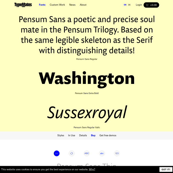
Pensum Sans
A fairly standard looking specimen, but it's enriched with content of its creation written by the designer.
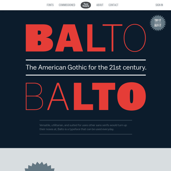
Balto
A visually interesting specimen that would be made so much better by being constructed with web fonts instead of rendered images. That aside, it does a good job of displaying the typeface's best features in an easily digestable format.
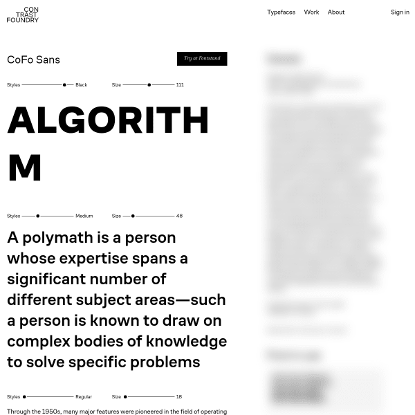
CoFo Sans
This is a smart looking specimen. Minimal in features, the design is horizontally split: typical specimen features on the left such as type testers, character set etc. But the right is blurred out. Until it is clicked, which reveals editorial about the typeface and designer, in addition to some fonts in use content.
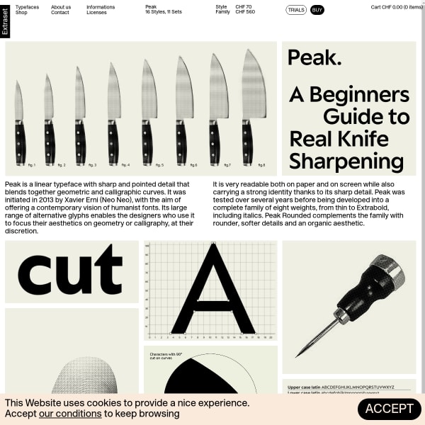
Peak
Another Extraset specimen with a vintage feel about it. Leading with illustrations to explain the font's features, the specimen moves on to a comprehensive and well-designed type tester. And there's that buy button again!
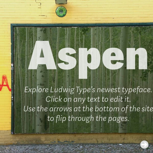
Aspen
This is a fun specimen. Luwig Type's Aspen typeface can be manipulated in mocked up contexts – from billboards and shop fronts, to books and magazines.
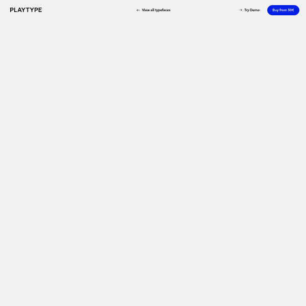
Playtype
Big. Type. but effective. The overlaid, layered, information panel is a useful and effective addition to the layout giving the appearence the user is scrolling an actual page of a specimen, rather than a web page. Subtle depth adding a subtle perception.