A curated list of digital specimens
of the highest quality. Updated daily.
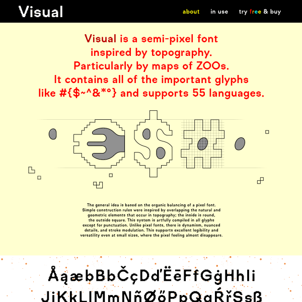
Visual
A conventional digital specimen for an unusual typeface. Visual is a semi-pixel font inspired by topography. The specimen leads with a quick explanation before showing some type in use.
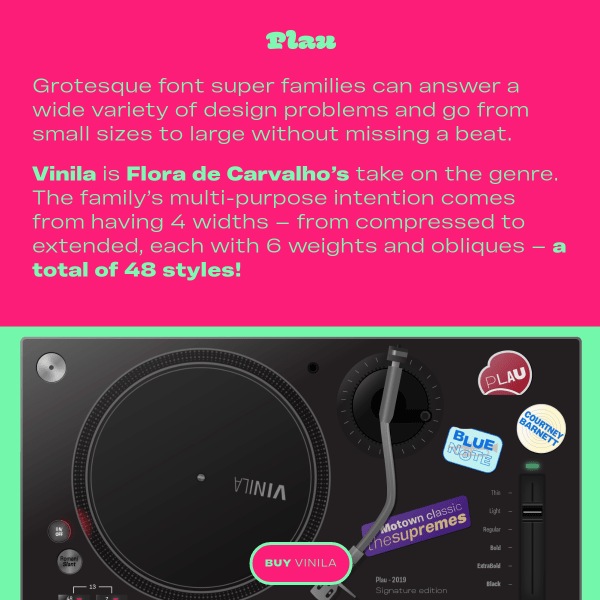
Vinila
Bright, energetic, playful specimen focussed on intended usage with some inspired sticker designs.
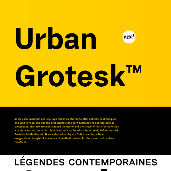
Urban Grotesk™
A forumulaic specimen, but done so well. Making up for its lack of interactive elements with tasteful design.
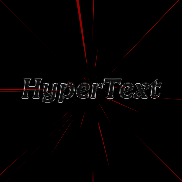
HyperText * Future Fonts Year One
The web used to be full of websites like this. Part art project, part exercise in learning (and pushing) the medium, and part commercial project. This site delightfully side-steps convention – chaotically, playfully, cheekily – and kills your browser in the process! Brilliant.
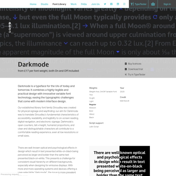
Darkmode
Despite Darkmode being presented within Dalton Maag's templated typeface library section, the specimen shows a few unique elements I wanted to draw your attention to. The animated explainer diagrams demonstrate Darkmode's core, variable typeface, benefit: the ability to switch to slightly heavier weights when using light text on a dark background. The axis switcher pattern is very well done. Sliders on two axis allow the user to dig into the weight axis and presents the problem the typeface is aiming to fix.
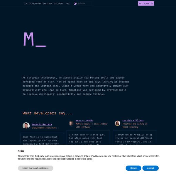
MonoLisa - A font family designed for software developers
A beautifully functional typeface from FaceType. The specimen starts with an all too fleeting flash of an ascii Mona Lisa shown full screen. The muted colour ways mimic the intended environment for use: themes for the likes of Visual Studio Code. Moving into features, the specimen site is full of useful animations and diagrams intended to not only demonstrate MonaLisa's attributes but also to educate the audience. The new design pattern I thought was fabulous was the little tabbed code viewer where you could preview MonaLisa in various, syntax-highlighted, programming languages – from Javascript to Python.
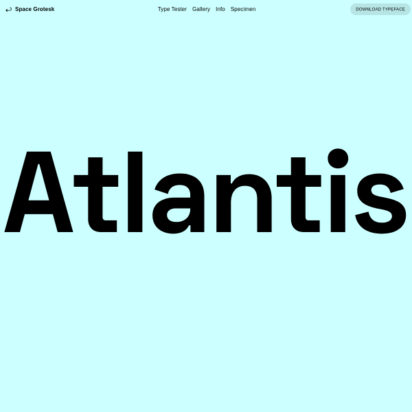
Space Grotesk | Florian Karsten Typefaces
Refreshingly simple to be presented with just the name of the typeface big and bold. Interacting with it, changes the state of the screen to be a type tester with the inclusion of very simple controls. The digital specimen could benefit from the detail of its print counterpart. If you download the PDF, there are a few comparison tools available with paragraphs shown at multiple sizes and weights. Still missing a glyph table, though, and some detail on some of the typeface features such as the alternates.
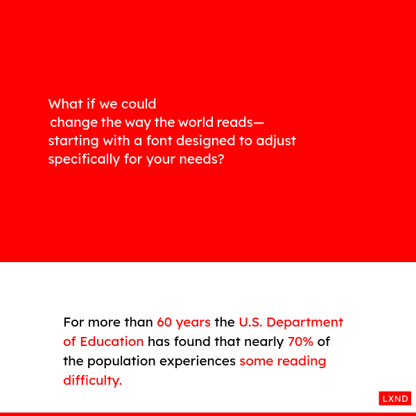
Lexend — Change the way the world reads.
How could we solve experiences of reading difficulty? Could variable fonts be a way of doing that? This specimen takes one firm step towards project overview and article, whilst highlighting the benefits of the approach with some hard data and well-constructed demos.
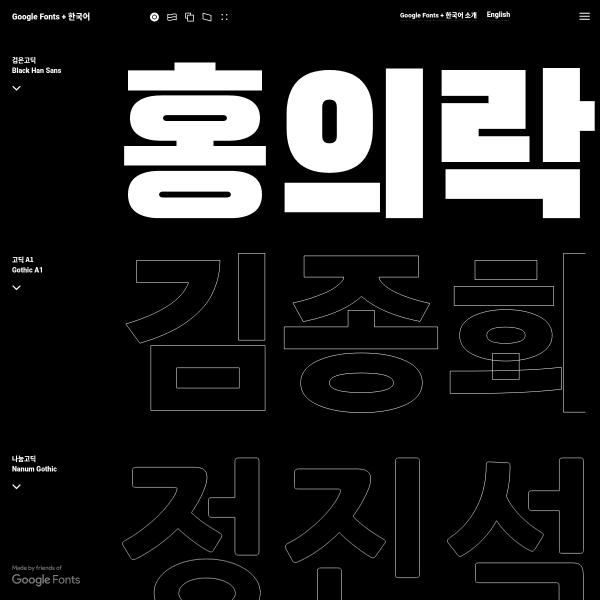
Google Fonts 한국어 • Google Fonts Korean
Great typography makes the web more beautiful, fast, and open. Using machine learning and the latest web standards, Google Fonts now offers the open source Korean fonts showcased in this website.
Faune, Alice Savoie / Cnap
No doubt a beautiful typeface, but let's focus on the specimen. As is usual for many modern digital specimens, it leads with the story. Presenting the typeface in its various intended uses, it's not until the end that the specimen digs a little into the features of the fonts. It's not until you download the PDF specimen, can you dig into the font features and individual glyphs.
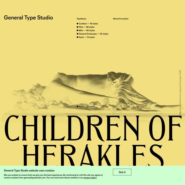
General Type Studio
As a homepage for a foundry, why not completely combine specimens of the catalogue in just one. big scrolling page? General Type Studio do just that and the result is wonderful.
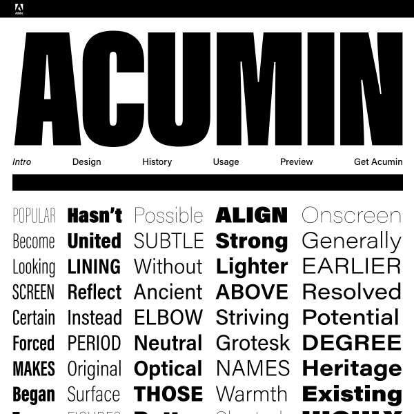
Acumin
What struck me about this specimen was the type tester. Most testers are quite lightweight; allowing the user to change weight and size, but that's pretty much it. Acumin's tester goes one step further in presenting a simple two column layout with a headline, a subhead, and some body copy. Allowing the designer to not only change the weights and sizes, but to do so in a limited (unbreakable) context.
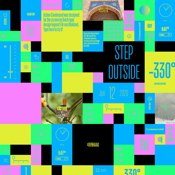
Action
A brilliant specimen. Full of little controls, icons and widgets to play with that alter the appearance and content.
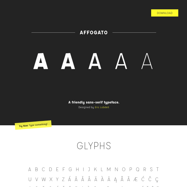
Affogato, A Friendly Sans-Serif Typeface
Unusually, Affogato leads with a glyph table. Normally this kind of detail is left to the end of a specimen – almost an after thought, unless presenting a comprehensive set of stylistic alternates, or particular support of unusual characters.
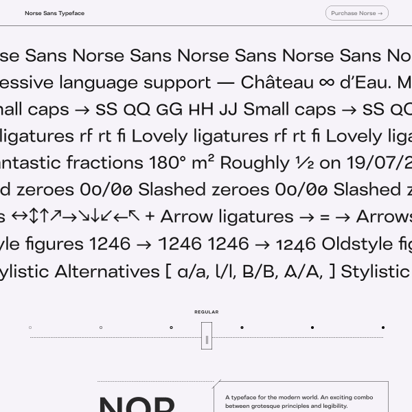
Norse Sans
The specimen leads with an unusual design pattern. A sort of feature carousel/animation in which the user can explore the features and switch weights if they wish. Unusually, this typeface specimen completely does away with any back story, marketing, or designers inspiration and just lays the typeface before the user: ' here are the features, here are my glyphs, buy me if you like me'.
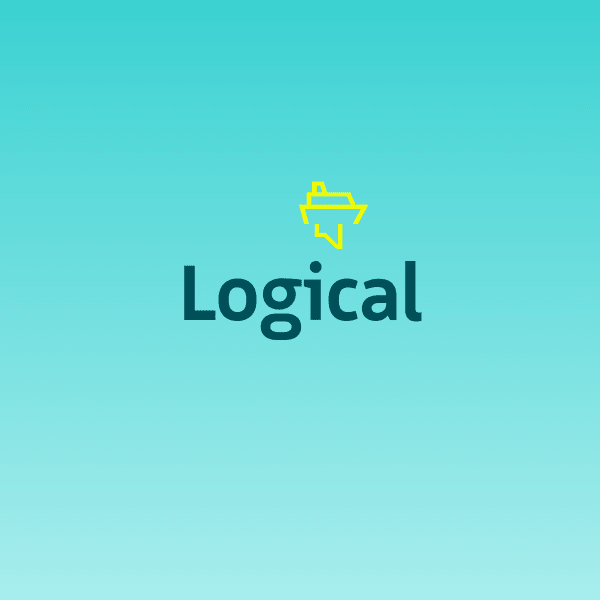
Logical
Beautiful, simple, legible sans serif from Bold Monday. It took me just minutes before I bought this typeface such is the power of this specimen. Leading with key stylistic features focussing on optimum legibility and humanistic feel, the large simple illustration help communicate what can often be type design specialist language. Another bonus of the typeface is the icons and the simply wonderful instructional animations. At the end of the specimen – in case you're not sold yet – we get to the nitty gritty features and glyph tables.
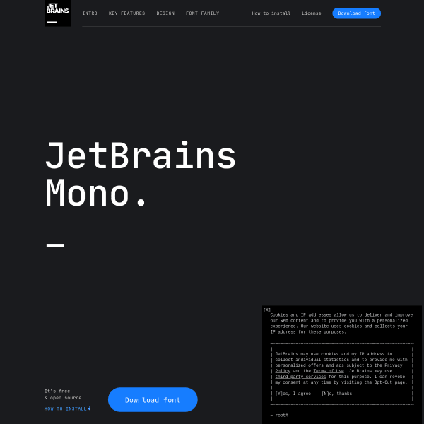
JetBrains Mono
Specimen as product website. There is just so much that can be learnt from how this website communicates the features of the typeface. From compelling layout, to informative animations, to a fantastic comparison table.
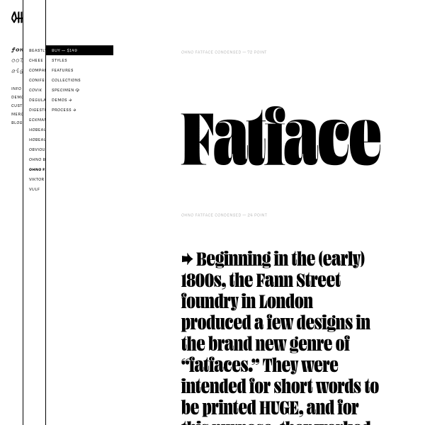
Ohno Fatface ☠️ OH no Type Company
The specimens for Ohno's website follow a similar simple design with stacked text containers at different sizes and weights. These areas are editable, but offer no type tester controls. The visual representations and animations of the features of the font work really well. Education, wayfinding, and a little bit of quirky fun, all wrapped into one.
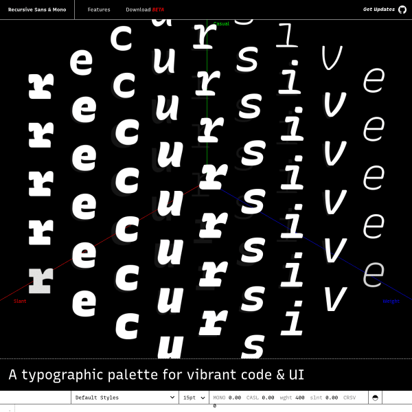
Recursive Sans
An amazing variable typeface under development. Not just a typeface, but a 'typographic palette for vibrant code & UI'. Another specimen that tells the features and benefits of the font through interactive and instructional design patterns. Continually inviting the user to get their hands on the typeface, rather than passively observing.
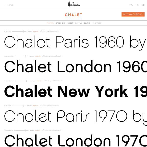
Chalet - House Industries
House industry specimens – whether in print or on screen – are always a masterclass in simplicity. Design-wise, they only show enough for you to make a decision. What I find refreshing about this specimen is the full browser width design with tiny type tester controls.
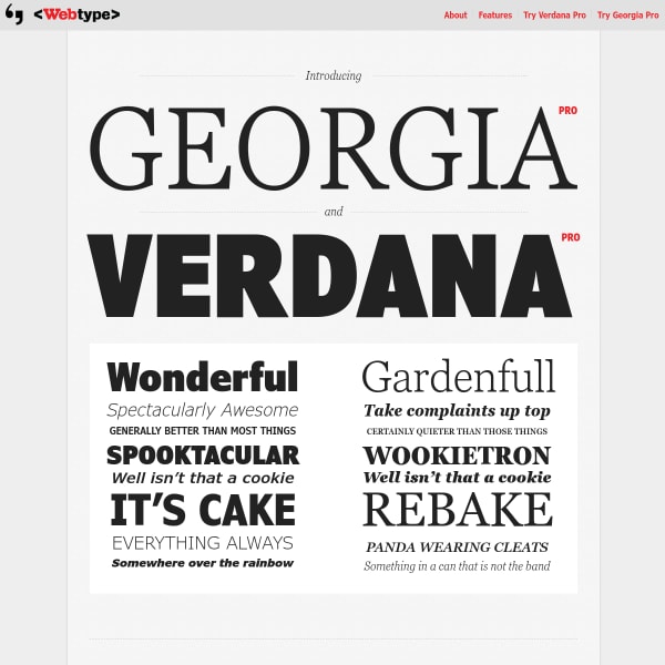
Georgia Pro and Verdana Pro
Superb simple specimen for the web's favourite typefaces: Georgia and Verdana Pro. The best bit about this specimen? The text is all set in web fonts. And it's crystal clear and sharp as a result. Georgia Pro looking especially good.