A curated list of digital specimens
of the highest quality. Updated daily.
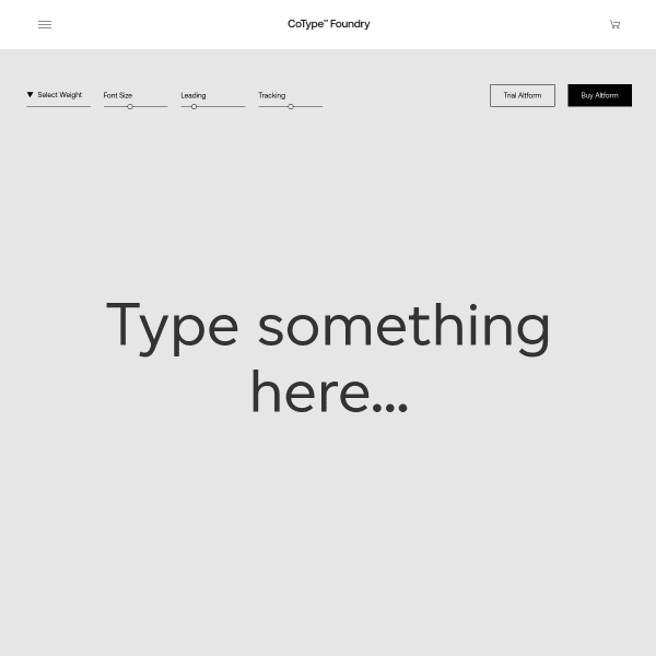
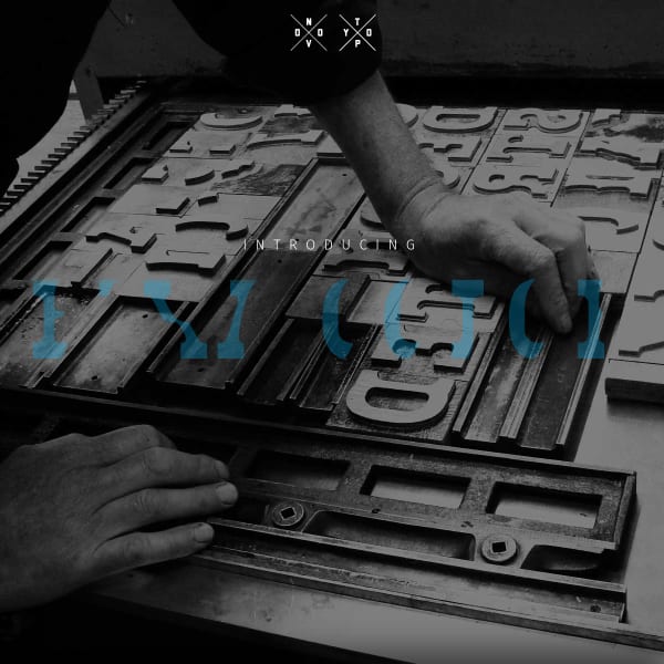
Altform
CoType's sepcimens are really good in their clarity and simplicity. The overlaying of content areas on scroll is a simple but effective little trick to clearly demonstrate different content areas, but also adds subtle animation and a feeling of depth.
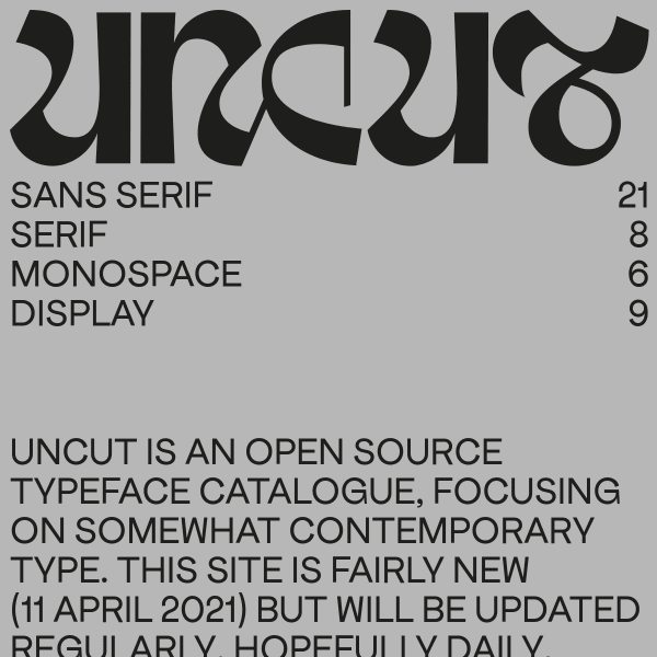
UNCUT
An unusual website. Or catalogue? Or specimen(s)? Maybe it's a foundry? I'm a little unsure, but what I do like is the bold, unconventional web design. Feels like a print publication for a contemporary gallery space. Refreshing!
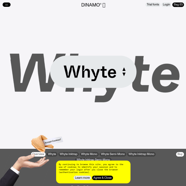
Whyte
I'm a massive fan of Dinamo's typefaces and specimens and this is no exception. Whyte is a brilliant typeface and specimen is bold and delightful, yet useful and usable. A delicate balance realised very well, here.
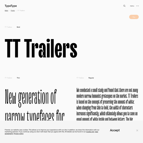
TT Trailers
The refreshing aspect of this efficient specimen for Trailers is the multi-lingual predefined sample text at different lengths. So often, language evaluation is limited to a list of supported languages. More specimens taking this approach would be welcome.

RT Alias
Green and black and nothing else. Simple design with effective designed panels. To explain the features of the font (different density of pixels) has been handled really well.
RT Rondelle
This is more 'essay as specimen' for Rondelle. Describing the motivation, design process, and results is refreshing in its depth providing the user with plenty of opportunity to review the features.
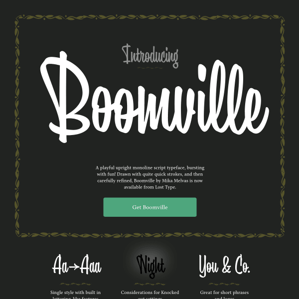
Boomville
Boomville describes itself as 'A playful upright monoline script typeface, bursting with fun!'. It's not wrong! Packed with nifty features, Boomville will certainly sit in a niche place in my font library.
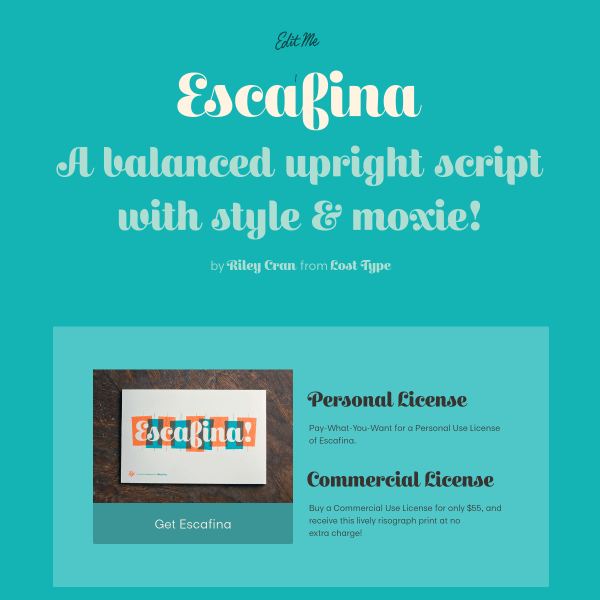
Escafina
This is a characterful specimen for Escafina. A simple, bright colour palette of the design pairs well with the playful curves of the typeface.
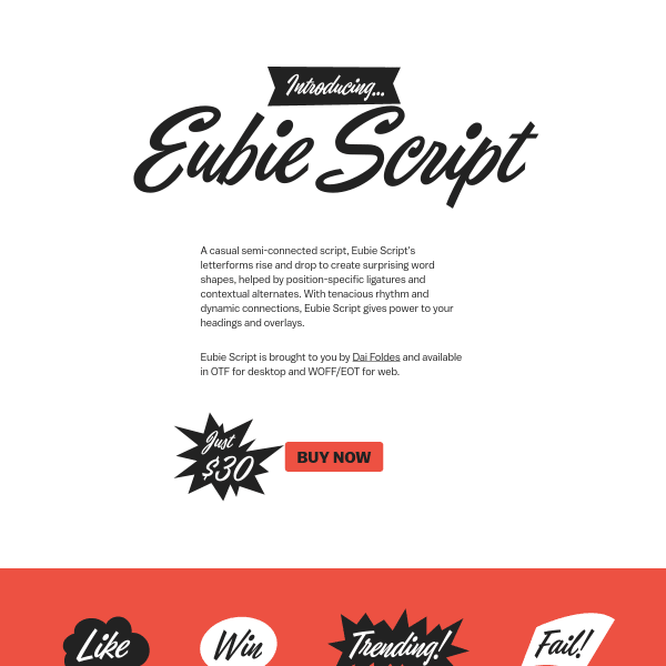
Eubie Script
These simple, single-page specimens - which just outline the features of the font - but rely on the design of the page to really sell the idea are really effective. I love the arrows surrounding the buy button.

Marvin Visions
Stranger things? Yes, sort of. But where this specimen for Marvin from Visions really shines is the use of the variable weights. There are some novel UI elements to help the user explore variable axis. I really like the square 'design space' slider. Nifty.
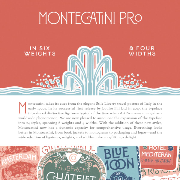
Montecatini Pro
Will you look at that CA ligature in the title! This specimen for Montecatini is very refreshing. Leading with design information and inspiration, the specimen goes on to provide type testers. The real stand-out, though, is the real selling point: the contextual and stylistic alternates.
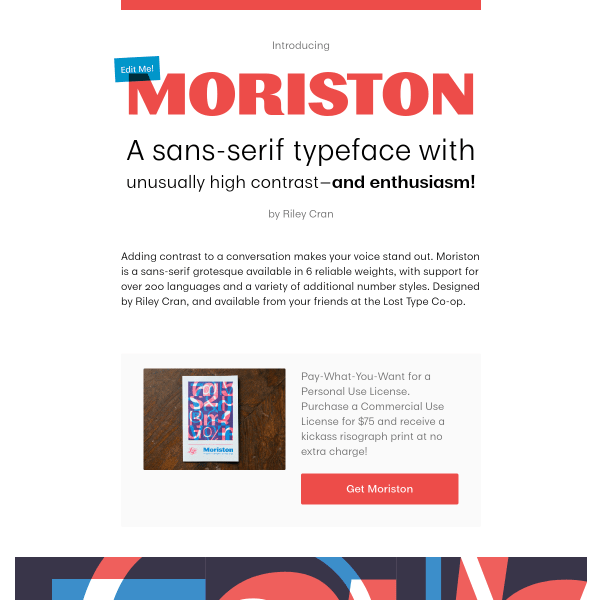
Moriston
Part article, part type specimen, and part – sort of – product landing page. The 'pay-what-you-want' personal licensing is a welcome addition, plus the various calls to action for signing up to the newsletter. These commercial additions – whilst welcome here – are sadly lacking from many specimens out there.
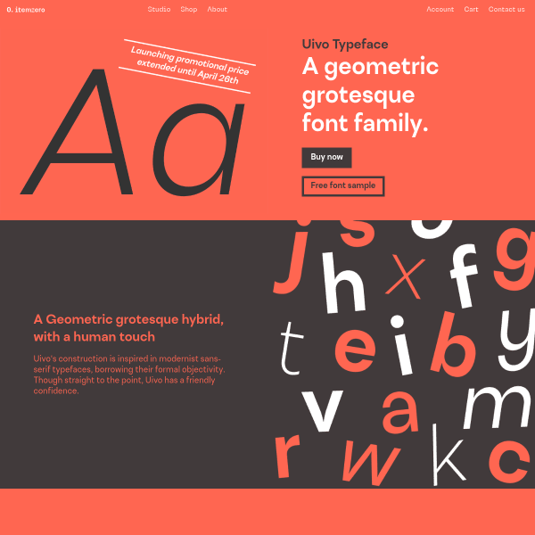
Uivo
Uivo is a geometric grotesque hybrid with a specimen full of personality. The delicate balance of marketing, usefulness, distinctive, and design is well constructed with a simple colour palette, stacked specimen components, and finishing with some really useful customer testimonials. I wish we'd see more of those.
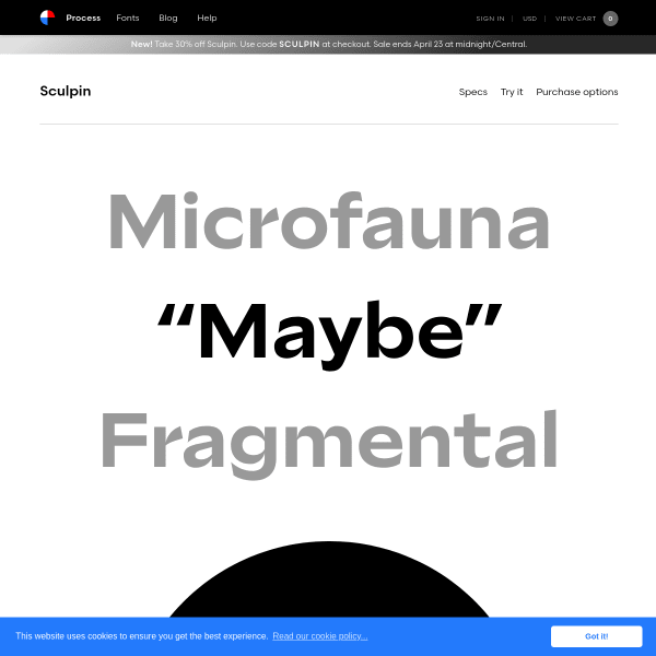
Sculpin
Process's type specimens are always so simple, engaging, and just useful enough to tempt any designer to part with their cash. Really good specimen with larger than life type.
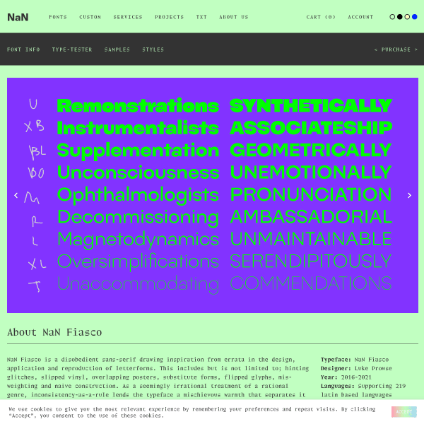
NaN Fiasco – NaN
NaN Fiasco is a disobedient sans-serif drawing inspiration from errata in the design, application and reproduction of letterforms. The specimen is a neatly stacked selection of type testers before concluding with one of the most engaging license selectors I've seen.
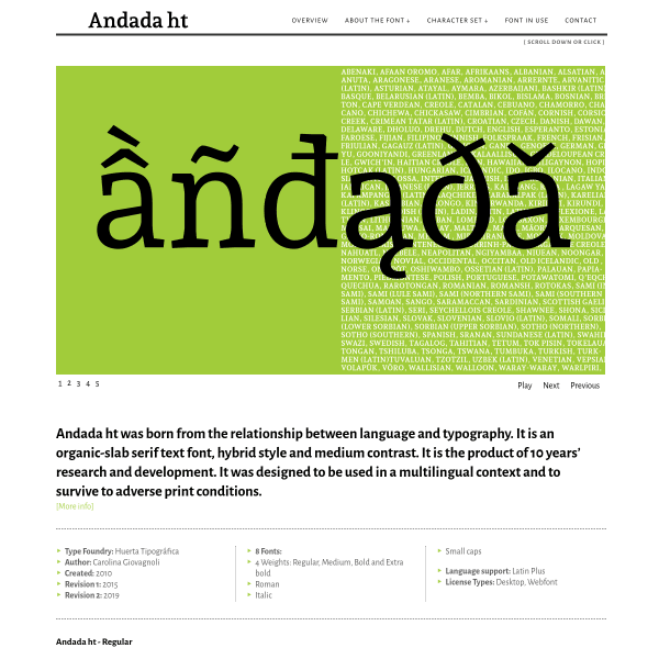
Andada
This specimen for Andana is just about as comprehensive as you can get. It's got it all: fonts in use, complete character set, open type features (together with educational content).
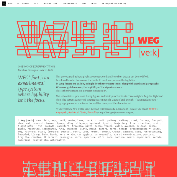
— WEG —
WEG font is an experimental type system where legibility isn't the focus. It's refreshing to see this type of experimentation is still alive and kicking in the type design industry. The specimen demonstrates potential usage which frames the experiment in the real world of application to products and services.
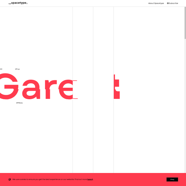
Garet
Some interesting components in the specimen for Garet. The opentype features selector is particularly useful when combined with the sample text. The inclusion of some experimental and playful components – such as the 'talk' component – is very welcome.
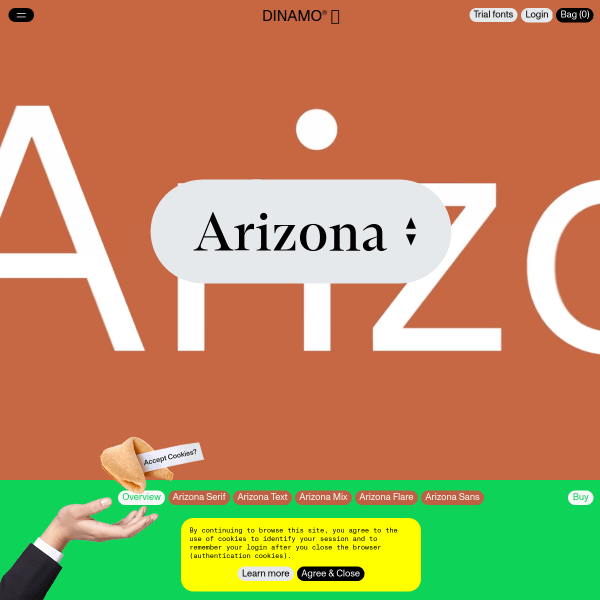
Arizona
Dinamo does it again. Vibrant, useful, exciting specimen for a monster typeface release. Of particular interest is Arizona Flare – a nice blend between Serif and Sans and a natural progression from the variable font design space.
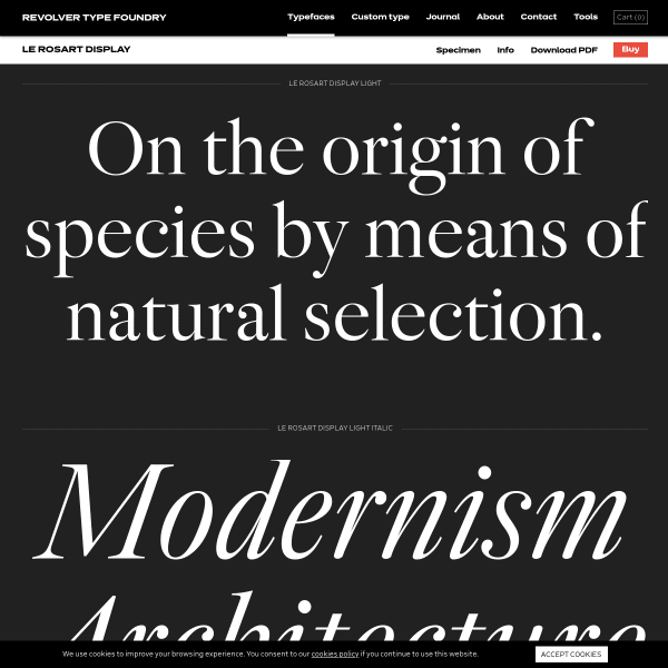
Le Rosart Display
There has been an increase of this type of digital specimen over the last year; stacked type testers of set text in the various weights of the typeface. And that's it. The best of both worlds. Interesting enough from a design perspective to really show the glyphs off, but with the added functionality to really start probing the typeface for your own needs.
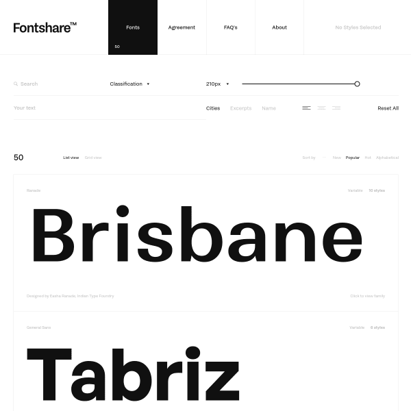
Fontshare
This is a little different. Indian Type Foundry have created this free offering of their entire catalogue for non-profit or personal use. Brilliant. And the specimens to display the catalogue are really well done with some nifty, subtle design elements.
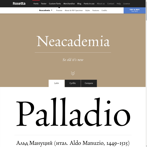
Neacademia
Neacademia is a Latin and Cyrillic type family inspired by the types cut by 15th century Italian punchcutter Francesco Griffo for the famous Venetian printer and publisher Aldus Manutius. The specimen is available in Latin or Cyrillic which is nice – so often language support is shown in the glyph table, rather being set as text.
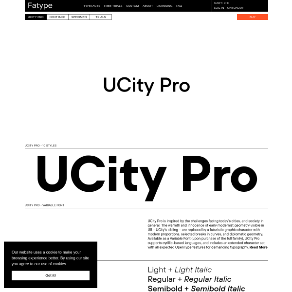
Fatype
Almost every bit of type on this specimen is a type tester. Controls reviewing themselves on hover, they are stacked, starting with huge single words before slowly changing into more long form content all the way to paragraphs.
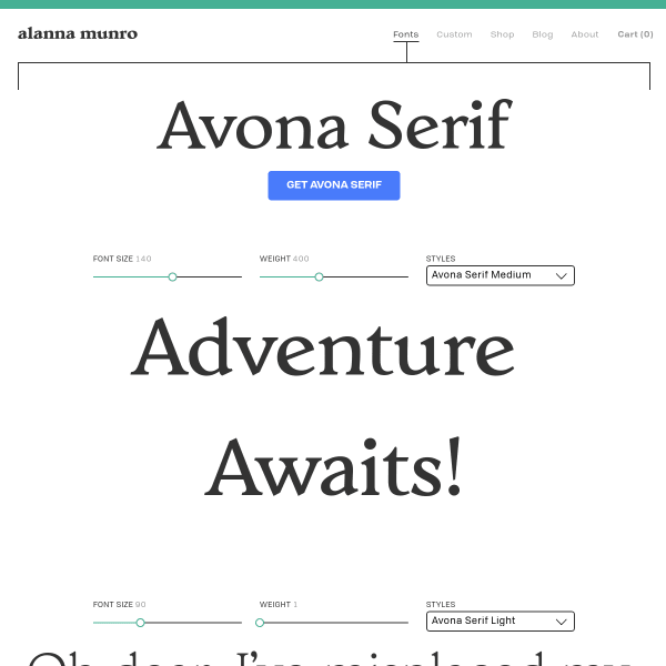
Avona Serif
Another specimen where the buying options caught my eye. A multitude of boxes – each labelled with the font packages, ranging from Personal, to Large, allow the user to easily choose. The one thing that caught my eye was the 'pay-what-you-want' for non-commercial and testing purposes. An interesting alternative to limited trial fonts.
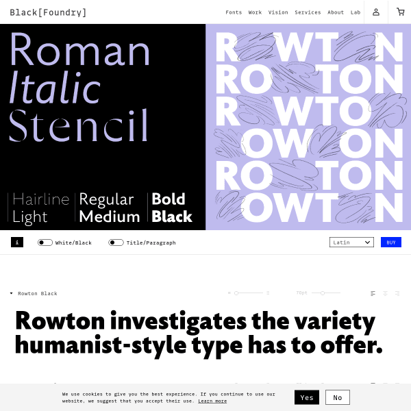
Rowton
This specimen for Rowton has the usual components: type testers, carousel of designed images etc. But, rather unglamorously, it's the buying options that sets this apart. A really simple walk through licence type, scripts, and individual weights and promotional packages. Super clear and easy.
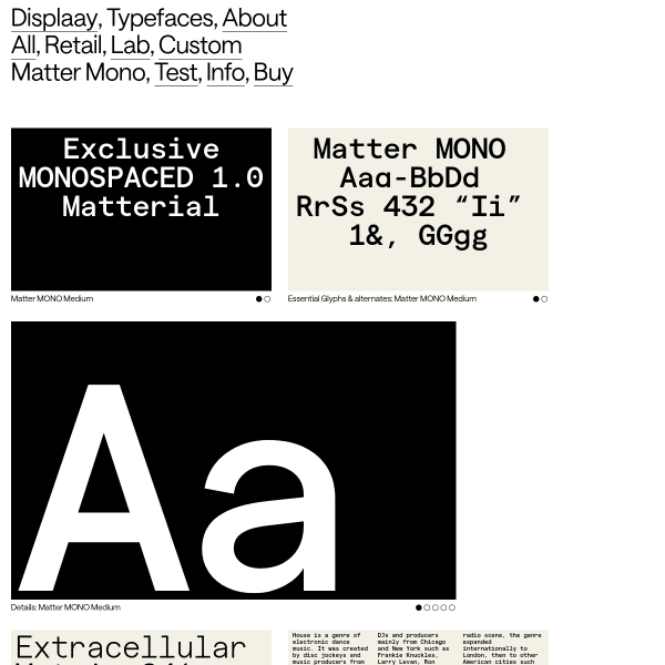
Matter Mono
New addition to Displaay's Matter typeface. Like its parent typeface, Matter Mono is just different enough to warrant attention. The specimen has a good type tester proceeded by some designed images.
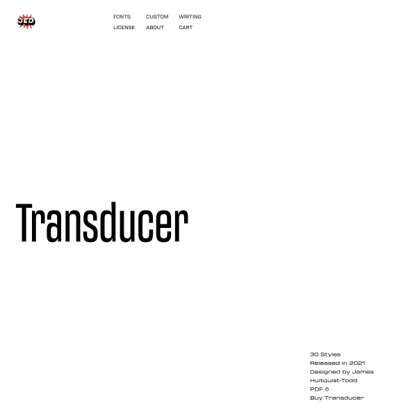
Transducer Font Family
There is just something about slightly extended or condensed typefaces that take me right back to memories of Space Lego, ABBA, and the early '80's Where everything was brown and orange. Not this specimen, though. Stark, stylish black type testers display large type harking back to those more stylish days.
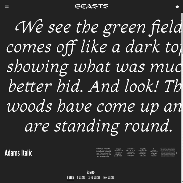
Adams Italic
Just look at those swash italics! Beautiful font, and quite a simple specimen – from a functional and aesthetic point of view. But what stands out on this is the copywriting. The wonderful little story sits alongside the font in the quirkiest of ways. There are other short stories o the site as well for you to enjoy.
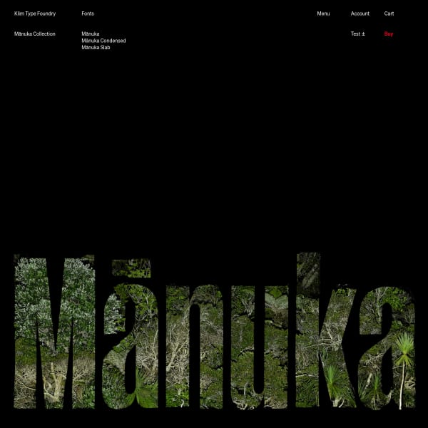
Mānuka Collection
A big release from Klim, and, as you'd expect, the specimen is pretty special. Following similar information architecture to the other specimens in the collection, Mānuka's distinctive branding sits atop the specimen and across all of the marketing. That's what I like about Klim's releases: the thought and careful execution given to branding every release.
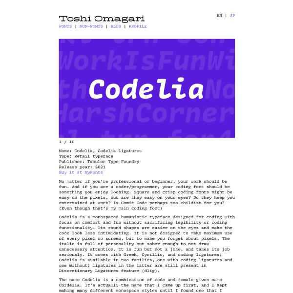
Codelia
Not a specimen as such, but I know Toshi and the care and attention he puts into the design of his typefaces. Codelia is no exception. Beautifully designed for a difficult work environment, it's sensitive to the needs of programmers who sit all day looking at code.
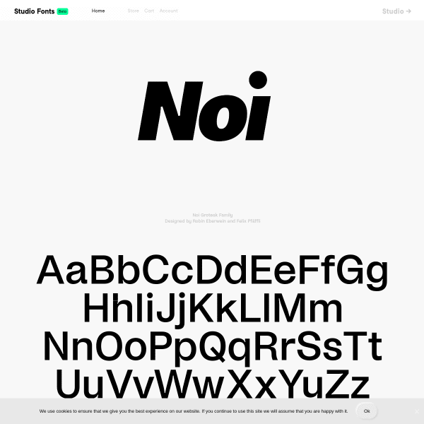
Noi Grotesk Family
Perhaps the longest scrolling foundry homepage I've seen. Atop is the specimen for Now Grotesk with some brilliantly designed components outlining the font features and design details.
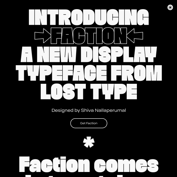
Faction
I'm a big fan of combining the design story of the typeface in a specimen. Of course, this has to be done sensitively, and at the right point in the user's evaluation of the typeface. The specimen for Faction does that particularly well, seamlessly moving from detailed specification type content, over to the story of how the typeface came to be.
Essonnes
Now this is cool. Instead of just showing a bunch of letters, type testers, and features like all specimens do, why not take three short stories and typeset them to show off the real-world capabilities of the web font. Perfect.
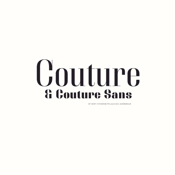
Couture and Couture Sans
This is really, really interesting from Positype. The unusual, but simple, interaction design of mirrored scrolling lend itself perfectly to this high contrast fashionista type design. Just enough content to whet the appetite presented in a cool way. Take my money.
Bixa Color
Some interesting things can be done with colour fonts. Bixa was originally designed as wood type for letterpress, and is now transformed into a multicolor font for web. The specimen suffers slightly in the same way specimens for variable fonts do: they have to explain the benefits and features ahead of the actual design. That said, this is an interesting specimen.
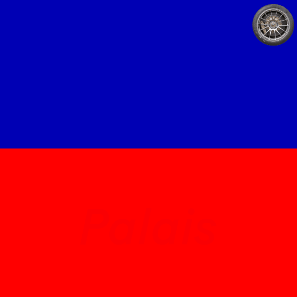
Baton Turbo
If you ignore the strange spinning wheel in the top corner, this is a well put together specimen. Striking colourways underpin some solid, usable components. The feature illustrations are particularly good.