A curated list of digital specimens
of the highest quality. Updated daily.
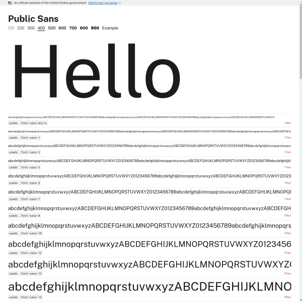
Public Sans 400
We've probably featured Public Sans on here before, but this is the actual specimen page – a level down from the micro site home page. Mirroring a print design, it displays a waterfall of different font sizes. An interesting comparative component where Public Sans is shown next to Verdana, Georgia, and System.
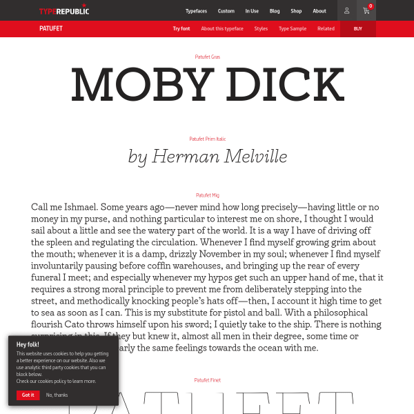
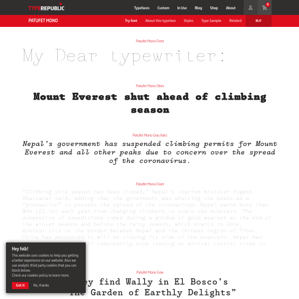
Patufet font
This is a great specimen from Type Republic. Traditionally designed, but with each paragraph or single sentence changing into a type tester when the user clicks on it. It's a detailed, considered digital specimen.
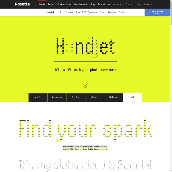
Handjet
An amazing experimental variable font, the specimen for Handset tries to articulate the huge range of options available to the user. The discretionary ligatures are such a delight.
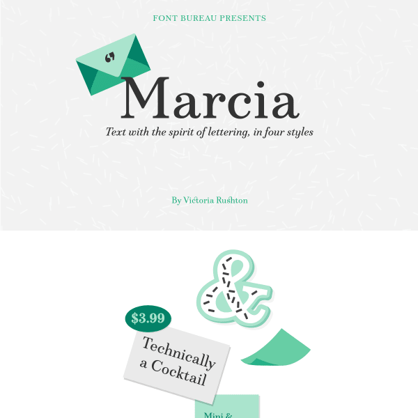
Marcia
The notable point about this specimen is the conversational tone it takes in explaining the features of the font – particularly the Very Discretionary Ligatures. Nicely presented illustrations give a 50's vibe.
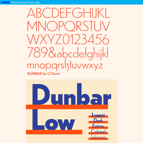
Dunbar
An impressively detailed, long-form specimen for Dunbar. Starting with stacked typographic illustrations, it moves onto typesetters for each individual weight. The detailed overview of Opentype features is a welcome addition, as are the in-depth design notes.
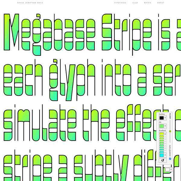
Megabase Stripe
A brilliant single page specimen for an experimental version of Megabase that allows the user to create colour gradients. It includes simple UI controls for changing the slant axis, as well as each of the colour steps in the gradient.
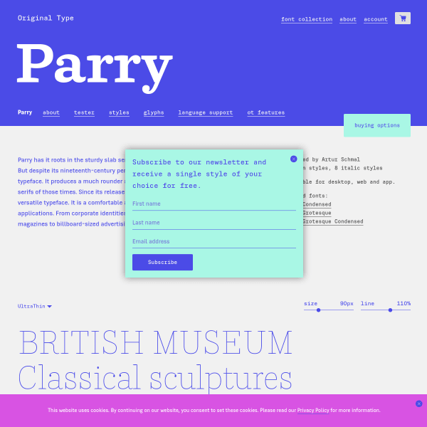
Parry
Simple, functional, and shows off the typeface in the best possible way, this specimen for Parry – similar to all specimens on the Original Type website – has a detailed view of all opentype features, glyph set, and stacked type testers.
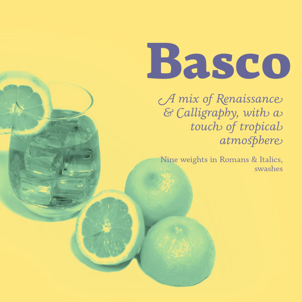
Basco
This specimen for Basco neatly combines a very tight-specific print aesthetic – duotone colour palette, and mixing supportive photography – with a more web-native feel with scrolling animations.
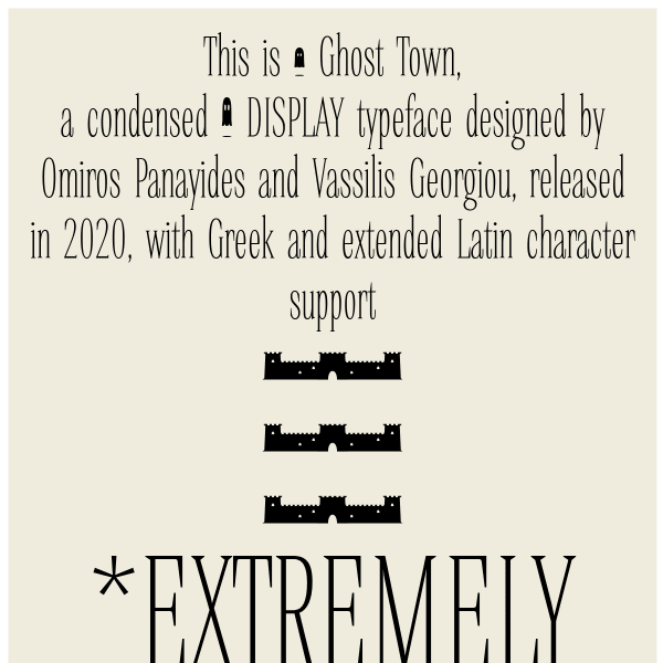
Ghost Town
The notable point about this specimen for Ghost Town from Ooukpress is the long form editorial as a way of introducing the typeface, describing the features of the typeface, but all set in varying weights and styles. It reads like a product page. Notable for Greek support, it's also freely available.
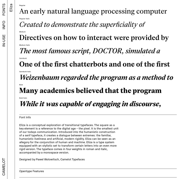
Eliza
This specimen for Eliza is notable for the graphic explanation of opentype features and support in addition to the detailed and categorised glyph set. The purchasing flow is interesting opening up drawers of content from the site's horizontal navigation.
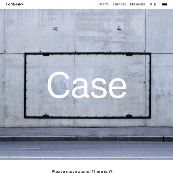
Case
A new typeface from Fontwerk. Case is a modern Neo-Grotesque made for the new Twenties. The specimen's subtle use of photography of found objects or urban textures works nicely with the content. The information architecture of Fontwork's specimens work really well in guiding the user down to more detailed information.
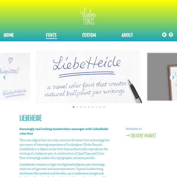
LiebeHeide
A lovely hand-written font with some clever additions detailed in the specimen. This typeface has emoji conversions, double underlines, and also some delightful scribbling-outs. The specimen itself is a stacked set of type testers sitting below a carousel and some brief editorial.
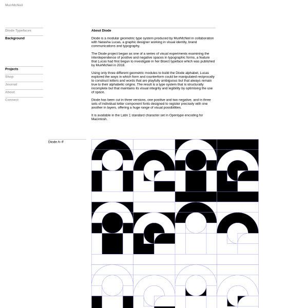
Diode Type System
A strange font with a strange, exploratory digital specimen. Unfortunately, as we see quite often, the print specimen PDF is full of examples and striking design with accompanying editorial. The digital specimen, in contrast, falls a bit flat.
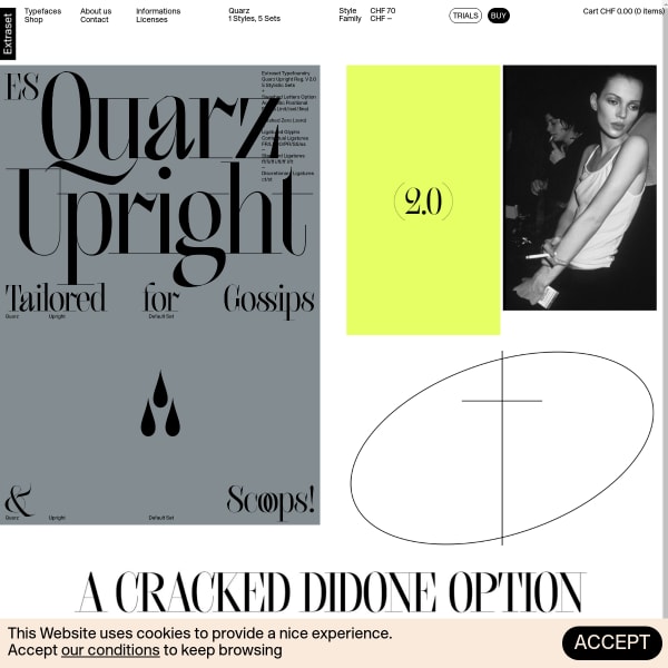
Quarz
Quarz's specimen follows the structure of the other Extraset specimens, with an interesting mixture of designed panels and animations. The blend of associated photography is a strong design choice, but the functionality offered below is second to none. Excellent type tester and glyph set.
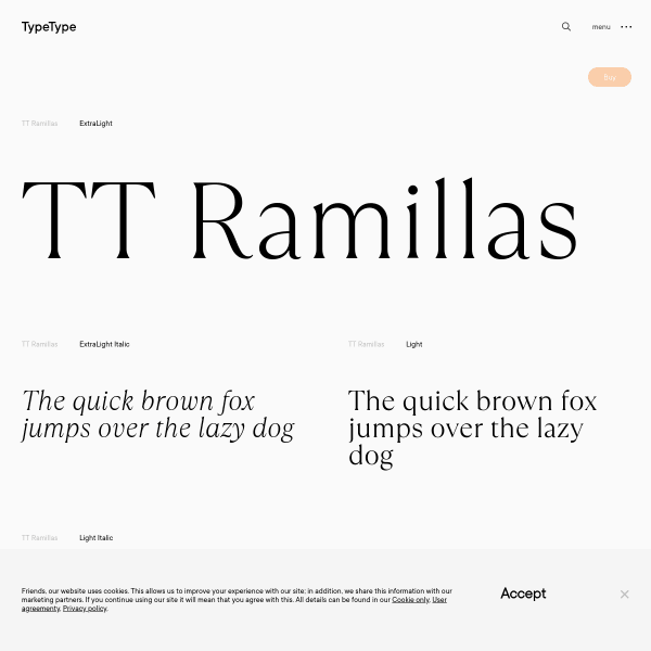
TT Ramilla
Excellent type testers from TypeType for this specimen for Ramilla. Notable for its inclusion of multi-lingual defined paragraphs.
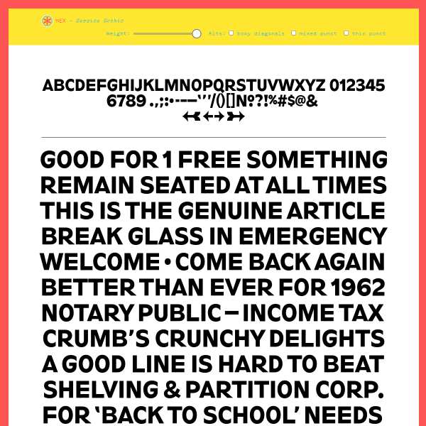
Service Gothic
This specimen from Service Gothic from Hex is a refreshing design. Presented as a single page – almost like a poster design – it is a full page poster with type set at various weights and sizes with controls at the top. Showing so much type in a type tester really helps in conveying the changes made to the weight axis.
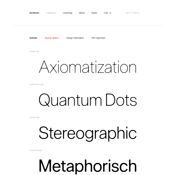
Arkitekt
Super simple specimen from Aesthetic Type for their latest release, Arkitekt. A list of type testers, some long form design information, and a clear call to action to buy some licenses
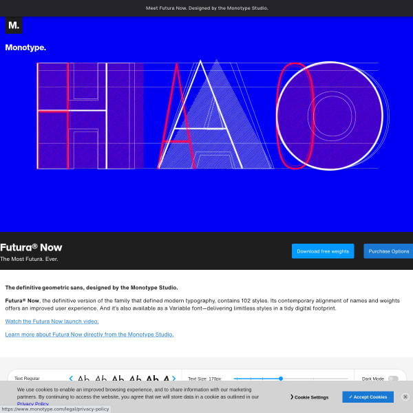
Futura Now
This specimen from Monotype is like many of the recent specimens from the Studio's releases: templated, and fronted by a bespoke marketing video. One interesting additions, though. The type tester has state changes on resizing the text. As a user moves down the sizes, the names – and associated ranges – change, as does the content of the tester. Nifty.
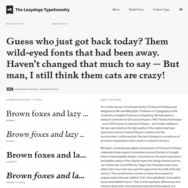
LD GENZSCH ANTIQUA
A simple specimen that is basically one big typetester and a list of weights set side by side with a lengnthy piece about the design. SImple, but effective.
La Pontaise
This specimen takes user configurable options to a whole new level. Presenting vertically stacked canvases, with pre-designed settings in each, the specimen allows the user to interact with every element of type. Not only that, they can make small design changes such as alignment, spacing, multicolumns, and even adding images.
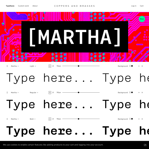
Martha
Wonderful specimen for code font, Martha from Coppers and Brasses. Excellent graphic design and imagery underpin a structurally sound digital specimen. Stacked type testers punctuated by bright, distinctive graphics.
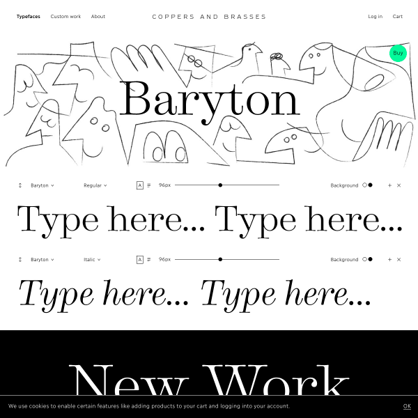
Baryton
A stylistic specimen that neatly combines sympathetic illustration to the sutble forms of Baryton. Great art direction.
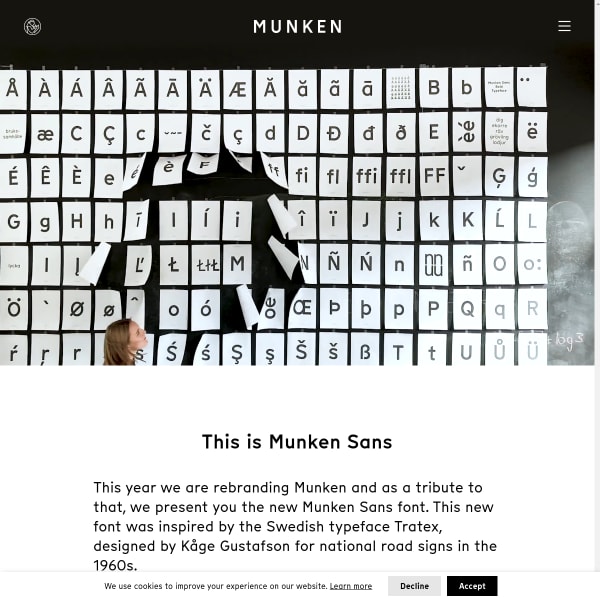
Munken Sans
There is much to admire in this specimen for Munken Sans. It hits all the right points for usability, design inspiration, and marketing the features. The use of video and photography is a welcome addition.
Patufet Mono font
Simple and effective specimen from Type Republic for Patufet Mono. We continue to see this welcome design pattern for disclosing type tester controls when a user intercats with a body of text.
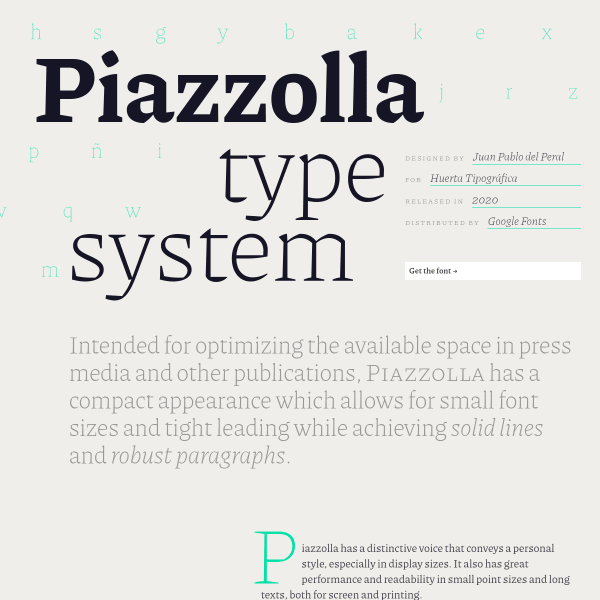
Piazzolla
So much detail in this specimen. From the long-form editorial, to the different interactive panels. One of these really stood out: the highlights panel. Here, we have on display a grid of selected glyphs for the user. Useful.
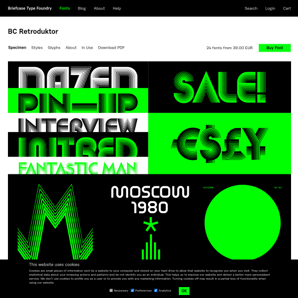
BC Retroduktor
The opening screen of this specimen is striking. A stacked selection of svg graphics show the typeface in various graphics. The rest of the specimen – behind sub navigation – allows the user to sample the typeface as well as a complete glyph table.
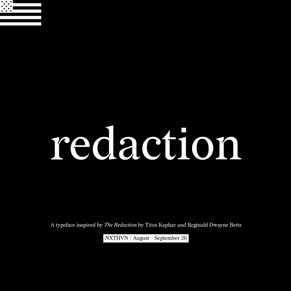
Redaction
A specimen that takes cursor-jacking to a whole new level! There is much to enjoy in this specimen and, for those who are old enough, you may be reminded of early 2000s web design where experimentation, play, and expression were still high on the medium's agenda.
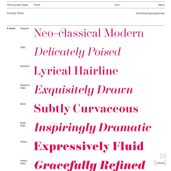
Foundry Tiento
A subtle, simple and usable specimen for Tiento. It delivers on the basics, but being such a simple design, there is an elegance there that matches the typeface beautifully.
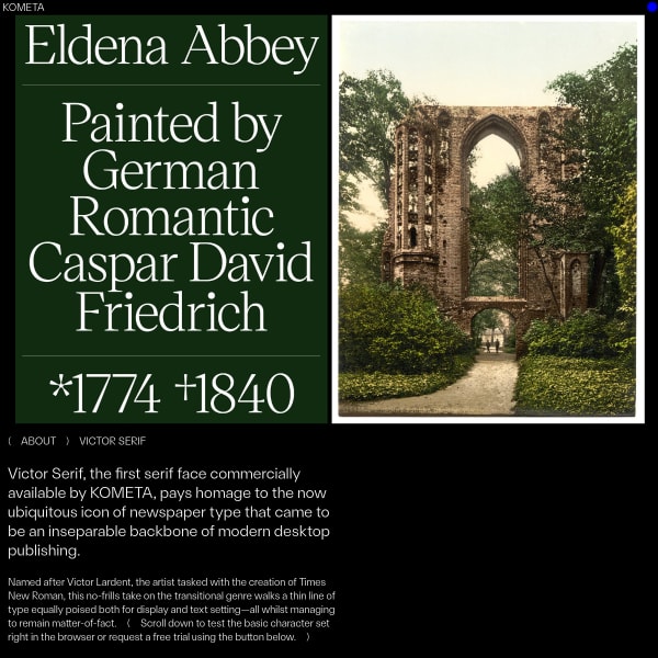
( KOMETA ) Victor Serif
Another interesting specimen from Kometa. Notable for it's use of vintage photography combined with starkly contrasting and large type, the specimen moves onto stacked settings that build on the idea of paying homage to the ubiquitous icon of newspaper type.
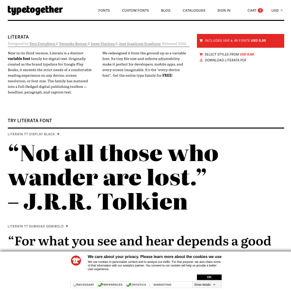
Literata
Typetogether's specimens are always so detailed, full of useful and detailed information. This specimen for Literata doesn't disappoint. The specimens as type testers work particularly well since they only reveal their controls when a user interacts with them keeping the overall appearance clean and uncluttered with UI controls.
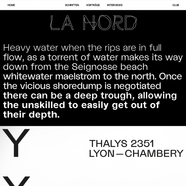
La Nord
A simple specimen for an interesting typeface. The typeface has some unsettling attributes – the lower case a, the cap M. When set in a paragraph, it gives this uneasy feeling. One has to wonder why that aesthetic wasn't carried through to the specimen. Regardless, this specimen does the job.
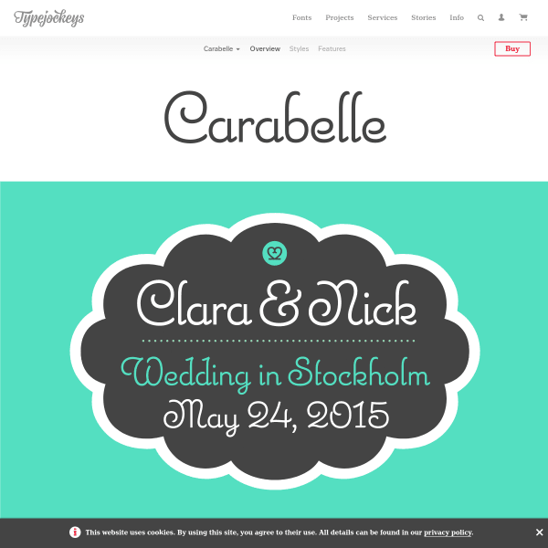
Carabelle
This specimen for Carabelle is a delight. Beautiful illustrations and example designs are stacked around the most simple but effectvie test tester. It would be useful to see some details such as a glyph table and specifics for the alternates and language support instead of indicative illustrations.
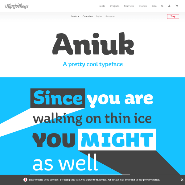
Aniuk
Aniuk is, as the specimen says, a 'pretty cool typeface'. As is the specimen. The user is invited to scroll through several designed panels in a simple monotone colour palette. The opentype feature illustration works particularly well.
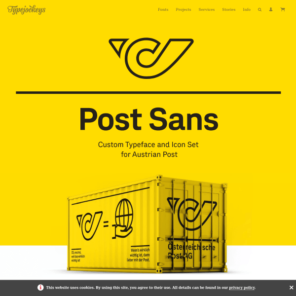
Post Sans
This is a case study for some custom type, but shows how close to a specimen it could be. Excellent design throughout, with engaging content and examples of use.
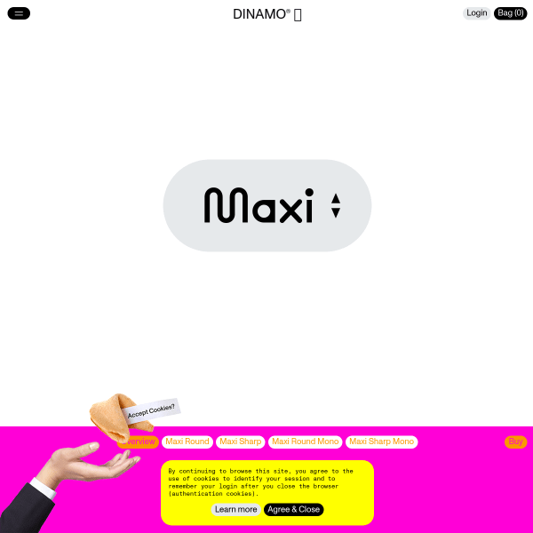
Maxi
Where to start with this from DINAMO!? Brilliantly concieved variable typeface. Or playful, bold specimen. Or maybe a colour palette designed to challenge your eyeballs. Refreshing. Brilliant.
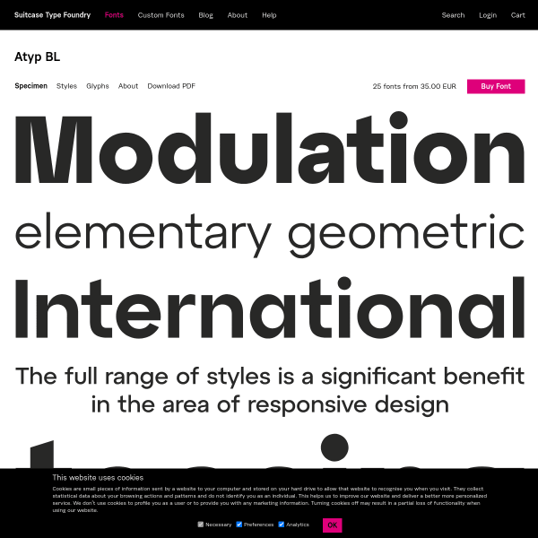
Atyp BL
A traditional format for this specimen for Atyp BL. Starting with stacked words (in svgs, not web fonts) with navigable sections of the specimen to try the various styles with a type tester, download trial fonts, and a PDF specimen.