A curated list of digital specimens
of the highest quality. Updated daily.
Ogg
A light specimen for a delicate typeface. The unusual part of this specimen is the presentation of the opentype features. Each feature has a little slideout window showing the details of each.

Indivisible
Process' specimens are clean, simple, and functional. Large, full-width words in the range of weights is followed by a variable font tester just demonstrating one variable axis: weight. A more feature-rich tester is available under the 'try it' navigation option.
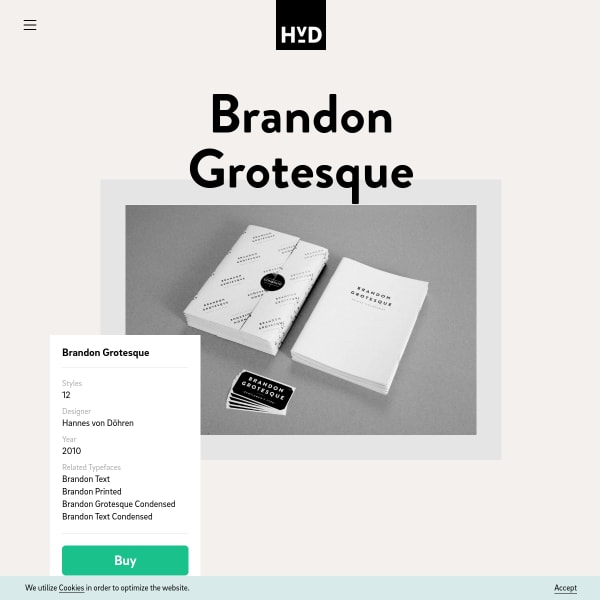
Brandon Grotesque
This enormous specimen is crammed full of useful detail. Starting with the simple type testers, but it's towards the bottom of the page that the specimen documents intended context, and some of the typeface's key features.
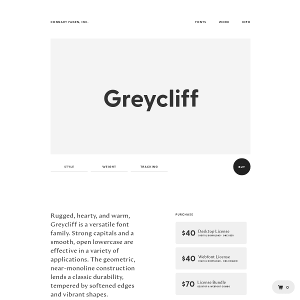
Greycliff
Of course a specimen about a typeface called Greycliff should be all greyscale. A simple design with stacked images of the typeface in context.

Kalnia
Stacked images and animations tell the story of the design in this unconventional specimen. Of particular interest is the 'move me and play' panel inviting the user to move individual glyphs around on a black canvas.
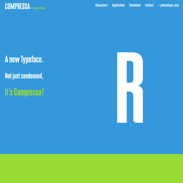
Compressa
Colourful, vertically stacked panels outline the features of Compressa before digging into details of the individual characters.
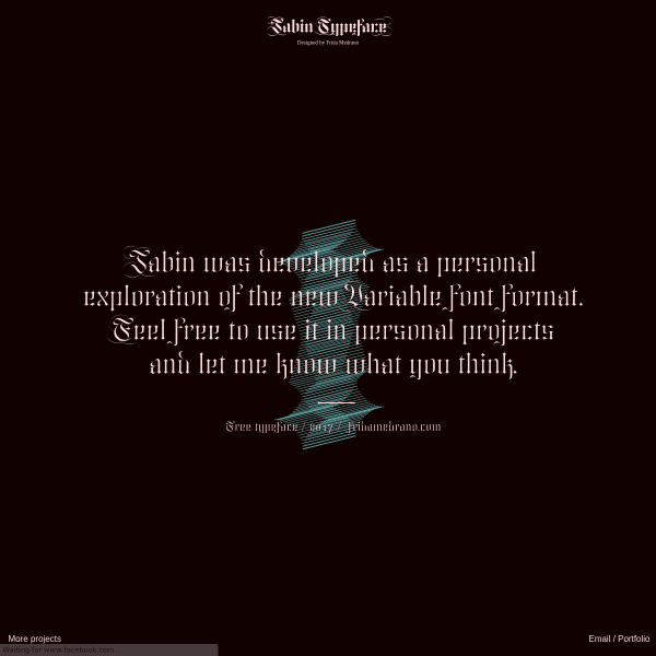
Jabin
Developed as a personal exploration of the Variable font format, the Jabin specimen designed by Frida Medrano is a playful presentation of spiky forms and educational animations.
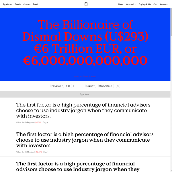
Value Serif
Colophon's digital specimens all follow the same templated approach, but with subtle variation of the design of the full width panels.
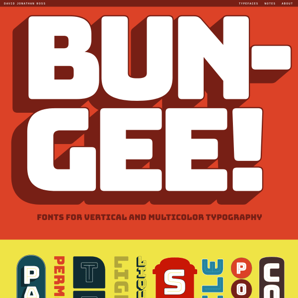
Bungee
Bungee is for 'vertical and multicolour typography'. The type-tester is particularly interesting in this horizontally scrolling specimen. It allows the user, through various parameters, to emulate the designs shown in the specimen and share them across Twitter.
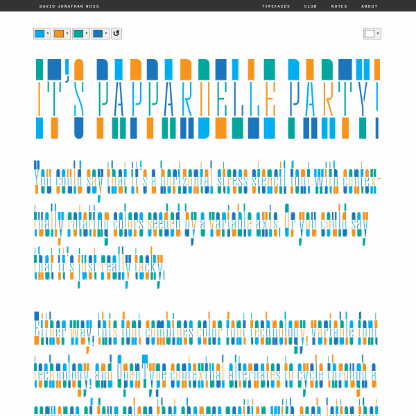
Pappardelle Party Font
Eye-wateringly wonderful. Switch the colours in this specimen and the tyography changes accordingly.
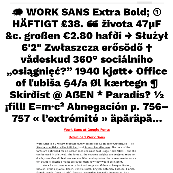
Work Sans
The Work Sans specimen is unusual being almost entirely focussed on the functional aspects of the typeface. Providing the user with the usual features of the typeface, this specimen goes a step further and presents the typeface in multi-language long-form.
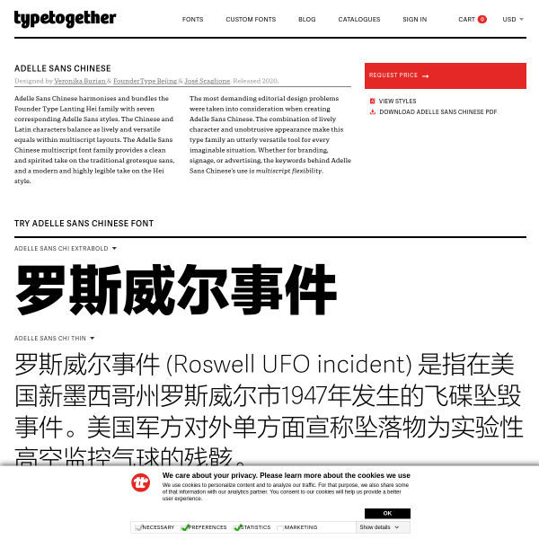
Adelle Sans Chinese
A versatile complement to the Adelle typeface family, Adelle Sans Chinese ships with a sparce but elegant specimen getting its priorities straight: invite the user to test, then go on to explain the origins and design. Function first.
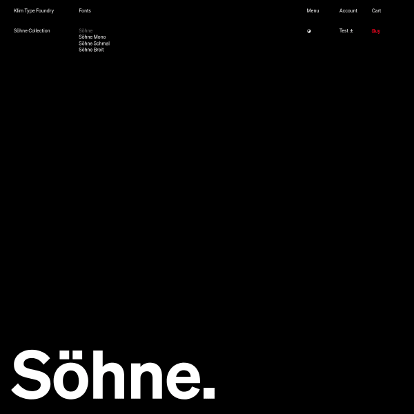
Söhne
Exquisite specimen from Klim Type Foundry. On the surface, the specimen for Söhne is simply presented. Almost like a print specimen. It's not until you interact with the type that the controls appear for a feature-rich typetester. What is particularly interesting about this one is the ability to test multi-lingual definitions of 1984's Newspeak.
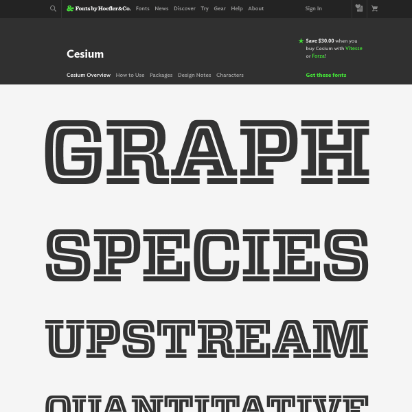
Cesium
Hoefler&Co's specimens follow a similar templated approach, but they are considered and elegant. The full-featured type tester is front and centre inviting the user to get in and test the fonts themselves. Simple and effective.
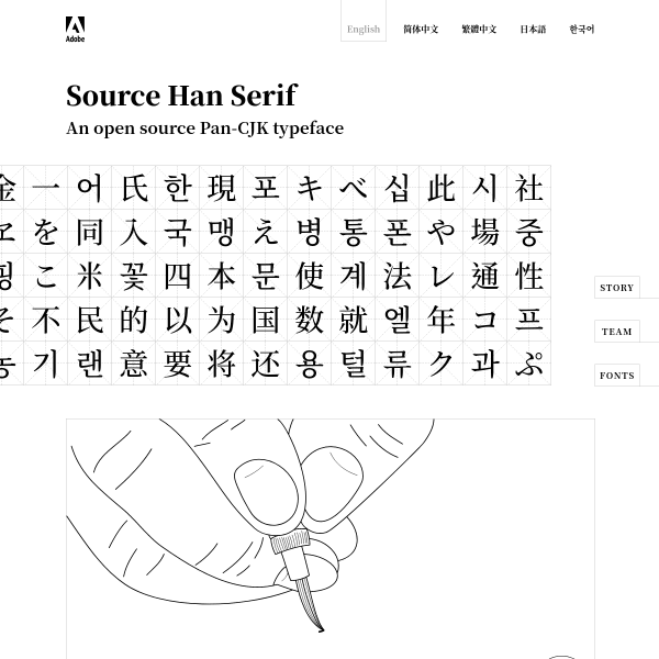
Source Han Serif
Adobe's open source CJK typeface initiative. A calming and sophisticated website punctuated with line drawing illustrations and subtle interactions.
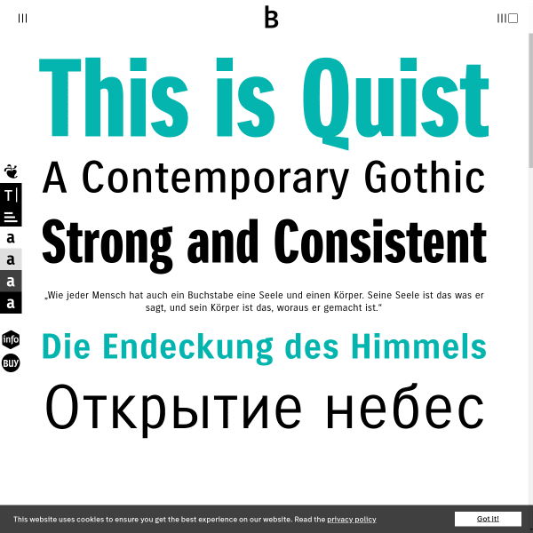
Quist
A functional, traditional-looking specimen from bBox Type. Leading with the various weights, sizes and simple two colour presentation, the specimen quickly moves on to describe features. The type tester is another section, but feature rich allowing the user to change paragraphs and do basic typesetting.
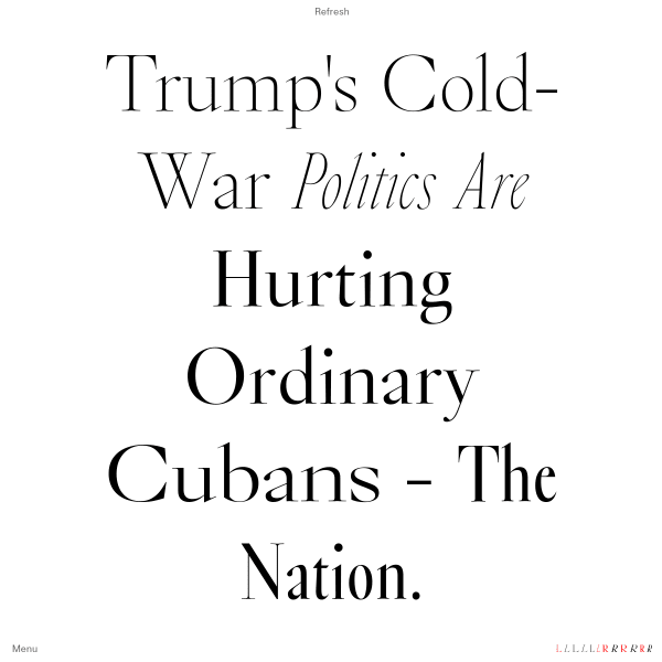
Bold Decisions
An unusual specimen, Bold Decision's Glossy specimen follows the same style as the other typefaces on sale: a simple quote is presented full screen. There's something to be said for powerful words set large and strong.
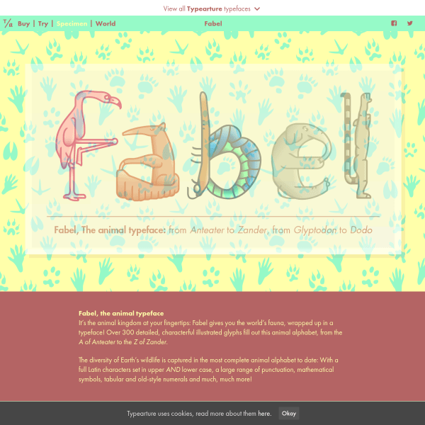
Fabel, the animal alphabet
A delightful specimen to match a delightful typeface. The ligatures and tabular vs old style numerals are particularly lovely.
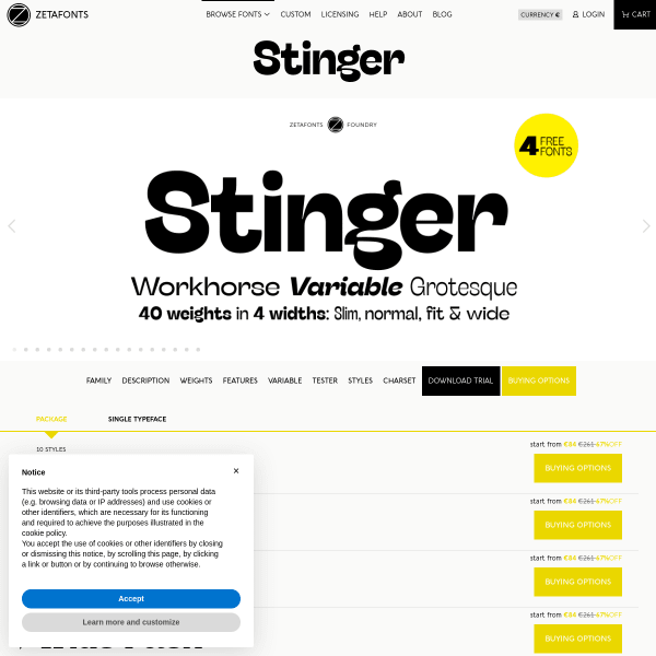
Stinger
This is a workhorse of a specimen. Functionally driven, it's about getting the prospective customer to the features quickly for them to make a decision and try out Stinger.
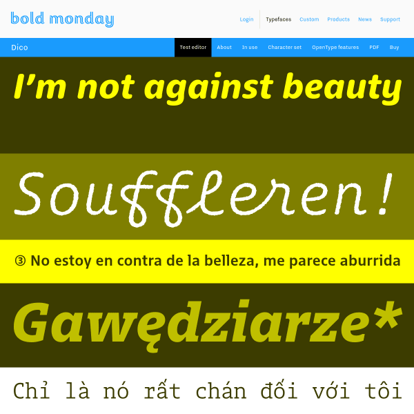
Bold Monday - independent font foundry of high quality type
Bold Monday's specimens always strike such a good balance between form and function. This new specimen for Dico opens with several stacked typetesters that go beyond just changing weights. You can also change colours, alignment, and letter spacing.
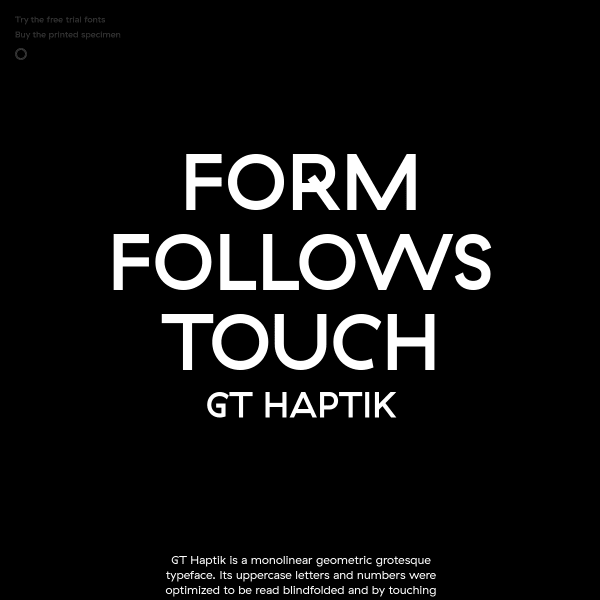
GT Haptik Font
Haptic is a monolinear geometric grotesque typeface with uppercase letters and numbers that have been optimised to be read blindfolded and by touching them. The specimen takes this experience a little way on as their are touches of discovery throughout, for example, the controls to view the different weights. A bold lack of colour and simple photography add to the stark design.
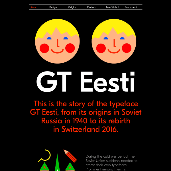
GT Eesti
This specimen is delightful. From the bold, large letters presented alongside vibrant illustrations evoking the typeface's inspiration from 1940's Soviet Russia.
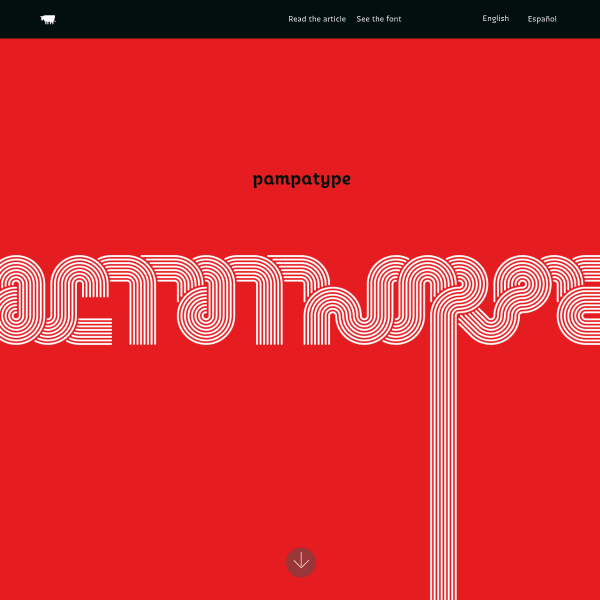
Octothorpe
This is a joy. A reimagining of a 1970's transfer lettering classic, Octothorpe's specimen takes us vertically through its features: from swashes, to contextual ligatures, to 'all sorts of figures'. No type testers here, but an invitation to try out the font elsewhere in a more templated tester as well as read an in-depth article.
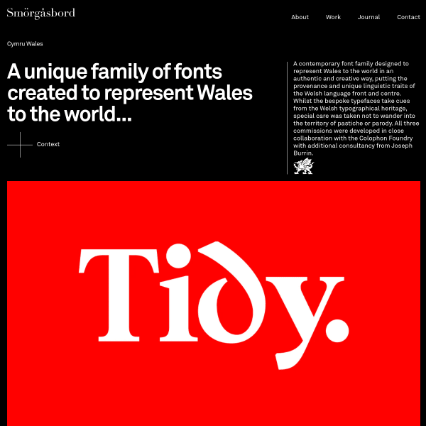
Cymru Wales
Part case study, part specimen. The Cymru Wales font has been designed in collaboration with the Colophon Foundry. Cymru Wales has a rather overt nod to Wales' cultural and typographic history but I think it just about pulls it off without the usual Celtic clichés.
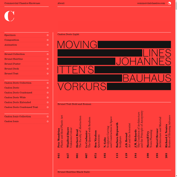
Three cornerstone typefaces
Class graphic design meets modern web design, the Commercial Classics Showcase specimen is everything you'd expect from the team involved. Notable that Michael Bierut was Creative Director for the specimen. As always, beautiful typefaces from Paul Barnes and Christian Schwartz.
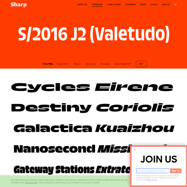
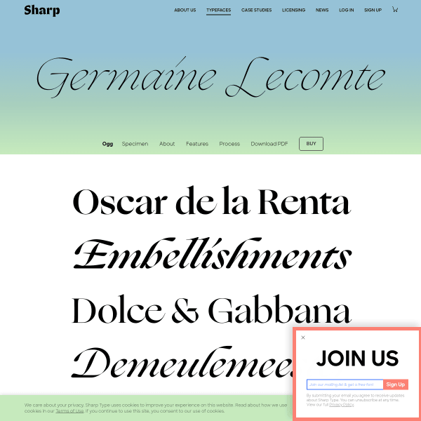
Trois Mille (3000)
Smart looking specimen from Sharp. What works for me here is the progressive disclosure of the user interface which appear only on hover of selected elements. The Menu is a solid addition, too. Many specimens forego labelled sections in favour of just one, scrollable page. Having an insight into the process is a nice touch, too.
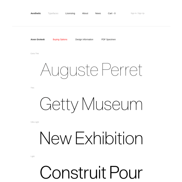
Anon Grotesk
This specimen is an exercise in restraint. Just the barest of essentials are provided for the designer evaluating Anon Grotesk: a list of weights – presented as as a type tester – with the simplist of tools to just vary the font size. A PDF Specimen, available on download, mirrors the stark functionalism of the online version. The only bit of colour is the link to purchase.
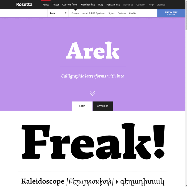
Arek
At first, I was drawn to the bold, confident typesetting at the start of this specimen. It's a little tempered by the fact these are images when, really, they should be web fonts in a digital specimen. That aside, the real beauty of this specimen is at the bottom of the page with clear, instructional illustrations for the features available in the font. I think many type designers and foundries can forget that many font users do not know what 'stylist alternates', for example, might be.
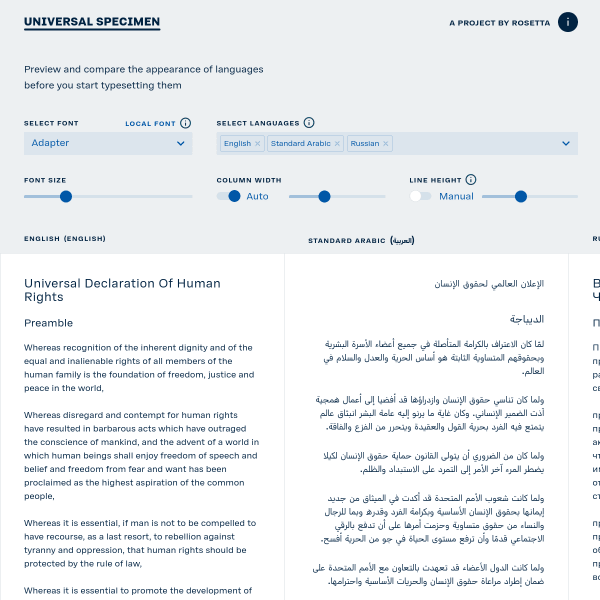
Universal Specimen
This is something a little different. Universal Specimen is a single page app designed to preview and compare local fonts across multiple languages. Simple controls allow for tweaking column width, line height, and size. A really useful idea for web designers and type designers alike.
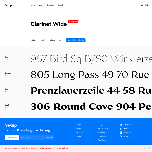
Clarinet Wide
Clarinet is a work in progress I stumbled across at Future Fonts. The specimen is somewhat templated (as it's, well, a template), but the page showing examples of various types of layouts and designs are interesting. I wish these were produced with the web-fonts, however, instead of images.
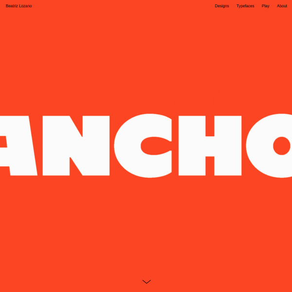
Ancho
Apparently inspired by the peppers of Mexican cuisine, Ancho is a bold, brash, commercial looking typeface with some interesting quirks. The ultra bold weight is my favourite. The specimen is broken up into horizontal containers and it starts getting interesting as you get down into the display of the alternates and features of some of the letters. *enormous* type. Bold, unforgiving forms that look fabulous in a web browser.
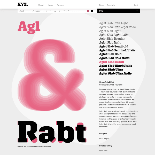
XYZ Type – Fonts – Aglet Slab
I'm a big fan of this specimen. It's clear, leads with tools that allow me to get stuck into some typesetting and evaluation, before closing with some features and a little content about the typeface. The type tester is particularly good, not only offering the standard size and weight controls, but also leading and more advanced features. We're seeing more specimens now with type testers edging towards this.
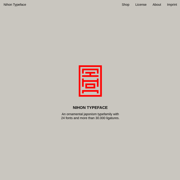
Nihon
An ornamental Japanism typefamily. Inspired by traditional Japanese Inkan-Seals, Nihon takes abstracted latin letters and presents them as used by the seals. A complex goal, but the specimen walks through the results before digging into some features.
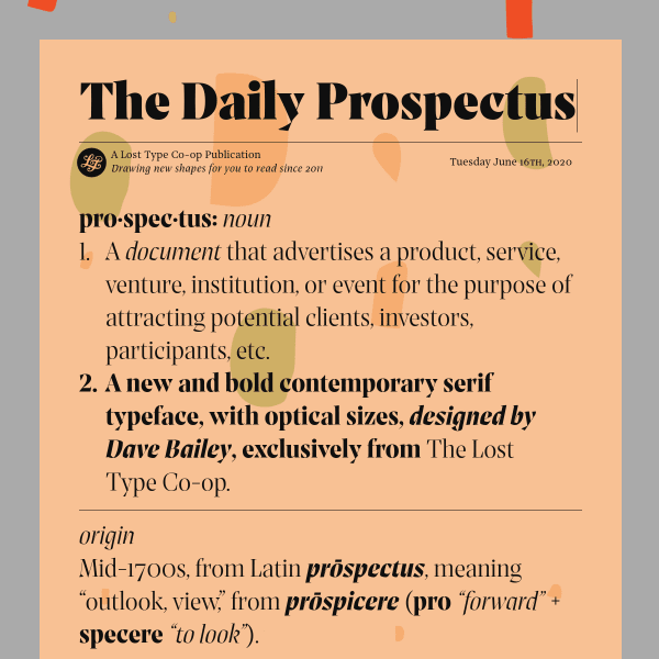
Prospectus
Quirky specimen for a quirky contemporary serif. Full featured type tester before moving onto interesting sections displaying various features and contexts. The specimen ends with a long form article explaining the origins and design of the typeface.
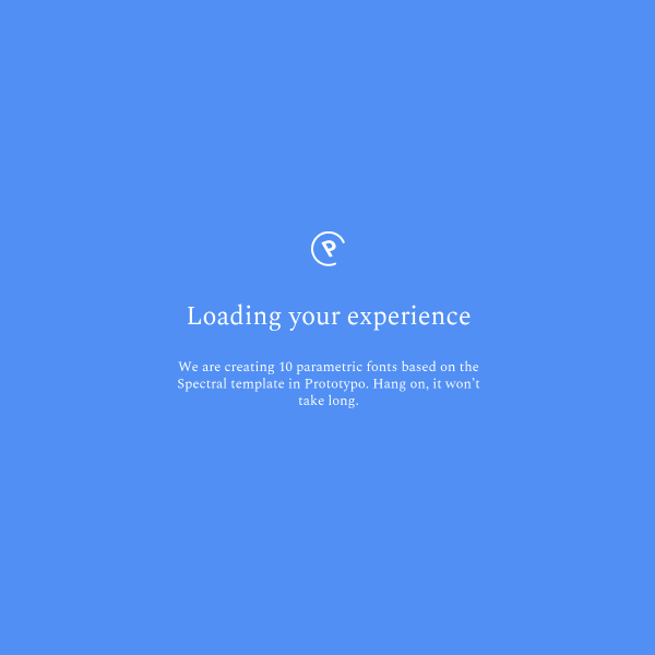
Spectral
The first parametric Google font by Prototypo, the specimen for Spectral is a patchwork of user discovery. Each panel is a mouse-over animation designed to inform of the features of this experimental typeface. Impressive stuff!
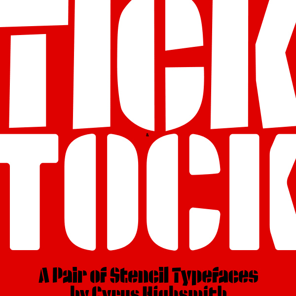
Tick and Tock
Just about as bold a design as you can get. Full screen, in-your-face graphics perfectly compliment Tick and Tock's design.