A curated list of digital specimens
of the highest quality. Updated daily.
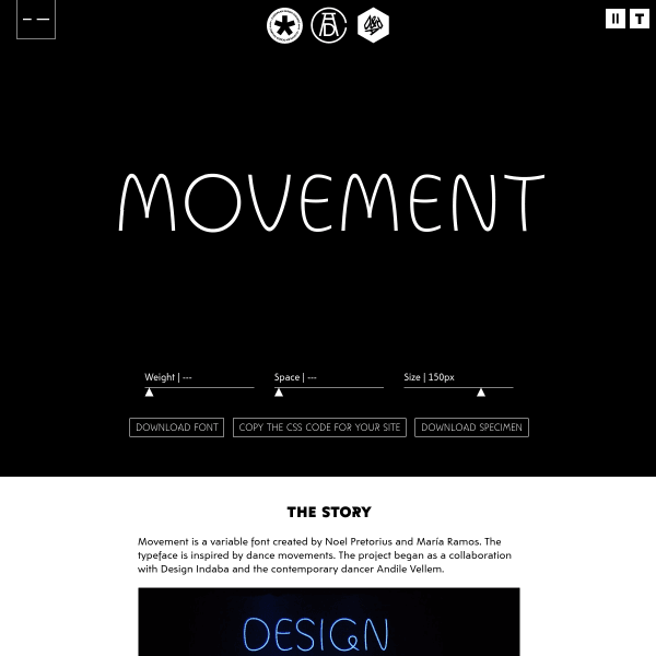
Movement
A simple type tester specimen frames the real content – a video and description of the origin of the typeface.
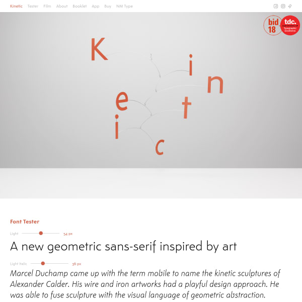
Kinetic
Refreshing design for Kinetic – light, duotone – all bolstered by stylish photography and a video. Interestingly, Kinetic has a companion iOS app – Kinetic Notes – that allows you to create simple text notes.
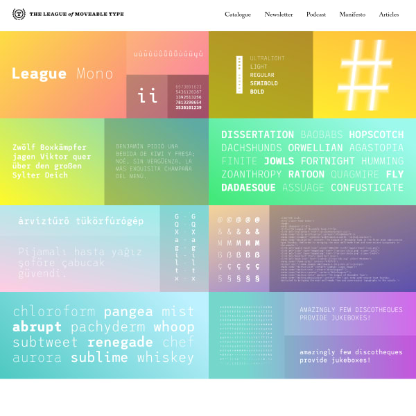
League Mono
Described as 'Five weights of monospace fun', the specimen for League Mono is a patchwork of subtle rainbow gradients with content describing the features of the font.
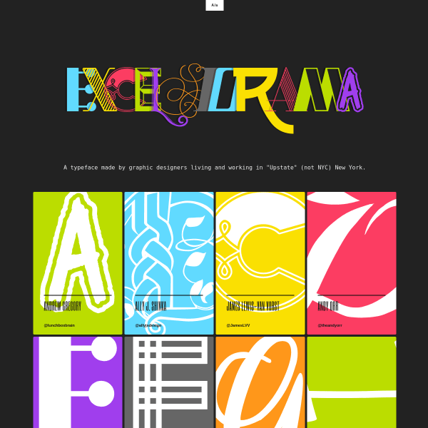
EXCELSIORAMA
This is a fun specimen for a fun typeface. 'A typeface made by graphic designers living and working in "Upstate" (not NYC) New York.' each designer creating an individual glyph. Coloured panelled typesetters allow the user to explore the typeface further.
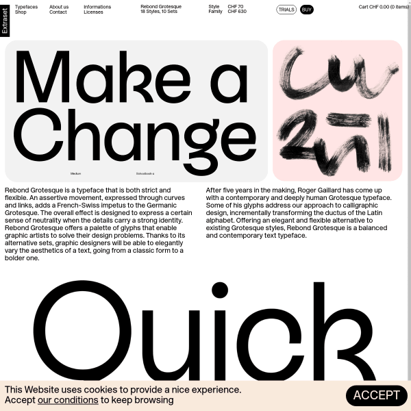
Rebond Grotesque
Another detailed (and delightful) specimen from Extraset. It strikes exactly the right balance between inspiration, design, functionality, and technical features. The type tester is particularly good with toggles for all the font's features.
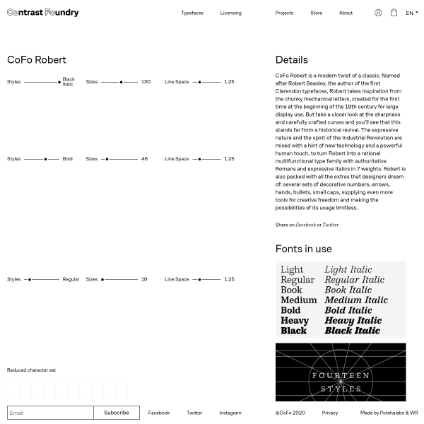
CoFo Robert
A unique specimen design with a vertical 50/50 split of the the screen showing stacked type testers on one side, and explanatory text on the other. An efficient use of screen real-estate.
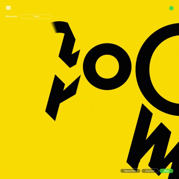
MONAAKO FLOW
MONAAKO FLOW is an interesting typeface designed to create animated typographic compositions on After Effects, using Animography plugins. A constant scrolling animation is the primary design pattern with a downloadable PDF with more information.
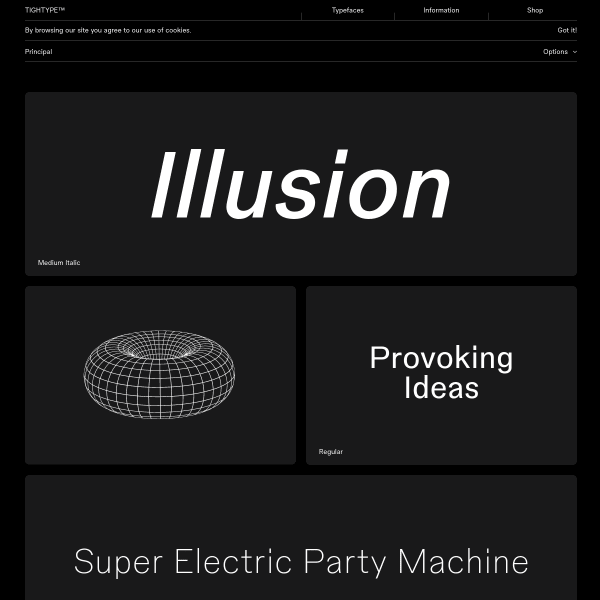
Principal
A mosaic of typetesters (often with individual words) are punctuated with wireframe illustrations of geometric forms. A conventional, but with enough unique touches, from TightType.

Gerstner Programm
This is a cool interface. Two panels of content: the typeface displaying weights in a fairly conventional manner, and the other a long form article explaining the design rationale in detail. The specimen page retains it's clean interface by progressively disclosing more detailed information.
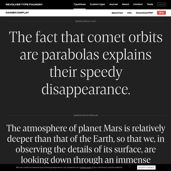
Damien Display
What's notable about this specimen for Damien Display is the controls for the type tester. Subtle, well designed controls in a control panel. But the notable thing is a 'buy now' button displayed in context.
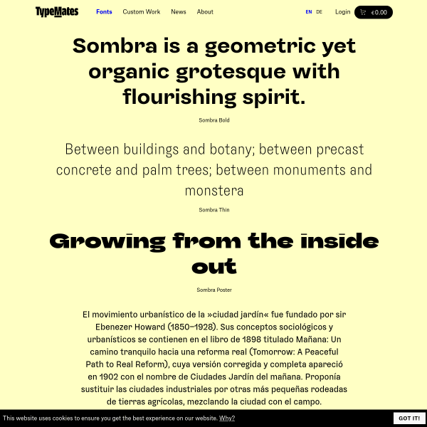
Sombra
The specimen for Sombra is templated but efficient. Stacked typetesters greet the user before displaying some in-context designs in striking orange and black duotone.
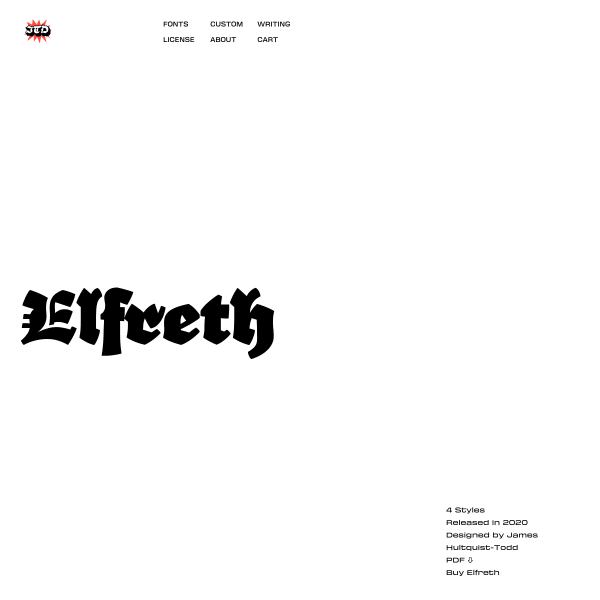
Elfreth
Everybody loves a good Blackletter. And this is a good one! The specimen reads as an article punctuated with images of inspiration and typeface development.
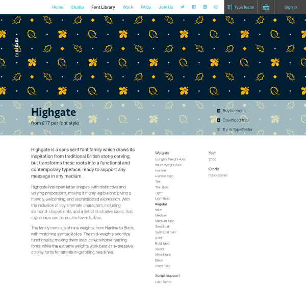
Highgate
Dalton Maag's Highgate typeface specimen has the right balance of aesthetics, history and context, and font features. The animation displaying the variable font animation is particularly good, highlighting the different glyph shapes when traversing the weight axis. The changes to the little leaf glyph are particularly revealing as to the considerations of the type designer.
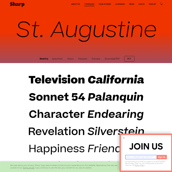
Beatrice
This is a great specimen focussing on the technical details and features of Beatrice. Following a template for all of Sharptype's specimens, Beatrice is presented amongst plenty of information about the process and examples of usage.
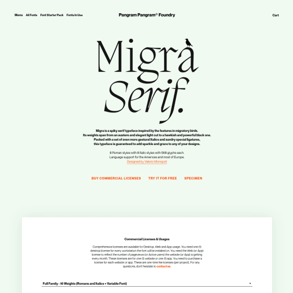
Migra
The standout of this specimen are the stacked images of example usage. The illustrations documenting the ligatures and typesetting are particularly outstanding.
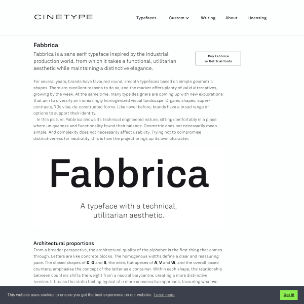
Fabbrica
This is fantastic. A specimen that is, in fact, just an article documenting the conception and influence for Fabbrica's creation.
Tongari
Leading with a typetester, the specimen for Tongari quickly moves into panle after panel of usage examples. The design sketches are a welcome addition to any specimen. These show the level of craft the designer puts into every single letterform.
Goldman Sans
Interesting slideshow for Goldman Sans. Sort of a specimen, sort of marketing to an internal audience, the website does a good job at explaining accessbility features to a lay audience. The section on number was especially good.
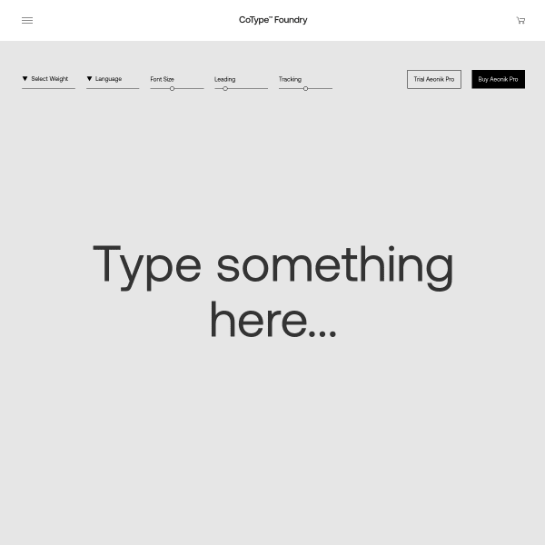
Aeonik Pro
A straight-forward typetester leads the specimen for Aeonik Pro, before an equally straight-forward list of weights, glyphs, and features. Nothing out of the ordinary here. The carousel of images of usage is where the interesting design lies on this specimen. Some beautiful pieces of work that I wish had been transposed into digital form.
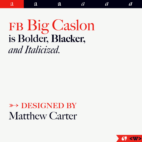
FB Big Caslon
Another slick, informative and exploratory specimen from The Font Bureau. Vertically stacked sample text invites the user to explore the large text before a simple categorised glyph list.
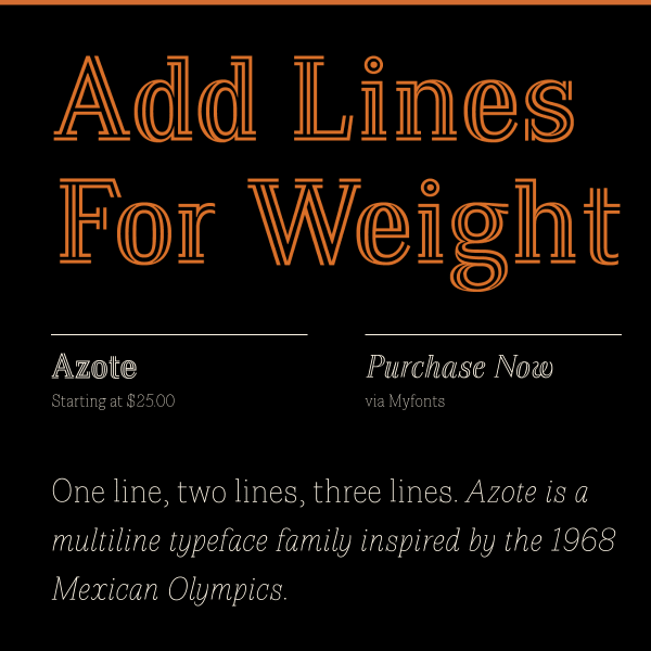
Azote
This is a traditional, but effective, digital specimen. Large sample text in different weights visually show the benefits and features of the font.
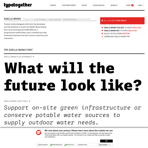
Adelle Mono Flex
TypeTogethers specimens take a templated approach, but include this large section on the backstory of the typeface. Typically, they pair this with an even lengthier blog post providing a package of material to support the typeface release. A perfect example of when a specimen isn't just a specimen.
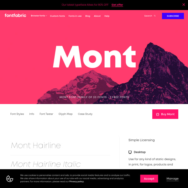
Mont
So many specimens follow a sinlge page approach with vertically defined sections. Mont takes the other approach of incorporating sub-pages and navigation. The type tester is particularly elegant.
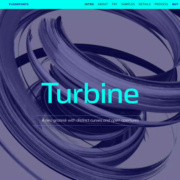
Turbine
Turbine is a neo grotesk with distinctive curves and open apertures. This is quite some specimen. Starting with a quick introduction and type tester, it moves on to a long list of branded samples in the same two-colour palette. The Process section is a particularly good read.
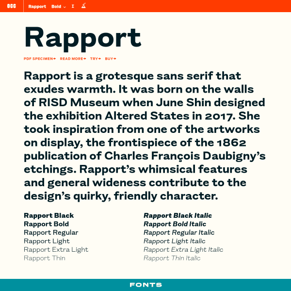
Rapport
This is a deceptively simple specimen that, on further investigation, reveals different features in interesting ways. The type tester's controls are a little unusual. Clicking the 'read more' about the font opens a treasure trove of an article outlining the typeface's origins, inspiration, and design
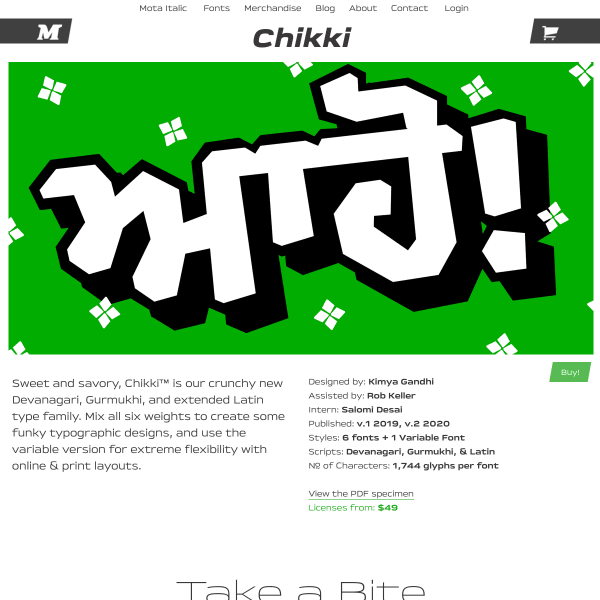
Chikki
What a fun specimen! Bright, bold typographic illustrations pepper the content explaining the typeface's features. Really refreshing design.
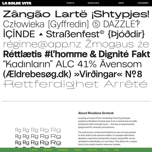
Residenz Grotesk
A specimen that reads like a product page, including often used conventions such as the alternating image and paragraph combination. Where this specimen breaks with convention is the navigation stuck to the bottom of the page.
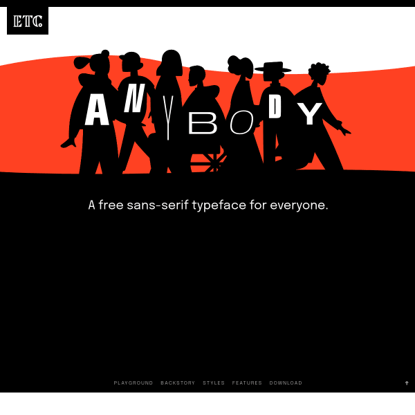
Anybody
A heavily stylised retro illustration opens the specimen before leading onto more conventional design patterns. It's a shame the aesthetic wasn't carried through to the features or back story of the typeface.
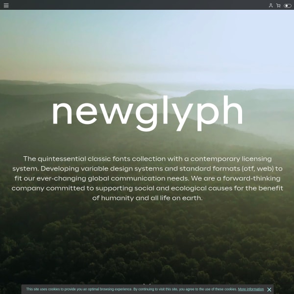
Newglyph
This is a really cool collection of specimens (as a catalogue, I suppose). Presented in a passive, scrollable format, the controls for manipulating the content ever-present at the bottom of the interface.
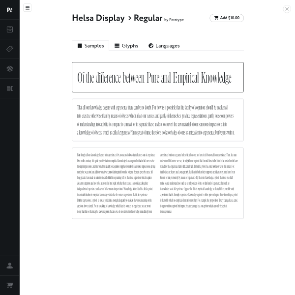
Helsa Display
Super simple specimen from Paratype which has glyphs and languages as different sections. There is a tool menu (which is a little obfuscated) and in here are the usual controls to manipulate the text.

Forgotten Shapes
This is a really interesting user interface and specimen format. It's a type specimen coupled with a lengthy article in a refreshing interface for swapping between the two.
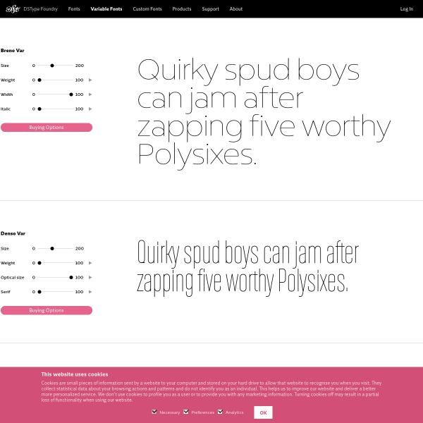
Breno Var et al
Tiny stacked type testers with variable font axis controllers. Simple but effective.
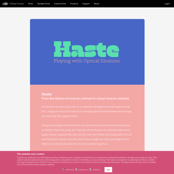
Haste
A simple digital equivalent of a flyer, I suppose. Stacked images of type samples for Haste. The larger weights particularly good.
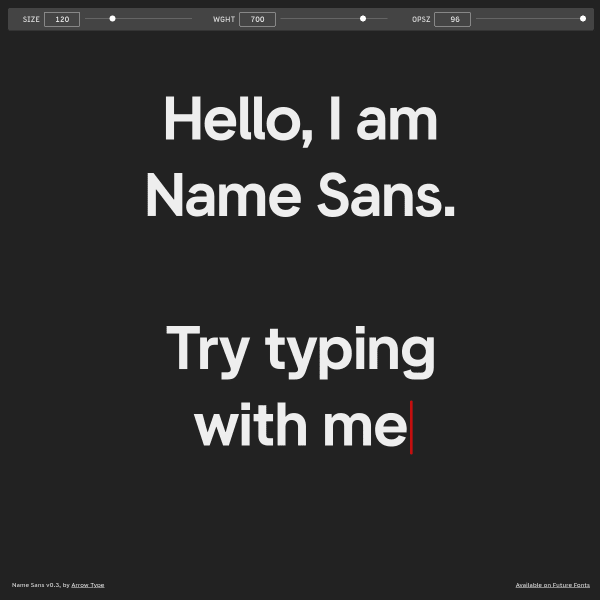
Name Sans
Refreshingly simple. A full page type tester with three variable font axis controllers. That's it!
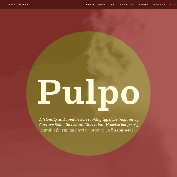
Pulpo
An in-depth specimen trying hard to display the many features and possible applications of the typeface.
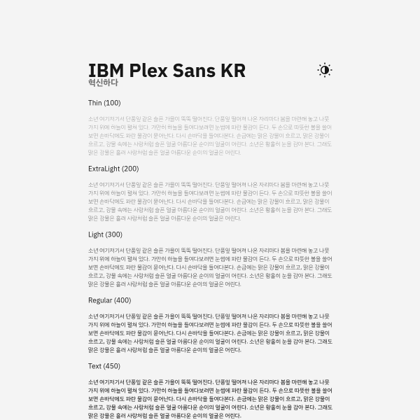
IBM Plex Sans KR
Specimen for IBM Plex Korean. Super simple, but elegantly displays the typeface at the various weights.