A curated list of digital specimens
of the highest quality. Updated daily.
Leon Sans
A geometric sans serif built using code to create animations. probably one of the better examples of kinetic typography on the web at the moment. Whilst this specimen site aims to really show what is possible, even with the simplist and most subtle animations, this typeface could be effective in many contexts.
Ēdìtørîaļ Něw
A rich, immersive experience for a versatile typeface. The specimen reads like a book – and can be navigated as such. But the designers have given much attention to the experience of the passive scrolling user. Animations and transitions lead the user through each section inviting them to interact with the content in non-conventional ways.
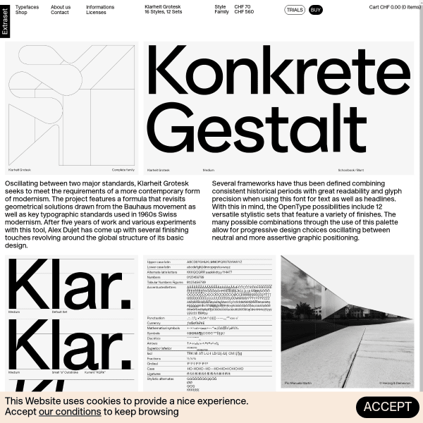
Klarheit Grotesk
Another specimen from Extraset. Presenting a wonderfully stark design, the specimen's biggest asset is the typetester allowing the user to explore the many alternate glyphs available for the font.
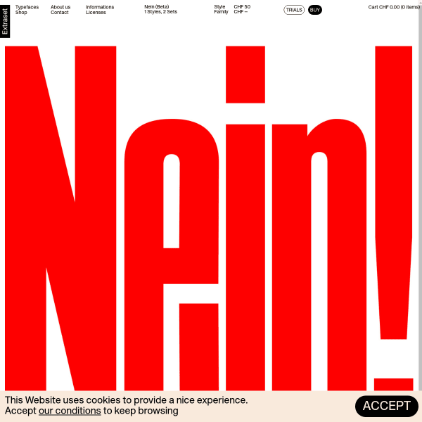
Nein (Beta) | Extraset
There's a lot going on in the design of this specimen. Opening with probably the largest type seen anywhere, the visual assault continues through panelled animations demonstrating potential use. That started with enormous type, ends with an enormous buy button.
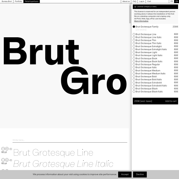
Brut Grotesque – Bureau Brut
A brutalist specimen for a brutalist typeface. The stark functionalism of this digital specimen mirros a PDF layout with minimal interaction.
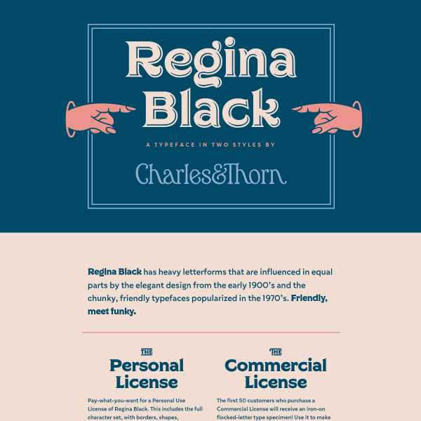
Regina Black
Quicky specimen for a quirky typeface. Regina Black is a wonderfully expressive typeface that is demonstrated so well throughout the vertical panels on this specimen. With ample mouse pointer hijacking, and a limited colour palette, the specimen really injects a sense of fun.

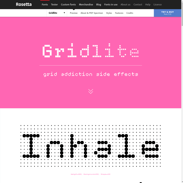
Rosetta
New display typeface from Rosetta, Gridlite's specimen looks disarmingly simple. It's not until you use the type tester that the power and variation of Gridlite becomes apparent.
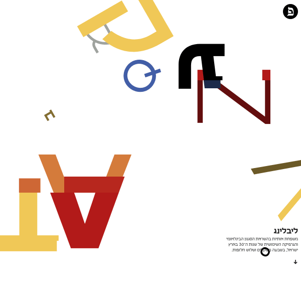
Liebling ליבלינג by Fontef
The specimen opens with it's most striking feature: modernist animations of letterform compositions. Each area is a simple typetester with controls activated on hover.
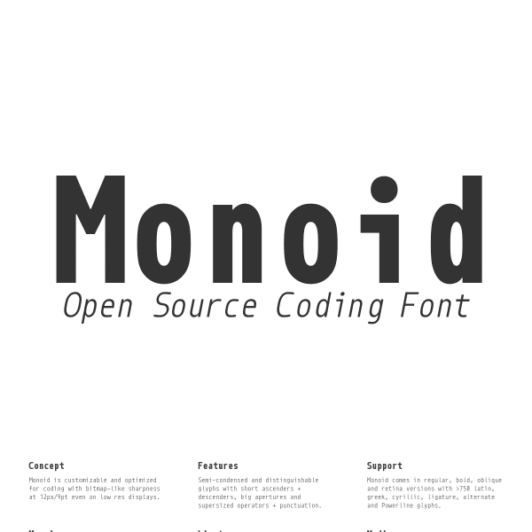
Monoid
Simple specimen for a simple typeface. Monoid is an open sourcing coding font. The specimen's features are a coding preview area to test various language rendering. This show's real empathy for Monoid's intended audience; they need to see the font in the language they use the most, in a theme they use the most.
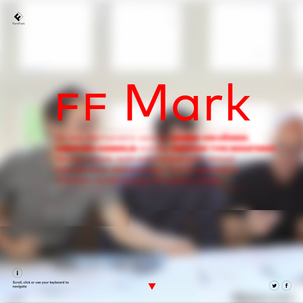
FF Mark
Another page-based scroll-hijacking specimen, but in a good way. The overlay section – showing the different weights overlaid a weight of your choosing – is particularly well done.

FS Millbank - A wayfinding typeface from Fontsmith
FS Millbank is a wayfinding typeface by Fontsmith. The specimen is more like a presentaiton than a traditional format. The user zooms in, out, and through the typeface's various applications, features and design details. Compelling viewing.
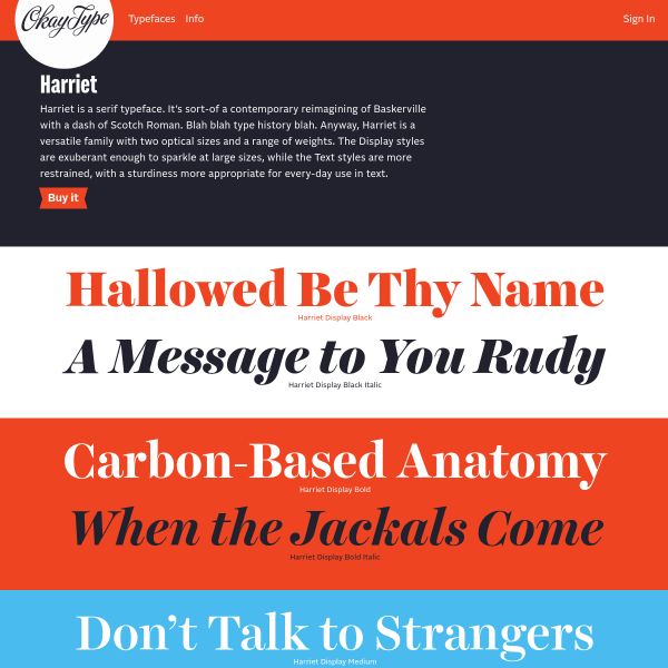
Okay Type ✶ Harriet
Harriet continues the theme of two tone, stacked type testers, but it's just done *so* well! The type tester tools are shown on interaction with the editable content areas. The OpenType feature panel is particularly well done with examples shown in context to the controls.
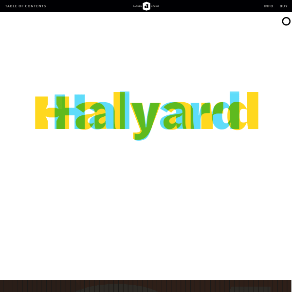
Halyard
Scroll through page after page of contextual examples in the specimen for Halyard from Darden Studio. This microsite really shows how this typeface could be put to use on a broad range of outputs.
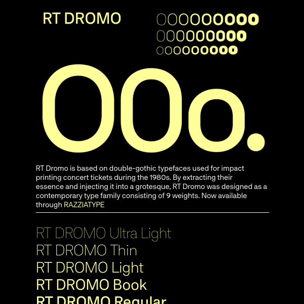
RT DROMO
Based on double-gothic typefaces used for impact printing, RT Dromo is a characterful sans serif, especially the heavy weights. The specimen mixes panels of illustrative and educational content.
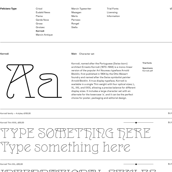
Korrodi – Feliciano Type
A simple black and white specimen with stacked type testers with size controls.
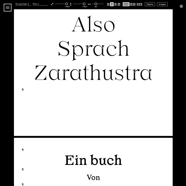
Or Lemmon
A comprehensive interactive specimen from Or Type. This takes type testers to another level offering rudamentary layout software. Add multi-columns, images, and interact with any element of type. The specimen is arranged in vertical pages – prepopulated with different text types – with options to add further pages to create your own.
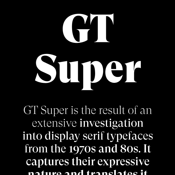
GT Super — Download Free Trial Fonts
A glorious black and white specimen with enormous type, the GT Super specimen tells the story of the typeface before digging into detail. Almost all vertical panels revieal a typetester on colicking with an array of tightly constrained controls.
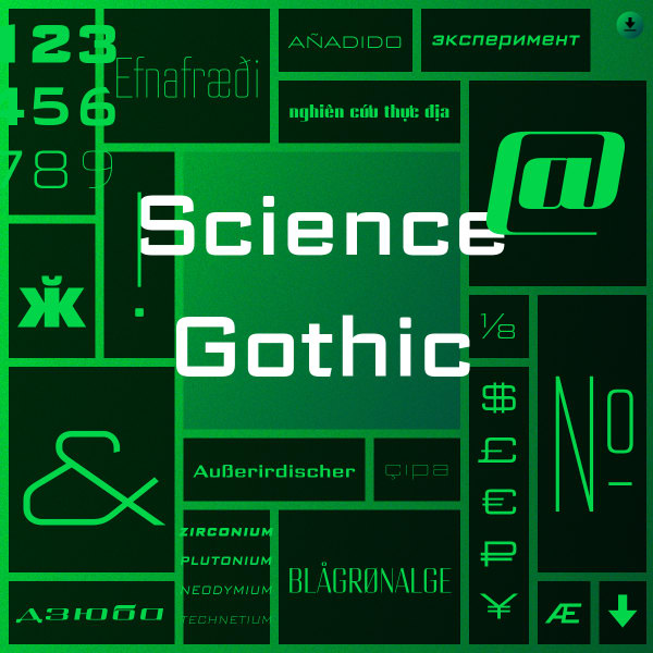
Science Gothic
A variable font with a lot of variation! Science Gothic is a reimagining of Bank Gothic in a HUGE new design space. The specimen is interesting from a graphic design and web design perspective. A blend of noised backgrounds with two tone gradients fill each horizontal container.
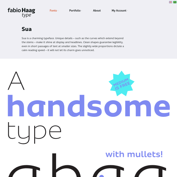
Sua
A lovely looking typeface with a simple and clear specimen. Images of the type set in various contexts open the specimen – presumably from a printed companion – before moving into some type testing and finally the ability to download trial fonts.

Antonia
Following the trend of leading the digital specimens with images of the font in various contexts, the specimen for Antonia includes some notable additions – an animation of the variable font, individual type testers for the many weights but with options to preselect to HTML headings and text.
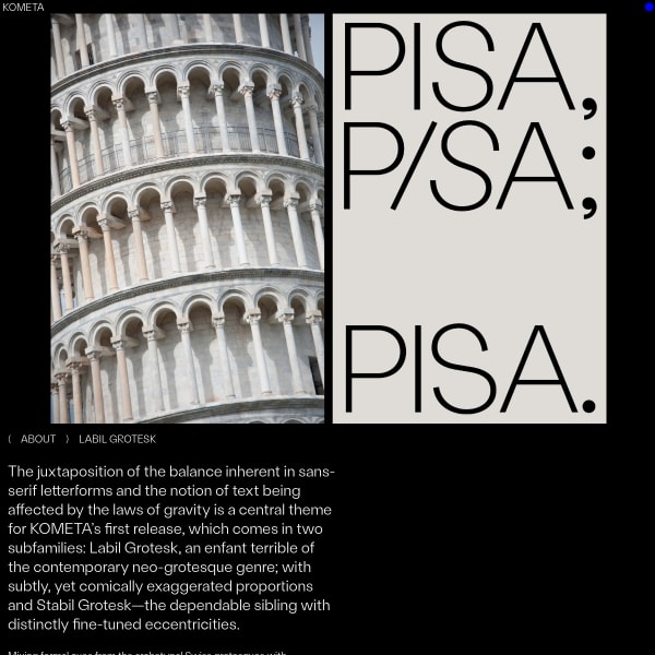
( KOMETA ) Labil Grotesk
An unconventional specimen for an unconventional typeface. It's quite rare to see experimentation in this space, so when it does happen it's refreshing. A carousel of images with introductory content open the specimen leading onto stacked typesetters for the various weights. The design patterns themselves are conventional, but the presentation less so.
![screenshot of Live Weather Forecasts by Black[Foundry]](https://res.cloudinary.com/typespecimens/image/fetch/q_auto,f_auto,w_600,c_limit/https://image.thum.io/get/width/1200/crop/1200/noanimate/https://wthr.live/)
Live Weather Forecasts by Black[Foundry]
This is an interesting little application of a font selling the benefits of variable fonts, but packaged up into something useful.
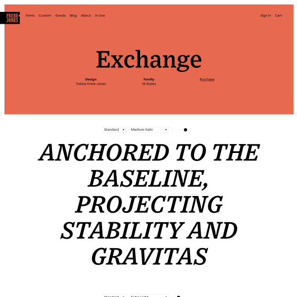
Exchange
There is something nuts and bolts about this specimen that appeals. Lean on snazzy features, or enticing content, the Exchange specimen leads with simple typetesters, small explanatory text, and options to read more in-depth content or download a print specimen.
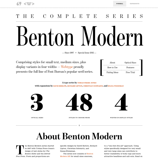
Benton Modern
The formal showing of this specimen shows web typography at its best. Beautiful type, quality educational content, and imaginitive layout.
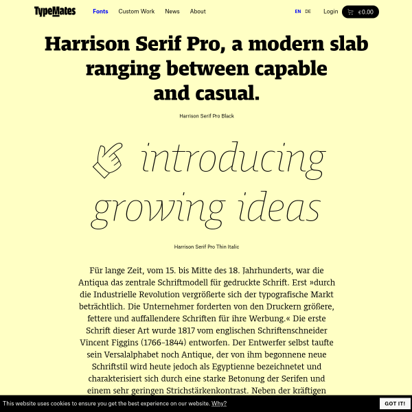
Harrison® Serif Pro
This is a great specimen. Every panel is editable meaning you get to play with the various sizes, weights and settings in context. The specimen is further bolstered with full character set, language support, opentype features, and a downloadable PDF specimen.
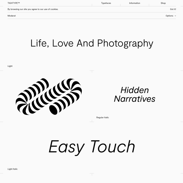
Moderat
A single colour specimen that mixes geometric shapes with individually typeset single words in the many different weights. The specimen closes with a glyph set and demonstration of the many features of the typeface.

silka mono
An interesting specimen, but if only this was in web fonts! Stacked images of various incontext settings are really what sells the typeface here. Alternating black and white, large and small text across the various weights have striking appearance.
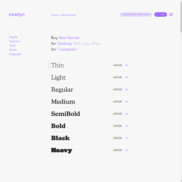
Newlyn
All Newlyn's specimens follow the same, templated (but slick) design. Simple cues, such as the flashing cursor, invite users to interact with the specimen further.
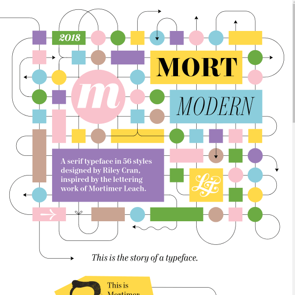
Mort Modern
This is a fun specimen. Beautifully designed to match the feel of the typeface, the specimen initially takes you through the origin and inspiration of the work. There's a lot to dig into here: a long form essay, beautifully designed little panels of type features and testers.
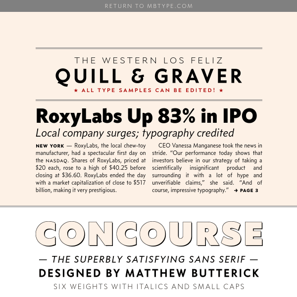
Concourse
Beautifully typeset digital specimen opens with just a paragraph of editable text. Scrolling reveals panels of example text for various contexts for Concourse.
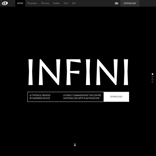
Infini typeface by Sandrine Nugue | CNAP
Infini is a public commission by the Centre National Des Arts Plastiques in France. A freely available font, the specimen is an infinate scroll across four 'pages' but with links to a type tester, and in depth typographic studies.

IBM Plex
The specimen for IBM Plex is as close to a printed specimen as you can get in digital. It has those feelings of bespoke design, collectability – something special. Quality content and bold large typography.
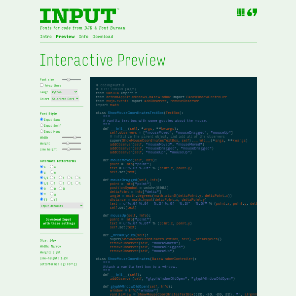
Input: Fonts for Code
Detailed and full-featured type tester for coding font, Input. Mirroring an IDE with sample code, the user is invited to tweak the settings to find the perfect weights, balance, and alternate letterforms just for them.
Circular
LLineto's specimens follow a similar templated approach and closely mimicking a printed specimen. This is all about showing the different weights over titles and long form. What is particularly good is the very detailed technical information at the bottom of the page. Detailed waterfall design patterns with a full glyph table.
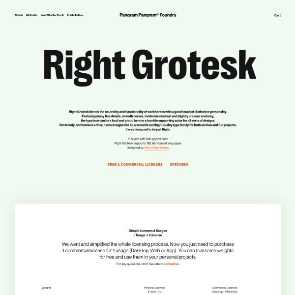
Right Grotesk
From PangramPangram, the Right Grotesque specimen, unusually, leads with pricing and downloads. Refreshing to see the continuing trends of free licences. The typeface tester is way down in the hierarchy followed by some images from the PDF specimen. Again, I wish these were presented as web fonts.